The 25 best responsive websites
Our expert jury selects the best responsive websites.
In 2012 responsive web design really went mainstream. Two years after Ethan Marcotte's seminal article on A List Apart, it wasn't just a concept any more. We've asked some of the leading lights in responsive web design – you can find the list at the end of the article – to choose the best responsive websites that launched over the last 12 months, and here's what they've come up with.
It's an impressive mix, ranging from personal projects that are free to roam without a client breathing down their neck to innovative client work for the likes of Microsoft, Disney, Currys and Starbucks and some future-friendly in-house jobs by the BBC, The Next Web and Time. Here they are, in alphabetical order...
01. Ableton
"Never have I seen Futura used so bravely!" exclaims designer, speaker and author Elliot Jay Stocks of Edenspiekermann's work for Berlin-based music software developer Ableton. "It works, though, combined with bold imagery and a vibrant colour palette."
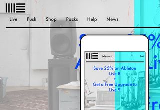
Stephanie Rieger, designer and co-owner of Yiibu, a wee mobile design consultancy based in Edinburgh, agrees: "This [is a] gorgeous, fun and delightfully on-brand site. Parts of the site are a bit heavy but given the audience, the nature of the brand and the need to incorporate music and video, I think they've done an awesome job. Be sure to hunt for the many little creative (and practical) design touches – like rotating column labels on a software comparison table to better fit smaller screens."
02. Adobe & HTML
"This site, which showcases Adobe's web-related products, is actually more of an adaptive layout rather than a real responsive design," explains designer and developer Stephen Hay. "Performance could be significantly improved, and I'm not fond of the navigation taking up most of the space at the top of the page on mobile.
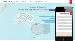
The reason I mention this site here is that both the adaptive layout and the content signal that Adobe, behemoth of print design software, is beginning to acknowledge the modern web and the needs of its designers. Adobe, with its design roots, has an opportunity to turn this site into a graphically appealing, full-blown responsive design."
03. An Event Apart
"The freshly redesigned An Event Apart is not only gorgeous but also wonderfully crafted," says Tim Kadlec, web developer and author of Implementing Responsive Design. "[The developers] use SVG icons when they can, and fall back to PNGs if they have to.
Get the Creative Bloq Newsletter
Daily design news, reviews, how-tos and more, as picked by the editors.

Images are lazy-loaded as they come into view. For example, as you scroll down an events page you can see the speaker images subtly fading in. All this plus an appealing and clean design!"
04. BBC News
"The best responsive site of 2012 was the BBC News mobile website," says Paul Robert Lloyd, designer at Clearleft and author of .net's monthly Responsive column. "While it doesn't yet scale up to desktop browsers in terms of layout, it's responsive in the truest sense of the word.
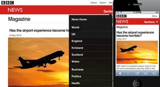
"Designed with a mobile-first mentality, it scales to meet different device characteristics beautifully. It is a fantastic example of progressive enhancement. There's lots of discussion around responsive images, but the BBC's approach is starkly pragmatic. The markup references just a single image, that for the headline story, and conditional loading means only more capable devices receive the highly optimised images for other stories. The site is not only accessible from any device but blazingly fast, too.
"In the next year, I'd like to see greater focus on performance over visual design and layout. In that regard, the BBC News mobile site is a great example for others to follow."
05. Build 2012
"One of my favourite parts of the year is to see what Andy McMillan and Kyle Meyer come up with for the new Build conference site," enthuses Reagan Ray, lead designer and one third of Paravel.
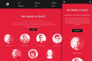
"They went responsive for the 2012 version and I think it's their best effort to date."
06. Contents
"Contents magazine may have an unfair advantage with Ethan Marcotte himself as their creative director – but nobody said my choices had to be fair," says Mat Marquis, designer/developer working at Filament Group in Boston and founder and chair of the Responsive Images Community Group for the W3C.
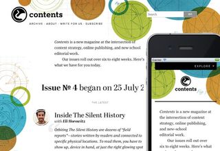
"Contents boasts beautiful typography and an overall design that keeps their content – as one might expect – front and centre at any size. The design is backed by per-issue illustrations that wrap around the copy in differing ways depending on the breakpoint. The illustrations enhance the design, but never serve as a distraction. It’s a genuine pleasure to read, and that’s really what this 'web design' stuff is all about."
07. CSS-Tricks
"Again: choosing a site with Chris Coyier’s name on it feels a little like cheating, but fair’s fair – the guy is a beast, and he did a hell of a job with this redesign," Mat Marquis laughs. "Chris manages an insane amount of useful information on his site and he does so with a design that’s not only logical and usable at every screen size, but has a ton of personality.
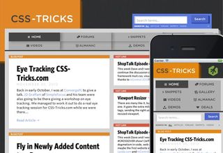
"Honorable mention here goes to Chris’ codepen.io (not yet fully responsive when editing) which is an incredibly useful tool for creating quick demos and test cases. There’s some amazing work on there."
08. Currys
"Currys may not have what we consider to be the level of design a lot of agency and personal sites have, but I'm picking it for its significance to the wider uptake of responsive design techniques. It's the first truly large-scale ecommerce site I've seen that's embraced responsive design," explains James Young, creative director at Offroadcode .

"It provides a good experience on a range of devices while dealing with a massive amount of content and products of all shapes and sizes, and includes an easy-to-use buying process – all within a single codebase that's clearly been well considered by the Currys web team."
09. dConstruct 2012
"Apart from the incredible speaker lineup, the dConstruct site itself is a beautifully crafted responsive experience," says Ben Callahan, president of small Ohio-based agency Sparkbox.
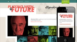
"My favourite detail of the site is the navigation. Note the added iconography for a smaller viewport experience. This shows that real care was given to the touch target area and signifies an implicit value [placed on] those users viewing the site on smaller devices – a mobile-first mentality. Well done @clearleft!"
10. Disney.com
"When a site with the media complexity of Disney went responsive, it really showcased the validity of the approach for delivering multimedia content on the web," remembers Scott Jehl, web designer/developer at Filament Group. "The site's understated, clean design highlights the rich imagery from Disney movies and television that can be viewed inline on the site, and a nice use of Ajax and history.pushState makes for subtle, non-jarring page transitions.
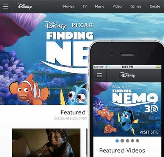
"The site also layers nice contextual interactivity, such as gesture-driven carousels for touch devices and off-canvas page-pushing navigation on small screens."
11. Fray, Issue 3
"Issue 3 of the Fray, 'the web's original storytelling magazine', was my favourite responsive design I saw this year, and maybe my favourite ever," recalls Scott Jehl. "In addition to its beautiful responsive cover design where design elements from the cover artwork are reused throughout the layout, each of the articles in the issue has its own unique custom art-directed design, much like we see in print magazines, but less frequently on the web.
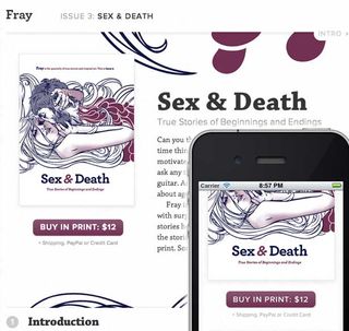
"Many of the layouts incorporate finely tuned CSS to beautiful effect, like the skewed title and byline of the 'Braces' article, and offset pullquotes throughout. Just a warning: the site's subject matter is aimed towards adults."
12. Gov.uk
Stephen Hay says: "The Gov.uk design is visually simple (practically no images), but it's clear what its intention is: to help you find information quickly. For government websites, this is no easy task. I love that this site is not only responsive but a perfect example of how well-thought-out content and structure can lead to a clearer user experience, regardless of the device used.
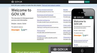
"It's so important that goverments present their information accessibly; I'm sure the simplicity of this site will be an example other government organisations will follow."
13. Heroku Status
"Heroku is a deployment service for web applications, so this site skews towards a very technical audience," says Scott Jehl of his second choice. "Heroku's status site is merely a place for monitoring the service's uptime, with status notifications for any current incidents and a timeline of reports.
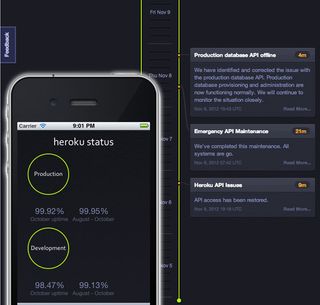
"The small-screen presentation is conservative, but very functional and semantically rich, with a cleanly designed list presentation. However, in wider viewports, the timeline morphs into a vertical data visualisation where incidents are boxed and linked to time points via curvy HTML5 canvas-drawn lines, making the content more engaging."
14. Lotta Nieminen
"Lotta's clever site encourages exploration, as the left and right sides of the screen tease content from the adjacent sections," enthuses Elliot Jay Stocks.
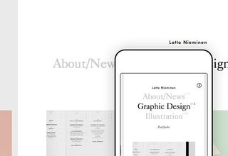
"I half expected this to break at different widths, but the behaviour stays consistent at all times, and combines media queries with JavaScript to stack and resize individual columns sensibly."
15. Microsoft
"The new Microsoft site is exciting to me for so many reasons," Ben Callahan reveals. "To see a giant like Microsoft get behind responsive web design in this way really demonstrates how far we've come in the past two years. The design clearly embraces the Metro style and gives us a level of cleanliness and space that is missing on most corporate sites. There is also a significant amount of navigation, which can be a real challenge to make usable across a wide range of viewports and interaction models. I love the fact that the drop-downs are behind click or touch [events] as opposed to :hover. I believe we're going to see much more of this in the near future, even at larger resolutions. Well done @paravelinc!"
Reagan Ray, who worked on the site, says: "Trent and Dave are too modest to toot the Paravel horn, so I will. We were happy to play a small part in such an exciting time for Microsoft. I think it's a great example of a large corporation adopting responsive design."
16. Polygon
"Polygon is an insanely rich responsive gaming site that puts its big brothers (IGN, Gamespot, and so on) to shame," praises Dave Rupert, lead developer of Paravel and co-host of ShopTalk with Chris Coyier. "The big graphics get my gamer senses tingling. The interior posts are an amazing blend of art direction and responsive architecture."
17. Riot
Elliot Jay Stocks comments: "Simple, centred, one-page sites might seem like they translate to responsive design easily, but it takes skill, consideration, and a keen eye to make everything re-adjust seamlessly. Riot's site does just that."
18. Skinny Ties
"While I don't own any skinny ties, other than a handful of 80s leftovers tucked away in a storage bin somewhere, I do think this site is beautifully executed," says Ben Callahan. "It's also encouraging to see responsive techniques being used on more complex sites: in this case, an ecommerce experience. The navigation on this site is unique throughout all viewport resolutions, but works exceptionally well on the small end of the spectrum. Its visual nature is perfectly sensible for a store of this size and it remains usable despite the use of :hover on touch devices. Well done @falkowski!"
19. Starbucks
"The responsive Starbucks.com is great, but what's even more inspiring to us is the web-based style guide that comes with it," Trent Walton, founder of Paravel, points out. "It conveys the power of the fluid/responsive layout much better than a .psd or .pdf can."
20. Tattly
"I’ve just included a dangerous time sink in this list," warns Mat Marquis of this temporary tattoo site, "so I apologise in advance to you and/or your boss. I’ve burned through an embarrassing amount of time browsing the designs on Tattly across various devices, and I’m never left wanting for an experience I can only get at a certain breakpoint. They’ve done a great job making sure their site translates well to a huge range of device/window sizes, and perhaps even more importantly, they provide me with a sure-fire way of making myself look like a badass. Y’know, for a few days at a time, anyway."
21. The Next Web
"While I'm still not a fan of the sticky sidebar thing, this site is pretty amazing," Dave Rupert admits. "The whitespace and typography create a really relaxed environment. I'm pleasantly relieved when I visit TNW on a tablet: it has a great feel and good reading experience."
22. The Shape of Design
"Frank Chimero's take on a responsive reading experience is inspiring on all levels," says Trent Walton. "His online version of The Shape of Design is a joy to read. The unobtrusive chapter navigation works well and the media-query font-size scaling keeps everything wonderfully proportional."
23. Time
"Following The Boston Globe's lead, Time has made its mark on the world of responsive news websites with its implementation," applauds Stephen Hay. "The fact that there is one fewer news website in the world offering us a link to 'the full website' on mobile is already enough, but the site really does look good on mobile: it's the Time identity through and through. Some of the text might be a bit small on some devices, but the developers have left scaling on: always a good idea. Some steps could be taken to improve performance, such as serving scaled images [but] nevertheless, it's a step in the right direction."
24. United Pixelworkers
"I'm a fan of the bold simplicity of United Pixelworkers and the solid grid layout and navigation treatment for small screens works well," says James Young. "As with the Currys site, this is an ecommerce site that makes it easy to complete my primary task – buying goodies – on any device.
"It's a shame you jump to Shopify to complete your purchase, and I'd love to see at least a branded checkout completion page soon, but it's still very easy to buy your T-shirts."
"Responsive ecommerce is difficult, but the Pixelworkers seem to have figured it out," adds Dave Rupert. "Great homepage, great product pages, great checkout flow. If you're looking create a wonderful responsive ecommerce site, this is your bar."
25. University of Notre Dame
"I love some of the things University of Notre Dame has going on under the hood," raves Tim Kadlec. "It uses RESS to reduce the page weight on small screens. It also uses geolocation to enhance the Campus Tour feature. If the site detects you're on campus, it identifies which locations are closest and offers you walking directions. It's a helpful way of using the context of the user and the capabilities of the device to enhance the experience."
Many thanks to all our contributors for selecting their very favourite responsive sites of 2012 for this article: Ben Callahan, Elliot Jay Stocks, Tim Kadlec, Paul Robert Lloyd, Mat Marquis, Scott Jehl, Stephanie Rieger, Stephan Hay, James Young and the whole of Paravel: Trent Walton, Dave Rupert and Reagan Ray.
We hope you've been inspired to check some of the sites out. Let us know what you think of our selection in the comments, and which sites were your own favourites this year.
Liked this? Read these!
- Brilliant Wordpress tutorial selection
- The ultimate logo design guides
- The best free web fonts for designers
- Discover what's next for Augmented Reality
- Download free textures: high resolution and ready to use now

Thank you for reading 5 articles this month* Join now for unlimited access
Enjoy your first month for just £1 / $1 / €1
*Read 5 free articles per month without a subscription

Join now for unlimited access
Try first month for just £1 / $1 / €1
The Creative Bloq team is made up of a group of design fans, and has changed and evolved since Creative Bloq began back in 2012. The current website team consists of eight full-time members of staff: Editor Georgia Coggan, Deputy Editor Rosie Hilder, Ecommerce Editor Beren Neale, Senior News Editor Daniel Piper, Editor, Digital Art and 3D Ian Dean, Tech Reviews Editor Erlingur Einarsson and Ecommerce Writer Beth Nicholls and Staff Writer Natalie Fear, as well as a roster of freelancers from around the world. The 3D World and ImagineFX magazine teams also pitch in, ensuring that content from 3D World and ImagineFX is represented on Creative Bloq.


