Ecommerce web design: 20 essential tips
Ecommerce web design is about making the journey to the checkout as quick and easy as possible. Follow these 20 expert tips to build ecommerce websites customers will love.
We've all been there. You're looking to buy something online, and a nice product at a great price pops up in Google.
You click through, take one look at the site ... and bounce out of it quicker than an Olympic trampolinist. Other times you may land on a beautiful site, a piece or art almost, but after being timed out going through the maze of a checkout process you move on.
Ecommerce web design is not just about making an online store aesthetically pleasing (although that helps). More important is the undeniable fact that the quicker the customer can get from landing page to completed order, the more likely they are to get to the end and give you their money. Quality ecommerce web design is all about getting potential customers through that process.
Here are a few key tips I have picked up in the course of designing, building and running a number of ecommerce websites. This is by no means an exhaustive list, but follow this advice and you should be able to create a successful ecommerce site.
Words: Andy Booth
01. Let customers refine their options
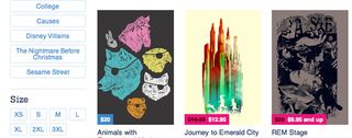
When customers are trying to search for what they want on your ecommerce site, being able to filter their options will save them a lot of time and effort. This is particularly important when it comes to sizing, for items such as clothes. Customers hate finding that "perfect" piece of apparel, only to discover you don't carry it in their size.
02. Let them reverse their choices too
When a user starts to "narrow" their navigation inside a particular category (for example, selecting large clothes only), they may make a mistake, or change their minds. So it's vital that you allow them to remove those navigation selections - rather than forcing the use of "back button" clicks - which are repetitive at best, and may cut off their browser connection at worst.
03. Keep the search bar in easy reach
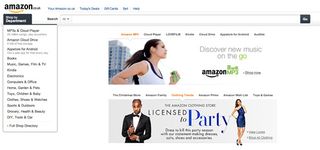
Many of us don't realise how often the search bar on our ecommerce website is used. When customer come to a site looking for something in particular, if it's not clearly identify on the landing page then the most common reaction is to search for it.
Consider making the search bar the key focus of your ecommerce site. This will also work to keep users on the site, as they may be tempted to look around more.
04. If items are out of stock, make it clear
One of the biggest mistakes I made running my first ecommerce store was not keeping on top of the stock. For SEO purposes it is better to keep the product on the site instead of removing it and having to add it again. If a product is out of stock that needs to be crystal clear. Otherwise, like me, your client will be emailing angry customers apologising about the fact you have to cancel their order.
05. Make use of quality photography
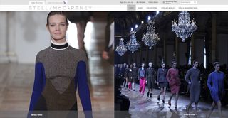
Ecommerce is all about buying with your eyes, as most of the time you won't get to see or touch the real thing until it's been delivered. Having plenty of photos is a guaranteed way to attract more business, so plan a product page layout in mind. Will you have a product slide show? Or tiled thumbnails. Just as important is the quality of these images, as blurry or pixelated photos will be a major put off as well as bringing down the quality of the site.
06. Make the shopping cart visible
More advanced online shoppers will not want to be sent straight to the basket page if they add an item. Therefore it is important that the basket is visible on every page of the site.
Many designers like to use the side bar for this, but I find that clogs valuable promotion area. Think of the basket as the search bars partner in crime. They both need to be on every page so look for a way to incorporate them together for a clean looking site.
A basket must also contain more information than simply how many items are in it. Consider using thumbnails of the products to add a bit of life to the basket.
07. Make your site easy to navigate
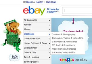
For larger site there is a good chance there will be a lot of categories. However, fly-out or super menus (the drop down menus when you hover over them) are an effective way to keep your page from getting too cluttered whilst creating maximum accessibility throughout the site.
The key to fly-out menus is being simple and effective. Trying to be too elaborate defeats the whole point of making the site easier to navigate. In the example above, the fly out menu may not be the best designed one you will come across, but it does exactly what it needs with the minimum amount of space taken up.
Using breadcrumbs is also key to making the navigation of your site a smooth process for a user.
08. Don't add delivery charges at the end
Many users like to know how much delivery will be. A quick way to find abandoned shopping carts is to suddenly have an extra fiver added right before purchase. Make sure on the product page the delivery options are clear - although try to avoid overpowering the description of the product in the process.
09. Question every pixel
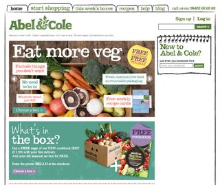
WHY WHY WHY? This is what you need to keep asking yourself about every single pixel you decide to edit. Why do I need this? Why will this benefit the user’s experience?
The most effective ecommerce web design is so good you don't even notice it's there, and no user wants to be over powered by too much gloss, when all they are there for is the products and the price.
10. Consider SEO
SEO is something I severely underestimated on my first ecommerce web design project. Without a well optimised site they only way you will attract visitors is via pay per click.
Consider carefully how and where H1 and H2 tags will be used. For H1 tags, it is key you do not use the logo as one, as this will be repeated on every single page of the site. Think about utilising the space below the header and navigation menu.
11. Give your site personality
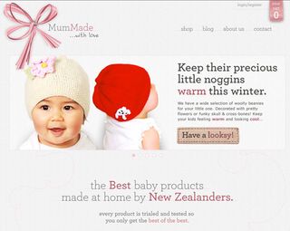
To make a site stand out you need to add a bit of personality. Obviously a clean, simple to navigate site is the bedrock, but on it's own that's not enough. Without that small bit of personality, your ecommerce store will not stand out and be remembered.
In the example above there is a simple colour theme and clean layout, but with some tweaks to the style the site has its own unique look without scaring away users.
12. Incorporate social media
Although the likelihood of say a garden furniture store having a mass following seems low, social media plays a big part in SEO and back links. In other words get tweeting.
But putting social media links on your site is not a simple task. They need to be placed somewhere which does not dominate the page, however hiding them away will render them useless.
n a product page, Pinterest is an under estimated tool. A simple click to share a great photo of your product to thousands of pincers could attract more business, so make sure there is a clear way to do this.
13. Provide a quick product preview
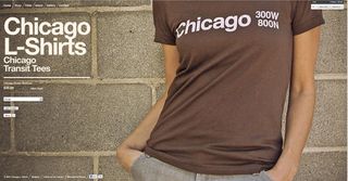
Visitors hunting down products online might want to quickly browse your category pages for items matching their needs. Whether due to lack of time, slow loading speeds or personal preferences, clicking on individual items for additional details on a separate page is avoided by some users.
By adding a quick preview to your category and search pages, ranging from a simply larger version of the image to a more complex view that loads details via ajax, you can get the user's attention towards your products and their details.
14. Add a newsletter signup form
Building up a strong email list is a long process, but incredibly valuable for promotion especially around Christmas. Having a newsletter sign up form is standard on any ecommerce store, so try to make yours more appealing than others.
15. Keep product pages clean
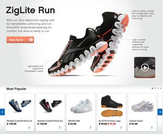
There is a recurring theme in this article and that is keep it clean. This is most important on the product page.
An ecommerce store is a shop online, (stating the obvious), so treat it like your shop. You can't get away with the clumsy mess of products that Primark offer. You need your site to shine like an Apple store. The products are spread out in their own space, complete with a tidy description and price. The experience should be the same when online. No adverts, and as little distraction away from the product.
Adding 'also purchased', or 'also viewed' products are great ways to keep your user shopping, but must be used with care. It's easy to go far and create an overabundance of clutter.
16. Include testimonials
Had a lovely email from a customer complimenting your amazing service? Surely any potential user will only see this a more of a reason to spend money on your site. This is something that works well as a slider or sidebar addition.
17. Display product variations intuitively
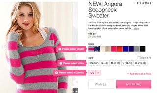
Within many industries the ordering process involves selecting specific variations of the main product. For any item that might require a size or colour selection, be as clear as possible. Include images for the different combinations.
If a jumper comes in red, I want to see the red jumper. Use colour swatches and graphical representations like a size chart in addition to more standard elements like drop-downs or radio buttons.
18. Eliminate checkout distractions
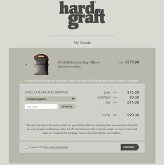
Once your customer proceeds to the checkout, you want them to find it very easy to complete the order. When designing, remove items like sidebar navigation and adverts to define a clear path to the goal. Don't try to promote more products and deals on this page.
The more content on the checkout page, the less appealling it will be. Single-page checkouts have the highest conversion rates; however if your checkout process has multiple steps, make sure the customer is aware on his progress. In the example above, any customer can clearly see what they have set so far, and if there are any spelling errors or amendments required it is easy to navigate to.
19. Keep the 'add to cart' visible
This is by far the most important rule, and it is very simple. The clearer, bolder and more attractive the add to cart button is, the higher the chance it will be used.
If you are designing an ecommerce store for yourself then it is an easier process if you plan all these factors ahead. However, if you are designing for a client then I know how stubborn they can be over horrid things like product promotion and getting Twitter followers.
You need to stand your ground. Web designers are hired because we know best, and although a client only thinks about his margins, it is important to show how these design tips will improve the user experience of your store. If you have any other tips you have picked while working on an ecommerce store then please comment below and share with the community.
20. Make contacting you easy
If you are likely to attract an older generation then it is vital that the site has clear phone numbers. Although technology like tablets and mobile browsing is growing in popularity, there are still a lot of potential customers who are very nervous about buying online.
If they see an option to speak to an actual person, there is a much more likely chance you can convince them of your trust and process the order over the phone with them. Otherwise you could be losing a lot of customers who are there for the taking.
- Andy Booth works as a web designer and developer. He's mainly focused on WordPress and creating ecommerce sites with Magento. He's recently set up Blog on a Train, a blog aimed at people who are new to web design.
Now read these!
- 20 pro tips for creating a mobile website
- 40 amazing examples of HTML5
- 30 web design secrets to boost your skills!
- 101 CSS and JavaScript tutorials to power up your skills

Thank you for reading 5 articles this month* Join now for unlimited access
Enjoy your first month for just £1 / $1 / €1
*Read 5 free articles per month without a subscription

Join now for unlimited access
Try first month for just £1 / $1 / €1
Get the Creative Bloq Newsletter
Daily design news, reviews, how-tos and more, as picked by the editors.
The Creative Bloq team is made up of a group of design fans, and has changed and evolved since Creative Bloq began back in 2012. The current website team consists of eight full-time members of staff: Editor Georgia Coggan, Deputy Editor Rosie Hilder, Ecommerce Editor Beren Neale, Senior News Editor Daniel Piper, Editor, Digital Art and 3D Ian Dean, Tech Reviews Editor Erlingur Einarsson and Ecommerce Writer Beth Nicholls and Staff Writer Natalie Fear, as well as a roster of freelancers from around the world. The 3D World and ImagineFX magazine teams also pitch in, ensuring that content from 3D World and ImagineFX is represented on Creative Bloq.


