How to design a poster: 10 pro tips
Want to know how to design a poster? Three top poster designers offer advice to help you perfect the art.
If you want to know how to design a poster, then you can do no better than turn to the experts. With that in mind, we've quizzed three top illustrators and designers on their poster projects and got them to offer tips on how you can design better posters.
Whether you're doing client work or creating a collectors' series to sell on the likes of Society6, your poster design needs to convey information at the same time appealing to the aesthetic tastes of your audience. But where do you start and what do you have to bear in mind? Read on to find out how the pros do it...
01. Find a focus
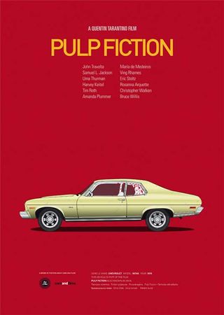
"Behind a good poster should be a message or idea," says Jesús Prudencio, the illustrator/designer behind the fantastic Cars and Films series of posters. "It must communicate something and should reach everyone.
"One of my passions is movies," Prudencio explains. "I saw that there were many people making alternative movie posters," he says, "but I tried to give another approach. I wanted to create a series, which I'm still working and I hope to grow, but not only legendary films, but also films that I admire and where cars are not as well known." It's a great example of a personal project that can generate some serious cash (A3 prints are for sale for €21 each – and great for film fans).
Make an impact
"I like to follow the trends, but do not usually apply them to my designs," he adds. "I like minimalist design and simple lines. I try to convey what I want with a few elements that make an impact and have a lasting message."
In other words, before you design a poster make sure you have a good idea, so it will not only appeal to designers due to the aesthetics, but will also appeal to fans through the focus.
02. Be consistent with details
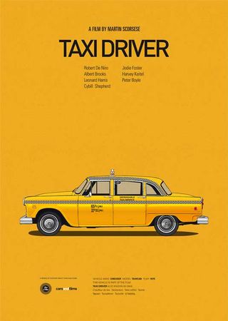
Prudencio's next piece of advice is especially important if you're doing a collectable series - that details should be consistent.
"I'm primarily a graphic designer so I'm used to working with fonts," continues Prudencio. In the case of my Cars and Films project, the most important aspect was obviously was the car.
"I chose the same font for the titles of all the series for consistency. And I used a contrasting font for the detailed information accompanying the car. But for me, just as important as the font is the background color. The background colour I chose was based on what I felt the film symbolized and what would combine well with the other elements."
03. Choose references carefully
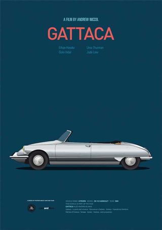
"I saw that there were many people making alternative movie posters," he continues "but I tried to give another approach. I wanted to create a series, which I'm still working and I hope to grow, but not only legendary films, but also films that I admire and where cars are not as well known."
"My process for this project was as follows: I did a sketch and then vectorised using Illustrator. My references were obviously the pictures of the cars and watching the the movie. I didn't go into too much detail – analysing particular frames – for example to see what was on the label hanging on the chair of the Mr Bean car." It's about balancing artistic interpretation with authenticity, in this case.
04. Have fun, but be tight on the details
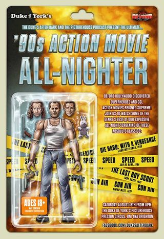
Sam Gilbey's stunning illustration work – particularly his recent painterly interpretations of film characters for the likes of Virgin Media – have brought him much critical acclaim within the poster design world. He was recently commissioned by Picturehouse Cinemas to design and illustrate a poster to promote a '90s action movie all-nighter featuring Die Hard: With a Vengeance, Speed, The Last Boy Scout and Con Air, as part of the Scala Beyond season, at the Duke of York cinema in Brighton.
"Originally I was planning to do a collage-style piece, featuring the protagonist from each film, but this was scuppered by the fact that Bruce Willis in the star of both Die Hard: With a Vengeance and The Last Boy Scout," he explains. "I then remembered reading once that Under Siege, the Steven Seagal vehicle, actually began life as a Die Hard script.
"Basically the wise-cracking heroes – and antiheroes – of so many action films, and especially from that era, are pretty interchangeable. I love the genre, and in way that's part of the fun, but I then figured it would be fun to illustrate this literally, and have an action figure with interchangeable heads."
Factually correct
"When creating an image like this, with such a clear inspiration point, it's all about having fun with it, but making sure there are plenty of interesting – and factually-correct – details in there," he continues. "For instance, I included the actual guns from the films as accessories, and of course the Con Air bunny had to be in there!"
For a promotional piece such as this aimed at true fans of a genre, it's a great idea to put some in-jokes in there – thus confirming the fans' knowledge and giving them a bit of a chuckle at the same time.
05. Balance the composition
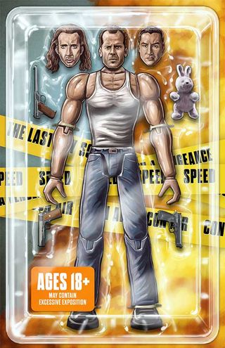
"The core skill is learning how to balance a composition, and looking at how the viewer's eye will - ideally - bounce around the image, rather than being taken out of it," adds Gilbey. "That's no different to creating any other artwork, but if you're including type as well, then the challenge to weight everything just right can be tougher.
"Use a grid wherever there's a significant amount of type to include, Other than that, it's about finding your own style, and then within that, trying to find a way to tell a bit of a story with your image."
06. Balance type and images - but sometimes go crazy!
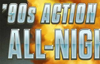
"Balancing the type and images is essential in that first up you want people to notice the image," continues Gilbey. "But then, if the actual event is of interest, the info needs to be easy to understand too.
"Of course restraint with type is normally advisable, but in this case it was time to let loose. That said, it's all set in Garage Gothic, so it's only the style that varies for the different areas of info."
07. Mix up your typography
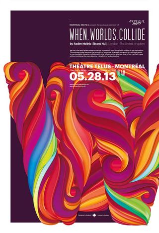
Radim Malinic is one of the UK's best-known and established creative forces. With clients including Acer, Arts Council England, BBC and The London Film Museum, he is known for his incredible use of colour and composition and his straining photo-montage work, but turns his hand to just about anything. He recently completed this stunning poster to promote the designer's talk at Montreal Meets 2013.
"This was a personal piece to promote the debut of my latest talk - When Worlds Collide," says Radim. "I wanted to do kinda of a gig poster, which was only available on the day/night of the event at Montreal Meets Three.
Typography
"Ever since I'd discovered the font Graphik, I wanted to use it and this was the right opportunity," adds Radim. "Graphik possesses a beautiful combination of boldness and elegance.
"To illustrate the contrast, I used SF Movie Poster [a free font from dafont.com] for the super condensed font. Then it was a question of mixing the two fonts to find the right result." Be playful but considered is the message here.
08. Spend a day with it
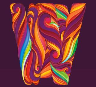
"Even though deadlines can be pretty tough, it always pays to spend a day with the design," Radim continues. "Especially when you create both image and type.
"This poster looked a lot different the night before I finished. The overall design can become better and more complete." It's essential to do this for any design - not just a poster - and if you can try and get some feedback from your peers as well.
09. Theme = composition
"The backbone of my presentation was about stepping into the different worlds of interest and adding them to the our creative worlds," adds Radim. "Therefore I wanted a focal point, albeit a bit abstract, to be a huge letter W which is fragmented to symbolise everything that goes on within one discipline. The other coloured fragments represent the outside influences.
"Before print supply, I added white border within the canvas to make elements 'spill' out, to once again emphasise the crossover of ideas and styles." The lesson here is to draw your composition ideas from the theme your design around."
10. Further reading
Looking for further advice on poster creation and sources of inspiration? Then check out these articles:
- How to print a poster: the designer's guide
- Ben Whitesell on fan art, copyright and Moonrise Kingdom
- Inspiring gig posters
- The top movie posters of all time
- Viva la revolution! Stunning Cuban posters
- Best Olympic poster designs
- Glass onion posters are causing havoc
Do you have any poster design tips to add to our list? Let us know in the comments!

Thank you for reading 5 articles this month* Join now for unlimited access
Enjoy your first month for just £1 / $1 / €1
*Read 5 free articles per month without a subscription

Join now for unlimited access
Try first month for just £1 / $1 / €1
Get the Creative Bloq Newsletter
Daily design news, reviews, how-tos and more, as picked by the editors.
The Creative Bloq team is made up of a group of design fans, and has changed and evolved since Creative Bloq began back in 2012. The current website team consists of eight full-time members of staff: Editor Georgia Coggan, Deputy Editor Rosie Hilder, Ecommerce Editor Beren Neale, Senior News Editor Daniel Piper, Editor, Digital Art and 3D Ian Dean, Tech Reviews Editor Erlingur Einarsson and Ecommerce Writer Beth Nicholls and Staff Writer Natalie Fear, as well as a roster of freelancers from around the world. The 3D World and ImagineFX magazine teams also pitch in, ensuring that content from 3D World and ImagineFX is represented on Creative Bloq.
