The 20 posters of the FIFA World Cup
FIFA's tradition of having an official poster for each World Cup has led to a library of fascinating pieces. We review over 80 years of world-class design.
The FIFA World Cup is about to kick off and, as with each of the previous 20 tournaments, Brazil 2014 has its own poster. The tradition of having an official poster for each World Cup tournament stretches back to the very first, which was held in Uruguay in 1930.
The first logo only came about with Brazil in 1950, and the first mascot was England's Willie the Lion in 1966. We step back through the ages to look at the people who created the posters and why they remain so fascinating. Many were intentionally created to be works of art as well as being methods of communication. Some are brilliant. Others are strange. And one or two are connected with the more dubious characters of the century...
1930: Uruguay
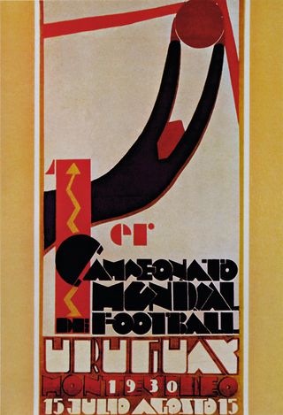
The organisers of the first World Cup had the foresight to commission a poster, and its designer highlighted its premier status by using lots of red. With lovely stylised graphics of a goalie making a save, and fantastic custom text, it measured 785x380mm. Original prints of this poster sell for up to £20,000, according to Christie's.
1934: Italy
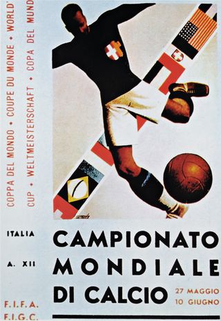
If this great piece of Art Deco poster painting reminds you of totalitarian propaganda, it won't surprise you to learn that it was painted by Gino Boccasile, a huge proponent of Mussolini's Art Italia movement. Undoubtedly talented, he unfortunately created racist and antisemitic posters during WWII, working for the Fascists and the German Nazis.
1938: France
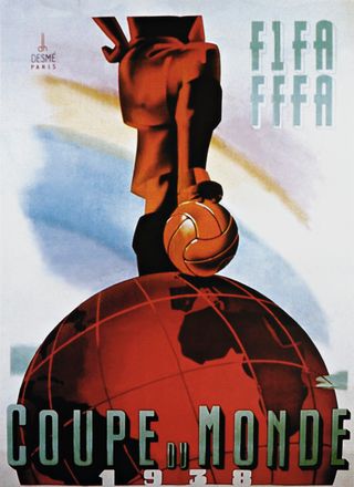
This poster was created by Henri Desmé, a little-known designer of the '20s and '30s. He used a stencil technique in an Art Deco style similar to propaganda and advertising posters of the era, settling on a composition not unlike his own logo, which appears in the top-left corner. The original was huge at 1575x1190mm.
1950: Brazil
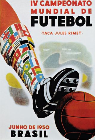
The World Cup went into hiatus thanks to the Germans getting caught offside in Poland in 1939, but was revived in 1950 in Brazil. The post-war spirit of internationalism is represented in the improbable multi-flagged sock, and the strong type harks back to the 1934 poster a touch, although it had put on a bit of weight over the years.
1954: Switzerland
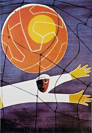
Back on European soil, this poster doesn't deliver everything you'd expect from Swiss design. It's artistic, with interesting shading on the goalkeeper's face, and him pictured with both unusual attire and expression. The tournament marked FIFA's 50th anniversary, with its headquarters in Zurich, and it was the first televised World Cup.
Get the Creative Bloq Newsletter
Daily design news, reviews, how-tos and more, as picked by the editors.
1958: Sweden
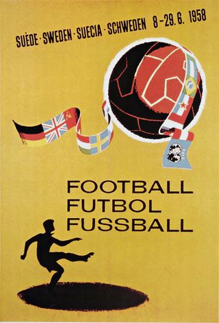
Alfred Hitchcock's Vertigo, with its iconic poster, came out the same year and, with a silhouette character standing in the shadow of his football, the World Cup poster took to the style of Saul Bass. The banner is made up of the flags of the competing nations, and the text 'Football, Futbol, Fussball' simply says the key word in FIFA's three official languages.
1962: Chile
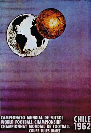
Chosen by FIFA during its inspection tour in 1961, this poster was designed by Gabarino Ponce, whose work was chosen from over 300 entries. Note the fantastic colour coding with Chile, and the football in the same tones. The ball is like a moon, or maybe even a sputnik. It was the first World Cup poster to use space to illustrate the internationalism of football.
1966: England
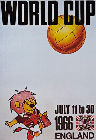
A glorious year for England, which hosted and won the tournament, 1966 was also the first tournament to have an official mascot, Willie the Lion. And the poster is firmly focused on the furry beast, who's lumping the ball into row Z. Nice use of white space maybe, but what England fans remember is that the ball crossed the line, right?
1970: Mexico
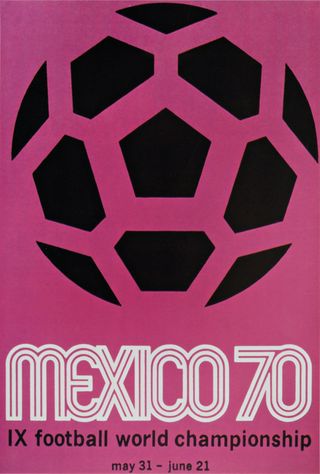
The double in-line text was perhaps in homage to the 1968 Mexico City Olympics poster and its iconic concentric line work. The poster is simple and graphic, and that's all there is to it. The designers expanded the tournament's official logo and put it on pink for the poster, and it proved a very popular design.
1974: West Germany
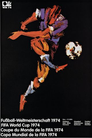
Artist Horst Schäfer painted this using big impressionistic dabs to equate football with art and beauty, although the subject's thigh seems to be coming from his waist rather than his hip and his head looks a little alien. But then great football isn't just about looks...
1978: Argentina
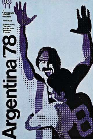
An attractive poster with its ink-dot pattern and two athletes celebrating, today it's associated with Argentina's military junta. During their rule, up to 30,000 people disappeared. It's said that the pointillism-influenced poster was created by an agency called Mandatos Internacionales, and many Argentines believe the creators also worked on the dictatorship's propaganda.
1982: Spain
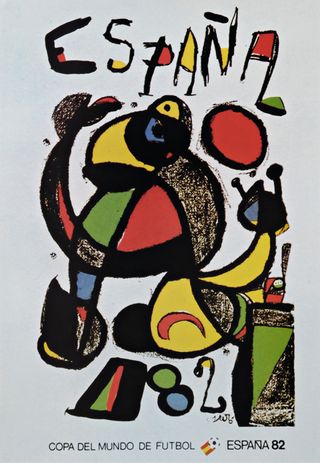
Catalan artist Joan Miró painted the image. The Surrealist had once called for the assassination of painting and, if that was the brief, he did a fine job with this footballer. Nevertheless, his powerful black line work and use of bright colours were ideal for poster work, and he was no stranger to it. A very Spanish outcome.
1986: Mexico
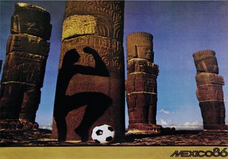
Annie Leibovitz is the only photographer ever to be commissioned to shoot and design the posters for the World Cup. Hers featured some quite bizarre use of shadow over ancient Aztec stonework, really putting the country's pre-Columbian heritage centre stage.
1990: Italy
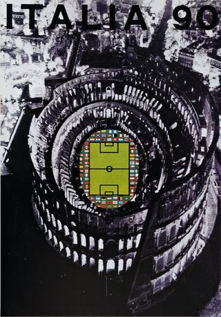
The artful tradition in World Cup posters continued with the appointment of stalwart Italian artist Alberto Burri to create this. They probably didn't expect him to use a digitally elongated, photo negative image of the Colosseum, adding a football pitch, tiny flags and bold type. It links nicely to the spirit of gladiatorial Rome.
1994: USA
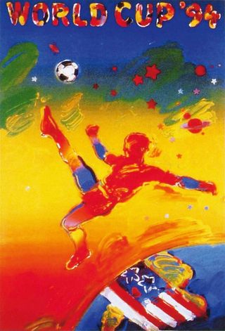
New York artist Peter Max's career was peaking at the time he was chosen to create a poster for the 1994 tournament. Space was again a theme, with the floating footballer putting a ball into orbit. This, the artist said, was to represent the universal appeal of the sport. The previous year he'd painted the official poster of the Superbowl.
1998: France
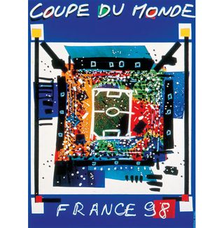
The France 1998 organising committee ran a poster design competition, which was won by Natalie le Gall, a student at the Ecole Supérieure des Beaux-Arts de Montpellier. A mixed-media piece including dabs of bright colour and nice touches like the texture on the pitch and the shadow effects, it launched her on the French illustration scene.
2002: Japan/Korea
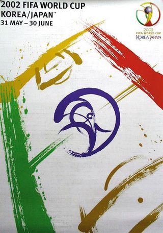
Because the tournament was to be hosted by two nations, FIFA called on one calligrapher from each to collaborate to create the poster. Byun Choo Suk (Korea) and Hirano Sogen (Japan) spent two days making various football-related brush strokes. The best ones were scanned and put together for this composition.
2006: Germany
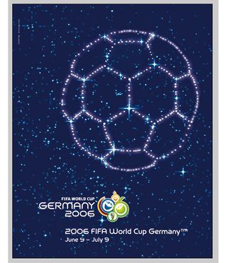
Franz Beckenbauer was on hand to unveil this poster, which was designed by Berlin agency WE DO Communication. It beat four other posters to win the official accolade in a poll run across Germany. With stars forming a ball in the night sky, it plays on the notions of wishing and dreaming.
2010: South Africa
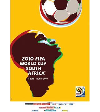
The poster for the 2010 World Cup in South Africa was designed by Gaby De Abreu (executive creative Director and founder of the Switch Design Group) as the conceptualiser and typographer, and Paul Dale as the illustrator. It uses very bold, literal graphics of an African gentleman about to header the ball. The ball is symbolic of hope and aspiration as well as the unknown - when heading a ball, up until the point of contact and deflection, it's anyone's game!
His head is more representative of the people of Africa, whilst the neck and chest morph more into the African continent, culminating in the South African coastline - the ultimate destination for the world cup and host country on behalf of Africa.
2014: Brazil
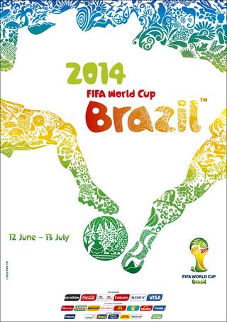
The official World Cup poster for this year was unveiled on January 30th 2013 in Rio de Janeiro. According to FIFA, the artwork depicts the beauty and diversity of Brazil through a colourful, emotional and vibrant design. The creative concept at the heart of the poster is 'An entire country at football's service - Brazil and football: one shared identity'. The poster was designed by Karen Haidinger at Crama and weaves Brazil's culture, flora and nature into a dynamic image - note the players' legs challenging for the ball revealing a map of Brazil. Clever, huh?
Words: Garrick Webster and Rob Carney

Thank you for reading 5 articles this month* Join now for unlimited access
Enjoy your first month for just £1 / $1 / €1
*Read 5 free articles per month without a subscription

Join now for unlimited access
Try first month for just £1 / $1 / €1
The Creative Bloq team is made up of a group of design fans, and has changed and evolved since Creative Bloq began back in 2012. The current website team consists of eight full-time members of staff: Editor Georgia Coggan, Deputy Editor Rosie Hilder, Ecommerce Editor Beren Neale, Senior News Editor Daniel Piper, Editor, Digital Art and 3D Ian Dean, Tech Reviews Editor Erlingur Einarsson and Ecommerce Writer Beth Nicholls and Staff Writer Natalie Fear, as well as a roster of freelancers from around the world. The 3D World and ImagineFX magazine teams also pitch in, ensuring that content from 3D World and ImagineFX is represented on Creative Bloq.
