15 of the best design portfolio examples
The best design portfolios come in all shapes, sizes and formats.

As a creative, your design portfolio is a vital part of your personal brand, especially if you're a freelancer looking to promote yourself. There's no limit to how creative you can be but if you're looking for some standout examples to guide you, we've collated a list of the best design portfolio examples to spark some inspiration.
If you're not sure how to create an online portfolio, first you'll need a platform to host your site – there are some great options on our best website builder roundup to get you started. To get a feel for what to include in your portfolio, take a look at our diverse range of portfolio examples below listed in no particular order.
Top design portfolio examples for inspiration
01. Bruno Simon
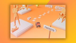
Paris-based creative developer Bruno Simon has approached his portfolio in an unexpected way. You can actually drive a virtual car between his projects and experience using a keyboard. In 2019, it won Site of the Year at awwwards, and it's not hard to see why. We wouldn't recommend this type of portfolio to everyone, but if you can make the design of your portfolio show off the skills you want to highlight, then you should.
02. Gus
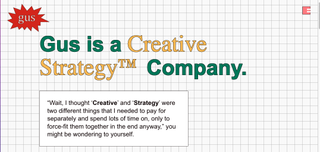
Gus is a creative strategy company rather than a straight design site, but we think there are plenty of lessons to be learned from its brilliant site. It's cleverly laid out on a grid, and strikes an irreverent tone while giving the reader exactly what they're looking for, with an easy to navigate UX. We particularly like the 'frequently asked questions' section.
03. Good Habit
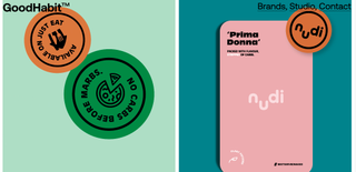
London branding and design studio, Good Habit, has a fun and fresh portfolio that beautifully displays its work. A plainer Studio section outlines what the studio does, while the brands section displays projects with large format photography intermixed with sections of texts. It really works.
04. Studio Feixen
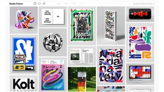
This Switzerland based design studio is absolutely jam-packed full of fun and characterful work. Studio Feixen perfectly showcases its vibrant work with a mix-match style portfolio that abstains from a 'less-is-more' approach. Despite the examples being framed in a range of different sized shapes on the portfolio page, the site still looks cohesive.
05. RoAndCo
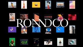
Founded by creative director Roanne Adams, NYC-based RoAndCo offers beautifully crafted design, branding and creative direction to clients in fashion, beauty, tech and lifestyle. Viewing RoAndCo’s portfolio is an experience in itself, in keeping with the studio's work ethos. Projects are presented in an editorial-like fashion, allowing the viewer to flick through split-screen images, animated web presentations and full-screen video. It's a carefully considered design portfolio and a pleasure to view, whether you're browsing on a computer or a mobile device.
Get the Creative Bloq Newsletter
Daily design news, reviews, how-tos and more, as picked by the editors.
06. Robin Mastromarino
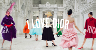
Paris-based interface designer Robin Mastromarino employs some neat UI animation touches to keeps things fresh on his design portfolio site. His projects appear as though they're on a wheel, juddering into view, which is an engaging effect. The images in each case study respond to scrolling by warping slightly. It's an effect that we wouldn't recommend for every creative, but for a UI design specialist, this strikes the right note and gives a taster of what the designer can do.
07. Active Theory
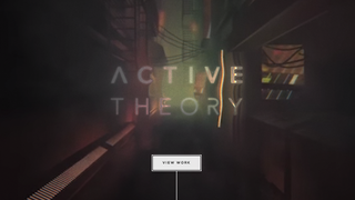
Entering Active Theory's portfolio website is like visiting a whole other world. It employs a moody, almost cyberpunk aesthetic throughout, and to great effect. From the atmospheric homepage animation with mouse-activated glitch effects to the trippy About page, the setting all gels together to form a cohesive package. The studio keeps things cleaner for its project pages. Each example features a full-screen animation overlaid with a short blurb and relevant links to further information, including detailed case studies hosted on Medium.
08. Raw Materials
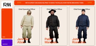
Raw Material's site is a feast for the eyes. The Work section is particularly fun, with more detail on projects shown through diagrams and images. We also like the 3D models in the 'Hello' section, which also appear in 'Contact'. Overall it's a fun fresh site that makes the studio stand out from the crowd.
09. Velvet Spectrum
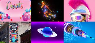
Velvet Spectrum is the online moniker of visual artist and designer Luke Choice. He shows that simplicity can also make an impact on his homepage, which shows a montage of uber-colourful thumbnails that lead through to visually arresting super-size examples of his work for maximum impact. The black background keeps things clean and helps the work stand out. It makes for a simple but highly effective design portfolio.
10. Locomotive
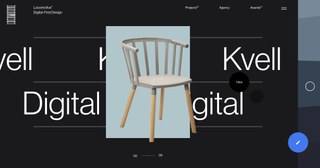
Locomotive, a studio based in Quebec, Canada, specialises in crafting digital experiences, so it's taken care to make its design portfolio site an all-round delightful and engaging experience. Playful, entertaining animations bring the site to life, and not just on the homepage. It seems like thought and effort has been put into every detail. Little surprises keep the viewer's interest while they browse through the site, making this a perfect example of how animated flourishes can be used effectively without them becoming gimmicky or distracting.
11. Studio Thomas
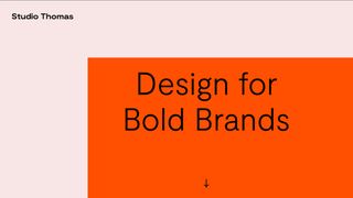
Named after its two creative directors, Thomas Austin and Thomas Coombes, Studio Thomas in East London creates visual communication for both physical and digital worlds. Its portfolio is a superb example of Brutalist web design with plenty of neat touches. Projects are presented in an orderly but eye-catching way with clear visuals and wireframe models. The site perfectly reflects the studio's explorative and experimental attitude, and it backs up the studio's claim to offer "design for bold brands."
12. Buzzworthy Studio
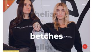
Describing itself as a "badass digital studio in Brooklyn", Buzzworthy Studio really needed to come up with the goods to back up that claim, and happily, its portfolio does the job. It features dazzling web techniques from the off. Bold typography and animation combine to grab your attention, and a strong eye for aesthetics ensures that viewers stick around to explore all of Buzzworthy's projects. It's one hell of a calling card.
13. Xavier Cussó
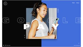
This stunning portfolio site for Barcelona-based designer Xavier Cussó was built by Burundanga Studio. It shows off Cussó's work with bold colours, in-your-face typography and practically every animation and parallax scrolling trick in the book. But that doesn't make it feel overloaded. The animation makes and impact and maintains the viewer's attention throughout.
14. Merijn Hoss
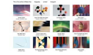
Illustrator and artist Merijn Hoss takes a more pared-back approach, but his design portfolio is still very effective. Hoss creates beautifully detailed psychedelic works of art, but his profile presents his work in quite a simple, clean format. It's one of the most traditional approaches we've included on this list of design portfolios and isn't nearly as flashy as some of the previous examples, but it works well because the colourful thumbnails really pop out of the gallery's white background, putting the focus on the artist's work. Click the thumbnails, and large project images and a short description are revealed. Hoss's design portfolio is proof that you don't need all the bells and whistles to make an impact.
15. Malika Favre
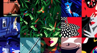
Illustrator Malika Favre uses a full-screen edge-to-edge tapestry of thumbnails to entice visitors into viewing her vibrant artwork in more detail. The colours and layout already draw attention, while the arrangement of animated pieces within still artworks serves even more to keep eyes on the screen. Once clicked, the thumbnails reveal a full-screen gallery presentation of the work featured. It's displayed on complementary coloured backgrounds that show off her work to great effect and makes for a bold, colourful presentation that grabs the viewer's attention.
What is a design portfolio?
A design portfolio is a curated selection of your best work which demonstrates your talents to potential clients. Whether you're a freelancer or an in-house creative, your portfolio is vital for showcasing your skills and displaying a diverse range of work. Your design portfolio should be a selection of your career highlights, including client samples that spotlight your professional work.
What should a design portfolio include?
While there are no strict guidelines, there are a few key things you should include in your design portfolio. Create a concise 'about' section that covers your education, experience, skills and most importantly, your contact information – you want to give potential clients a flavour of your personality but avoid rambling too much. When displaying your work, you want to curate your 'best bits'. Include a diverse range of formats and styles that demonstrate a range of skills – showcase what makes you unique!

Thank you for reading 5 articles this month* Join now for unlimited access
Enjoy your first month for just £1 / $1 / €1
*Read 5 free articles per month without a subscription

Join now for unlimited access
Try first month for just £1 / $1 / €1
Ruth spent a couple of years as Deputy Editor of Creative Bloq, and has also either worked on or written for almost all of the site's former and current design print titles, from Computer Arts to ImagineFX. She now spends her days reviewing small appliances as the Homes Editor at TechRadar, but still occasionally writes about design on a freelance basis in her spare time.
Related articles
-

-

-
 Tottenham Hotspur FC's nostalgic rebrand was a "labour of love"
-
