Papercut aesthetics with vectors
Steven Bonner shows you how to digitally replicate a 3D papercut style
- Software Illustrator and Photoshop CS3 or later
- Time needed 3-4 hours
- Skills-Understand how to layer an image-Use basic layer effects-Increase relevance with colour
I’ve always been drawn towards craft-led techniques, and like to find ways to recreate them in a digital environment. I often add some traditional airbrushing into my shading work with Photoshop and a Wacom tablet, for instance.
I was recently asked to produce my own take on Diesel’s Only The Brave Eau de Toilette bottle, and decided to emulate a papercut aesthetic to create a fluid and abstract design that would be distinctive and have a sense of depth. Using a juice bottle as a subject, I’ll show you how to digitally produce a papercut look and integrate it with the style of type that you might find on advertising posters or print adverts, for example.
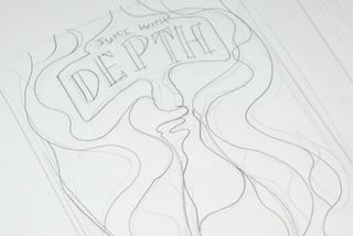
01 Start by sketching a few rough layouts with a pencil. Pay close attention to how the layers interact, as this is where you’ll build up the shape of the object you’re illustrating. Even if you think you’ve hit on the perfect image early in the process, keep sketching as you might find that new ideas come to you as you go.
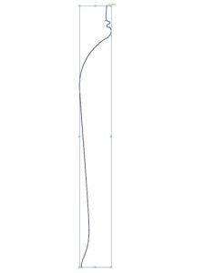
02 When you’re happy with your design, open Illustrator and create a new document. Select the Pen tool (P) and begin drawing one side of your bottle image.
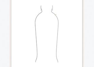
03 Once complete, copy the shape (Ctrl/Cmd+C) and paste it in front (Ctrl/Cmd+F). Next, select the Reflect tool (O), hold down Shift to constrain the proportions and flip the shape horizontally. This will give you the other side of your bottle. Position it an appropriate distance away from the original, experimenting until you’re happy with the width of the silhouette.
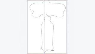
04 Using the Pen tool again, extend the lines off the page and connect them to form two solid shapes. Take care to keep the lines smooth, and allow space for your headline elements.
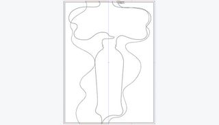
05 Continue drawing more shapes in the same way, following the layer interaction sketch that you developed in Step 1.
Get the Creative Bloq Newsletter
Daily design news, reviews, how-tos and more, as picked by the editors.
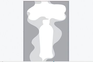
06 Once you’ve drawn a few layers, it might be easier to block-colour them to give a better idea of how they work together. Again, make sure each element is joined as a solid shape to frame the page – this will make the elements easier to reposition when transferring the layers to Photoshop later. Use shades of grey for now because we’ll add colour later.
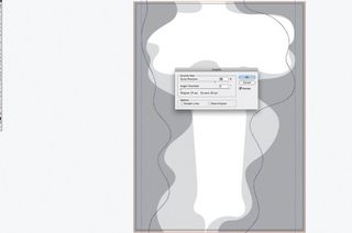
07 A great tip when creating your lines is to use the Simplify option to make sure they keep a smoothness to them, and have nice, natural curves – especially if you’re drawing with a graphics tablet. To do this, select your lines and go to Object>Path>Simplify. In the dialog box you can set the levels to your own preference to achieve the look you prefer.
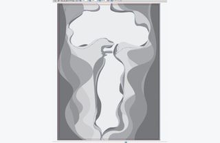
08 Continue building up your layers, taking care to achieve a sense of randomness in the overall image. Although you want to show a definite shape, you don’t want it to look unnatural. Using the Direct Selection tool (A), adjust individual points to create differences in adjacent layers. To help add more depth later when we add shadows in Photoshop, try copying a layer behind itself and making very small changes to points.
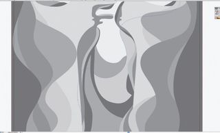
09 Once you’ve blocked in the main silhouette, zoom in and create a series of waves inside the bottle, in the semi-circular style shown here. This will make it appear as though liquid is sloshing around inside the bottle.
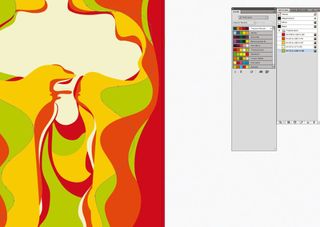
10 When you’re happy with the main composition, begin adding in your colours. I often use Adobe’s Kuler engine to help me choose a colour palette – it enables you to try out a variety of schemes in minutes, based on keywords that you input. As this image is for a fictitious fruit juice brand, I’ve chosen colours that suggest different flavoured juices. This keeps the image brand-led, rather than focusing on an individual product or flavour.
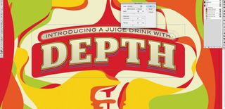
11 Next, draw your title. It doesn’t have to be very complicated as the image itself is quite full-on and you don’t want the typography to become lost, but it’s a headline so it needs to stand out. To frame the type, I’ve added a curved banner behind it (Effect>Warp>Arch, with Bend set to 15%), and drawn curved lines top and bottom to illustrate the liquid pouring into the banner and dripping from underneath into the bottle. This helps link both elements more effectively than if the type had been placed with no environmental link, and results in the overall piece feeling more connected.
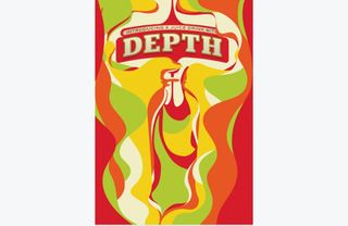
12 With the base image now drawn in Illustrator, it’s time to add the finishing touches in Photoshop. Of course, the same aesthetic could be achieved with Illustrator’s Effects menu, but I prefer the quicker rendering and control in Photoshop. Copy and paste each layer into Photoshop in a new document.
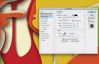
13 Select a layer and then double-click the Layer Style icon in the Layers palette. Check the Drop Shadow box and set it to Multiply, reducing the Opacity to around 35-40%. Play around here with the various settings to get a look that suits you best. Now check the Satin box and set it to Multiply, reducing the Opacity to around 12% – this will give the look of a slightly raised piece of paper or board. Go to Layer>Layer Style>Copy Layer Style, select all the layers except the logo and go to Layer>Layer Style>Paste Layer Style. This will apply the same style to all the other layers. You might find you need to go into some layers individually to fine-tune them.
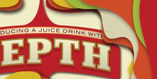
14 To give the headline a little bit more interest, create a layer mask and paint out some areas of the layers above. This will help it integrate with the design more effectively. You’ll find you have more precision if you first create a mask then click on the layer you want to paint out and select it with the Magic Wand tool (W) before returning to the mask and painting the area with a soft brush (B).
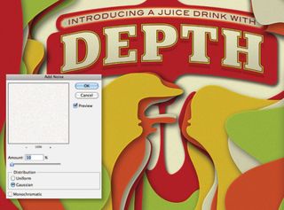
15 Lastly, add a little texture to the piece by creating a new layer and filling it with white, then setting it to Multiply. From there, add some noise (Filter>Noise>Add Noise) to give the overall image a slightly mottled grain texture, reminiscent of mounting board. And that’s it: you’re done.
Steven Bonner
Stirling-based Steven is a multi-disciplined designer and illustrator, working for clients such as Harper Collins, Cadbury and Diesel. A love of type is a recurring feature of his work.
www.stevenbonner.com

Thank you for reading 5 articles this month* Join now for unlimited access
Enjoy your first month for just £1 / $1 / €1
*Read 5 free articles per month without a subscription

Join now for unlimited access
Try first month for just £1 / $1 / €1
The Creative Bloq team is made up of a group of design fans, and has changed and evolved since Creative Bloq began back in 2012. The current website team consists of eight full-time members of staff: Editor Georgia Coggan, Deputy Editor Rosie Hilder, Ecommerce Editor Beren Neale, Senior News Editor Daniel Piper, Editor, Digital Art and 3D Ian Dean, Tech Reviews Editor Erlingur Einarsson and Ecommerce Writer Beth Nicholls and Staff Writer Natalie Fear, as well as a roster of freelancers from around the world. The 3D World and ImagineFX magazine teams also pitch in, ensuring that content from 3D World and ImagineFX is represented on Creative Bloq.
Related articles
-

-
-
-
