Penguin brand's new logo follows 2017 design trends
Non-fiction publisher Ebury has a timely new logo design by Form.

This week saw Penguin Random House's non-fiction imprint, Ebury, rebrand itself with a less corporate and more creative logo that appears to cash in on some of 2017's biggest design trends.
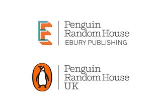
Designed by London-based studio Form, the centrepiece of the new look is a capitalised letter 'E' wordmark. This isn't the first rebrand we've seen this week that's based on this idea. Just a few days ago we saw how Elton John's new visual identity pulled a similar trick with its star-shaped glasses inspired lettering.
And just like the musician's makeover, Ebury's rebrand treads the same path as other big brands such as Fanta and Calvin Klein in that they all seem to have adopted 2017's biggest logo design trend: uppercasification. (That's our unofficial term for saying brands currently have a habit of putting all their text in uppercase.)
Click through the image gallery below to see how the new Ebury logo compares with the old one.


Replacing the lowercase, italic red logo previously used by Ebury, the new design opts for a new colour scheme that Form partner Paula Benson describes as "fresh and vibrant."
Following another trend, the colour choice also taps in (coincidentally) to a major global survey which found that a rich teal hue is the world's favourite colour.
Thanks to an overprint of two semi-opaque colours, the logo appears three-dimensional and leaps off both the screen and printed page. The overprinting method also references traditional practices such as screen printing. This results in a sense of imperfection that Bensons says helps to "embrace the spirit of creativity."
Get the Creative Bloq Newsletter
Daily design news, reviews, how-tos and more, as picked by the editors.

This logo is even more striking thanks to its use of contrasting colours. The 'E' itself is rendered in a beautiful teal, while the drop shadow is picked out in the Penguin brand's signature orange. The consistent typography also brings it in line with the overall Penguin Random House branding.
The new logo has already started to appear across online platforms, and readers can expect to see more of it later in the year as it continues to roll out across marketing materials, products and packaging.
[Via Design Week]
Related articles:

Thank you for reading 5 articles this month* Join now for unlimited access
Enjoy your first month for just £1 / $1 / €1
*Read 5 free articles per month without a subscription

Join now for unlimited access
Try first month for just £1 / $1 / €1
Dom Carter is a freelance writer who specialises in art and design. Formerly a staff writer for Creative Bloq, his work has also appeared on Creative Boom and in the pages of ImagineFX, Computer Arts, 3D World, and .net. He has been a D&AD New Blood judge, and has a particular interest in picture books.
Related articles
-

-

-

-
