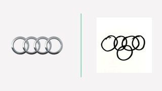
People drew car logos from memory and the results are unbelievable
How can you get Audi wrong?

When it comes to logos and branding, we like to think we're pretty in-the-know. But remembering the logos we see everyday can be harder than you'd think, as a study hilariously revealed last year.
Vanmonster asked 100 members of the British public to draw several famous car logos from memory, and the results range from impressively accurate to hilariously off. They also serve as an interesting insight into which logo elements are ingrained into the public consciousness, and which are more forgettable than the manufacturers might like to think. For some of the most memorable logos ever, check out our best logos of all time.
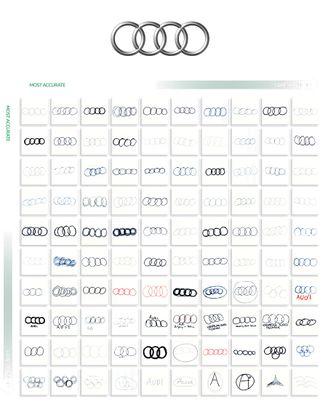
We'll start with perhaps the simplest logo on Vanmonster's list. Surely Audi's four intersecting rings (below) are impossible to forget? To be fair, the vast majority of entrants got this one right, and most slip-ups are at least ring-related (Audi's and the Olympics' rings are similar, we'll give them that). As for those towards the bottom-right (Vanmonster lists the drawings from 'most accurate' to 'least accurate'), a few seem to have mixed up Audi and the Avengers. They both begin with 'A', we guess.

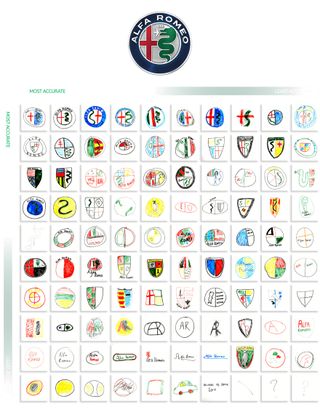
On the other end of the spectrum, the Alfa Romeo logo is probably the most complex on the list. Unsurprising, then, that most got this one wrong. 74 per cent of entrants forgot to include the red cross, 63 per cent forgot the green snake and a whopping 75 per cent didn't include the shield. Our favourites are probably the three 'least accurate': two question marks, and one which simply says, "animals of some sort".

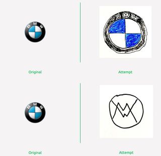
As well as showing all 100 entries for each logo, Vanmonster includes a handy gallery showing us the original logo alongside the most and least accurate attempt. Below are the best and worst attempts at BMW's logo (which underwent its biggest design change in over 100 years earlier this year).

You can find the rest of the entries on Vanmonster's website, with logos including Renault, Toyota, Ferrari and many more. One thing's for sure, just like when 150 Americans tried to draw various (non-vehicular) logos from memory, this car logo test proves that the simplest are the most memorable. It's easier to recall rings than flag-snake-shield combinations. Fancy designing a logo of your own? Check out the best Adobe Creative Cloud deals below.
Read more:
Get the Creative Bloq Newsletter
Daily design news, reviews, how-tos and more, as picked by the editors.

Thank you for reading 5 articles this month* Join now for unlimited access
Enjoy your first month for just £1 / $1 / €1
*Read 5 free articles per month without a subscription

Join now for unlimited access
Try first month for just £1 / $1 / €1

Daniel John is Design Editor at Creative Bloq. He reports on the worlds of design, branding and lifestyle tech, and has covered several industry events including Milan Design Week, OFFF Barcelona and Adobe Max in Los Angeles.


