Build a better personal brand
Learn how a little self-love can help make you more attractive to potential clients and collaborators.

Browsing the portfolio websites of design studios and freelance creatives, you can easily play a successful game of bingo. 'About' pages brim with words like 'meaningful', 'impact', 'stories' and 'difference', and you'll be striking white-walled offices, brainstorm scribbles, bikes and plants from your scorecard like nobody's business.
It shows that even creatives who craft the most thought-provoking, disruptive and provocative work for their clients can be a bit – we hate to say it – unadventurous when it comes to presenting themselves to the world.
But whether you've just started out or currently run a decades-old studio with a zillion employees, it's never too late for a bit of self-love. Not only will it make sure your work is getting the presentation – and explanation – it needs, but rethinking your own brand can be a trajectory-changing experience that helps you recalibrate and prepare for the future.
01. Define your vision

Whether you're creating a new company or having a spring clean, the temptation might be to go straight to the visuals – images are what designers do best, after all. But Ansel Neckles, co-founder of platform Let's Be Brief who works with brands and creative entrepreneurs to refine their positioning, suggests taking several large steps back.
"Try to establish what you're trying to achieve in a broader holistic sense – a vision for your work," says Neckles. "From working out what you want to achieve you'll find a natural alignment with the folks that are working in those spaces and the clients that fit with that vision."
This sense of vision, says Chris Rehberger, founder of Berlin studio Double Standards – whose bold typographic-led rebrands have been sought by everyone from orchestras to Lacoste – should hinge on your motivations for getting up and going to work.
"Dig down deep, ask yourself why you're doing it," says Rehberger, "If you want to do it for stardom that's okay, but communicate that." If that feels too complex, reframe the question to ask where you'd like to be in five years. "It's combining these two poles, where you're coming from and where you want to go," Rehberger adds, "Somewhere in between you find yourself."
Get the Creative Bloq Newsletter
Daily design news, reviews, how-tos and more, as picked by the editors.
02. Align with your clients
As well as working out what you want to do and why you do it, working out who you want to do it for may also help bring focus to your brand. "Knowing you want to work for Nike is good, but everyone will say that," says Neckles, using an example that often comes up when he's coaching. "Knowing why you want to work for Nike is better."
The strength of Nike's brand, Neckles explains, is in inspiring motivation in their customer base. "If I'm working as an art director at an agency – which I did for many years – I want to find someone's work that supplements the concepts I've developed," says Neckles. "If you're not about betterment through activity and proactivity, or people don't take that feeling away from your work, there's no way Nike will want to align with you."
Unpicking what potential clients are like, to see whether they match your own approach, is key to pitching for work. "You can then talk about the alignment of your brands rather than 'I make nice posters or I'm really good at typography', which may also be true," adds Neckles.
03. Promote your personality

Whether you're developing identity systems for FTSE giants or you specialise in the most niche comic styles, reflecting your work in your personal brand – and its most obvious representation, your website – is essential.
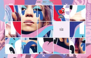
For example, illustrator Hattie Stewart, who specialises in cheeky flower-filled defacements of celebrities, allows her website visitors to remix her illustrations as a digital sliding puzzle in a similar style to her own re-workings. Manchester-based designer Craig Oldham's site features a playful soundboard – reflective of Oldham's humour, but also of his status as a disruptor who is willing to do things differently.
04. Consider your logo
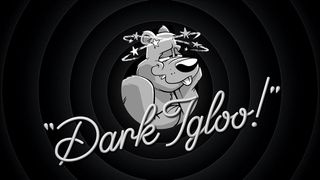
When US design studio Dark Igloo first started working on its own logo, it decided on a mash-up of the state flags of its two founders Dave Franzese and Mark Richard Miller (whose first names combined also produced the 'Dark').
Although the state insignia says little about Dark Igloo's current work – which includes motion-heavy branding for Giphy and Miami-inspired art direction for Converse – its treatment of this logo and mascot does. A grizzly bear with 10 stars circling its head, the logo soon morphed into a cartoon character which the studio uses on its site, its lighters-cum-business cards and as its social media avatars.
"It has a dazed personality, joyous and following the bliss," says Miller. Whether he's scrolling through an iPad on Dark Igloo's blog page or laden with swag in the shop, the bear is an anchor across the hectic site. It's fun, nostalgic and showcases the animation skills that Dark Igloo has in buckets.
Coupled with a surreal landing page and a contacts section that you can play as a racer game, self-initiated projects such as Dark Igloo's ad for an '80s megamix board game that never existed (complete with wizard and dry ice) show prospective clients exactly the feel and ambitious scope of the work Dark Igloo could do for them.
05. Extend your personality through social media
For New York designer Wade Jeffree, the idea of performance is a key facet of his personal visual identity, often appearing in his own work as a way of playing out design ideas or aesthetics. "It's a combination of time, discipline and being critical that has led me to where I am now," says Jeffree of his distinctively surreal and funny vision.
Just as with Dark Igloo, it's clear from the consistency of his social feeds that Jeffree lives and breathes his personal brand, expressing himself through colour, awkward angles and weird props – something essential for its longevity. "You also need to be honest with yourself about what you enjoy making – so those things can get better."
Whether you're part of a studio or a solo practitioner, collaborating with a copywriter, fellow designer or developer is a sure-fire way to get some much needed perspective on your personal brand. When Gabriella Marcella redeveloped the website for her print studio Risotto, the advice and skills of developer and motion graphics expert Brendan Bennett was invaluable.
"It's simultaneously easy and hard being your own client," admits Marcella. "Working with Brendan has been essential to ensuring decisions are challenged and thought-through. It was one big puzzle that was exciting to solve."
06. Nail the text

Although visual branding comes easily to most designers, expressing personality verbally might not be so straightforward. When working with designers and other businesses to help them talk about what they do, copywriter Roshni Goyate starts with a spot of homework: asking participants to bring in an example of brand language from outside their industry that's stood out to them.
"We go through what is happening in those pieces, what kind of language is being used, and analyse what the brand could have said and why they said what they did," says Goyate. Untangling other brands' verbal communications allows you to see some of the choices at work, and make your own.
The next step is a series of writing exercises that ask designers to describe what they do in their job to their grandma or to an eight-year-old child. "It's about getting them to step away from using jargon and established ways of communicating what they do, and show their personality instead," she adds.
07. Find the hook
The first impression, Goyate says, counts as much as the 'About' page. "Imagine that the person reading your site has no time at all – which is all of us – but you want them to understand what you do from the first line that they read. With design studios, it's about being provocative or being brave and finding that hook that sets you apart from others."
Goyate also recommends weaving information around a website through interesting labelling, so readers aren't overwhelmed with lots of information all at once. The most important thing is consistency – on your site, in publications and especially on social media. "It's just as important as your visual language," says Goyate. "You wouldn't use different logos on different pieces of collateral or different colours. In the same way, your brand language should be one watertight personality that you're communicating."
Whereas Double Standard's brand language is clipped and conceptually driven, Dark Igloo's is equally as playful as its visual identity. "I think we want there to be a level of entertainment in it, even in the writing." For example, instead of telling readers to click the link to see more about Giphy, they opt for "Ditch water polo practice and fill a powerade bottle with vodka with Giphy to see the rest." The pair also devised the tagline 'Dark Igloo is a company that specialises'.
"We never say what we specialise in," explains Franzese. "We could be puppeteers one month, animators the next, and branding experts the month after that. Come to us with the brains and we'll figure out the execution with you."
Next page: Present your work through the right lens, and three more tips

Thank you for reading 5 articles this month* Join now for unlimited access
Enjoy your first month for just £1 / $1 / €1
*Read 5 free articles per month without a subscription

Join now for unlimited access
Try first month for just £1 / $1 / €1
