The pro guide to user research
User research can be an invaluable tool in defining and structuring a site, says Nomensa's Alastair Campbell - here's how to utilise it.
Web usability is often seen as either a point on a checklist or a statistic you get by watching punters try out your site. Yet if you think that's it, you're missing out on some really useful methods for creating websites. The ideas for sites come from a variety of places, but a lot of the time, we as web designers simply apply what we've done before, or what the competition has done. Sometimes, that approach can backfire. Take the situation where Target used the same review feature as Amazon but failed to generate user content.
Here I'm going to focus on user-research methods that can drive your designs and help you break free of preconceptions and assumptions you might have. One of the problems with writing an article like this is that clients tend not to like revealing what they didn't know before they started a project. We've been lucky here, in that we have a good case study: the successful redesign and relaunch of the site for The London Paper (TLP), an organisation that no longer exists.
After the new website went live, it exceeded its 18-month targets in just three months. Analytics revealed an 89 per cent uplift in repeat visitors and a 110 per cent increase in advertising clickthroughs. The project was recognised as having broken from the norm, and it proved to the web community that good user research can have an impact.
Deciding on a direction
When you're approaching a new project, there are often many choices to be made about what the website could do. So how do you decide which ones to implement? If you're creating a new site for a newspaper, do you focus on news, places to go out or celebrity gossip, or spread it evenly between each element?
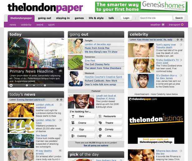
The stakeholders of TLP had a lot of research and anecdotal evidence from readers of the physical paper to hand, but no one was sure how that would translate online. Would people who check the news and sport do the same on the web, or want different things?
If you can do it, observation in the natural setting is the ideal. A great offline example was Paco
Underhill using a team of trackers and extensive CCTV to analyse how people shop. Underhill is to physical-shop usability what Steve Krug is to online usability. After analysing the patterns, Underhill made recommendations on placement and readability that could save or make millions. A lot of the advice is featured in Why We Buy, and will sound very familiar to anyone who's involved in creating a website.
The online context can be harder to observe naturally: I'm certainly not recommending that you sneak into people's homes! However, there are often ways and means of getting data. A variation on natural observation is an in-situ interview (sometimes called a contextual inquiry).
Get the Creative Bloq Newsletter
Daily design news, reviews, how-tos and more, as picked by the editors.
When planning intranet redevelopments, one of my most common first steps is to sit down individually with a range of users, literally at the desks where they work. The in-situ interview is a cross between a regular talk and usability test. After a couple of questions in which you gain an understanding of their background and find out what they do, I generally say, "Show me what you usually do on the intranet."
An intranet tends to be used as part of people's work, so it really lends itself to this type of research. Most people aren't that great at understanding how technology can change a process, so you shouldn't just be interested in what they show you on screen. The aim is to understand their processes as a whole, as well as the context of use. When you take notes from this type of interview, make sure you know how people currently use the system and what they think should be changed.
Another benefit of interviewing is that you can work things out from a user's situation. Like Patrick Jane, the main character in The Mentalist, ask yourself what you can see in their environment. Do they have a list of phone numbers attached to the side of their screen? If so, the intranet's contact directory is either not efficient enough or out of date. What are the big piles of paper or folders on their desk that are begging to be digitised? Make sure to follow up on these points, because it's likely that people have habituated to their working patterns.
Remember to discuss
In the case of TLP, looking over people's shoulders when they used the website wouldn't have been very useful, because the new website was going to be quite different from the old one. We were more interested in how people consume news, event diaries and features such as property listings. Every aspect of the site fitted into people's lives somehow, so our aims were to make the elements useful and the transition easy.
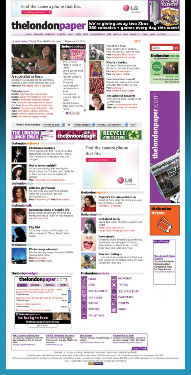
We conducted some very open usability testing, asking questions such as, "How would you plan a night out in London?" Participants took us to a variety of sites, including the one for Time Out, and showed us how they would narrow their options down. Critically, this helped us understand the mental model people use when organising.
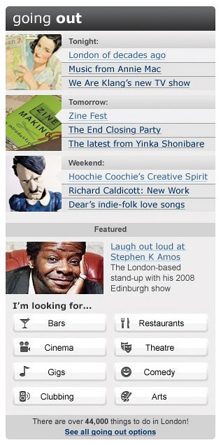
The old TLP site had an extensive events listing function, boasting thousands of things to do in the capital. However, during the early sessions, one of the key phrases that came out was, "I just want a couple of recommended things to do with my partner tonight, or at the weekend."
Discovering this opinion, which was also backed up by the site's analytics, meant we chose to lead with several specially selected events that people could just glance at, delving into more detail if they needed to. We worked out that focusing on tonight, tomorrow and the weekend would be the most effective way to flag up the various options.
What you should concentrate on during an interview isn't necessarily what the participants say, but how they behave and perceive the process of using a site. It's then your responsibility to improve the situation for them.
I have to admit that, as someone who enjoys the interactive aspects of usability, focus groups have rarely been my first-choice tactic for analytics. They were born from sociology and marketing, and people tend to view them as opinion-based sessions in which a few individuals are likely to dominate.
However, as with any method, there are examples of good and bad practices. When planning a website, a focus group with five to 12 users from your target audience can help you understand people's perceptions of current services, and what barriers a new website would have to overcome.
During the planning stage for TLP, we led several focus groups. From these, it quickly became apparent that the BBC dominated people's online news habits, while Time Out was the best-known site for finding events. For each main feature of the TLP website, we explored the brand landscape to understand how the new pages could fit in and provide value.
Using these sessions, we could work out what the best hooks would be for our approach. For example, the style of news from TLP was a sufficient pull for many people.
After completing this sort of research, you should know the user requirements for the site, and what would be best for the users. That could be perfect or unfeasible, so the next question is how to prioritise.
Evaluate your content
For individuals working in web design and development, it's really easy to look at someone else's work and rate it based on the overall look and features. However, viewing a project this way doesn't always show you the improvements that affect the bottom line.
One of the most interesting aspects of the success of the TLP redesign wasn't that the style was particularly new or different (although we thought it was), but that the structure was so useful for people. The prioritisation of content and functions, and how they were distributed around the page, was what made the difference for the page view and advert clickthrough numbers. At the start of a project, though, with the proverbial blank page in front of you, how do you work out what should be at the top of the homepage and what to relegate to footer material?
One of the exercises we did with end-users was to get each person to write down how valuable each feature was to them. This was a variation of a method outlined by Joel Spolsky, but aimed purely at end-users. Each person was given a list of potential content elements, and had to assign £1 or more from a virtual total of £10 to the ones they wanted most.
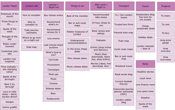
After a little discussion time, the participants put their heads down for a minute and wrote values against what they would most like to see. What the project team ended up with was a combined total that people had assigned to each option. The number of users who wanted each feature was also a useful data point: sometimes, a few individuals really want an article and lots only want it a little bit.
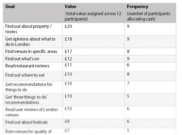
That list didn't totally define the prioritisation order we used, but it was used in conjunction with the business goals to set the relative importance of content. That method works well for applications and sites with a variety of potential content, but what about more information-oriented domains? One of the most common complaints about websites isn't not being able to find something specific; it's actually that the site isn't structured in a way users would expect. Often, pages are built around a similar framework to the organisations they represent, or in the way an owner has assumed people will look for things.
For many sites, it's difficult to work out how people would expect content to be set out. Simply being part of a company means that you think differently about it compared to the people who aren't directly involved.
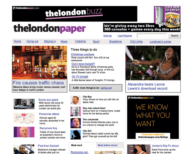
So how do you get into the mind of a user who's looking for something in your site? My favourite technique is one of the simplest: card sorting with index cards on a table. You create a sample of content items from across the proposed site; things that would be two or three levels in, rather than gateway pages. Between 30 and 70 options is generally fine. You then write the name of each item on the front of a card. On the back, put a one-sentence description of the object, in case people don't get it from the name. Then invite in a few potential users, one at a time. Ask them to spread out the cards and group together the things they think match up.
Once they've arranged the cards, ask them to explain why they set them out in the way they did, and what they'd expect the group to be called. Also, make sure you take a note of the things that people had to check the description of before identifying them correctly: it's a sure sign that the name isn't clear enough.
Iteration and refinement
Using the card trick, you gain several potential ways of structuring your site. More importantly, though, you develop an understanding of the different approaches people take towards your content. I rarely use a particular user's exact structure, and I'd never develop a combined one because that would be a mish-mash of partly formed groups. I try to form the frame using the most common approach, and then build out logically from there, trying to employ terms with the least overlap.
Once you know what features and content you're creating, and how to structure and prioritise them, it's time to get a prototype together. Whether that's on paper or in Visio, Axure or HTML, it's a good idea to have something throwaway that you can test.
For example, if you're creating and trialling a site where people can buy groceries, ask about how they currently do this, on- or offline. If they already shop via the web, ask them to tell you what they've done before, and what was good or bad during that experience. This helps put your site in context with people's expectations.
For TLP, one of the key questions was about advertising: the old battle of getting clickthroughs without getting in the way. Initial testing showed that the right-hand side (typically filled with adverts on many sites) was being ignored, so the next iteration included useful, eye-catching content on the right, and ads in the content area.
Although this could have created more annoying pages, making the ads more effective meant TLP could use fewer of them. Another round of testing validated this approach, ensuring we were creating a win-win scenario.
You might be thinking that the output from these research methods is somewhat abstract: it doesn't tell you exactly what design to use. That's completely intentional; you're trying to understand people's behaviours and perceptions. How you then influence those characteristics with your projects is entirely up to you. Obviously, the more you understand human nature and the greater your ability is to translate that knowledge into design, the better the overall experience will be for your end-users.
The type of information you get doesn't necessarily lead to a revolutionary new way of doing something (planning a night out, for example). The most likely outcome is an evolutionary improvement.
However, if you do have a radical idea, this kind of usability research helps you understand people's current assumptions. With those in mind, you can build bridges into the design that enable people to understand and use your application more easily and effectively.

Thank you for reading 5 articles this month* Join now for unlimited access
Enjoy your first month for just £1 / $1 / €1
*Read 5 free articles per month without a subscription

Join now for unlimited access
Try first month for just £1 / $1 / €1

The Creative Bloq team is made up of a group of art and design enthusiasts, and has changed and evolved since Creative Bloq began back in 2012. The current website team consists of eight full-time members of staff: Editor Georgia Coggan, Deputy Editor Rosie Hilder, Ecommerce Editor Beren Neale, Senior News Editor Daniel Piper, Editor, Digital Art and 3D Ian Dean, Tech Reviews Editor Erlingur Einarsson, Ecommerce Writer Beth Nicholls and Staff Writer Natalie Fear, as well as a roster of freelancers from around the world. The ImagineFX magazine team also pitch in, ensuring that content from leading digital art publication ImagineFX is represented on Creative Bloq.
