Léonie Watson on making accessibility integral to web design process
Why you should give a damn about what you're building and who it's for.

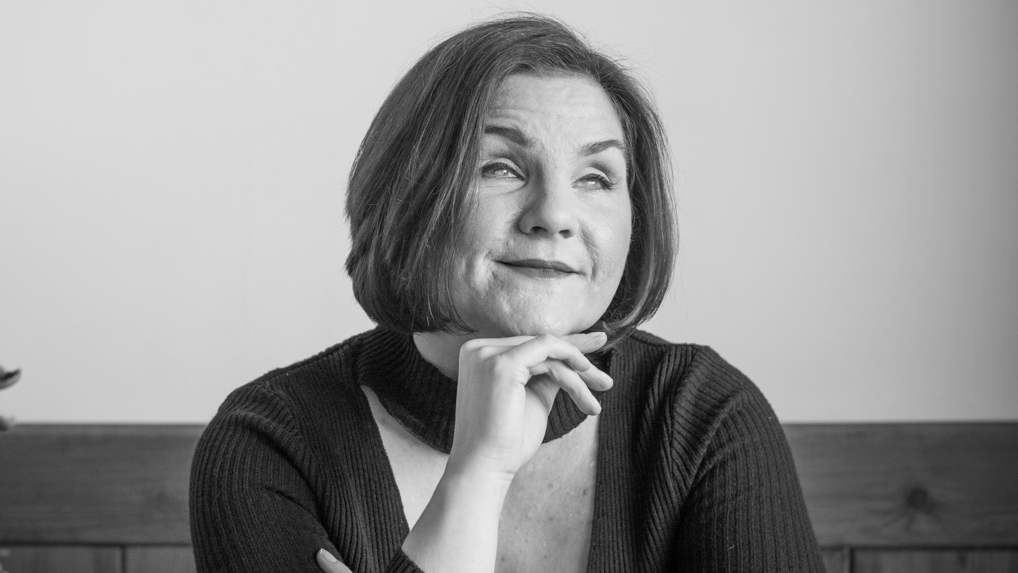
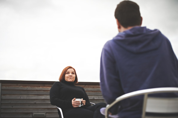
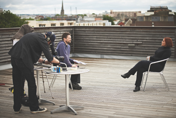
As the photographer and sound engineers set up for our interview on the roof of Aardman Animation, rain and vocal seagulls gather. In the midst of the bustle, cables, tripods and lights, Léonie Watson sits quietly, dressed in black, and sips from a cup of black, sugarless tea. A crew member attaches a mic to her collar.
Watson is communications director and principal engineer at The Paciello Group. She also works with the UK Government Digital Service (GDS) and is a member of the W3C Advisory Board, and co-chair of the W3C Web Platform Working Group.
She is, of course, best known for her work in the sphere of accessibility. “I’m blind, so for me personally, it’s about being able to do stuff,” Watson says, still sipping her tea. “If it weren’t for accessibility, I couldn’t do my job, I couldn’t do my shopping, I couldn’t do a whole bunch of stuff."

"It wouldn’t surprise you that I’m a big technology fan. A lot of my life is spent in and around technology. If accessibility isn’t there, then my life either grinds to a halt or becomes a hell of a lot more difficult.
“Professionally, it’s my career. Spiritually – if I can call it that without sounding too ridiculous – it’s about quality. In this day and age we’re talking about a huge audience of web and technology consumers and in some respects everyone is a niche.
"You’ve got people using a particular tablet, you’ve got a number of people using a screen reader. You have people on laptops, desktops and phones. Our entire audience, as designers and developers, is all about niche audiences. So, accessibility is just one part of getting that experience right.”
Sites can be accessible and beautiful

Given the web’s trend-consciousness, is accessibility the enemy of beautiful? Watson’s response comes like a boxer’s jab: “Absolutely not. [Accessibility] is a creative challenge, not a challenge to creativity. We’ve come a long way since the late '90s and early 2000s, when the concept of an accessible website was probably a text-only site.
"There are lots of companies making beautiful, creative and engaging websites that are completely usable by all sorts of people: people with and without disabilities, and people using different technologies.
"To anybody now who thinks accessibility has to cramp their style, I suggest, ‘Take another look at it’. Put the talent you have as designers and developers to finding accessible solutions to the creative stuff rather than constraining creative stuff to make it accessible.”
Who's getting accessibility right?
So who’s getting accessibility right? “In terms of productions, I was really privileged to be part of the new UK government website. They’ve rewritten the book on a whole bunch of stuff around web development – especially in the public sector. The thing they’ve done that’s been a real game changer is to put their audience, people, as their absolute top priority. That, of course, includes people with accessibility requirements.
"It’s not perfect – nothing ever is – but each person working in that team understands that whatever they build and however they build it, it has to be done in such a way that anyone in the country, across an extraordinary demographic, can use it.
“You know,” she continues, “accessibility can seem scary at first... really complicated. But it’s not rocket science. The rocket science is learning to do what we all do; it’s learning HTML, it’s CSS, it’s cross-browser compatibility and debugging. If you can do all that, you can get accessibility right – no question.
"If you’re looking for advice, I’d say think about the quality of the stuff we’re designing. We want people to use our websites, our apps and our web applications. Design like you give a damn. That’s all accessibility is: giving a damn about what you’re building and who you’re building it for.”
Making accessibility mainstream

So, accessibility and good design are easy bedfellows. What about accessibility and responsive web design? With all its breakpoints, finesses and maths, is it a frontier too far for accessibility?
“No. Responsive design is brilliant for accessibility! In fact, it’s what accessibility, in some respects, is about in its very heart. [Responsive] is about creating different experiences for different audiences so, actually, it’s brought something [that has been] in accessibility for a long time right into the mainstream.
“We can now build on that to make things even more accessible. [RWD has been] about looking at different platforms: mobile, desktop. You can take that on to great variations. CSS media queries [enable you to] present different experiences to different user agents. So, yes, responsive is brilliant for accessibility.”
Is accessible, responsive web design harder?
From a user outlook this is great, but from a design and development team’s perspective, responsive does have a reputation for making the nine-to-five more taxing. If we’re setting our sights on making products that are both accessible and responsive, are web pros facing a tougher future?
“Bringing together two things like responsive and accessibility: that’s the wrong way to look at it. We all need to be doing that first ‘design and build’ part with accessibility built in.
"I talk to designers around the world who just get it. There’s no concept of, ‘I’ve got to build this. Oh. I’d better stop to work out how to make it accessible.’ Accessibility is built into all they do. If you take that on to responsive, it’s inherently there.”
How do browsers affect accessibility?
With browser builders competing to build ever newer features into their products, how can assistive technologies keep pace? “It comes down to not wanting to separate accessibility from the stuff we’re doing every day.
"Accessibility is also pretty dependent on the browsers. For example, a screen reader depends on the browser a person is using. The browser has an accessibility API and pushes out information about the content on a page. The screen reader picks it up and conveys this information to the user. There’s a real symbiosis.
"The rapid changes taking place don’t cause any more of a headache because you’re thinking about accessibility. They cause a monumental headache simply because they’re changing so fast!”
And which browser does Watson rate best from an accessibility point of view? “Firefox is good. It’s making a lot of information available through its accessibility API. The team working on it has put a lot of time and effort into it and deserves a lot of credit.
"There are probably others doing good things in that space but, for the moment, Firefox and Internet Explorer are the two big players when it comes to screen reader support. But Firefox has to take the winning ticket on that one.”
Assistive technologies

The discussion shifts, to explore the assistive technologies themselves that are impressing her. “Jaws is a screen reader developed in the States by a company called Freedom Scientific. They’re doing good stuff in terms of ARIA support.”
WAI-ARIA (Web Accessibility Initiative – Accessible Rich Internet Applications), Watson explains, is a spec from the W3C designed to bridge gaps between assistive technologies and some of the components being built into websites. In essence, it’s a method of supplementing and extending some of the information available through the browser accessibility APIs, providing assistive technologies with more to work on.
A simple example, Watson suggests, is “if you’ve got a link, you style it to look like a button, but to a screen reader it’s still a link though it looks like a button – there’s an obvious discrepancy. With ARIA, you can stick a role of ‘button’ on that link and, to a screen reader, the thing looks and behaves like a button.”
Technicalities cleared up, Watson continues to list open-source screen reader NVDA (NonVisual Desktop Access). “It’s brilliant to use in testing,” she says.
“I’d probably have to include Apple’s VoiceOver screen reader, too, because it’s available on all Apple products. That was a game-changer in the marketplace, when a blind person could walk into an Apple store, pick up a device, and have it speak to you straight out of the box.”
Accessible web strategy
Finally, we arrive at content strategy and what accessibility experts need to think about. If you’re looking for a pithy summary of Léonie Watson’s professional quest, you’ll find it here.
“This is a real passion of mine: we need to stop thinking about accessibility as a separate entity and make sure it’s part of everything we do,” Watson says.
“[With] content, you need to think about the audience it’s going to target. Some people in that audience aren’t going to be able to see, hear, move around. To separate [your content] is going to make life a lot more difficult when it comes to putting that strategy together, let alone delivering on it.”
This interview first appeared in issue 245 of net magazine. It was conducted before Léonie Watson's talk at the inaugural Generate London conference. We're thrilled she will be back to mark the fifth event this September.
Generate London features 16 talks on web animations, performance, UX strategy, user interfaces, and much more. As Seb Lee-Delisle will be there, you can also expect lasers! And if you treat yourself to a workshop as well as the conference, you can save £95 by buying a ticket bundle.
Related articles:

Thank you for reading 5 articles this month* Join now for unlimited access
Enjoy your first month for just £1 / $1 / €1
*Read 5 free articles per month without a subscription

Join now for unlimited access
Try first month for just £1 / $1 / €1
Get the Creative Bloq Newsletter
Daily design news, reviews, how-tos and more, as picked by the editors.
