How web design and mobile design are becoming the same thing
Mobile and web (and even desktop) application design is converging, says Chris Bank of UXPin.
In this article, Chris Bank of UXPin – The UX Design App discusses how mobile and web (even desktop) application design is converging, and some of the key indicators in this trend – they're covered in more detail with examples from over 50 hot websites and web apps in UXPin's free e-book, Web UI Design Patterns 2014.
At the heart of many of these new UI design patterns is the emergence of responsive design, and incorporation of touch screens on traditional desktops and laptops.
Shifting definitions
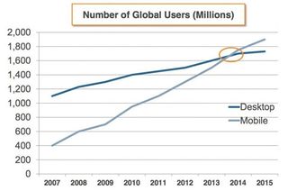
As the use of mobile devices surpasses web, we have both seen an increasing influence of mobile design on web but also a shifting definition of both.
In the Mobile UI Design Patterns e-book, I talk in detail about animations and gestures heavily impacting mobile UI design patterns which is becoming increasingly relevant to web design as mobile and web continue to their convergence.
In the new Web UI Design Patterns e-book, I detail how responsive design and the proliferation of touch screens are also major indicators in this trend. And I'll share these in this article.
To help illustrate my point, I've deconstructed an abundance of web design patterns and elements from the hottest websites and web applications around – Pinterest, OKCupid, Spotify, Amazon, Kickstarter, AirBnB, Facebook, Dropbox, Quora, Eventbrite, Twitter, Asana, RelateIQ, Flipboard and many, many more.
Some of the UI design patterns and elements are also covered in UXPin's free Mobile UI Design Patterns, Web Design Trends, Mobile Design Trends, and The Guide to Wireframing e-books – bookmark them for another time since there's a lot to catch up on.
Get the Creative Bloq Newsletter
Daily design news, reviews, how-tos and more, as picked by the editors.
The real meaning of responsive
Although many designers and developers reference 'responsive design' as a fancy synonym for 'resizeable on different devices', it is far from this simple. Many have tried that approach and failed. Smashing Magazine summarizes a common definition of Responsive Web Design:
"Responsive Web Design is the approach that suggests that design and development should respond to the user's behavior and environment based on screen size, platform and orientation…"
But it's not just about adjustable screen resolutions and automatically resizable images. Practically speaking, a different product must be designed start-to-finish for each device (not just copy-pasted): one design for the BlackBerry, another for the iPhone, the iPad, Android, Kindle and so on.
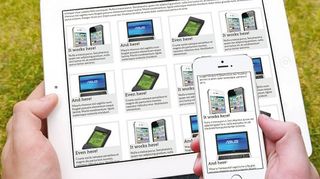
To make this process easier, applications on web and mobile are increasingly designed and developed in the same way so changes made between application implementations are more easily understood and can be made more expediently.
Common considerations
Here are a few common considerations to take when designing responsively:
- Adjusting screen resolution – How do you adjust all of the application content and features to fit on different screen sizes? How do you account for portrait and landscape orientation?
- Flexible images – How large or small are images on smaller screens? Do you crop parts of the images or surrounding content?
- Custom layout structure – How does the navigation respond to smaller screens? How should the layout adjust for smaller-sized devices?
- Showing or hiding content – What is the hierarchy of the content? How do you hide content so it's still intuitively accessible when he user needs it?
- Adding or removing content and features – What is or isn't necessary on different applications, particularly web versus mobile? How do you make these changes without confusing the user when they switch between web and mobile?
- Changing user interactions – How does a user interact with content, navigation, action buttons, etc? Do does any content or feature in the product change due to this change in behavior?
Touch screens
Although the iPad – in some respects, an oversized iPhone – is credited for popularizing large touchscreens, it was only the beginning.
Not only has it ignited the development of many other large touchscreen devices but also hybrids, which ultimately increase the complexity of product design and development.

And while large and small (mobile) touchscreen devices are similar in terms of hardware and OS, the diversity of products in each product class is testament to the differences in use cases for which they're being designed.
Granted, there are many iPhone applications that work seamlessly on the iPad. But that doesn't change the way products are designed the same way re-sizing and re-arranging applications between web and mobile isn't really 'Responsive Design'.
The impact that large format touch screens has on product design will be quite large. These devices are a natural home not just for the viewers and small utilities we've seen on our phones, but also for creators and editors as we see on desktop platforms.
Productivity applications, and sophisticated workflows will be the norm – and we're just scratching the surface with apps like Dropbox, Mailbox, RelateIQ, Google Docs, and many others.
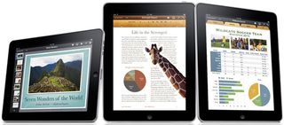
As Matt Gemmell points out, there are several key differences between large and small (mobile) touchscreen devices that impact how we must think about product design:
- Display size: Web apps with more demanding presentation requirements will be at home here. Although you hold your smartphone closer to your face so the relative visual size between large and small touchscreens isn't that different in many cases, the optionality of viewing content in even greater size and detail is a big benefit for this use case.
- Virtual keyboard size: Web apps which focus on typing are now much more feasible, especially because external keyboards can also be used.
- Multi-touch and Multi-hand: Web apps offering more advanced multi-hand and multi-touch controls are much more feasible, not only because of larger surface area but because users often only use one hand on their mobile devices but likely have two free hands when using larger devices.
These differences in larger touchscreen devices leads to new UI conventions, which can be applied to large mobile devices like the Apple iPad, laptops like the Microsoft Surface Pro, or even larger touchscreens:
- Master-detail visibility: On larger screens, you can see both a list of things (master) and also additional information about the currently-selected thing in the list (detail). On smaller screens, only one or the other is visible.
- Look like viewer, behave like an editor: More real estate should allow for bigger primary content and features for better viewing and interactivity, not necessarily more content and features to fill in all of the space.
- Edit in place: Unlike other desktop platforms where there are globally-positioned editing UIs with floating palettes, toolbars, menus and status bars, touch screens require a greater level of direction between editing actions and the object being edited.
- Make inspectors contextual: If you're going to keep standard editing interfaces in standard positions, consider which elements of the UI are actually necessary or relevant, and scrap the rest. This is a common mistake even on traditional web and desktop applications where every control is displayed and the irrelevant ones are only greyed out. Don't overload the user with options.
- Use modes to simplify UI: Allowing the user to switch contexts easily in sections of the application make it much easier to add and remove elements of the UI to keep it clear and uncluttered while providing the most relevant content and functionality. Make sure it's simple, and not an excuse for feature creep. And don't go overboard with the number of modes.
- Add fewer features: While users have been trained to accept bloated applications on computers and even the web, they have little tolerance on mobile and touch screens. Feature-creep is common in web and desktop applications; just look at Adobe Photoshop or Illustrator. Most users need only a small set of features. A nice side-effect of focused applications is that the UI is easier to design and comprehend.
- Build for one hand, allow for two hands: The user should also have the option to use one hand and not be required to use two. Just because the user has twice the available hands (they typically only have one on smaller screens), don't provide twice the UI. Dual-handed input should still be done in a discoverable and optional way so the user can enjoy the viewing benefits of a bigger screen and the simplicity of limited options.
- Use the psychology of touch: Touch is emotionally important to people; it conveys the identity and 'realness' of an object. With larger screens, users can make much stronger associations between the application and existing real-world associations or new triggers can be developed more easily because of a greater visual feedback loop from actions taken on the application, compared to mobile.
Independent but unified design
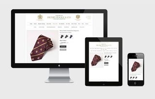
It's an exciting time for web and mobile design. And the examples of how responsive design and touch screens are being used in websites and web applications is exploding.
While each instance of an application must be designed uniquely for the use cases and form factors of each device on which it is to be used, there is no question that the experience is becoming more unified across all instances. Many applications are even developing unique, proprietary devices because their use cases – think about wearable devices and the 'connected' home (ex: networks home appliances and fixtures).
For a deeper look at how some of the hottest companies are using them for new and existing design patterns and elements, check out UXPin's new e-book, Web UI Design Patterns 2014. Use what you need and scrap the rest – but make sure to tailor them to solve your own problems and, most importantly, those of your users.
Words: Chris Bank
Chris Bank is the growth lead at UXPin, a UX design app that creates responsive interactive wireframes and prototypes.

Thank you for reading 5 articles this month* Join now for unlimited access
Enjoy your first month for just £1 / $1 / €1
*Read 5 free articles per month without a subscription

Join now for unlimited access
Try first month for just £1 / $1 / €1
The Creative Bloq team is made up of a group of design fans, and has changed and evolved since Creative Bloq began back in 2012. The current website team consists of eight full-time members of staff: Editor Georgia Coggan, Deputy Editor Rosie Hilder, Ecommerce Editor Beren Neale, Senior News Editor Daniel Piper, Editor, Digital Art and 3D Ian Dean, Tech Reviews Editor Erlingur Einarsson and Ecommerce Writer Beth Nicholls and Staff Writer Natalie Fear, as well as a roster of freelancers from around the world. The 3D World and ImagineFX magazine teams also pitch in, ensuring that content from 3D World and ImagineFX is represented on Creative Bloq.
