How to design for the 'internet of things'
It's still a big buzzword but what's the Internet of Things all about and what does it mean for designers? Dan Frost explains all.
In 2013, the Internet of Things was everywhere: more startups, services and platforms launching and coming out of beta. Last month, CES was awash with connected-this and smart-that and while much of this is in the early-adopter stage, what's remarkable is that the price and size are making possible futuristic products which were unimaginable a few years ago.
The 'Internet of Things' is undoubtedly a buzzword but if you speak to anyone who's been working with this technology for a while, they'll tell you that the underlying technology isn't at all new. The ability to connect remote things and interact with them has been around for years, but it's the confluence of cheapness and smallness in five technology areas that is bringing this to consumers. Those five are: connectivity, sensors, actuators, processors and power. The gadgets at CES show how this technology is hitting the high-street prices and size.
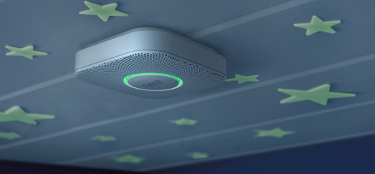
The technology behind the IoT
IoT is the latest generation of a series of terms that mean, roughly, connecting lots of stuff and giving it processing power: M2M (machine-to-machine), ubiquitous computing. The term IoT is now being attached to almost anything that is connected, which is turning out to be almost everything from watches, through scales to cars and toothbrushes.
I think it's actually a really good buzzword for us to put up with for a couple of years, not because the technology has morphed itself into a new school of engineering called 'things' or because buzzwords are great. It's good because if we think about all this technology as one, we get to think about it from the user's point of view. We have to think about the user experience.
As you learn about IoT technology and platforms, it's important to keep in mind the question: what does this do and feel like for the user? Where does it fit in their life? What is the experience?
The success of the bundle of IoT technologies will be in their ability to make changes to the world and how people live their lives, and you only succeed in this if you consider the user experience.
Hence my belief that UX is critical to the IoT, and it needs a really good philosophy unpinning it so we don't create the 'thing' version of the flash banner.
And this is where you come in. If you design almost any sort of user experience, 'things' will start being part of your world. It's going to be people like you who make these whizzy clever devices beautiful and engaging to use.
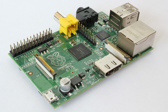
Idea, prototype... then where?
Many projects start as prototyped devices using a Raspberry Pi or Arduino. Because these are general purpose processors, and because the Raspberry Pi can do fairly complex processing, you can prototype just about everything but it'll look like a heap of wires in a box.
When the hacky prototype is done, you can start getting it ready for hardware developers to turn into a real, marketable product. (I've glossed over quite a few things here, but hopefully you get the point.)
But there's another thing to do: start thinking about the user experience. A marked difference between the devices of 10 years ago and today is their ease of use. The quality, sleekness and slickness is amazing.
When we started on our product, we looked around at the existing products in the space. Everything was clunky. Unchanged in years. Hard to use. Naff. Then we looked around at the IoT products being launched and asked: What was it that made them easy to use?
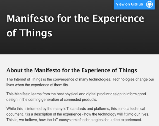
We distilled this down to five principles. Five things that we could see in everything good going on in the IoT and that we couldn't see in the not-so-good stuff. We've published these on github to include contributions from a growing User Experience of Internet of Things following.
How is IoT different?
Here are a few of the differences we've found:
Is it My, Your, Our or The?
Be clear whether this is 'my' thing, 'our' thing or whether it's a shared thing. 'The' thing. With the user – or users – clear, much of the rest follows such as decisions you make about pairing, configuring, logging in (or not) and controlling the data.
If the city wants people to report broken street lights, you don't want the user to use Bluetooth pairing. If it's a smart light switch, I shouldn't have to log in with my Twitter account. But if it's car security, you want to know that no one can access that data.
Design for scale of everything
We've got good at designing for scale of data. We each follow hundreds of people on Twitter, receive thousands of emails each month and are friends with far too many people on Facebook.
This design practice has to carry over to devices. If I bought a Bluetooth lightbulb, I might be okay pairing with it. But what if I kit my house out with 200 lightbulbs? Design for scale of 'things' as well as data.
Imbue ownership
A lot is packed into this. Ownership is more than legal, it's psychological but it implies security and privacy. The security and privacy issues around the Internet of Things are being worked out by many firms and interest groups, but telling someone that it's secure isn't the same as making the UX feel secure and private.
The best products give a sense – the right sense – of ownership. You, the user feel that you know where the data is. You know what happens if you share the 'thing'. You trust that it'll behave.
Anything confusing or alien to the user's experience of the world breeds mistrust and doesn't convey ownership. Avoid the nasty, legacy ways of controlling the device and make it elegant to use.
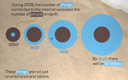
Taming things
You can read and contribute to this on github. We probably don't have the answers for the connected world in 10 years but by learning from the best physical and digital products, we've got a start.
What do you do now? Get yourself a Raspberry Pi project, push to make the experience as polished as possible and fork the manifesto with everything you learned about the new world of connected product design.
Contributor: Dan Frost
Dan Frost is founder of Seamless.li and Technical Director of 3ev. This is an updated version of an article that was previously published on Creative Bloq.

Thank you for reading 5 articles this month* Join now for unlimited access
Enjoy your first month for just £1 / $1 / €1
*Read 5 free articles per month without a subscription

Join now for unlimited access
Try first month for just £1 / $1 / €1
Get the Creative Bloq Newsletter
Daily design news, reviews, how-tos and more, as picked by the editors.

The Creative Bloq team is made up of a group of art and design enthusiasts, and has changed and evolved since Creative Bloq began back in 2012. The current website team consists of eight full-time members of staff: Editor Georgia Coggan, Deputy Editor Rosie Hilder, Ecommerce Editor Beren Neale, Senior News Editor Daniel Piper, Editor, Digital Art and 3D Ian Dean, Tech Reviews Editor Erlingur Einarsson, Ecommerce Writer Beth Nicholls and Staff Writer Natalie Fear, as well as a roster of freelancers from around the world. The ImagineFX magazine team also pitch in, ensuring that content from leading digital art publication ImagineFX is represented on Creative Bloq.
