The expert guide to experience mapping
Losing track of your end-users' complex journeys? Chris Ridson is here to lead you through the key touchpoints of experience mapping.
Analysing the end-user journey isn't new in digital design. But as websites and digital products become more interconnected across channels and devices, it's increasingly important to find sources of insight about end-users' interactions with your digital product or service.
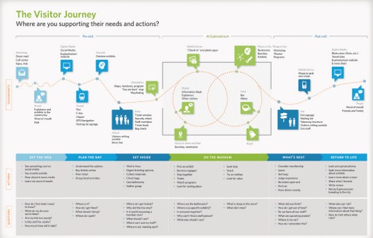
Gaining insight into that journey through experience mapping has become more and more useful. A good experience map will show the journey of the user through the different touchpoints that characterise his or her interactions. It shows a persona in action and serves as a hub for empathy and understanding around the end-user's experience.
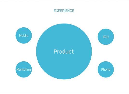
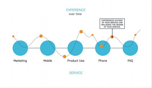
Traditionally, designing a website or digital product experience involved thinking about a person and their use of a single digital touchpoint. Now, we're realising we want to orchestrate an experience among many touchpoints: not just interfaces, but people, artifacts and places. We're designing experiences that unfold over time, and across many different channels and platforms.
Even if your purview is just a digital interface, you can no longer design that in a vacuum. You must understand how that interface works in a variety of contexts.
As an example, take Homeplus, a South Korean grocery chain that has created virtual grocery stores in public places such as subway stations. Homeplus replaced print real estate normally reserved for advertising with virtual store shelves. Users scan codes on the virtual stock via a mobile app to order different products, and can even organise for home delivery that day.
Homeplus says most orders placed via the app are at 10am and 4pm, while people are on their way to and from work.
Clearly designing an app that can facilitate the whole shopping experience is possible, but even better is an experience that combines two channels (print and mobile) to facilitate the needs of consumers at the most opportune moment. Understanding the whole journey – the behaviours of the end-users and their shopping habits – can help identify how to support this type of touchpoint: purchasing your groceries through a virtual store.
Get the Creative Bloq Newsletter
Daily design news, reviews, how-tos and more, as picked by the editors.
Digital services such as Netflix, Uber, Airbnb and Nike+, as well as more traditional services such as banking and air travel, all work best when you think about how different channels and platforms work together to support the end-user's journey over time.
Why map the experience?
There are three big areas that are served through insight into the whole journey:
Organisational planning
As products and services become ever more complex, and large organisations want to break down silos, it's important to know where and how to marshal resources. Understanding how the whole journey is experienced helps an organisation understand which of its parts need to work more closely together, and where there needs to be an emphasis on resources.
Surfacing and prioritising initiatives
Once you can see where there are opportunities or pain-points, you have a great tool for prioritising those areas, usually against technical feasibility and end-user impact. Once you prioritise, the logical next step is to create a roadmap – now you have a plan of action for improving the journey.
Providing guiding principles or insight to inform design
An experience map is a bird's-eye view. But eventually you need to zoom back in and design a touchpoint-design to support a specific moment along the journey. That may be a customer support call, a kiosk touchscreen in a store, or the checkout experience on an commerce site. But after zooming up and looking at the whole journey, you now have insight not only into how any given moment is experienced; that touchpoint now has the DNA of the whole journey and you can take into consideration things about how it connects to other touchpoints.
Doing it right
Done correctly, experience maps involve different parts of the organisation. The collaborative activity encourages people to get their heads out of the weeds and see the whole end-user experience, beyond any single interaction point.
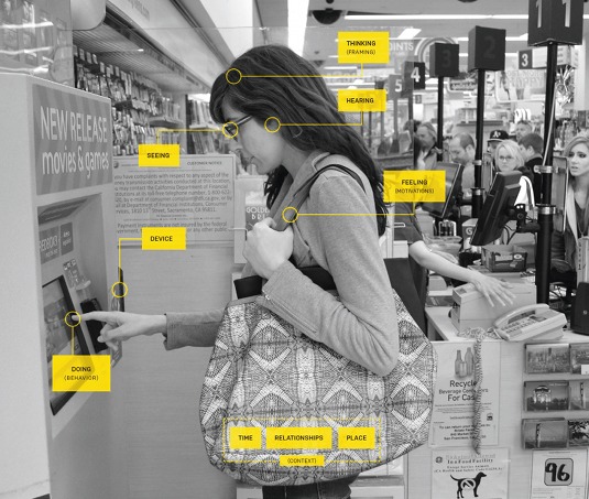
Journey mapping brings understanding of what customers are feeling, thinking and doing at any given point in time when interacting with a service, and recognition of how that may change over time.
When done right, maps tell a story with depth and richness around the human experience, via the layering of qualitative and quantitative information. With the element of time, this visual model is the quickest, most effective way to tell a story.
Levels of zoom
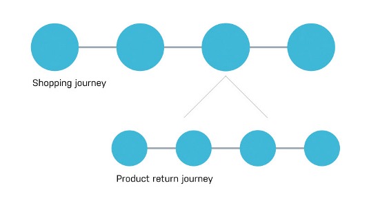
As you determine what you're trying to solve through mapping the experience of a journey, you'll know to what level of zoom you are mapping. Is it a view from 10,000 feet, or 2,000 feet?
For example, if you're a big-box retailer, and you know that you just need to start getting alignment on your physical store channel, phone customer support, web and mobile experiences, you may choose to map the whole experience: from what triggered the need to shop for a product, through to checking out instore, or online.
However, you may want to take a more focused look – for instance, the experience around product returns – by zooming in on an area with its smaller, distinct journey. Both examples display an experience that unfolds over time, and usually across touchpoints or channels; they're just different zoom levels.
Science before adventure
The map, at its simplest, is an articulation of research insights. An experience map should have some qualitative and quantitative information for it to take shape in a meaningful way. It's useful to think of the inputs of an experience map in two parts: discovery about what is encompassed within the journey – what are its moving parts? – and qualitative and quantitative end-user research about how that journey is experienced.
Discovery
If the experience journey has a large number of touchpoints – moments of interaction between the end-user and the system or service – it becomes hard to highlight all of them in the experience map. Too many touchpoints and the map may start to lose focus and meaning.
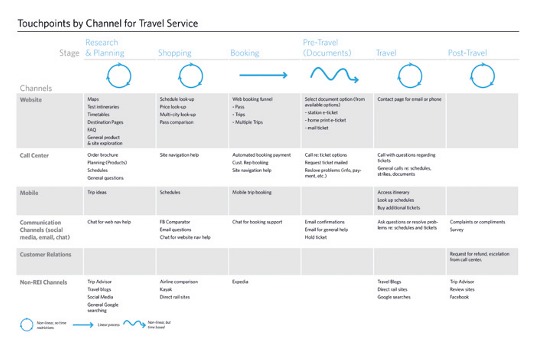
Instead, we often start with a touchpoint inventory, which is just as it sounds. We want to catalogue all the touchpoints a customer could have with the product system or service, great and small. But, beyond some logical groupings, we aren't worried how they relate to each other, save for identifying the nature of each touchpoint or the phase in which it lives. This isn't unlike doing an content audit within information architecture. We want to know what each touchpoint is, what type it is, and where it is located.
We don't care, at this point in the process, how these touchpoints are experienced. We are just getting a handle on all the moving parts.
To create a good touchpoint inventory, think of the channels within the journey that an end-user encounters (desktop web, mobile web, email, phone, kiosk, to name a few) and about the part of the journey, or stage, within which they are engaged. When this is done collaboratively, with a cross-functional group, it's often surprising how many touchpoints your end-user has with your organisation that you may not have realised.
Research
To support a better experience, we must understand the context in which an end-user is engaging with the system at a given point – and care about what the end-user is feeling, thinking and doing.
- Feeling is about emotion and motivations. Why am I doing this? How do I feel about it?
- Thinking is more about expectations, or the end-user's mental model. How does this work? Where do I go?
- When dealing with a product ecosystem with multiple interfaces, it becomes important to know what they are doing. Are they using a mouse and keyboard? A touchscreen at a kiosk? Having a conversation on the phone?
Like any good UX endeavour, you want to get in the shoes of your end user, right? Observations, contextual inquiries – all the same types of ethnographic research are good. But there are some things you can ask about the end-user's experience through a journey-specific lens:
- What triggered the journey? (reveals their motivation)
- What were their expectations? (reveals mental model)
- What actions did they take? (reveals what they were doing)
- What was involved at different points in time? (people, devices, screens etc)
- What were they thinking at key points?
- What were they feeling at key points?
- What were their lasting impressions?
As you research, through the lens of a journey, and start getting answers, you can merge it with what you know about all the touchpoints from your inventory. You can then start to see themes emerge of how different touchpoints at different times are experienced – good or bad. Expectation gaps, pain-points, and areas of opportunity start becoming evident.
Bring it together
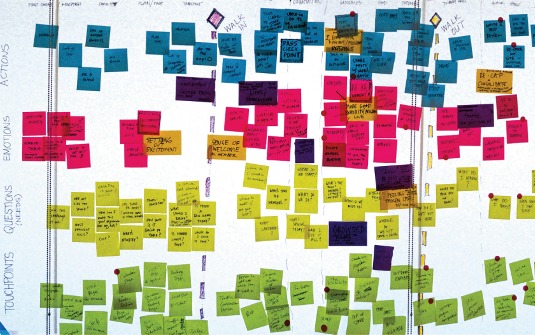
Once you have some insight into how an ecosystem is experienced, start bringing it together. A good experience map should serve as a catalyst for one of the abovementioned reasons: organisational or strategic planning, or tactical design guidance. When you do this in a cross-functional group, create large canvas areas and utilise our old standby, sticky notes.
We've shared our research insights; we have our touchpoint inventory, for reference of the 'stops' within the journey. We then begin to collaboratively 'map' it, starting with key building blocks. If the journey is big enough to break into obvious stages, go from there; for example triggers for a journey, things people do before engaging in a product or service (research, shopping around), purchasing, and using it. However, healthcare, air travel or bigbox retail shopping all may have different stages or chunks. How you section your journey depends on the particular domain or industry as well as the level of zoom.
Telling the story
If you're a startup, or a small team, you may be able to take a picture of and reference your sticky-note canvas. But if you need to socialise this to a larger audience, you may want to create an artifact that can be shared as a tool.
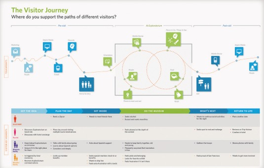
There's no right way to build your experience map. But there are obvious things you want to accomplish. You want to show the major themes across key touchpoints. Highlight what's involved in making that touchpoint happen, and communicate what the end-user is feeling, thinking or doing through that journey. You may emphasise certain things as the main takeaway. Is it about the end-user's emotional journey? Is it about what they are doing? And you may arrange your journey illustration according to what that story is. It depends on the themes or insights you want to communicate.
But the common elements are typically going to be stages, touchpoints within those stages, key end-user quotes that illuminate what they are feeling or thinking, and what is involved to make that moment happen: channels, people, other services, artifacts and so on. You've applied some hierarchy and told a story that captures the themes and insight from your research. Your goal is to make this a catalyst, not a conclusion.
You can tell a visual story that's far easier to comprehend than a research report in PowerPoint – and much more engaging.
- Download full-size images from this article here.
Words: Chris Ridson
Chris Risdon is a design director at Adaptive Path, and spends his extra time as a professor at the Austin Center for Design, Texas, teaching service design and interaction design theory. This article originally appeared in net magazine issue 254.

Thank you for reading 5 articles this month* Join now for unlimited access
Enjoy your first month for just £1 / $1 / €1
*Read 5 free articles per month without a subscription

Join now for unlimited access
Try first month for just £1 / $1 / €1

The Creative Bloq team is made up of a group of art and design enthusiasts, and has changed and evolved since Creative Bloq began back in 2012. The current website team consists of eight full-time members of staff: Editor Georgia Coggan, Deputy Editor Rosie Hilder, Ecommerce Editor Beren Neale, Senior News Editor Daniel Piper, Editor, Digital Art and 3D Ian Dean, Tech Reviews Editor Erlingur Einarsson, Ecommerce Writer Beth Nicholls and Staff Writer Natalie Fear, as well as a roster of freelancers from around the world. The ImagineFX magazine team also pitch in, ensuring that content from leading digital art publication ImagineFX is represented on Creative Bloq.
