Create an incredible custom Tumblr blog
Often derided as a lightweight social blogging platform, there's more to Tumblr than you might think. John Surdakowski explains how you can start to push the boundaries.
Tumblr's popularity has grown exponentially year on year - the reason being that it's easy to use, flexible and, when managed correctly, a very powerful platform. Many web designers and developers still look at Tumblr as just a social network or micro-blogging website - one that uses pre-made templates for sharing cute pictures of kittens and memes. But it can be so much more. Today, it hosts 90 million blogs, which generate more than 89 million new posts every day. With numbers like this, it's hard to ignore the possibilities (see our roundup of the best Tumblr blogs to see what can be achieved).
Utilising Tumblr's variables to insert dynamic data, and 'blocks' to conditionally render HTML, we can really push our blog's functionality in fresh directions.
Tumblr is built around seven key types of posts: text, photos, links, quotes, chat, audio and video. Using CSS, we can customise our themes around these types so that our posts will look beautiful on our own blog, the dashboards of our followers and on other users' blogs when they're 'reblogged'.
Getting started
From your Tumblr Dashboard, click Customize appearance on the right column. Then click Edit HTML below the theme thumbnail on the left. This is where all your HTML code will be written.
Many Tumblr theme developers practice inline CSS within the HTML editor. This doesn't sit well with me. Having to scroll up and down to write your CSS is cumbersome and tedious. Plus, our code can become a jumbled mess, making it difficult to edit in the future.
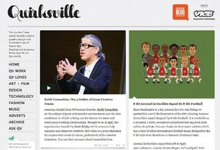
In practice, I suggest calling a style sheet, hosted on an external server, the same way we do on a standard HTML page - although, I should mention that one advantage of using inline CSS would be that Tumblr serves the styles using its content delivery network (CDN). For the sake of simplicity, I will be using inline CSS for this tutorial.
Displaying photo post types
Go to the example page. Here, we're going to display one of Tumblr's seven post types. This photo post will display an image, a caption and the post's tags.
Get the Creative Bloq Newsletter
Daily design news, reviews, how-tos and more, as picked by the editors.
First, we'll need to use Tumblr's 'blocks' to render some HTML for a set of data - in this case, our Photo Post. By wrapping our blocks in HTML IDs and classes, we can target each piece of content that the blocks output:
<article id="posts">
{block:Posts}
{block:Photo}
<div class="post photo">
<img src="{PhotoURL-500}" alt="{PhotoAlt}"/>
{block:Caption}
<div class="caption">{Caption}</div>
{/block:Caption}
</div>
{/block:Photo}
{block:HasTags}
<ul class="tags">
{block:Tags}
<li>
<a href="{TagURL}">{Tag}</a>
</li>
{/block:Tags}
</ul>
{/block:HasTags}
{/block:Posts}
</article>
Styling your photo post type
Applying some CSS to our markup, we can style our posts however we like. In this case, we are adding a border and slight drop shadow.
#posts .photo img {
border:10px solid #fff;
-moz-box-shadow:0px 0px 20px 0px #aaa;
-webkit-box-shadow:0px 0px 20px 0px #aaa;
box-shadow:0px 0px 20px 0px #aaa;
}
With little effort, we can now start to see the possibilities of styling our Tumblr post types.
Tagging and navigation
Tags are what Tumblr is all about. In the previous example, we explained how you can display tags on your posts using the HasTags block. Tags are a great way to organise your posts, as well as making them searchable on Tumblr and search engines. We can also use them to create navigation for our users to view posts within a given tag.
When you add tags to a post, the URL for the tagged page is automatically created. For example, when I created our first post, I tagged it with 'kitty'. If we were to go to http://OUR-TUMBLR-URL/tagged/kitty, it would only display posts tagged with 'kitty'.
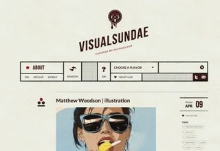
There are a couple of ways to set up a tagged navigation. I prefer manually, because it allows more control over the links and styling. Here, we're adding a basic nav list, linking to our two tagged pages. When a user clicks on one of the items in the navigation, they will only see a feed of posts that are tagged with the corresponding tag.
<nav>
<ul>
<li><a href="/tagged/kitty">Kitty</a></li>
<li><a href="/tagged/dog">Dog</a></li>
</ul>
</nav>
Styling posts based on tags
The previous examples, although easy, can really improve the layout of your Tumblr design. Custom styles for posts and navigation for your tagged pages can enhance the user's experience. But what if we wanted to get a little bit more custom?
Sometimes different types of posts need to be styled in discrete ways. By using our tags (remember that these are created automatically when adding them to posts) we can generate classes, based on the individual tags that we have added. (For an example, see http://nettutorialtags.tumblr.com/tagged/mountains.)

We do this by utilising the TagsAsClasses variable in our HTML. This variable is an HTML class-attribute friendly list of the post's tags. With this variable, we can treat our tags as a class name and inject it into our HTML.
<article id="posts">
{block:Posts}
{block:Photo}
<div class="post photo {TagsAsClasses}">
<img src="{PhotoURL-500}" alt="{PhotoAlt}"/>
{block:Caption}
<div class="caption">{Caption}</div>
{/block:Caption}
</div>
{/block:Photo}
{block:HasTags}
<ul class="tags">
{block:Tags}
<li>
<a href="{TagURL}">{Tag}</a>
</li>
{/block:Tags}
</ul>
{/block:HasTags}
{/block:Posts}
</article>
In this example, we have added the TagsAsClasses variable to our Photo post type, and styled all posts tagged with 'mountains' a little differently. Changing the border and the caption size and colour. This example is very subtle but, with a little imagination, we can endlessly customise different posts based on their tag alone.
#posts .mountains img {
border:10px solid #d92565;
}
#posts .mountains .caption {
font-size:1.5em;
color:#d92565;
}
Permalink pages
Permalinks are URLs that point to a specific blog entry. In Tumblr, this is also the page that displays all of the reblogs and likes. Linking your posts to this single entry page is quite easy. Within your 'post block', link your image, title, caption or even a custom button using the following. Here we are linking the uploaded image:
<a href="{Permalink}"><img src="{PhotoURL-500}" alt="{PhotoAlt}"/></a>Customising permalink pages
So you want to style your permalink page differently? No problem. Adding the Permalink block to your body tag, along with a unique ID, will dynamically inject the id only when a user is visiting the permalink page. (See an example page.) Now you can style your permalinks page differently, targeting the permalink ID, using CSS.
<body{block:Permalink} id="permalink"{/block:Permalink}>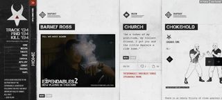
Different content for different pages
Just because we are developing in Tumblr doesn't mean every post page and permalink page will need to have the same content. We can target individual pages and only display the content that we want. For example, what if we wanted to add some heading copy to our permalinks pages? We can do this using Tumblr's PermalinkPage block. By wrapping our HTML within this block, it will only display when a user visits the permalink page:
{block:PermalinkPage}
<h2>Your Heading Here</h2>
{/block:PermalinkPage}
We can also display different content for only the main feed pages:
{block:IndexPage}
<section>
<p>This will only display on the main feed pages.</p>
</section>
{/block:IndexPage}
Conclusion
The possibilities of customising Tumblr are potentially endless. Enhancing the user's experience and utilising Tumblr's social aspect can be a very powerful tool for your projects.
Words: John Surdakowski
This article originally appeared in net magazine issue 242.
Liked this? Read these!
- The best WordPress portfolio themes
- Brilliant Wordpress tutorial selection
- Create a perfect mood board with these pro tips

Thank you for reading 5 articles this month* Join now for unlimited access
Enjoy your first month for just £1 / $1 / €1
*Read 5 free articles per month without a subscription

Join now for unlimited access
Try first month for just £1 / $1 / €1
The Creative Bloq team is made up of a group of design fans, and has changed and evolved since Creative Bloq began back in 2012. The current website team consists of eight full-time members of staff: Editor Georgia Coggan, Deputy Editor Rosie Hilder, Ecommerce Editor Beren Neale, Senior News Editor Daniel Piper, Editor, Digital Art and 3D Ian Dean, Tech Reviews Editor Erlingur Einarsson and Ecommerce Writer Beth Nicholls and Staff Writer Natalie Fear, as well as a roster of freelancers from around the world. The 3D World and ImagineFX magazine teams also pitch in, ensuring that content from 3D World and ImagineFX is represented on Creative Bloq.
