Create a hairline icon set using Sketch
Andreas Dantz shows his approach towards making a small client-specific icon set that works on iOS 7, the web and in print.
Icons and visual hints are on every designer's tool belt. With current high-resolution displays, more and more icon sets are delivered in vectors and as icon fonts. Some of them are so ubiquitous that you'll be very used to their shapes. For most projects, it makes sense to stand out by using unique icons.
When Apple released iOS 7 last year and changed the direction of its visual language, the icons inside the apps started being very thin and simplistic. When designing for a project called Use & Value, we decided we wanted to design icons in this overall style, but a little more round and friendlier.
The goal for the project was to create vector icons that could be used for the website, web app and for print. I started by collecting all the things that would probably need an icon in the first wave. To explore different ideas and get a feeling for the design and recurring shapes, I sketched several ideas.
Watch an exclusive screencast of this tutorial created by the author:
I also started using Sketch, a vector-based graphics program for the Mac. If you're used to something like Adobe Illustrator that originates from the printing world, Sketch looks like those icons on iOS 7: extremely simplistic. And it is to some degree. However, you'll be amazed how much you can do with it. In this tutorial, I'll introduce some of the interface concepts in Sketch: the simple and powerful shape manipulation functions as well as the export.
01. Create your artboards
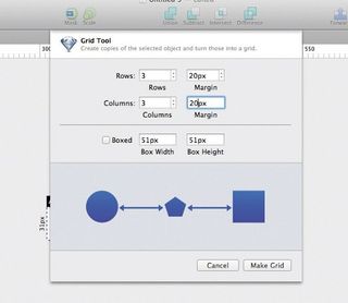
Sketch allows us to have as many artboards in our document as we like. We want nine artboards for the first icons we're going to draw. If you're anything like me, you'll want your artboards to be evenly spaced and aligned. In order to do that, let's draw one 31px square artboard and then select Arrange>Make Grid…. Set Rows and Columns to 3 and Margin to something like 20px. Hit Make Grid.
02. Simple shapes
Let's start drawing the first simple shapes to make a cross icon with slightly rounded corners. Click the shape tool in the toolbar and select the Rectangle (or just hit R) and draw a 27px by 11px box.
Get the Creative Bloq Newsletter
Daily design news, reviews, how-tos and more, as picked by the editors.
03. Enter the inspector
On the right side, the inspector for our shape opens. Set the radius to 1 and remove the fill by right-clicking and removing it. We're creating outline icons, so no fill is needed.
04. Lose some lines
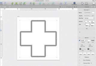
Duplicate the shape and select the rotate tool from the toolbar. Turn the copy by 90°. The cross is almost done. We just need to get rid of the overlapping lines. That's pretty easy. Select both shapes and select Union in the toolbar. Now we've created our first shape. The really neat part is that Sketch, for the most part, is non-destructive. If we select the little triangle in the layers palette on the left, we see both sub-shapes of our cross. We can still select them and change settings such as the radius at any point. It's a great and powerful tool because we can start combining shapes and fine-tune them later.
05. Build a pig
Now let's go a little further and make a more complex shape. For the money icon, I decided to go with a piggy bank instead of a wallet or coins because it's more emotional than the other two. Let's start with a simple oval shape for the body.
06. Legs and nose
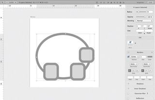
Place two rounded rectangles for legs on top of the oval and another one for the nose. Combine the three shapes.
07. Tweak the contours
To make the body shape more organic, we select the sub-shape and double-click the contour. You'll have the four points that define the shape. Anyone familiar with other vector programs will see the familiar control handles for the vectors when selecting one of those points. Click on the top and bottom points and simply move them a little to the inside of the pig.
08. Bring home the bacon
Finally, select the left one and switch the handle mode to detach both handles from each other. Move the bottom handle down slightly to give our pig a little more bacon. By pressing Ctrl+P we can toggle the pixel mode at any time and move the lines to align with the grid. This make outlines as sharp as possible on devices with lower resolutions.
09. Pig's ear
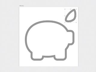
For the ear we need to draw the shape ourselves. Select the Vector tool and draw a roughly triangular shape by setting our control points. After placing every point before releasing the mouse, we can drag a little bit to set the vector controls. Play with this tool to get a feeling for its behaviour.
10. Fine tuning
Now click on the newly-drawn shape and select each of the control points to tune the outline. Union the ear onto our pig and maybe move the sub-shape to get the blending of the shapes right.
11. Eye and tail
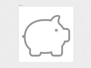
For the eye and the tail simply place a circle and another rounded rectangle on the artboard. This time we remove the border and set the fill colour to the outline colour. Because a one pixel-sized eye is a little small, make it 1.5 pixel, and the same for the tail, by setting the dimensions in the inspector. The same goes for the positioning.
12. Live preview
Another handy option when fine-tuning our shapes is to open a preview: View>Show Artboard Preview. We can crunch the pixels zoomed in and get a live preview of our changes. Last, we build our coin. That's simple. Draw a circle and subtract the part that goes into the pig, but we want the outline to be open.
13. Transform the border
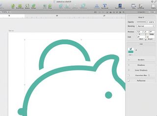
Make the border into the shape itself by navigating to Edit>Path>Vectorize Stroke and just subtract an oval. In my experience, this sometimes produces unexpected results. In this case, just drag the sub-paths out of the collection and Subtract the shapes in the logical order.
14. Export
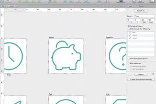
Now it's time to export our work. When clicking on the Export button for the first time, Sketch asks us if we want to create slices from our artboards. A slice is an area that can be exported. With the icons we're creating in this example, we simply hit Yes and we're done. If you build a screen design you may want to give creating slices more thought and decide what layers to export on what slice. We can use Sketch for laying out an app and export icons and other assets that overlap each other on the artboard.
15. Extra resolutions
If you need double resolution assets (or half resolution in case you designed at 2x), check the Also export as option as desired, hit Export all and then select the relevant file type to save it out as. And we're done.
Words: Andreas Dantz
This article originally appeared in net magazine issue 252.

Thank you for reading 5 articles this month* Join now for unlimited access
Enjoy your first month for just £1 / $1 / €1
*Read 5 free articles per month without a subscription

Join now for unlimited access
Try first month for just £1 / $1 / €1
The Creative Bloq team is made up of a group of design fans, and has changed and evolved since Creative Bloq began back in 2012. The current website team consists of eight full-time members of staff: Editor Georgia Coggan, Deputy Editor Rosie Hilder, Ecommerce Editor Beren Neale, Senior News Editor Daniel Piper, Editor, Digital Art and 3D Ian Dean, Tech Reviews Editor Erlingur Einarsson and Ecommerce Writer Beth Nicholls and Staff Writer Natalie Fear, as well as a roster of freelancers from around the world. The 3D World and ImagineFX magazine teams also pitch in, ensuring that content from 3D World and ImagineFX is represented on Creative Bloq.
