Adaptive Web Design author shares his accessibility quest
Aaron Gustafson discusses creating an accessible mobile web.

Aaron Gustafson, web standards and accessibility advocate and author of Adaptive Web Design, will present a keynote at Generate London on 22 September about adaptive interfaces. This will include an introduction to a battle-tested tool for planning, discussing, building and testing adaptive interfaces.
"Hiya," a voice says as Skype begins to wake and warm up. The image clears to reveal Aaron Gustafson – bearded, smiling and reclining in his chair. He starts telling his story by explaining his here and now.
"I'm probably best known for being a big advocate of progressive enhancement," he says. "I've been singing its praises since 2004 and that work has become much more relevant in the world of mobile and responsive web design... with all these devices with different configurations, capabilities and – in some cases – liabilities. Beyond that, I'm pretty involved with the Open Device Lab."
Rather modestly, Gustafson glosses over his achievements. He's a regular speaker on the web circuit, web standards and accessibility advocate at Microsoft, runs web development consultancy Easy Designs, spearheaded Web Standards Sherpa and has written a book entitled Adaptive Web Design.

Late web design starter
Casting his mind back however, Gustafson admits his love affair with computers was a slow-burner. "I wasn't a prodigy in high school. I had friends who had email accounts but that always seemed too geeky for me. I didn't take any computer science classes," he recalls.
"I first went on the web in 1995. I was an avid music fan and the first site I went to was Sony.com. All I saw was this black screen with white words that said 'Image' with square brackets in various positions. I thought: this web thing is bullshit!"
Thankfully, a Jurassic-era Mosaic browser rode to the rescue and Gustafson finally 'saw the web'. "There were lots of table layouts, marble backgrounds with gold lettering and giant Times New Roman text," he laughs.
Learning to code with book and floppy disks

"I started out doing web stuff in 1996. I was an aspiring journalist and magazine publisher back in college, and I was running a music and entertainment magazine and learned from a friend how to make a web page. I wanted to learn more, so taught myself using a book called Creating and Enhancing Netscape Web Pages by Andrew Shafran.
"It's funny to think back now... It was all hand-coding. I also had a copy of Photoshop 3 on 3.5-inch floppy disks. That's how I got into web design."
In 1999, Gustafson landed his first paying web job – working for the Bradenton Herald newspaper. "Back then," he laughs, "I was the content management system. This was way back before we had CMSes and XML was 'the future'.
"I went into the Herald at 11 o'clock at night and worked until seven in the morning, and I picked which stories went out on the site. I'd pull the stories out of Quark, drop them into Dreamweaver and use Fetch to get them out on our server."

After a few years freelancing and a few full-time jobs, Gustafson ended up working for an advertising company called Cronin & Co. "I came on as their lead web guy – I was the middleman between the design team and the web folks.
"I had taught myself PHP and MySQL and knew quite a bit about frontend development... HTML, JavaScript and CSS. Coming from a print background, I was able to bridge the gap and make sure the designers weren't designing anything the developers couldn't make and vice versa."
Working on the Web Standards Project
Beyond progressive enhancement – a sphere which we can safely say he has made his own – Gustafson is also a prominent member of the web community.
He was one of the managers of the Web Standards Project (WaSP), a grassroots group founded in 1988. At that time, Netscape and Microsoft split the browser market between themselves and produced platforms that weren't compatible.
With designers and developers fighting on two fronts, the web had become fragmented and WaSP – a pack of volunteers and visionaries from around the world – set out to heal it. They advocated open source, consistency, accessibility and portability. We've got a lot to thank them for.
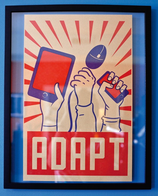
So, what attracted Gustafson to the church of web standards? Back in the early 2000s, Gustafson read an article entitled 'CSS Design: Going to Print' by Eric Meyer on A List Apart. Meyer detailed how to create and design print style sheets that would format web content for off-screen reading and printing.
"Back then, I'd become quite the master of table layouts. That was the way we built things, but it always felt weird. So I read Eric's article and thought: there's a lot more to this CSS stuff. I started to read everything I could, and I immediately understood that web standards was a way forward.
"I saw how fragile the web we were building was... If you had an error in your code and something went wrong, the entire thing could fall apart.
He recalls his time freelancing at Gartner, where there were separate style sheets for each browser, and the team used JavaScript to decide which sheet to serve. "I remember all of the heinous JavaScript we were writing and editing. It was so painful. Then, a lightbulb went on in my head – I thought, 'This web standards thing makes a lot of sense!' If we're able to establish standards, it creates a solid foundation upon which we can build better experiences."
From there, by his own admission, Gustafson was like a sponge, absorbing anything and everything he could find about web standards. Writing about the topic was followed by speaking about it, and in 2006 Gustafson joined WaSP himself.
He spent his early days working on "some pretty cool stuff" , including collaborating with the team at Internet Explorer to improve the JavaScript interpreter and to adopt the W3C's Event Model.
Quite soon Gustafson was invited to become a manager at WaSP. "After Glenda Sims, Derek Featherstone and I took over, we worked with Microsoft a bit more to improve Internet Explorer, launched Web Standards Sherpa and began our small business outreach campaign... but eventually we decided it was time to shut down WaSP."
The mission, he says, to a degree, was over too. "The web standards war – trying to get interoperable standards across browsers – was won at that point. There's still work to be done, but we're in a much better place than we were 10 or 15 years ago."
The standards war might be won but Gustafson doesn't seem like a man ready to turn off his Mac and go fishing. Rather, he explains, there are still many risks to the web's apparent wellbeing.
"The app mentality is a threat. This idea of creating walled gardens which are 'of the web', but not the web itself. They use web technologies and rely on the fundamentals of HTTP, but the resources they provide access to aren't addressable from the web. That scares me. Having indicators about where you can find content is a huge part of the web's power."
Inside the bubble
Another big fear for Gustafson is to do with equal access. "Those of us building websites are technically savvy and tend to have more income to spend, so we have more expensive devices like iPhones and high-end Androids. That leads us to have a very myopic view of what the 'mobile web' is, and what web access on a mobile device needs to be."
To underline his point, he explains he's consulting with a store that's begun selling cheap tablets. "I asked the web team if they're testing on the devices they sell. There was stunned silence on the phone. We're surrounded by high-end devices and get into the mindset that this is the mobile web. We miss the low-end devices with Android, a bad processor and a crappy screen."
This brings us to Gustafson's primary hunting ground: adaptive design. "Progressive enhancement underpins everything I do," Gustafson says. "The entire idea is that you're creating sites, content, web pages, whatever it is, without placing any technological restrictions on the users.
"With progressive enhancement, you focus on the content and the key tasks of the page, and build up the experience from there, layering on different technologies. The experience is more of a continuum from a basic one that might just be text with links, right up to a fully interactive one."
Gustafson's philosophy centres around giving different people – or more correctly, different devices – different experiences. "It's all about recognising that it's okay for people to have different experiences of an interface as long as those experiences are positive and as long as they can accomplish the tasks they set out to," he says.
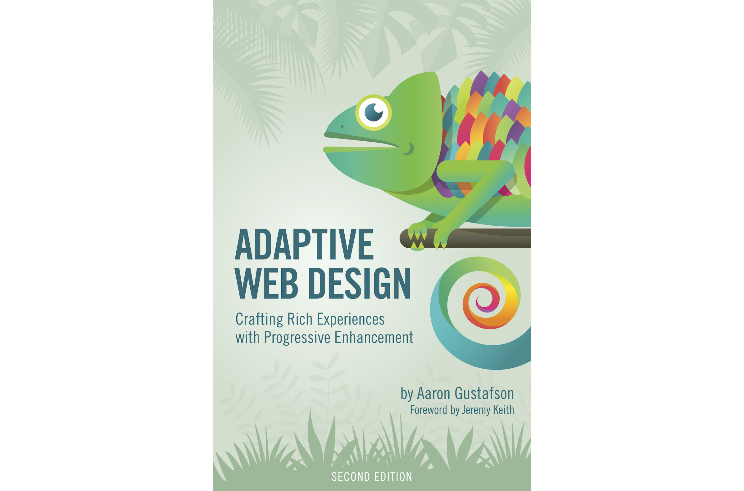
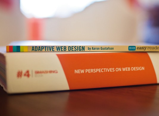
"The name of my book, Adaptive Web Design, came about because 'Progressive Enhancement' has a very sterile sound to it. We liked the idea of a web experience that could adapt to the user." Little did Gustafson know, the book version of Ethan Marcotte's 'Responsive Web Design' article would be launching at around the same time, prompting a flurry of 'adaptive versus responsive' discussions.
"Ultimately the two approaches are very much aligned," says Gustafson. "According to Ethan, responsive design is three things: media queries, fluid grids and flexible images. Those three things absolutely should be part of a page's progressive enhancement.
"That said, you can build a desktop-first responsive site and work from the largest size down to the smallest. The lowest common denominator devices don't have media query support... So, if you were to flip it the other way and practice responsive web design from a mobile-first perspective, that aligns perfectly with progressive enhancement. For me, responsive is a technique that comes under the umbrella of progressive enhancement."
Gustafson is at pains to point out that building with progressive enhancement doesn't necessarily mean sites cost more to make. "When you get into this mindset of progressive enhancement, it adds very little. You start to realise how browsers work. An underlying feature in HTML and CSS is fault tolerance... The system can cope with problems without throwing errors to the user."
In HTML and CSS, he points out, browsers ignore what they don't understand. Recognising this is key to writing HTML5 such that browsers that don't even understand HTML4 will still render the content. "The browser will expose any text inside the element, it'll just ignore the element," he explains.
"So, you have the brilliant system of fallbacks within HTML and within CSS that empower you to drive a baseline of support for older devices whilst, at the same time, being able to reach for the stars."
Photography: Chloe Wright
This article originally appeared in net magazine issue 256 (August 2014).
Aaron Gustafson will appear at Generate London in September, alongside 16 other great speakers, including Anton & Irene, Steve Fisher, Seb Lee-Delisle, Léonie Watson, Zell Liew and more. They'll cover a whole range of topics from prototyping at Netflix via UX strategy to web performance. Also, make sure to check out the workshops. If you opt for a combined workshop and conference pass, you can save £95!
You might also enjoy these interviews:

Thank you for reading 5 articles this month* Join now for unlimited access
Enjoy your first month for just £1 / $1 / €1
*Read 5 free articles per month without a subscription

Join now for unlimited access
Try first month for just £1 / $1 / €1
Get the Creative Bloq Newsletter
Daily design news, reviews, how-tos and more, as picked by the editors.
