The 10 principles of interaction design
Chad Vavra, interaction design director at The Barbarian Group, rounds up 10 key rules that make good interaction designs and designers.
I got my start as an interaction designer during the first internet bubble. Since then I've worked on interactive marketing and products for everything including finance, automotive, electronics, packaged consumer goods, pharmaceuticals and healthcare. In that time and experience I have come to know that there are a few key things that make good interaction designs and designers. Here are 10 of them.
01. Start with two
To steal a metaphor from EL Doctorow, "[Interaction Design] is like driving a car at night. You can only see as far as the headlights, but you can still get to your destination." When a task seems too big, start by picking two things, like a page and a button. Establish their relationship and interaction. Once that is done, pick something else that relates and keep going. Everything will come together thanks to the brain's natural ability to spatially model the world.
02. Prototype

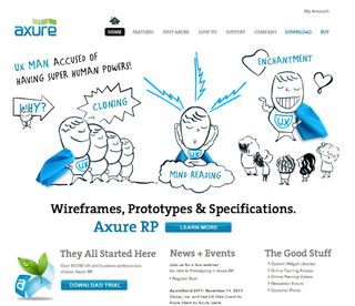
Benjamin Franklin is famously quoted as saying, "Well done is better than well said." I highly doubt he said this because Thomas Jefferson was long-winded and used too many buzzwords. The fact is, showing something working is always better than saying it will work. Wireframes speak to interactions while prototypes are interactive. Learn some code, Keynote or Powerpoint, Fireworks, or any of the many tools, like Axure RP, that allow you to prototype and start doing designs well.
03. Use patterns and prediction
Everything people do is based on a pattern they have previously experienced and the expectation they have is based on those patterns. Some interaction designers call those patterns 'mental models' and use them to build 'scenarios' to predict how users will interaction with their designs. Mental models and scenarios are esoteric ways of saying that you should predict what your users expect and plan your response accordingly.
04. Trick people

Technology tends to be very slow compared to our cognitive abilities. There are technical ways to speed up the response time of our designs, but sometimes it isn't enough. This is when I design ways to trick people. Remember that while people are predicting an expected outcome, they can be easily distracted. Use this to your advantage when technology isn't keeping up and design the unexpected. The distraction will trick them into thinking the technology is faster than it really is.
05. Tell stories
Stories include a setting, characters, dramatic tension and resolution. That's all fine and good if you're writing a novel, but thankfully interaction designers don't have to be so structured. Users need interaction designers to solve their problems, and the best way I've found is to frame the character and tension as the problem to resolve.
06. Use but don't abuse metaphors

Metaphors are everywhere in interaction design. The desktop, like your desk, is where you keep your frequently accessed files, folders hold those files, so on and so forth. These are acceptable metaphors that are based on previously learned interactions. However, there are also metaphors like the page-curl. That 3D looking, dog-eared corner suggests a layer of content below: a terrible metaphor for pages in a book bound by a spine. It's nothing more than a button and does nothing to improve interaction with technology today. Use metaphors to improve interaction, not for the sake of being cute.
Get the Creative Bloq Newsletter
Daily design news, reviews, how-tos and more, as picked by the editors.
07. Don't be a dick

Ten years ago, Flash was at odds with accessibility experts because, as a plug-in, it didn't expose its code to devices for impaired users. Today I'm shocked when I talk to young designers who don't know that the 'alt' in HTML was created specifically for those devices. Now as HTML5 and CSS3 are taking the limelight away from Flash, it is our job as interaction designers to bring accessibility issues back to the forefront. Consider the elderly, those who rely on hearing devices and screen readers for the blind when designing interaction. Ignoring them as users is inexcusable. Don't be a dick.
08. Make novices experts

No product is so simple that every user is automatically an expert. Make sure that by default your designs have a learnability that make novices into experts with every interaction.
09. Be a humble expert
People are impossibly complicated, and designing interactions for them is even more so. You have to be a student of the world if you want to be successful, and that success will make you an expert in where ever your designs end up. However, being that expert does not always make you right. Good ideas can come from anyone and anywhere. Being humble enough to accept other ideas is paramount to your success.
10. Seek your failures

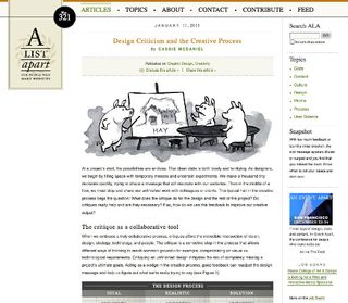
You won't learn as much from praise as you will from criticism. Criticism almost always comes from honesty. It's a lot harder to know if that is the case with praise. The best things are always hard, and the hardest part of criticism is not taking it personally. When you find a good critic you'll be able to defend yourself in lively debate with neither party taking it as an attack. You and your work will be better for it.
One last thing to remember is that rules should be broken as systems evolve but you first have to understand the rules inside and out in order to break them and come out ahead. Understanding comes with experience and experience comes with time and good mentors. If you don't have access to mentors at your company, seek out communities online, like the www.IXDA.org and read as much as you can.
Remember, interaction design is the coming together of psychological behaviour and technical development. Personally, I like to alternate between books on business innovation and management like The Cluetrain Manifesto by Rick Levine and classic design books like About Face by Alan Cooper with the occasional cognitive science book, On Intelligence by Jeff Hawkins thrown in.
Words: Chad Vavra
Chad Vavra is the director of user experience at RFI studios in New York City. His work includes websites for Michael J Fox, Citibank, Bloomberg, Lenovo, Samsung, GE, and mobile applications for ESPN and Firefox. Previously he was the interaction design director at The Barbarian Group. You can follow him at @chadvavra.
Liked this? Read these!
- The designer's guide to working from home
- Our favourite web fonts - and they don't cost a penny
- The designer's guide to special characters

Thank you for reading 5 articles this month* Join now for unlimited access
Enjoy your first month for just £1 / $1 / €1
*Read 5 free articles per month without a subscription

Join now for unlimited access
Try first month for just £1 / $1 / €1
The Creative Bloq team is made up of a group of design fans, and has changed and evolved since Creative Bloq began back in 2012. The current website team consists of eight full-time members of staff: Editor Georgia Coggan, Deputy Editor Rosie Hilder, Ecommerce Editor Beren Neale, Senior News Editor Daniel Piper, Editor, Digital Art and 3D Ian Dean, Tech Reviews Editor Erlingur Einarsson and Ecommerce Writer Beth Nicholls and Staff Writer Natalie Fear, as well as a roster of freelancers from around the world. The 3D World and ImagineFX magazine teams also pitch in, ensuring that content from 3D World and ImagineFX is represented on Creative Bloq.


