How to design better data visualizations
Graham Odds outlines principles that will help you to design more compelling data visualizations.
Over the last couple of centuries, data visualization has developed to the point where it is in everyday use across all walks of life. Many recognise it as an effective tool for both storytelling and analysis, overcoming most language and educational barriers. But why is this? How are abstract shapes and colours often able to communicate large amounts of data more effectively than a table of numbers or paragraphs of text? An understanding of human perception will not only answer this question, but will also provide clear guidance and tools for improving the design of your own visualizations.
In order to understand how we are able to interpret data visualizations so effectively, we must start by examining the basics of how we perceive and process information, in particular visual information.
System 1 vs System 2
Daniel Kahnemann, in Thinking, Fast and Slow, introduces the terms System 1 and System 2 to differentiate between the information processing that occurs in our sub-conscious and conscious minds respectively. The former encapsulates the functions that are uncontrolled, always-on and effortless, while the latter refers to those functions that are controlled but require effort to engage.
To better understand the differences between System 1 and System 2, consider Figure 1. In the photograph on the left we immediately perceive an angry man and probably associate loud noise and aggressive movement with the depicted scene. This exceedingly sophisticated interpretation of mere pixels is almost immediate, requires no effort and comes completely naturally. Contrast that with the multiplication on the right. We instantly recognise what is being asked of us and that we are able to work it out, but most will not attempt the mental arithmetic involved because of the conscious effort required. The initial reactions in both cases are pure System 1, while the mental arithmetic is an example of System 2.

We have evolved these separate systems so that our conscious minds do not become swamped with mundane processing. Our System 2 can focus on more complex comprehension and calculation tasks, with System 1 feeding System 2 with the necessary information for such tasks. In data visualization, we should seek to encode as much information and understanding as possible in a way that is perceived correctly by our System 1, which then frees up System 2 for more involved understanding and analysis of the data.
Why visualization?
Having introduced a high-level, abstract view of how we process information, we can now turn attention to the problem of how the information to be processed enters our minds in the first place, via our senses. A significant amount of the human brain is dedicated to visual processing, resulting our sight having a sharpness of perception far surpassing our other senses. As you can see from Figure 2, more information enters our minds at any given time through sight than through any of our other senses, both at the sub-conscious and conscious level. In fact, roughly 70 per cent of the body's sense receptors relate to sight.
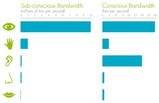
We can also see from Figure 2 that visual information, like all the sensory information, is heavily reduced between our sub-conscious and conscious. This is not because information is simply discarded, rather it is distilled by our System 1 so that our System 2 receives less, but richer information more relevant to whatever task we are currently undertaking. Sight's combination of bandwidth and processing power is why it is more suited to comprehending data sets than our other senses.
Get the Creative Bloq Newsletter
Daily design news, reviews, how-tos and more, as picked by the editors.
How we see
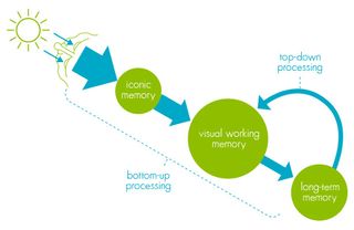
To maximise the efficacy of System 1's distillation of raw visual information, we need to delve into the details of our visual processing, presented in Figure 3. Light entering our eyes stimulates our retina, causing massively parallel impulses to be sent on to iconic memory. Iconic memory serves as a very short-term buffer and processor that ensures we maintain a coherent picture of the world at all times. Iconic memory also enriches the information passing through it by perceiving basic visual attributes such as shapes, edges, relative sizes and patches of colour. These are referred to as pre-attentive attributes.
Iconic memory's basic visual information is passed on to visual working memory, another form of short-term storage whose remarkably limited capacity gives rise to the observed 'seven, plus or minus two' limit on the number of things we can remember at any given time. In order for us to recognise objects and scenes, the pathway described so far ('bottom-up processing') converges in visual working memory with a pathway bringing items and associations retrieved from long-term memory ('top-down processing').
Pre-attentive attributes are the way forward
While the activities of visual working memory and long-term memory occur largely in System 2, the rapid, automatic and massively parallel bottom-up processing is entirely System 1. Therefore, to maximise the power and efficacy of a visualization, we should seek to encode as much information as possible in the pre-attentive features perceived during bottom-up processing.
Jacques Bertin set out basic rules for intuitive, accurate and universal encoding of data as abstract shapes in his 1967 book, Semiologie Graphique. Subsequent derivative work has further refined our understanding of these rules and our associated perceptions, and has clarified how they relate specifically to data visualization.
To explain how best to visually encode information pre-attentively, we will separately examine the two fundamental concerns that make up data: values and relationships.
Perceiving values
Figure 4 shows a selection of the pre-attentive visual attributes that can be used to encode data, as detailed by Colin Ware in Information Visualization: Perception for Design. Stephen Few states that only a handful of these are attributes that we naturally, and universally, interpret as quantitative. Of those, length and two-dimensional location are perceived more precisely than other attributes. For example, with length, we perceive a clear scale that corresponds well with objective measurement: bigger is 'more' and smaller is 'less'. By contrast, with shape, we cannot say whether a circle means more or less than a square without the introduction of an artificial scale using a key.
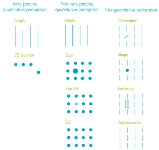
We can compare values using quantitatively perceived pre-attentive attributes, but cannot infer actual values. For example, we can easily see that one line is longer than another, and so represents a bigger value, but to perceive that a line represents a particular value (such as 100, rather than 200) we must add an explicit scale with numbers or text. Unfortunately, numbers and text are not pre-attentively perceived because they are learned symbols, requiring a degree of memory look-up. The result is that comparison of pre-attentive visual attributes falls within our System 1, but decoding of the encoded values requires light use of System 2.
Perceiving relationships
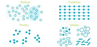
Now let us explore the perception of relationships in data, usually best presented by the structure and grouping in visualizations. In Figure 4 we can see that pre-attentive attributes that are not perceived quantitatively are effective at differentiating, i.e. grouping. However, rather than focusing on individual shapes we can use for grouping, we shall consider patterns, the pre-attentive perception of which has been captured in the Gestalt laws of perception (named after the Gestalt school of psychology where they were first observed).
Some of these laws, shown in Figure 5, clarify how we perceive groups. For example, series are usually differentiated in bar, line and scatter charts by colour or shape, i.e. the Gestalt law of similarity. Unfortunately, a true exploration of the often underappreciated subtlety and power of the Gestalt laws falls outside the scope of this article.
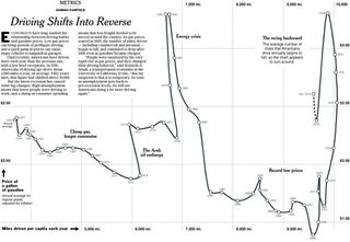
Besides grouping, another extremely powerful relationship in data visualization is ordering. The questions of 'best', 'worst' and more general rankings are common when considering data sets, and the simple act of applying appropriate ordering in a visualization ensures such insights are immediate and effortless. With a little creativity and thinking, ordering can be re-enforced even in situations where it might at first not seem possible, as in the chart shown in Figure 6 where the Gestalt law of connectedness is used to great effect.
Understanding the mechanisms of data visualization introduced here is invaluable when it comes to the detailed design of a new visualization. However, as with any user-centric design project, we should always start by understanding its intended users, its intended purpose and context before getting to the finer detail covered here so far.
In general it can be said that the intention of all visualizations falls somewhere on a spectrum between pure presentation, i.e. telling a known story in a data set, such as static charts in newspapers, and full-on exploration, i.e. analysis and examination of a not-yet-understood data set, such as interactive analytical charts on a financial research website. Research carried out by William Cleveland and Robert McGill can inform decisions about how best to represent data depending on where on the presentation-exploration spectrum we want to target. Cleveland and McGill evaluated the relative efficacy of a number of basic visual encodings of data for comparison tasks. Their results imply a clear scale for the accuracy of comparison using the evaluated techniques, depicted in Figure 6.
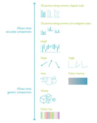
From this scale you can see that it is no coincidence that we regularly see charts bar, line and scatter charts, given that all three use the visual form supporting the most accurate comparisons. Unfortunately, many consider these chart types to be 'boring' and reach for more visually appealing chart forms such as pie charts. Cleveland and McGill's scale shows that the data encoding pie charts use, angle (and area, as a side-effect), do not support accurate comparison and, as such, are not a good choice in contexts where accurate comparison is required.
How does this help in the context of the presentation-exploration spectrum? The more analytical and exploratory your visualization needs to be, the further up Cleveland and McGill's scale you must go, since accurate comparison is probably more important. This is not to say that presentational visualizations should never use the more precise forms of visual encodings. Rather, in these situations we are able to choose the appropriate level of compromise between accuracy and visual interest required for the particular story we are trying to tell and its intended audience.
Conclusion
A thorough understanding of the mechanisms behind data visualization is a powerful tool for informing the design of appropriately effective visualizations for any context, whether it be a simple, static bar chart or something vastly more complex, multi-dimensional and interactive.
This account has covered some of the fundamentals of the science behind data visualization. There are many more subtle aspects of cognitive psychology and perception that relate to data visualization, an understanding of which will further improve your ability to analyse data and tell data-based stories using visualization.
Words: Graham Odds

Thank you for reading 5 articles this month* Join now for unlimited access
Enjoy your first month for just £1 / $1 / €1
*Read 5 free articles per month without a subscription

Join now for unlimited access
Try first month for just £1 / $1 / €1
The Creative Bloq team is made up of a group of design fans, and has changed and evolved since Creative Bloq began back in 2012. The current website team consists of eight full-time members of staff: Editor Georgia Coggan, Deputy Editor Rosie Hilder, Ecommerce Editor Beren Neale, Senior News Editor Daniel Piper, Editor, Digital Art and 3D Ian Dean, Tech Reviews Editor Erlingur Einarsson and Ecommerce Writer Beth Nicholls and Staff Writer Natalie Fear, as well as a roster of freelancers from around the world. The 3D World and ImagineFX magazine teams also pitch in, ensuring that content from 3D World and ImagineFX is represented on Creative Bloq.
