The top 10 mobile design mistakes – and how to avoid them
Dave Shea dives deep into what's wrong with the mobile web and considers how we can make it better by identifying 10 design anti-patterns.
Daily design news, reviews, how-tos and more, as picked by the editors.
You are now subscribed
Your newsletter sign-up was successful
Want to add more newsletters?
Five times a week
CreativeBloq
Your daily dose of creative inspiration: unmissable art, design and tech news, reviews, expert commentary and buying advice.

Once a week
By Design
The design newsletter from Creative Bloq, bringing you the latest news and inspiration from the worlds of graphic design, branding, typography and more.
Once a week
State of the Art
Our digital art newsletter is your go-to source for the latest news, trends, and inspiration from the worlds of art, illustration, 3D modelling, game design, animation, and beyond.
Seasonal (around events)
Brand Impact Awards
Make an impression. Sign up to learn more about this prestigious award scheme, which celebrates the best of branding.
A few years ago, I spent a few weeks driving around New Zealand's south island. Public Wi-Fi seems mostly unavailable in the South Pacific, so I relied on a prepaid SIM card for connectivity during that trip.
This shouldn't have been particularly memorable, but, after spending hours attempting hotel bookings on sites that clearly weren't optimised for my mobile phone, the experience is still fresh in my mind. I remember a lot of frustration, pinching and zooming to see minuscule form fields. I remember attempting to resubmit the form multiple times because I missed a field while zoomed in. I also remember this experience costing me more than just my time.
We make decisions as we design and build sites. Sometimes we decide in favour of approaches that meet our needs but cause grief for our end users. Those are mobile design mistakes and these practices need to die. Let's talk about them.
01. Separate mobile URLs
Whether it's m.yoursite.com, yoursite.mobi, or some other variation, having a separate URL for your mobile website is a practice that causes more harm than good.
The problem is redirection. A script on your server needs to detect whether a browser is on a desktop or a mobile device. Browsers lie.
When it detects a mobile device, the script kicks in and redirects to a separate URL with the same content optimised for mobile. Your search engine placement will be hurt by this. Read Google's article, 'Recommendations for building smartphone-optimised websites' and 'Changes in rankings of smartphone search results'.
During that redirect, any number of milliseconds will tick by as your script decides which site to direct you towards, then hands you off to the appropriate server. Longer loading times will affect your bottom line. See KISSmetrics's infographic.
Daily design news, reviews, how-tos and more, as picked by the editors.
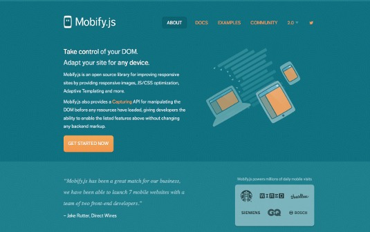
Separate URLs do enable some things that a responsive site may have a harder time accomplishing. Luke Wroblewski wrote a thoughtful article about this a few years back, titled 'Why separate mobile and desktop web pages?'. Two highlights of the article include the following points:
- Smaller pages. Separate mobile URLs can be an opportunity to optimise a site for mobile performance. Wroblewski mentions breaking down pages containing multiple UI components into smaller pages with a single component per page. Less content on each page means quicker load times over a slow connection.
- Source order. With separate mobile templates, you can reorder markup to your heart's content. Nowadays, we have other ways of reflowing source order.
You can build for smaller screens server-side with a solution like RESS or client-side with libraries like Mobify.js. Ultimately, the W3C advocates its One Web philosophy of the same content at the same URL, no matter which device is used to access it. There are increasing consequences of failing to follow that approach.
02. High-density as default
We have these new brilliantly sharp displays on our devices that make everything look amazing. So, we naturally serve the best assets we can to make our work look the best it can. Unfortunately, the increased file sizes come at a cost:
- Increased loading times. Larger files take longer to load. When you consider that mobile connections are slower than desktop connections to begin with, this problem is compounded.
- Heavier data plan usage. Every country has different contract terms, but your average data plan is far from unlimited. How many web pages could you visit before reaching your cap? Now quarter that number.
- Roaming. If a data plan's limit is a problem, try loading a few high density images while out of the country. My roaming rates are high enough that I don't turn on data when I travel unless I'm, say, completely lost in the middle of the night in a bad part of town.

Decide whether you'll provide high-resolution versions on a case by case basis. Each time you create a double-size asset, you should question whether the extra quality is worth the trade-off, or whether a lower-resolution version is really that noticeable. Even better, look for places where you can save an image in vector format, or use ultra-high compression like the Retina Revolution technique.
03. Doorslams
I'm certain you'll be familiar with the effects of a 'doorslam'. It most often happens like this: a user pulls out their phone to search for a specific term. They tap through one of the top results. Instead of seeing the information they hoped for, they're hit with a full-screen ad for a mobile app they don't care about. Everybody hates these. Why do they persist?
This is a pretty transparent example of serving business interests over users'. The business goal is getting the app on as many phones as possible. Who cares if it comes at the expense of day-to-day interaction with the site?
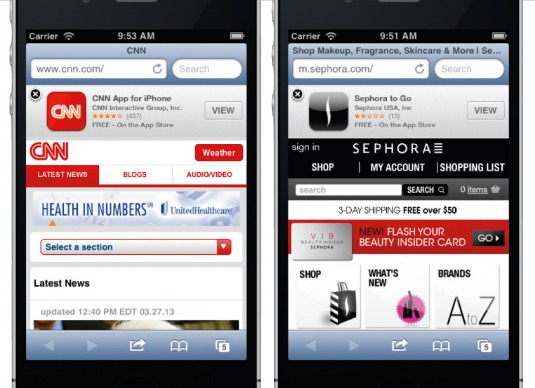
However unintentionally, these ads send the message that you're not confident in the experience of your mobile site. Unfortunately, we're not always in the room when the decision is made. If you're forced to implement a doorslam-like ad, iOS Smart App Banners are the least intrusive way of doing it.
04. Poor touch targets
Fingers are much less precise than mouse pointers, so they need bigger targets.

The common recommendation for minimum size is 44px square, but that number doesn't consider screen density. Mobile pixel count is all over the place. On the low end, most smartphones start at about 150dpi, and on the high end, they're pushing past the 400dpi mark. Your 44px square measures 7.4mm on the low-DPI screen, but a tiny 2.5mm on the higher density screen. Instead of pixels, we should be using physical dimensions to measure our targets. Adult finger sizes range between 12mm and 20mm wide, but you're able to tap targets smaller than your finger. Size and accuracy go hand in hand. The size you choose depends on how important it is to prevent errors in your users' targeting. 5mm is around the size of each key on your phone's keyboard. How often do you to rely on auto-correct to fix typing mistakes?
With a three per cent error rate, 5mm seems to be the smallest size we can safely use, but error rates drop to 0.5 per cent when you scale up to 9mm. That's probably a safer minimum for critical targets. Make sure you allow for at least 2mm between each target, especially at the smaller screen sizes. Without that minimum gap, it's far easier to accidentally trigger the wrong target.
Also consider reducing the number of targets. The size of each menu item in the first example is just a side effect of a bigger problem: trying to shove too much into a limited space. If the designers had recategorised and chosen to show fewer options, the remaining targets would have more room to breathe, and the simplified layout would reduce confusion on the part of the end user.
05. Following WIMP conventions
The WIMP (Windows, Icons, Menus, Pointer) user interface paradigm that Xerox pioneered decades ago has served us well, but mobile devices are really exposing its cracks.
We can't continue leaning on these tried and true UI conventions that worked so well in the past. New classes of devices demand a rethink of the basics.
Multiple windows don't make sense on a small screen. We instead use tabs as an organisational tool to present views of different content. Modern devices offer multi-tasking, but the most popular operating systems remove the need to manage windows by only ever presenting a single one at any given time.
Classical pointers were on-screen symbols to represent the movement of physical devices we could control, but touchscreens have removed the need for actual devices; we have become the pointers.
Mouse events have equivalents on touchscreens, but the relationships are often imprecise. For example, tapping is mostly equivalent to clicking, but double-tapping is often reserved for zooming in or out instead of opening an application. You can just forget about :hover events completely.
Some upcoming CSS4 media queries will allow us to more precisely target a wider range of devices.
@media (hover)As you may expect, the hover media query will apply a relevant style only if the device is capable of a hover event:
@media (pointer:fine)
@media (pointer:coarse)
@media (pointer:none)
The pointer query provides more information, as you're able to distinguish between a precise pointer like a mouse, a coarse pointer like a finger, or no pointer at all like a screenreader user.
Screen sizes and input devices necessarily influence another convention from the WIMP world: the menu. Web designer Brad Frost did a great job documenting some of the more common navigation patterns and how they work across screen sizes.But it doesn't end at making sure the UI renders well.
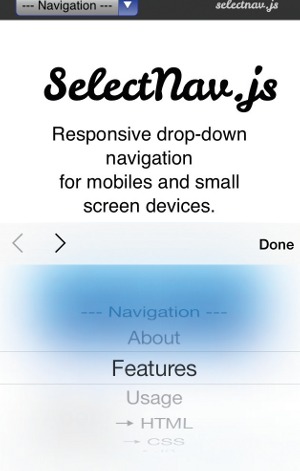
An implementation of a menu may have to adapt to screen real estate and input device. A great example of this is the select menu pattern, which is a popular way of shrinking down a menu with many options into a more compact space. The problem stems from how some mobile operating systems implement the select control as a half-screen overlay.
Even if the item a user eventually chooses was the first one they saw, many will scroll through the entire list before making a selection. The iOS select design makes this harder to accomplish.
This is only the tip of the iceberg. Our inputs and form factors are only getting more diverse, so we have to continuously rethink our existing user interface conventions.
06. Mystery meat navigation
Not a new term in our industry, 'mystery meat navigation' was coined to categorise a usability nightmare that was quite popular in the early days of the web: image-heavy navigation without textual labels to describe each option.
Somehow we seem to be OK with unlabelled navigation icons again. A group of five buttons with no descriptive text to tell you what they do? When did that start making sense?
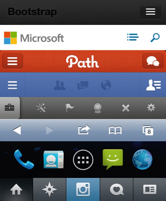
With so little room on your typical mobile screen for the icon bar, cramming in text labels often feels a step too far, and with mobile operating systems themselves offering many native examples of this type of navigation treatment, it's easy to follow their example. And while we're talking about unlabelled interactions, gestures count too. If your users need to be trained to perform a gesture, the chances of them finding it on their own are very slim.

Who hasn't seen the YouTube videos of babies using iPads? They demonstrate how discoverable simple, natural gestures with obvious target areas can be. Tapping, swiping, and pinch to zoom are so intuitive that no instruction manual is needed. You can easily understand an interface that implements those well. However, even the more common gestures can benefit from good labelling. Apple's first implementation of the iOS 7 lock screen accompanied the 'Slide to Unlock' message with an upward-pointing arrow at the bottom of the screen, which confused users into assuming a slide up would unlock when in fact a left-to-right swipe is required. This was ultimately changed for the final release of the operating system.
'Why did that happen?' is a great symptom of mystery meat. When users experience a behaviour that they can't explain, it's doubtful they understand what caused it or how they can duplicate it. Therefore, it's unlikely to be a behaviour that they will use.
So how can we change this for the better? Visual cues are essential. If a user is expected to perform an action, there should be a clear visual indicator that the action exists, as well as clear hints about what sort of reaction users can expect once that action is then performed.
07. Unoptimised assets
The number of individual HTTP requests is an important factor of a site's performance. Each one requires a separate connection. Too many open connections bogs down loading times. To address this:
- CSS files - the fewer the better. If we split our CSS across many individual files to aid management, that creates a performance hit at render time. There's nothing wrong relying on many CSS files in your workflow, but use tools like Compass and LESS to compile them at build time.
- Images - CSS Sprites are the short answer here. Combine multiple images into a single one, and use strategic background position values to mask out the one you're after later. Sprites are becoming a less valuable tool over time, so they're best used for common interface elements and the pieces of your site that won't change. But CSS effects are increasingly powerful, and graphic styling tastes have changed to require fewer effects. The need for UI imagery is rapidly reducing. If you can, use CSS styling.
- Vector graphics - SVG is great, but it doesn't sprite well. Web Fonts offer us a more performant way of encapsulating multiple vector shapes in a single file. They're more limited with only single colour rendering, but that makes them well-suited to UI imagery. The problem is creation.
Two tools I've found effective:
- IcoMoon is a web app for importing SVG shapes, assigning characters to glyphs, and saving as a web font with cross-browser compatible files and CSS syntax.
- Font Custom continuously polls a directory of vector images and rebuilds the contents of the directory to a single output web font when it detects changes.
Since web fonts are treated the same way as type on your site, you can use any CSS type effects, such as text-shadow.
08. 24-bit PNGs
Strangely, we seem to be increasingly comfortable with uploading files we've saved from Photoshop directly onto our servers without further optimisation. In the case of our transparent PNGs, this is particularly disastrous.
The problem was highlighted a few months ago. This single-page site weighed in at a whopping 85.4MB. A lot of this was due to unoptimised PNG-24 images.
Curious to see what sort of savings were possible, I ran one of its images (1468KB original file size) through my PNG optimisation flow. First, I halved the image size without much quality loss by dropping the colour level to 64 bit using an app called ImageAlpha. Then, I passed it through another app called ImageOptim, which throws a handful of optimisation techniques at any image you give it. As a result, it shaved off a further 10 per cent from the overall file size.

I got it down to 472KB, which is a third of the original size. If I'm willing to play with the newer WebP image format, I can shrink it even further to 316KB. WebP requires detection for support and serving a fallback image for browsers that haven't implemented it, but if download speeds are my priority the extra work might just be worth it.
The resulting images were nearly identical, especially when viewed in context as an element of a page I quickly scanned. Not every image on the web needs to be saved out at maximum quality. Most can get away with significantly less than our modern defaults. Keep in mind that our users will not scrutinise our images the way we do, and likely won't even notice the lower quality.
09. 600px email
When we talk about how we design, we often overlook the inevitable emails that our sites and apps generate. It's an unglamorous subject. HTML emails require a lot of ugly coding, and most of us in the field prefer plain text. But we often have to create them. If we're going to spend time making sure our sites are a pleasure to use, surely the emails that we send out deserve the same treatment?
A common standard for universal inbox support is a 600 pixel wide layout. That number comes from a time when only desktop inboxes were considered. But mobile screens are often smaller than 600 pixels wide, so emails that use that number start zoomed out so the contents fit the screen. The resulting tiny text forces a user to zoom in before they can see what the email is about.
Responsive email templates are, in fact, possible. Like all things HTML email, they're not at all easy; arcane hacks and workarounds should be expected.
Luckily, others have done much of the hard work for us. There are responsive email templates out there we can use as starting points. One of the best I've seen comes from Phil Wareham, his responsive template is a masterpiece of deep knowledge of the inner workings of email clients.
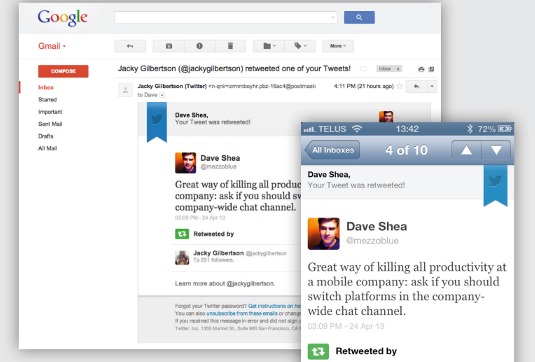
Because reading a desktop-optimised email on a mobile device is such an awful experience, and because there are useful starting points for responsive emails, we should be using these in our work when possible.
Speaking of email, another common mistake to be aware of is missing email summary text. Many clients attempt to show you the first couple of lines as context instead of just the email's subject. If the first few elements in your email's DOM are images or other non-textual markup, the potential for garbage appearing in your summaries is high. As a case in point, the iOS Mail inbox.
This is why those in the know recommend a textual summary of the email's contents somewhere near the top, before your content. (You can always hide it with display:none ).
10. Ignoring the fold
As an industry, we've spent a lot of time convincing ourselves the fold is dead. The debate is over. People know how to scroll. Right?
Well, there's one place where it could still matter: actions connected to revenue. Any key business conversion tool like 'Add to Cart buttons' or 'Get a Quote' links should probably be visible above the fold. Compare these two product pages:
At Mobify, we've experimented with button position, and we've seen conversions increase when it becomes more obvious. You won't lose truly motivated customers without a visible 'Cart' button, but it may just be enough to lose any would-be customers that only have a passing interest.
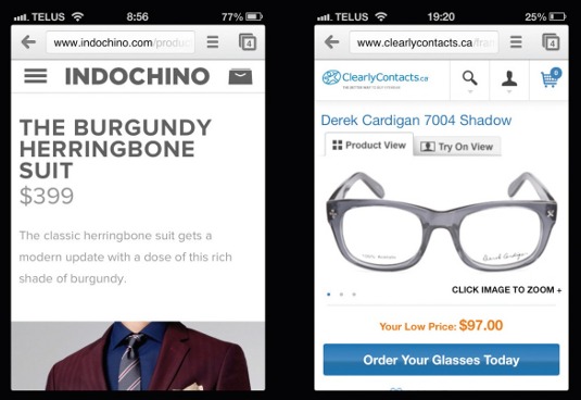
If you can take a given page and distill its purpose down to a single action you'd like a user to take, their ability to do so without scrolling is likely to perform better.
Conclusion
I introduced this article with a personal account of a bad mobile experience. It finishes with a cautionary tale. After my frustrating session of form errors, I finally managed to book my room and receive a confirmation email. When I arrived at the hotel, I discovered they weren't actually expecting me.
Through all of the form re-submissions as I attempted to fill out the booking form, I must have missed the date fields getting reset along the way. Consequently, my stay was accidentally booked for the night I made the booking, not the night I intended to arrive. I'm still owed a hundred bucks because of a bad mobile experience.
Let's stop racking up the debt. Hopefully, by reading this feature, it'll help you to identify mobile design anti-patterns in your own work projects and thereby contribute to improve the mobile web experience for all.
Words: Dave Shea
Dave Shea is a Canadian web designer and co-author of 'The Zen of CSS Design: Visual Enlightenment for the Web'. This article originally appeared in net magazine issue 250.

The Creative Bloq team is made up of a group of art and design enthusiasts, and has changed and evolved since Creative Bloq began back in 2012. The current website team consists of eight full-time members of staff: Editor Georgia Coggan, Deputy Editor Rosie Hilder, Ecommerce Editor Beren Neale, Senior News Editor Daniel Piper, Editor, Digital Art and 3D Ian Dean, Tech Reviews Editor Erlingur Einarsson, Ecommerce Writer Beth Nicholls and Staff Writer Natalie Fear, as well as a roster of freelancers from around the world. The ImagineFX magazine team also pitch in, ensuring that content from leading digital art publication ImagineFX is represented on Creative Bloq.
