Designers react to the new Guinness logo
See how the iconic Guinness harp has been updated and hear the verdict from designers.

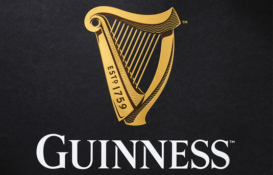
Beer brands don't come more recognisable than the Guinness harp. So when it came to updating the black stuff's logo design, London firm Design Bridge had to tread a fine line between creating something new and staying true to the established look. But by moving away from the trend of flat designs they've created a contemporary logo that reflects the brand's history.
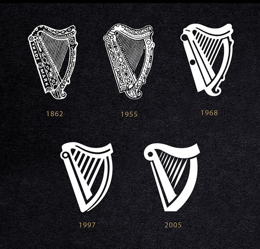
Revealed last week, the new logo is the first redesign for the golden harp in 10 years. Faced with the challenge to "breathe life back into the harp and let it sing once again," Design Bridge used the heritage of Guinness to tell the brand's story.

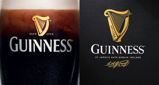
After spending time with harp makers to ensure the design remained authentic, illustrator Gerry Barney was enlisted to bring the logo to life. Hand-drawn typography taking its cues from the first Guinness print adverts in the 1920s completes the redesign.
Craftsmanship is at the heart of this redesign and it shows in the subtle details that can be found in the harp. While the 2005 design wouldn't look out of place as an app icon, the Design Bridge creation channels the stamped lettering found in the ironwork at the Guinness Storehouse, giving it a "depth, tactility and drama."

All of this hard work and research appears to have paid off as designers seem to love the redesign. No easy feat, considering that the recently unveiled Tokyo Olympics logo came in for a rough reception.
A stunning new design for the Guinness harp https://t.co/NC4J2Vq03j #Branding #GraphicDesign pic.twitter.com/FIIYVRsuS1April 23, 2016
New Guinness logo is utterly beautiful. Shame it wasn’t designed by an Irish studio though. pic.twitter.com/UrUQ6tWMgtApril 28, 2016
New Guinness #logo back to its craft roots @Design_Week https://t.co/mm57tFEKrv new harp is miles better #design pic.twitter.com/Q2C27iXriIApril 22, 2016
Absolutely love the newly revised Guinness logo. https://t.co/ancjrVqhgy#designinspiration #logodesignMay 2, 2016
Described by the team at Design Bridge as "a labour of love and a shining example of our creative philosophy," this redesign leads by example when it comes to creating a new look for an established brand.
Get the Creative Bloq Newsletter
Daily design news, reviews, how-tos and more, as picked by the editors.

Thank you for reading 5 articles this month* Join now for unlimited access
Enjoy your first month for just £1 / $1 / €1
*Read 5 free articles per month without a subscription

Join now for unlimited access
Try first month for just £1 / $1 / €1

Dom Carter is a freelance writer who specialises in art and design. Formerly a staff writer for Creative Bloq, his work has also appeared on Creative Boom and in the pages of ImagineFX, Computer Arts, 3D World, and .net. He has been a D&AD New Blood judge, and has a particular interest in picture books.
