The biggest mistakes logo designers make
The art of logo design is littered with pitfalls. We reveal the biggest mistakes to avoid, in order to guide your design to logo glory.
Whether you’re a logo design novice with just a handful of clients or a creative director, there are certain pitfalls every designer should avoid when creating logos. And with so many now socially sharing and scrutinising your work, designers must be extra vigilant to avoid falling into these traps. Here we've provided a run-down of the most common 10 to avoid...
- You'll find all our logo design articles here
01. Slavishly following trends
Choosing to design your logo based on current trends is likely to leave your logo looking dated and out-of-touch as soon as the trend dies out, not to mention making you look slightly amateur.
Rather than choose the popular flavour of the month, think about what's more likely to have longevity for your brand. For example, the current logo of the BBC (shown below) has been around since 1997, yet still has not become dated.
02. Overdoing colour
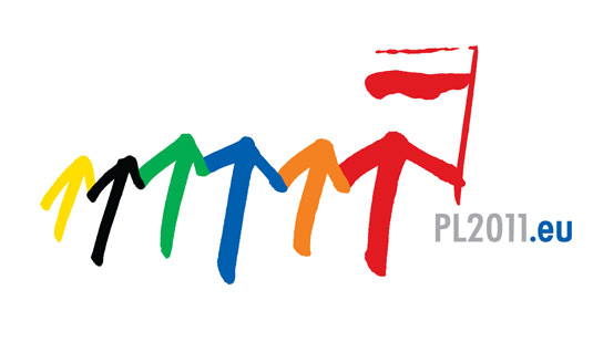
Overdoing colours will not only make your design busy and confusing but also make it difficult to translate into monotone, which you’re likely to need at some point. Try to keep colours under a maximum of four and if your client requests lots of colours, try to use logical combinations and remember colour psychology.
03. Failing to make the logo transferable

Keep in mind that your logo will need to be transferrable across a range of different mediums. Make sure that the colours, size and overall design will work on printed materials such as signs and T-shirts, as well as across various technology touchpoints such as websites and mobile sites.
04. Poor font choice
Deciding which font to use is hugely important and a significant factor in shaping your brand identity. If designing your own font proves to be too tasking, ensure that the off-the shelf version is first of all appropriate for logo use and secondly, appropriate for your brand. Remember, fonts are also subjective to trends so try and avoid the logo font-of-the-moment, which is likely to leave your logo looking tired in a matter of a few years. Also try to avoid choosing logos that look similar to Microsoft Word Art.
05. Copying other logos
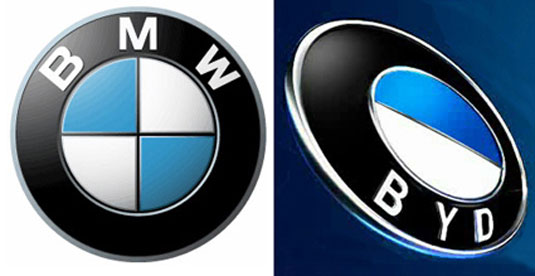
During the early stages of creating your logo, be very careful of copying, either deliberately or subconsciously, other brands. Having a logo too similar to someone else, especially a competitor, will both devalue your design and make you forgettable to your audience. The purpose of a logo is to make your brand stand out in the crowd, so differentiate yourself from the rest.
06. Using stock art
If you're thinking about turning to a stock image site to form the backbone of your logo, don't! The purpose is to create a logo that’s unique to a brand, which you’re unlikely to do if you’re using an image that’s done the rounds. Also, using stock images is more than likely to leave you looking cheap.
07. Too many fonts

A major, and surprisingly common, mistake is using too many fonts and font styles. Along with making the design look overly busy, the use of multiple fonts can also distort your brand identity and make it difficult for the audience to understand the message you’re trying to convey.
08. Overdoing special effects

Similarly to overdoing colour or excessive numbers of fonts, using special effects is also likely to confuse your design. Additionally, consider again how your logo translates to greyscale and other mediums. It’s unlikely that using these techniques will leave your logo standing out from the crowd.
09. Being too abstract

Whilst you don’t want your logo to be so bland and ordinary that it’s easily forgettable, you also don’t want to be so left-field that it both confuses your audience and misrepresents your organisation. Aim to strike a personal balance that will grab attention for all the right reasons.
10. Using pixelated images
Using pixelated images is likely to lead to headaches. Design software that use raster images won’t allow you to enlarge your image without it becoming pixelated, nor will you be able to post it on a web background colour without first changing it to a .PNG file. Instead opt for vector graphics that maintain consistency across varying mediums.
Words: Natalie Brandweiner
Natalie Brandweiner is an online journalist for MyCustomer.com, covering social media and marketing, and has a keen interest in design.
Liked this? Read these!
- Download the best free fonts
- Adobe Photoshop CS6 hands-on review
- Free Photoshop brushes every creative must have!
Have you seen a logo design gone hideously wrong? Tell us about it in the comments!

Thank you for reading 5 articles this month* Join now for unlimited access
Enjoy your first month for just £1 / $1 / €1
*Read 5 free articles per month without a subscription

Join now for unlimited access
Try first month for just £1 / $1 / €1
Get the Creative Bloq Newsletter
Daily design news, reviews, how-tos and more, as picked by the editors.

The Creative Bloq team is made up of a group of design fans, and has changed and evolved since Creative Bloq began back in 2012. The current website team consists of eight full-time members of staff: Editor Georgia Coggan, Deputy Editor Rosie Hilder, Ecommerce Editor Beren Neale, Senior News Editor Daniel Piper, Editor, Digital Art and 3D Ian Dean, Tech Reviews Editor Erlingur Einarsson, Ecommerce Writer Beth Nicholls and Staff Writer Natalie Fear, as well as a roster of freelancers from around the world. The ImagineFX magazine team also pitch in, ensuring that content from leading digital art publication ImagineFX is represented on Creative Bloq.
