Heinz cooks up a new logo with Kraft Foods
Two of the world's most recognisable food companies merge and create a new logo.
Heinz and Kraft Foods are two of the biggest food processing groups in the world. Chances are we've all eaten a can of beans distributed by one of these giant companies.

July saw the merging of Kraft Foods and Heinz, creating the logically named Kraft Heinz Company. Now the fifth largest food and beverage business in the world, the Kraft Heinz Company packs an impressive portfolio of household names.
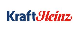
As far as consumers are concerned, one of the most notable differences will be the introduction of the Kraft Heinz logo.

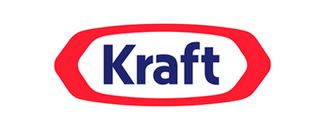
Taking each brand name out of their iconic borders and squishing them together with the help of a tapered letter 't', the logo reflects the merging of the two food groups. With the help of bold colouring, shoppers are reassured that they're still buying the same foods they know and love.
Liked this? Read these!

Thank you for reading 5 articles this month* Join now for unlimited access
Enjoy your first month for just £1 / $1 / €1
*Read 5 free articles per month without a subscription

Join now for unlimited access
Try first month for just £1 / $1 / €1
Get the Creative Bloq Newsletter
Daily design news, reviews, how-tos and more, as picked by the editors.
Dom Carter is a freelance writer who specialises in art and design. Formerly a staff writer for Creative Bloq, his work has also appeared on Creative Boom and in the pages of ImagineFX, Computer Arts, 3D World, and .net. He has been a D&AD New Blood judge, and has a particular interest in picture books.


