5 key logo trends and what you can learn from them
Niall O'Loughlin of 99designs shares some important lessons from the history of logo design.
You'd be forgiven for thinking that logo design and branding were relatively modern concepts. But in reality, they have been around in one form or another for thousands of years. Rather than going that far back in time though, in this article I'll focus on popular brands in the modern era.
QUIZ: Guess the logo – can you identify these brands?
Logos are one of the key principles of branding and need to be memorable and in-line with what a company stands for. As we go on this journey, it will become apparent that simplicity has more or less been 'in fashion' for more than 80 years.
Some organisations stumbled across the perfect logo for their brand and barely changed it while others found the need to make alterations to change with the tastes of their target audiences.
01. The beginning of simplicity (1930s-1940s)
The introduction of colour printing and the rise of the advertising industry saw an explosion in logo design as companies allowed their imaginations to run wild.
It was common for brands to freely utilise heraldic and agricultural symbols to advertise any product.
However, as the lifestyles of the general public became more complex, it was necessary for brands to embrace simpler designs in order to make their logos more recognisable in a faster moving world.
Get the Creative Bloq Newsletter
Daily design news, reviews, how-tos and more, as picked by the editors.
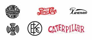
Graphic design giants such as Milton Glaser and Paul Rand were responsible for revolutionising the concept of simple logo design and these principles are still used today.
Major brands such as Caterpillar, Kodak, IBM, Pepsi and VW all changed their logos with serif face font becoming the most popular choice.
The new logos were not 'better' than their predecessors. Indeed, in pure art terms, the early logos were probably superior. But the simpler designs allowed brands to become better known and that is of course the whole point of logo design.
02. Enter sans serif (1950s-1960s)
A number of large brands decided that serif was passé and marketed themselves as being more 'futuristic' by embracing sans serif in their logo designs.
In the 1950s, Lego and Shell were among the first to transition to a simpler sans serif logo and were followed in the 1960s by Pepsi, Chevy, Wal-Mart, Caterpillar and others.
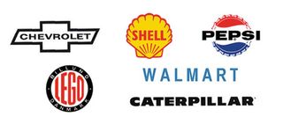
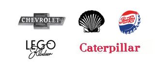
As was the case with the first change, sans serif logos were in no way superior to their serif counterparts but they were marketed as such.
In advertising, it is all about perception and these brands made it seem as if serif design was out of date.
As a result, brands became terrified of being labelled 'behind the times' and followed suit even in cases when their existing logo was absolutely fit for purpose.
03. Negative space (1970s)
In art, negative space is the space between and around the spaces of the object. It varies around lower case letters in order to allow the eye to distinguish every word as a distinctive item.
Once again, Shell was one of the first companies to make the change in 1971 with the creation of radiant beams while Kodak used negative space to create flashes of light.
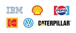
The following year saw the unveiling of the now famous IBM logo which was created by Paul Rand. Pepsi joined the party in 1973 with its distinctive circular frame coupled with a negative space border.
In 1978, VW changed its logo and placed it inside negative space. Unlike before, Caterpillar was slow to join this particular trend and only added negative space to its logo design in 1989.
Yet again, the changes in design were prompted by a desire to 'fit in', as opposed to the alterations being necessary.
04. 3D design (early 2000s)
The rapid improvements in technology ensured that logos needed to be flexible and adaptable to any kind of media while still being simple and built to last.
3D design quickly became popular as designers saw its ability to really make a logo stand out.
Huge brand names such as Ford, Chevrolet, Pepsi and Chevron all made the switch to a 3D logo design from 2000 to 2005.
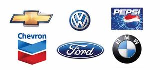
While it was a good idea in principle; in practice, the logos created during this age fail to inspire.
This is mainly due to the lack of mastery in the use of technology which made the logos look rather tacky.
Nonetheless, as it was the new 'style' of the time, major brands followed one another for fear of being left behind.
05. The modern era
Unlike previous eras, we are no longer in an age of a defined logo design 'style'.
For example, Pepsi has both flat design and 3D in its logo, Kodak is remaining faithful to the sans serif style of the 1950s and 1960s, Wal-Mart is happy to utilise a 2D element while IBM is delighted with its iconic negative space logo from the '70s.
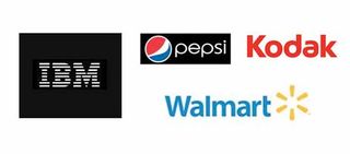
With the growing need for brand recognition in the face of tough competition, it seems as if major brands are simply striving for the best possible design, regardless of the 'style'.
The end of logo trends?
After decades of innovation and some would say needless changes, it appears as if we have finally arrived in a time where artistic merit is all that matters.
This is a positive thing and hopefully brands will remember this the next time a 'hot trend' rears its head.
Words: Niall O'Loughlin
Niall O'Loughlin is marketing manager for 99designs, an online graphic design marketplace that enables customers to quickly source graphic design work.
Like this? Read these!
- The story behind the McDonald's logo
- Hands-on review: Adobe Illustrator CC
- Photoshop tips, tricks and fixes to try today

Thank you for reading 5 articles this month* Join now for unlimited access
Enjoy your first month for just £1 / $1 / €1
*Read 5 free articles per month without a subscription

Join now for unlimited access
Try first month for just £1 / $1 / €1
The Creative Bloq team is made up of a group of design fans, and has changed and evolved since Creative Bloq began back in 2012. The current website team consists of eight full-time members of staff: Editor Georgia Coggan, Deputy Editor Rosie Hilder, Ecommerce Editor Beren Neale, Senior News Editor Daniel Piper, Editor, Digital Art and 3D Ian Dean, Tech Reviews Editor Erlingur Einarsson and Ecommerce Writer Beth Nicholls and Staff Writer Natalie Fear, as well as a roster of freelancers from around the world. The 3D World and ImagineFX magazine teams also pitch in, ensuring that content from 3D World and ImagineFX is represented on Creative Bloq.
