DKNY teases a fresh direction with new logo
New York-based fashion house DKNY previews its rebrand with a sophisticated new logo.

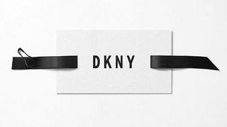
Ahead of the launch of their spring 2016 collection, DKNY has teased fashionistas by revealing their new logo on Instagram. Created by the founders of Public School, Dao-Yi Chow and Maxwell Osborne, the new wordmark suggests the fashion house will move in a more mature direction.
Discover the biggest logo designs of 2015 so far
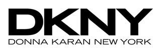
The designers explain that their rebrand will be targeting women, not girls, which is reflected in the subdued typeface. Gone is the crowded blocky font and the Donna Karan New York sub header, replaced by a more elegant Franklin Gothic that has room to breathe.

This sophisticated shift contrasts DKNY's previous trajectory, whose women had been getting younger and younger. The move forward is suggeted by the blocks of threaded ribbon bookending the logo, which are meant to evoke road markings.
Osborne says they wanted DKNY to be 'its own icon', hence the new logo's 'bold American font.' We'll have to wait until Wednesday to see how this extends to the clothes themselves.
Liked this? Read these!
- Download the best free fonts
- 13 fantastic logo fonts for 2015
- 5 key logo trends and what you can learn from them
Get the Creative Bloq Newsletter
Daily design news, reviews, how-tos and more, as picked by the editors.

Thank you for reading 5 articles this month* Join now for unlimited access
Enjoy your first month for just £1 / $1 / €1
*Read 5 free articles per month without a subscription

Join now for unlimited access
Try first month for just £1 / $1 / €1
Dom Carter is a freelance writer who specialises in art and design. Formerly a staff writer for Creative Bloq, his work has also appeared on Creative Boom and in the pages of ImagineFX, Computer Arts, 3D World, and .net. He has been a D&AD New Blood judge, and has a particular interest in picture books.
