Create a responsive wireframe
New developments make responsive wireframes a breeze. Chris Da Sie builds a single-page example showcasing the power of open source framework Wirefy.
- Knowledge needed: HTML, CSS, JavaScript
- Requires: A web browser and text editor
- Project Time: 1-2 hours
- Support file 1
This article first appeared in issue 233 of .net magazine.
If you’ve worked with responsive design some time in the last two years, you will have probably heard this comment from clients at least once: “I don’t get it. You’re going to build two sites”. The problem with discussing flow, structure and hierarchy across various screens and technologies is that our clients are still trying to catch up to these ideas.
We’ve tried several approaches to help them understand, such as paper sketches of the site at different sizes and using fully designed frameworks. But both of these have distracted the client from two important elements, content and user experience. Until recently, we haven’t been able to rapidly mock up functioning responsive wireframes to demonstrate how users will navigate the site and how the content will be viewed in context. This tutorial will demonstrate just that.
What is Wirefy?
We will be using an open source framework called Wirefy. This is a collection of HTML, CSS and JavaScript libraries that can be used for any project to help you define the user experience and user flow of your next web project. Unlike many of the other frameworks available, this tool is completely style agnostic so that clients don’t get hung up on colours, fonts and other design elements. It is meant to ease any confusion about usability of suggested functionality across differing screen sizes or operating systems. It will help us structure a strong foundation for how the content will be presented as you move along the workflow.
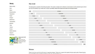
Wirefy isn’t a one-solution framework. Built on a 16-column grid using percentages as the base size, you can reuse the same elements over and over again in different ways. Creating a responsive wireframe shouldn’t be labour intensive; it should be quick and just work. The objective is to solve communication problems faster. With multiple options for many of the standard user interface components, you’ll be able to create the solution you need.
01. Get started
To begin, you’ll need to download the code. The CSS folder has two files; base.css and layout.css. We will be using layout.css to structure our layout. The base.css contains all the standard layout options such as the grid, menus, slideshows and form elements.
Start by opening up our index.html file. You’ll find some basic information such as having a header with a text logo, simple navigation, a main container with a section element and finally a footer element. Let’s organise and create our header information first. We want links for a blog and news, case studies, about and contact areas. We’re going to use the toggle menu approach for navigation. To this, we’ll add an empty div and give it a class menu-button. This will be hidden in larger screen sizes and be filled with an icon in smaller ones. For the main navigation, we want to distinguish our top nav against any secondary nav, so for each list element add a class of top-level. To add separation between our menu and the rest of the page we’ll add two wrapper divs, giving the first a class of header_wrapper and the second a class of inner.
<header role="banner">
<div class="header_wrapper">
<div class="inner">
<div class="logo">
<h1><a href="#top">Wirefy</a></h1>
</div>
<div class='menu-button'></div>
<nav>
<ul id="nav" role="navigation">
<li class="top-level wisdom"><a href="#blog">Blog</a></li>
<li class="top-level"><a href="#casestudies">Case Studies</a></li>
<li class="top-level contact"><a href="#contact">Contact</a></li>
<li class="top-level dojo"><a href="#about">About</a></li>
</ul>
</nav>
</div>
</div>
</header>
We put the contact link before the about link. We did this so that later we can swap them by floating them right and left around the logo. Usually one-page sites include an area to summarise or introduce the product or service with an image or colour behind it. We’re going to be no different.
There’s a bit more code we need to add to the header element, but we don’t want it wrapped in the header wrappers. So we’ll add a section element containing some generic intro code after our last closing div but before our header element ends.
Get the Creative Bloq Newsletter
Daily design news, reviews, how-tos and more, as picked by the editors.
<section class="intro">
<h2>We work flexibly with clients to fulfil their design needs.</h2>
<p>…</p>
</section>
02. Moving on
Now it’s time for our content. We know we want to wrap it all in a container div and then a content div. We’ll also include four main section elements to correspond with each navigation label we’ve already added, and give each an ID that matches our navigation links. These IDs will be used as our anchor tags for scrolling.
This is a good approach to have for a single page design, because even with JavaScript turned off, the navigation action will work. It’ll jump to the section rather than smoothly scrolling to it. It’s good practice to include a clearfix here as well for each section. We’ll include a class of sixteen and columns.
<div role="main" class="content clearfix">
<section class="sixteen columns clearfix" id="blog"></section>
<section class="sixteen columns clearfix" id="casestudies"></section>
<section class="sixteen columns clearfix" id="about"></section>
<section class="sixteen columns clearfix" id="contact"></section>
</div>
We’ve now built our basic site structure. Before we start looking at what each of these sections is going to contain, let’s finish off our site with a simple footer area. Because we don’t have a large amount of information to navigate through, we’ll keep our footer as basic as possible with some navigation and the site copyright info.
</div><!-- content -->
<footer role="contentinfo">
<ul>
<li><a href="#top">Top</a></li>
<li><a href="#">Twitter</a></li>
<li><a href="#">Linkedin</a></li>
<li><a href="#">Privacy Statement</a></li>
</ul>
<p class="copyright">©2012 .Net Magazine Example Site. All Rights Reserved.</p>
</footer>
</div><!-- container -->
Now let’s add some content into each of our sections. We’ll start with the blog. We want to display at least three of the latest blog postings. We can also make one of these a featured post and style it differently than the rest. Since we are using HTML5 syntax, we’ll create each element as an article, then include a header area, hgroup and a p element. To make the first article stand out, we’ll give it a class of first, then provide a secondary class to the other two. We want both of the secondary articles to be of equal weight and in line with each other at least in the larger screen sizes, so we can also include a seven-column class.
<article class="first">
<header>
<hgroup>
…
</hgroup>
</header>
<p>…</p><a href="#">Read More</a>
</article>
<article class="secondary seven columns">
<header>
<hgroup>
…
</hgroup>
</header>
<p>...</p><a href="#">Read More</a>
</article>
<article class="secondary seven columns">
<header>
<hgroup>
…
</hgroup>
</header>
<p>…</p><a href="#">Read More</a>
</article>
One of the main benefits of using Wirefy is that tab elements have been built into the structure, so with just a small snippet of code we are able to create fully functioning tab sections. We’re going to be showing three case studies in our design.
<ul class="tabs">
<li><a href="#tab1" class="active">Financial</a></li>
<li><a href="#tab2">Travel</a></li>
<li><a href="#tab3">Packaged</a></li>
</ul>
<ul class="tabs-content">
<li class="active" id="tab1">
…
</li>
<li id="tab2">
…
</li>
<li id="tab3">
…
</li>
</ul>
Our about area will contain three sections: to show team members, services (with a sample image in a slideshow) and who our clients are. We can create the sections using lists and apply classes to create the differences. For example, using the class rslides creates a slideshow. The final code will look like this.
<ul class="rslides clearfix">
<li><img src="http://placehold.it/600x400"><h6>Logo Design</h6><p>…</p>
</li>
<li><img src="http://placehold.it/600x400"><h6>Web Design</h6><p>…</p></li>
<li><img src="http://placehold.it/600x400"><h6>Strategy Planning</h6><p>…</p></li>
<li><img src="http://placehold.it/600x400"><h6>Graphic Design</h6><p>…</p></li>
</ul>
</div>
Last we’ll fill out our contact area. Wirefy has many form elements we can use. We’ll also use Font Awesome, included, for social media links, and another slideshow for career opportunities.
<h1>We Want To Hear From You</h1>
<form action="http://www.example.com/form.php" method="get" class="nine columns alpha">
…
</form>
<div class="socialmedia seven columns omega clearfix">
<h4>Find Us On Social Media</h4>
<a class="icon-twitter-sign"></a>
<a class="icon-linkedin-sign"></a>
<a class="icon-facebook-sign"></a>
</div>
<div class="careers seven columns omega clearfix">
<h4>Join Our Team</h4>
<ul class="rslides">
…
</ul>
</div>
03. Show some style
We want to make our wireframe friendlier to view. Let’s open our layout.css file. In the CSS, we’ll take a mobile-first approach. Our first set of CSS will be for our smallest size, then we’ll use media queries to add other styles for larger screens. These will be set to em sizing rather than pixels. This way we are covering a wider range of views, including potential future sizes that don’t exist yet.
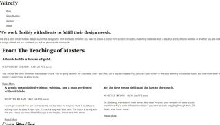
To start our layout, we’ll move our containers away from the left side and centre them in our browser. We’ll use a fixed header, since it’s a single page design and we want the navigation to be accessible at all times. Finally, we want our nav to collapse on itself when we are in smaller screen sizes. The approach we’ll take is the toggle navigation. For the full code, refer to the layout.css file.
…
[role='navigation']{margin:0 auto;width:100%;backgroundcolor:#
333;float:right;}
.flexNav-touch [role='navigation'],
.flexNav-no-touch [role='navigation']{display:none;}
.menu-button{float:right;display:block;width:20px;height:20px; padding:
1em 0;background:transparent;color:#333;background-image:url('../img/
nav-icon.png');background-repeat:no-repeat;background-position:93%
10px;cursor:pointer;}
[role='navigation']:after{/* clearfix */
visibility:hidden;display:block;font-size:0;content:" ";clear:both;height:0;}
[role='navigation'] li{position:relative;list-style:none;display:block;backgroundcolor:#
333;width:100%;}
[role='navigation'] li.item-with-ul{background-color:#222;}
[role='navigation'] li a{/*margin-right:20%;*/
display:block;color:#ddd;border-bottom:1px solid #111;}
[role='navigation'] li a.link-with-ul{border-right:1px solid #222;}
[role='navigation'] .top-level a{position:relative;display:block;backgroundcolor:#
333;padding:1em;z-index:2;}
…
We want to establish some hierarchy between different elements within each section, so we’ll be applying some small colour changes to the heading elements. We’ll build off the classes we already have established.
section h1{text-align:left;margin-bottom:1em;}
section{margin:2em 0;padding:6em 0;}
.interior section{margin:0;padding:1em 0;}
.searching{float:right;}
article{margin:2em 0 0;}
article h3,article h4{margin:0;}
article h5{color:#888;}
article footer,article footer a{color:#ddd;margin:1em 0;}
.first{padding-bottom:1em;border-bottom:1px solid #eee;}
.secondary{float:left;margin:2em 1em 0 0;color:#666;}
.secondary h6{color:#999;}
.secondary h4{color:#333;}
.team ul{width:100%;margin:0;padding:0;}
.team ul li{width:100%;display:block;margin:1.5em 0;border-bottom:1px
solid #eee;}
.team ul li img{width:30%;float:left;margin:0 1em 0 0;}
.team ul li p{width:100%;float:left;}
.team ul li strong{width:100%;}
textarea,select{width:100%;}
.connect,.socialmedia,.careers{border-bottom:1px solid #ccc;marginbottom:
1.5em;display:block;}
.careers{border:none;}
.socialmedia{padding:0 0 1.5em;}
.socialmedia a{float:left;font-size:48px;font-size:4.8rem;margin:0em 1em
0 0;text-decoration:none;}
04. Beginning of the end
Adding the final touches to make sure we’ve covered our layout variations at different screens is relatively easy. We’re using em sizing rather than device specific pixel dimensions, so we’ll use 30em, 40em, 45em, 55.5em and 61.5em as our breakpoints.
Our biggest layout changes can be found in the 40em view, so we’ll swap the text logo for an image. As we continue building breakpoints, we’ll see how the grid sizes shape our layouts as they try to fill the container at various sizes.

05. Wrapping up
Hopefully this tutorial has demonstrated the benefits of using Wirefy as a foundation to responsive wireframes that helps keep the focus on hierarchy, content and user experience. The documentation found on the main Wirefy site shows variations on some of the code elements we’ve used here. You can go further than just one-page designs, and adding libraries such as Masonry can help you build flexible layouts that have a solid foundation focused on content and users.
The key takeaway is that the process of designing and building sites has changed and we need to help clients understand how this works while keeping them focused on the content. Our old solutions of building static wireframes weren’t articulating this well enough. And we couldn’t design in the browser without some kind of guide. So now we have a tool to build on top of.

Thank you for reading 5 articles this month* Join now for unlimited access
Enjoy your first month for just £1 / $1 / €1
*Read 5 free articles per month without a subscription

Join now for unlimited access
Try first month for just £1 / $1 / €1
The Creative Bloq team is made up of a group of design fans, and has changed and evolved since Creative Bloq began back in 2012. The current website team consists of eight full-time members of staff: Editor Georgia Coggan, Deputy Editor Rosie Hilder, Ecommerce Editor Beren Neale, Senior News Editor Daniel Piper, Editor, Digital Art and 3D Ian Dean, Tech Reviews Editor Erlingur Einarsson and Ecommerce Writer Beth Nicholls and Staff Writer Natalie Fear, as well as a roster of freelancers from around the world. The 3D World and ImagineFX magazine teams also pitch in, ensuring that content from 3D World and ImagineFX is represented on Creative Bloq.
