Building a parallax scrolling storytelling framework
Stevan Živadinović, the brains behind multi-plane side-scroller web comic Hobo Lobo of Hamelin, walks us through the development of the Parallaxer platform and gives a crash course on turning pencil drawings into transparent-background assets.
Sign up to Creative Bloq's daily newsletter, which brings you the latest news and inspiration from the worlds of art, design and technology.
You are now subscribed
Your newsletter sign-up was successful
Want to add more newsletters?
- Knowledge needed: Intermediate JavaScript, solid Photoshop vocab
- Requires: Photoshop, jQuery, jQuery ScrollTo plug-in, jQuery Easing plug-in
- Project Time: Somewhere between half an hour and many months
- Support file
Reading MS Paint Adventures I had an epiphany: in this day and age, there is little justification in keeping comics within the constraints of early 20th century offset printing. No need for inked line art, or hand-lettered speech bubbles that compete with art for page real estate, no need to pack the drawings into grids of fixed dimensions and print them in multiples of four: those are all solutions to problems we no longer have. So, I took Scott McCloud's infinite canvas and upped the ante by throwing some JavaScript into the pot. The result is Hobo Lobo of Hamelin, a webtime story about a city, its scruples, some rats, a lobo, his woodwind and the stuff that goes down.
I would like to teach you to make a Parallaxer of your own, show you one way of drawing assets for it, and ultimately inspire you to trailblaze the internet storytelling frontier in your own direction.
01. Birth of the Parallaxer
Parallax as a means of faking 3D space is pretty counterintuitive. When you look around you with a simple 50mm camera lens, you see that as the distance to an object increases, bigger things can fit into your field of view. At about half a metre, you can see a full book. At about three metres you can see a whole couch. From 20m you can see a whole house. Pretty straightforward stuff.
Parallax, however, doesn't deal with distances. It deals with vectors. If you look through your camera from the previous example, and step one metre to the side, the book will have completely left your viewport, you will see about two-thirds of the couch, and the house will barely have moved. This stuff is pretty confusing to describe mathematically.
To better conceive how the huge panoramic ought to behave, let's split the stage and all of the parallax layers into panels. This solves a lot of problems we don't yet know we have. For one, instead of having to work with a single panorama that is difficult to fully grasp, we can draw our story in segments and better anticipate the interplay between the layers while they're within view, in and close to the centre of our browser window (shown below as the dotted line).
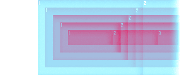
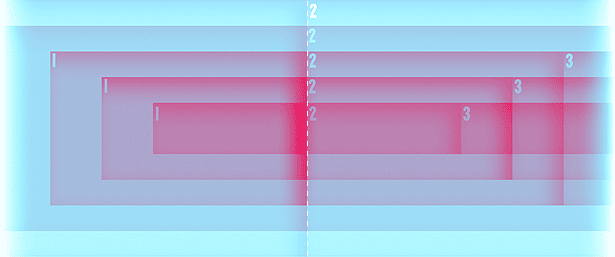
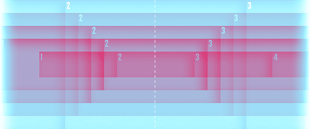
The page should load with all the layers of the first panel centred against each other and the centre of the window. As one scrolls to the right, the layers will align at the border between panels, then centre again on the second panel. The sensation is that of looking down a succession of corridors.
This diagram shows another counterintuitive aspect of parallax space. The layer furthest away, the one that should fit the house from the camera example, is horizontally the narrowest of all the layers (vertically this layer will be as tall as the rest, the diagram shows them shorter for legibility purposes). To draw a house as big as the biggest book that we can fit in the closest layer, we would have to spill into the adjacent panels of the furthest layer.
Faking a panorama parallax in Flash would be relatively trivial, but Flash isn't as sexy as it used to be. Plus, a full narrative would be cumbersome to update, and it wouldn't be as conducive to reverse-engineering by curious visitors as I would want it to be.
Let's set up a little scaffold for our Parallaxer that fits this diagram. I will be using XHTML since there is no implicit need for anything HTML5 offers, but you can use whatever doctype turns you on. Let's include jQuery 1.6.2 (the freshest we can get as of this writing), jQuery ScrollTo 1.4.2 (not updated in a while, but still a great plug-in, A+++ will plug again), and jQuery Easing 1.3 (another oldie but goodie).
<div id="overflowControl">
<div id="layerSling">
<div id="layerA">
<div class="p">1a</div>
<div class="p">2a</div>
<div class="p">3a</div>
<div class="p">4a</div>
<div class="p">5a</div>
<div class="p">6a</div>
</div>
<div id="layerB">
<div class="p">1b</div>
<div class="p">2b</div>
<div class="p">3b</div>
<div class="p">4b</div>
<div class="p">5b</div>
<div class="p">6b</div>
</div>
<div id="layerC">
<div class="p">1c</div>
<div class="p">2c</div>
<div class="p">3c</div>
<div class="p">4c</div>
<div class="p">5c</div>
<div class="p">6c</div>
</div>
<div id="layerD">
<div class="p">1d</div>
<div class="p">2d</div>
<div class="p">3d</div>
<div class="p">4d</div>
<div class="p">5d</div>
<div class="p">6d</div>
</div>
<div id="layerE">
<div class="p">1e</div>
<div class="p">2e</div>
<div class="p">3e</div>
<div class="p">4e</div>
<div class="p">5e</div>
<div class="p">6e</div>
</div>
</div>
</div>
We will work here with five layers, thought in theory Parallaxer doesn't have any limits on the number of layers it can support. Layer A will be in the back, while layer E will be in the front. Overflow control is necessary to anticipate a wonky behaviour that occurs on the far right side of the stage; without it we would scroll the last panel past its vertical alignment axis. The number and the letter represent the panel and the layer respectively, present here just as helpers.
We need to make a decision about which layer will be static, which layer we will parallax against. This layer will also be parent to the narrative containers.
We also need to pick a width for the panels in our static layer, and ratios for the other layers: panel widths relative to the static one. I'll pick layer B as my primary and 400px as its width. Let's also go with 0.75, 1.25, 1.5 and 1.75 for the ratios of the remaining layers' panels, which comes up to 300, 500, 600 and 700 pixels respectively. These are the dimensions of Hobo Lobo. I have found them to be flexible enough for a wide range of spatial situations, but they are entirely up to you.
<ul id="panelControl">
<li><a href="#c_1" title="Panel 1"><span>1</span></a></li>
<li><a href="#c_2" title="Panel 2"><span>2</span></a></li>
<li><a href="#c_3" title="Panel 3"><span>3</span></a></li>
<li><a href="#c_4" title="Panel 4"><span>4</span></a></li>
<li><a href="#c_5" title="Panel 5"><span>5</span></a></li>
<li><a href="#c_6" title="Panel 6"><span>6</span></a></li>
</ul>
<div id="overflowControl">
<div id="layerSling">
<div id="layerA">
<div class="p">1a</div>
<div class="p">2a</div>
<div class="p">3a</div>
<div class="p">4a</div>
<div class="p">5a</div>
<div class="p">6a</div>
</div>
<div id="layerB">
<div class="p" id="c_1">1b<div class="narrative"><p>Bacon ipsum dolor sit amet anim jerky sirloin, brisket salami cillum jowl.</p></div></div>
<div class="p" id="c_2">2b<div class="narrative"><p>Laboris occaecat ut dolore minim, non shankle laborum sausage boudin meatball shoulder.</p></div></div>
<div class="p" id="c_3">3b<div class="narrative"><p>Pastrami shankle ad chuck, chicken in strip steak pariatur culpa ex fatback sunt incididunt exercitation elit.</p></div></div>
<div class="p" id="c_4">4b<div class="narrative"><p>Elit dolor labore in pork tempor tri-tip cillum tenderloin duis, eiusmod ut aliquip strip steak.</p></div></div>
<div class="p" id="c_5">5b<div class="narrative"><p>Pancetta swine in dolore id laborum, cupidatat adipisicing mollit.</p></div></div>
<div class="p" id="c_6">6b<div class="narrative"><p>Officia incididunt adipisicing pancetta, ut veniam spare ribs cillum tempor flank chuck ex consectetur.</p></div></div>
</div>
<div id="layerC">
<div class="p">1c</div>
<div class="p">2c</div>
<div class="p">3c</div>
<div class="p">4c</div>
<div class="p">5c</div>
<div class="p">6c</div>
</div>
<div id="layerD">
<div class="p">1d</div>
<div class="p">2d</div>
<div class="p">3d</div>
<div class="p">4d</div>
<div class="p">5d</div>
<div class="p">6d</div>
</div>
<div id="layerE">
<div class="p">1e</div>
<div class="p">2e</div>
<div class="p">3e</div>
<div class="p">4e</div>
<div class="p">5e</div>
<div class="p">6e</div>
</div>
</div>
</div>
Note the narrative divs in the layer B panels and the menu with links to panels that correspond to ids in layer B. These will provide an alternate method for scrolling.
Sign up to Creative Bloq's daily newsletter, which brings you the latest news and inspiration from the worlds of art, design and technology.
@charset "UTF-8";
/* GENERAL and CLEANUP */
* { margin: 0px; padding: 0px; }
img { border: 0px; vertical-align: bottom; }
body { background-color: #fff; font-size: 14px; font-family: Monaco, Courier, monospace; }
/* PARALLAXER */
ul#panelControl { position: fixed; top: 13px; left: 70px; z-index: 999; }
ul#panelControl li { float: left; display: block; padding-right: 3px; }
ul#panelControl li a { display: block; border-radius: 20px; background-color: #000; color: #fff; width: 26px; height: 26px; text-align: center; font-size: 20px; line-height: 22px; text-decoration: none;}
ul#panelControl li a.clicked { opacity: 0.3; filter:alpha(opacity=30); }
ul#panelControl li a:hover { text-decoration: none; opacity: 1; filter:alpha(opacity=100); background-color: #fff; color: #000; box-shadow: 0px 5px 5px #000; }
ul#panelControl li a span { display: block; padding-top: 2px; }
#overflowControl { overflow: hidden; position: relative; height: 620px; top: 90px; }
#layerSling {}
#layerSling>div { display: block; position: absolute; top: 0px; left: 0; }
#layerSling .p { height: 400px; float: left; position: relative; overflow: visible; text-align: center; }
#layerSling .p img { display: block; position: absolute; top: 0; left: 0; }
#layerB .p { width: 400px; }
#layerB .p .narrative { position: absolute; top: 400px; left: 0; width: 360px; padding: 20px; text-align: left; }
/* FLAIR */
#layerA .p { box-shadow: inset 5px -50px 40px rgba(218, 74, 141, 0.9); color: #942a5c; }
#layerB .p { box-shadow: inset 5px -40px 40px rgba(187, 135, 197, 0.9); color: #86578f; }
#layerC .p { box-shadow: inset 5px -30px 40px rgba(165, 166, 216, 0.9); color: #696aae; }
#layerD .p { box-shadow: inset 5px -20px 40px rgba(154, 206, 241, 0.9); color: #4ca1d9; }
#layerE .p { box-shadow: inset 5px -10px 40px rgba(153, 227, 255, 0.9); color: #3dc3f5; }
We will start off overflow control with no overflow, a height and put it a little bit away from the top of the window. For now, I am going to define the widths of all the panels in JavaScript. Eventually though, when we're done experimenting, we should bake some things in the CSS, and have others calculated serverside and baked into style tags to reclaim lost performance. The blob of styles labelled 'flair' is just a temporary scaffold while we're developing.
All this set up, we need JavaScript to do a few things:
- We need the parallax to parallax.
- We need all the panels to always align in the middle of the window.
- At the point where a panel's edges overlap down all the layers, we should close the outgoing panel's narrative and unfurl the incomings.
- At the same time we should change the style of the panel control buttons to give a visual cue as to which panels have been visited.
- We need the panel control buttons to smoothly animate rather than jump to a given panel.
function aParallax(){
var p = this;
p.panelWd = 400; // the width of the primary panel
p.otherLayers = [{ id: 'layerA', ratio: 0.75 },{ id: 'layerC', ratio: 1.25 },{ id: 'layerD', ratio: 1.5 },{ id: 'layerE', ratio: 1.75 }]; // all of the other panels
p.panelCount = $('#layerB .p').length; // the total number of panels
p.didScroll = false;
p.panelHovered = 0; // current panel being hovered; will change as soon as the scripts start firing
p.overflowControl = $('#overflowControl'); // we will be dealing with this one enough to warrant putting it in its own var
// all methods will go here as well as constructor code
$(window).resize(function(){
// here we'll add all the stuff we need to fire when the window is resized
});
$(window).scroll(function(){
p.didScroll = true;
});
setInterval(function() {
if ( p.didScroll ) {
p.didScroll = false;
// all things that are affected by scrolling get executed here
}
}, 30);
}
$(document).ready(function(){
// execute when all code loads
p = new aParallax();
});
This class will contain all the variables and methods so as to not pollute the global scope with weirdly named things. Most of the functions will be methods of the aParallax class. To simplify the code, we are defining p to resolve to this within the class, and then naming the working parallax object p, so that calls to methods and variables from within and from without the class look the same.
We are also setting up a couple of areas for events that we will need to react to. Note the setInterval function that fires every 30 milliseconds and is connected to the scroll event. Different browsers fire the $(window).scroll() event differently and executing a lot of code on every pixel of scrolling can bog things down. The interval mitigates this by only allowing one scroll recalculation to take place every 30 milliseconds.
Let's set the fundamental methods:
this.crunchWinVars = function(){
p.winWd = $(window).width();
p.winHoriSp2Panel = Math.floor( ( p.winWd - p.panelWd ) / 2 );
$('#layerSling').offset({ left: p.winHoriSp2Panel });
p.overflowControl.width( p.winWd + (p.panelCount-1) * p.panelWd );
};
this.init = function(){
$('#layerB').width( p.panelCount * p.panelWd ); // This might be better to bake into style tags serverside
for(var ih=0; ih<p.otherLayers.length; ih++){
p.otherLayers[ih].ref = $('#'+p.otherLayers[ih].id); // we will be referencing these a lot
$( p.otherLayers[ih].ref ).width( Math.ceil(p.panelCount * p.panelWd * p.otherLayers[ih].ratio) ); // This might be better to bake into style tags serverside
$( '#'+p.otherLayers[ih].id+' .p' ).width( Math.round( p.panelWd * p.otherLayers[ih].ratio) ); // This might be better to bake into css
$( '#'+p.otherLayers[ih].id+' .p' ).text( Math.round( p.panelWd * p.otherLayers[ih].ratio) ); // Helper line
p.parallax(p.otherLayers[ih].ref, p.otherLayers[ih].ratio);
}
};
this.parallax = function (containerRef, ratio){
containerRef.css({ left : (1 - ratio) * ( p.panelWd / 2 + $(window).scrollLeft() ) +'px' });
}
p.crunchWinVars();
p.init();
The first method crunches the numbers that relate to the browser window, then centres the stage and applies the accurate width to the overflow control. If our parallax was a sad parallax with only a lone panel, the width of the overflow would be just the screen width. There would be no scrolling and the Parallaxer wouldn't actually do anything. We need to increase it by the width of every additional static panel.
The second method initiates the parallax and sets the widths of panels for different layers as well as the total width of layers themselves. Since the panels are all floated left, we mustn't give them opportunity to wrap. It also calls the parallax function for the first time.
And finally, parallax. I have reached this equation through very inefficient means of trial and error. I would be eternally grateful to whoever figures out a proper mathematical proof as to why this equation works, so have at it.
As soon as we plug in the following bit of code into the setInterval loop, we will be set with a functional Parallaxer.
for(var ih=0; ih<p.otherLayers.length; ih++){
p.parallax(p.otherLayers[ih].ref, p.otherLayers[ih].ratio);
}
The function that figures out when to unroll the narrative when we scroll over a panel is the only function outside of the aParallax class. We will define it in the head of the document.
function panelEventSniffer(){
var scroll = $(window).scrollLeft();
if( scroll >= -200 && scroll < 200 && p.panelHovered != 1 ){
p.panelNarr('#c_1');
p.panelHovered = 1;
}
else if( scroll >= 200 && scroll < 600 && p.panelHovered != 2 ){
p.panelNarr('#c_2');
p.panelHovered = 2;
}
else if( scroll >= 600 && scroll < 1000 && p.panelHovered != 3 ){
p.panelNarr('#c_3');
p.panelHovered = 3;
}
else if( scroll >= 1000 && scroll < 1400 && p.panelHovered != 4 ){
p.panelNarr('#c_4');
p.panelHovered = 4;
}
else if( scroll >= 1400 && scroll < 1800 && p.panelHovered != 5 ){
p.panelNarr('#c_5');
p.panelHovered = 5;
}
else if( scroll >= 1800 && scroll < 2200 && p.panelHovered != 6 ){
p.panelNarr('#c_6');
p.panelHovered = 6;
}
}
On Hobo Lobo, I generate this conditional serverside. If this were entirely done in JavaScript, it would be more cumbersome to update and less useful. Doing it this way enables us to run arbitrary code on a per-panel basis, outside of the rest of the JavaScript, which can be in its own file and get downloaded only once. The conditional starts at -200px (an impossible half a static panel outside the browser window) to keep it tidy and linear with all the subsequent values.
this.panelNarr = function(aPanel){
var elevator = $('#panelControl a[href="'+aPanel+'"]');
var narrative = $(aPanel+' .narrative');
var overflowNewHt = narrative.outerHeight() + 500;
$('.narrative:visible').stop(true,true).slideUp(100); // roll up text for other slides, if any are unfurled
if( !elevator.hasClass('clicked') ) {
elevator.addClass('clicked'); // add clicked class to the panelControl for page that we just passed by
}
if( overflowNewHt > p.overflowControl.outerHeight() ) {
p.overflowControl.animate( {'height' : overflowNewHt}, 200, 'easeInOutSine' );
}
narrative.slideDown(500); // unfurl narrative
if( p.winWd != $(window).width() ) {
p.crunchWinVars(); // sometimes extending the overflow adds the vertical scrollbar, so we need to account for that
}
};
this.panelControl = function() {
$('#panelControl a').click(function(elevator){
elevator.preventDefault();
p.correctScroll($(this).attr('href'));
});
}
this.correctScroll = function (hash, duration){
if(duration === undefined) {
var duration = 8345;
}
if($(window).scrollTop()) {
// scrollTo will take forever scrolling up if we have x & y queued in a single line, so doing it separately allows us to have a brisker upscroll and a longer side one
$.scrollTo( hash, { 'axis' : 'y', 'queue' : true, 'duration' : Math.floor($(window).scrollTop() * 3/2 + 200), 'offset' : { 'top' : -90 } });
}
$.scrollTo( hash, { 'axis' : 'x', 'queue' : true, 'duration' : duration, 'offset' : { 'left' : -p.winHoriSp2Panel }, 'easing' : 'easeInOutSine' });
}
p.panelControl();
The remaining methods are self-explanatory. The first one unfurls the narrative and does the cleanup associated with the unfurling. The second one binds the smooth animating correctScroll function to the panel control. The third one animates the scroll, doing the two axes independently so that y-scrolling happens quickly and x-scrolling benefits from a leisurely easing.
Finally, make sure to crunchWinVars() on $(window).resize() and to run panelEventSniffer() inside setInverval(). Now you have the barest bone imaginable Parallaxer on your hands. Hooray! Go you!
There are still things that can be improved. As is, Parallaxer is way iffy on mobile browsers; I have yet to explore hijacking touch events and gestures to get iOS to calculate the offsets at the right time. I could probably try not using the scrollTo plug-in; using it was an early-development time-saving decision. Also, there ought to be a more graceful way to let the user interrupt correctScroll while it's animating. And so on. Room for improvement is infinite.
Some things I wouldn't want to add, like a loading screen. I enjoy the marionette theatre feel of what we've got. If you know what to look for, you can see the strings, the people up in the rafters and the ninjas moving the furniture between acts. Some roughness left behind makes for a warmer experience. The sloppy hand of the artist is always enjoyable to recognise.
02. A way to PNG pencil drawings
Now onwards to Photoshop! I use CS3 because I have a PowerPC and have been abandoned by all developers everywhere. Adjust the keyboard shortcuts below for your system.
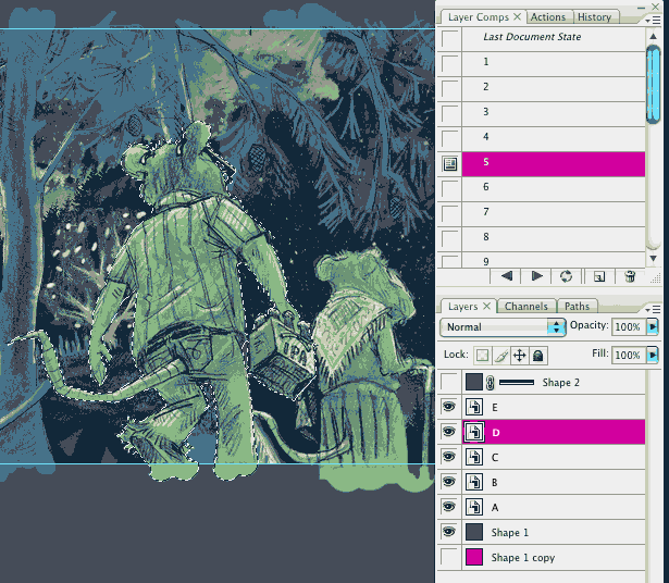
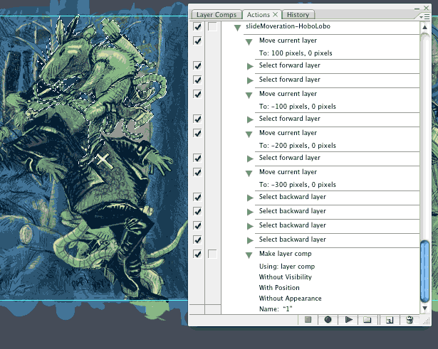
Set up your main document with five smart objects containing each of the parallax layers and build an action to generate layer comps that dial to a panel, like Parallaxer's panel control.
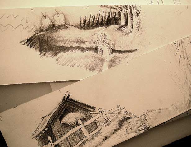
I draw the art on 4-inch strips of paper, using a lightbox for registration.
I scan it all in at 400 dpi and clean it up a little, then drop it into the designated smart object. While painting, instead of the chequerboard, I generally use a sharp contrast colour to whatever I am painting. Here's a rat drawing, sized and in place after having some levels tweaked and some paper grain dodged out.
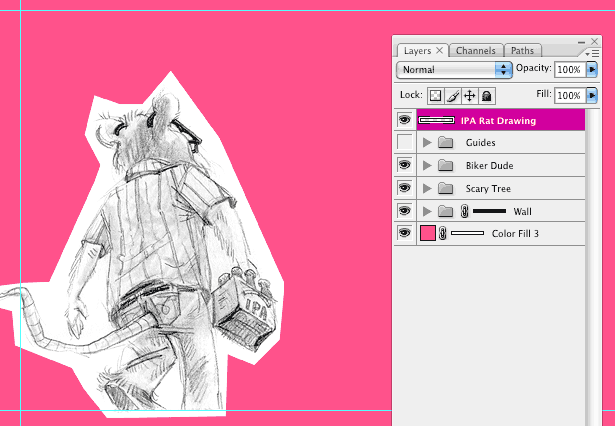
With the focus on the drawing layer, select-all and copy to clipboard, then deselect and create a solid colour layer.
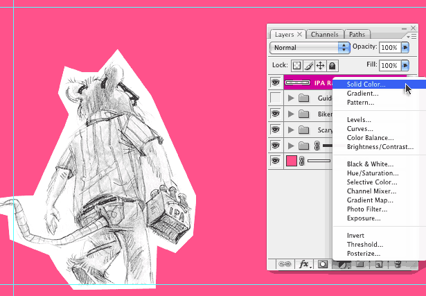
Alt+click into the color layer mask. The document should go white, we are now only seeing the mask. Paste the drawing into the mask and exit the view with the backslash (\) key. Click option+I to invert the mask. This is what we see:
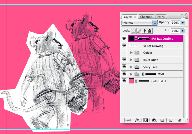
Paint in the fill and the highlights with a tablet on other single-colour layers.
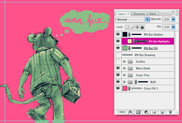
Turn off the rabid flamingo layer, slice, save-for-web as 24-bit PNGs and optimise.
And there you have it. You are now a certified Parallaxeer. Good luck!
Stevan Živadinović was born once upon a time in a fictitious country but has since gotten better. He is certified by an accredited institution to engage in art-making. Check him out at The Nihilist Canary and the Hobo Lobo of Hamelin.

The Creative Bloq team is made up of a group of art and design enthusiasts, and has changed and evolved since Creative Bloq began back in 2012. The current website team consists of eight full-time members of staff: Editor Georgia Coggan, Deputy Editor Rosie Hilder, Ecommerce Editor Beren Neale, Senior News Editor Daniel Piper, Editor, Digital Art and 3D Ian Dean, Tech Reviews Editor Erlingur Einarsson, Ecommerce Writer Beth Nicholls and Staff Writer Natalie Fear, as well as a roster of freelancers from around the world. The ImagineFX magazine team also pitch in, ensuring that content from leading digital art publication ImagineFX is represented on Creative Bloq.
