The 6 best design industry logos
With designers as your audience, your logo needs to be special.
In this design-obsessed age, branding is becoming more and more important for all kinds of organisations. But if your prime constituency is the design industry itself, you’re really going to have to pull it out of the bag when it comes to your logo design.
Here we select our favourite logos from design industry organisations. We hope they inspire your own logo design projects. But if there’s an iconic design industry logo you feel we should have included, let us know on Twitter or Facebook.
01. D&AD
D&AD, which stands for Designers & Art Directors Association, was founded by a group of London-based creatives including David Bailey, Terence Donovan and Alan Fletcher and Colin Forbes, in 1962. Its aim was to celebrate innovation and great work in the advertising and design industries.
One year later Forbes, who was then working at Fletcher/Forbes/Gill, designed the organisation’s logo by sticking its four characters onto the sides of a wooden cube and photographing the result. It’s a testament to the brilliance of this design that, with just one major tweak, it’s stayed in place for 55 years and counting… yet still looks strikingly modern.
The latest update of the logo, created by Rose Design in 2006, retained the essence of Forbes’ design but modernised it by placing it inside a hexagon. This made it easier to apply consistently to all corporate materials. The hexagon also represents the top of a Black Pencil, the distinctive awards D&AD gives out for superlative work every year.
02. Adobe
Another iconic industry logo that’s stayed in place for decades and yet still shows no signs of dating is that of design software giant Adobe. Adobe was founded in 1982 and its first emblem contained the full company name, Adobe Systems Incorporated. It was created by Marva Warnock, graphic designer and wife of company co-founder John Warnock.
A new, sleeker logo was created by in-house in 1990, featuring a stylised white A on a red background, and it’s been in place ever since. Instantly recognisable by anyone who’s ever opened Photoshop or Illustrator, it’s become somewhat iconic across the global design industry.
Since 2013, Adobe has capitalised on this phenomenon by asking a range of well-known creatives, including Sagmeister & Walsh, Alex Trochut, GMunk and Craig Ward, to produce their own unique versions of the logo. You can see what they’ve come up with on this Behance page.
03. SXSW
Starting life as a local music festival in 1987, South by Southwest has become one of the world’s biggest music, film and interactive design festivals. (The name, a play on the name of the classic Hitchcock film North by Northwest, points to its geographic location in Austin, Texas.)
Until recently, the festival commissioned a new logo every year, and then were generally quite colourful and cartoony. But 2017 saw a change of tack when it comes to the event’s visual identity. The organisers asked Austin agency Foxtrot to create a new, cleaned up logo and typography that could be used consistently for many years to come, and the design shown above is the result.
The new monochrome, sans-serif wordmark, with its self-explanatory directional arrow, does the job perfectly. So much so that, even though relatively young, it already feels like a classic.
04. Society for Environmental Graphic Design (SEGD)
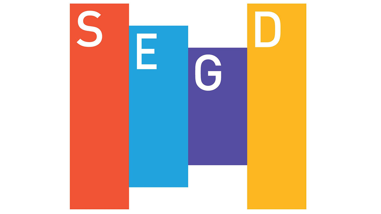
Describing itself as a “global, multidisciplinary community of professionals who plan, design, and build experiences that connect people to place”, the Society for Experiential Graphic Design (SEGD) is a non-profit organisation for graphic, architectural, interior, landscape, and industrial designers.
Its current logo was created in 2009 by designed by Pentagram partner Michael Gericke and his team. This colourful creation consists of four brightly coloured panels that, say Pentagram can be interpreted as “three-dimensional forms, printed graphics or interactive menus”.
This logo succeeds in being unique and distinctive while still offering the geometric flexibility to work across a variety of media; some of which weren’t even invented at the time of its conception.
In an age of minimalist tech logos that all look the same, Gericke’s design offer a great example of how a logo can be simple and stylish without defaulting to the lowest common denominator.
05. Society of Graphic Designers of Canada
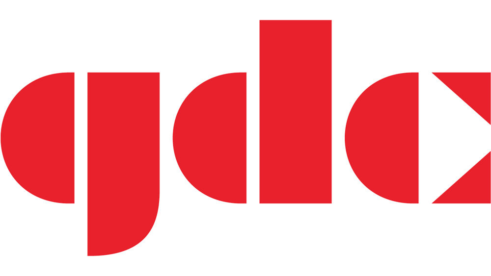
Founded in 1956, the Society of Graphic Designers of Canada (GDC) is a member-based organisation of design professionals, educators, administrators, students, and associates in communications, marketing, media and design-related fields.
Its current logo was created in 2014 by Vancouver-based designers Dennis Boyle and John Ngan. The aim of this redesign was to help promote the organisation to designers and its certification process to the wider business community.
Combining the vertical strips of the country’s flag with the vertical shapes of the font, Braggadocio, created a compelling design that instantly read ‘Canada’ to its intended audience.
There’s also a strong sense of movement and dynamism to the design that adds a real sense of authority to this national body’s visual identity. You can learn more about the thinking behind the logo in the video above.
06. Institute of Designers Ireland
The Institute of Designers in Ireland (IDI) represents designers and design students who practise on the island of Ireland and abroad. Founded in 1972, the non-profit organisation covers all design disciplines including graphic design, interior design and product design.
Its current logo was created in 2014 by Dublin brand and design agency RichardsDee. It sets the main three words of the organisation’s lengthy name in a condensed sans serif with smooth round corners, inside an overarching ‘D’.
This design may not be the most exciting logo ever but no one can argue it isn’t super-clean. Black and white, simple, legible... what’s not to like?
Bonus logo: Art Directors Club
Founded in 1920 in New York, the Art Directors Club has spent the last century doing sterling work promoting art directors' work through exhibitions and awards. As we were writing this article, however, its logo had disappeared from its site, as it became part of The One Club for Creativity. So we didn’t originally include it on our list of great industry logos.
Stop press, though: the organisation has since been in touch to say that its classic logo will live on, as part of the ADC Annual Awards program. So it’s official: the logo will appear on all materials related to the ADC 97th Annual Awards, which just opened its call for entries, and will continue to be used in future club programs.
This classic logo was originally inspired by the signature of Albrecht Dürer, a painter, printmaker, and theorist of the German Renaissance who’s considered one of the first commercial artists.
It’s been through several iterations since, including a 2002 refresh by Pentagram’s Paula Scher, while the latest version was designed by creative agency Sid Lee and Simon Chénier-Gauvreau. But it retained its original essence throughout, proving that simplicity isn’t incompatible with timeless elegance.
Effortlessly conveying a feel for the art deco-obsessed decade of its founding, yet still strikingly modern and flexible enough for today’s digital age, we’re delighted that this logo will continue to give great service.
Related articles:

Thank you for reading 5 articles this month* Join now for unlimited access
Enjoy your first month for just £1 / $1 / €1
*Read 5 free articles per month without a subscription

Join now for unlimited access
Try first month for just £1 / $1 / €1
Get the Creative Bloq Newsletter
Daily design news, reviews, how-tos and more, as picked by the editors.

Tom May is an award-winning journalist and author specialising in design, photography and technology. His latest book, The 50th Greatest Designers, was released in June 2025. He's also author of the Amazon #1 bestseller Great TED Talks: Creativity, published by Pavilion Books, Tom was previously editor of Professional Photography magazine, associate editor at Creative Bloq, and deputy editor at net magazine.
