14 tips for nailing composition like a pro
Artist James Gurney explains why composition isn’t about forcing elements into a grid.
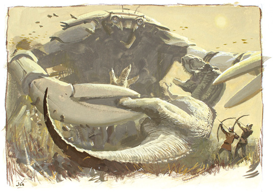
The key to composing and how to draw an effective picture is figuring out the best way to express your main idea in visual terms. That idea could be a dramatic clash of characters, an emotion tied to an environment, or a mood created by a story. I like to begin a painting by clarifying the idea and then deciding which pictorial tools best convey it.
The problem with most compositional theory is that the thinking is backwards. Instead of starting with the central idea, many art teachers dwell on shoehorning the picture into some rigid, preconceived geometry. Some focus on a set of dogmatic notions about how the eyes move around a picture. Others focus on abstract design for its own sake, aiming for rhythm, flow, balance or harmony.
But painting is more than designing bathroom tiles, presenting food on a plate or arranging flowers in a vase. What's the use of a pleasing, balanced arrangement if your story idea demands a design that's off-balance or arrhythmic? Painting is like any other art form: emotion and story should come first and they alone should drive the aesthetic choices.
In this workshop, I'll start by roasting a couple of sacred cows and then I'll offer some practical tips. Who's hungry?
01. The Golden Ratio is a myth
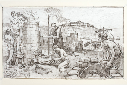
Almost every composition book these days talks about the Golden Ratio or the Golden Rectangle, but it turns out that even the textbook examples, such as the Parthenon and the human figure, don't conform to those ratios any more than they do to other mathematical relations, such as pi or Vitruvian relations of whole numbers.
No rectangle or grid stands out from the others as 'golden'. If a certain proportion gives us a warm feeling, it's because we've trained ourselves to appreciate it. For a complete discussion of this topic, see my five-part blog series, 'Mythbusting the Golden Mean' on my blog.
02. Don't worry about controlling the eye
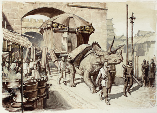
The composition doesn't control the eye. The eye doesn't flow along contours, and it doesn't move in ovals or spirals as many theorists have claimed. Eye tracking scanpath studies show that the viewer's eyes leap from one point of interest to another in rapid succession, about three times per second.
Viewers gravitate to faces or figures – or cleavage – wherever you place them in the composition. Viewers look at pictures in individual ways, and it depends on how their minds have been primed by such things as titles or captions.
03. You've got to feel something first
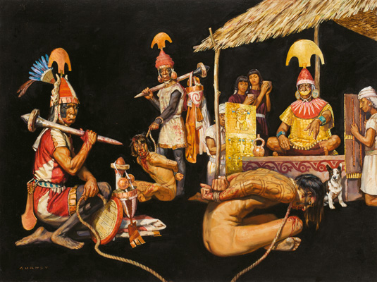
Art transmits emotion. The best design is the one that communicates the most powerful experience. If you want the viewer to feel something, you have to feel it first. That feeling will transmit to the viewer like a rubber ball bouncing off a wall.
The harder you throw it, the harder it'll bounce. Likewise, the more you feel the idea, the more the viewer will, too. As Howard Pyle recommended, project yourself into the picture. Leap through the frame and live inside the picture.
04. Do lots of thumbnails
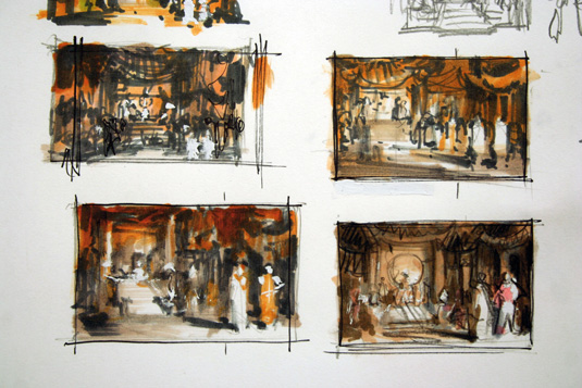
With each rough sketch, try to see the subject in elemental terms. Look for what Golden Age illustrator Harvey Dunn called the "epic in the incident." With a visually complex scene with lots of figures, like a crowded throne room, it's especially important to think about the essential idea.
In this case, I want to convey regal power. I remember the feeling I had when I met Ted Turner one-on-one in his big office building, and I try to channel that memory.
05. Choose the supreme moment in an imagined scene
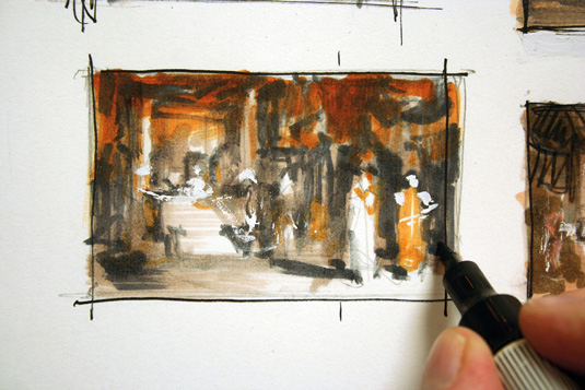
Unlike a film director, we have to choose a single moment out of a continuous flow of action in which to set our scene. What's the best moment to choose?
Usually it's the one with the greatest suspense, such as a fateful encounter or a moment when something is about to happen. If there's a main character, he or she should be faced with a decision, or a do-or-die moment. In this case, it's a meeting with the emperor.
06. Think about the camera angle
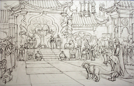
My main characters are in the foreground, and the exotic but diminutive emperor is high up, perched on a Tree-of-Life throne. I visualise the whole sequence in my mind and then pick this camera angle.
The eye level is equal to the height of the throne platform, a little more than a metre high, well below a normal human standing height, which makes the throne seem more impressive.
07. Simplify extraneous details
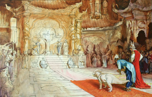
I work transparently, building opaques gradually. I suppress contrasts in the throne area to keep it from becoming too busy. I also allow the yellowish colours to be dominant, with a few blues and reds as contrast.
I eliminate greenish colours. I regularly check against the thumbnails to see if I'm keeping to that original idea
Next page: more top tips for composing your painting...

Thank you for reading 5 articles this month* Join now for unlimited access
Enjoy your first month for just £1 / $1 / €1
*Read 5 free articles per month without a subscription

Join now for unlimited access
Try first month for just £1 / $1 / €1
Get the Creative Bloq Newsletter
Daily design news, reviews, how-tos and more, as picked by the editors.

The Creative Bloq team is made up of a group of design fans, and has changed and evolved since Creative Bloq began back in 2012. The current website team consists of eight full-time members of staff: Editor Georgia Coggan, Deputy Editor Rosie Hilder, Ecommerce Editor Beren Neale, Senior News Editor Daniel Piper, Editor, Digital Art and 3D Ian Dean, Tech Reviews Editor Erlingur Einarsson, Ecommerce Writer Beth Nicholls and Staff Writer Natalie Fear, as well as a roster of freelancers from around the world. The ImagineFX magazine team also pitch in, ensuring that content from leading digital art publication ImagineFX is represented on Creative Bloq.
