15 new cover designs for children's classics
A series of striking new new jackets have been created for classic children's novels, from Alice in Wonderland to Peter Pan. What do you think of them?
Getting the balance right between traditional and modern when designing new covers for classic books is a tough ask.
You need to strike the right balance between respecting the heritage of stories loved by previous generations of children and parents, and making the books look modern and attractive to today's youngsters. Here, designers from Vintage Books present 15 new covers designed for the recently launched Vintage Children’s Classics series, and explain the thinking behind them. Do you think they hit the mark?
Words: Vintage Design Department
01. The Jungle Book

- Design: Stephen Parker
- Illustration: Gianni De Conno
Rudyard Kipling’s collection of fables have a much darker feel than the Disney musical, and we wanted to reflect this in the cover. We chose Italian illustrator, Gianni De Conno, to come up with an image which has engaging animal characters peering out from dense jungle foliage. The resulting cover illustration has both charm and intrigue, and a hypnotic feel from the staring faces.
02. Swallows And Amazons

- Design: James Jones
- Illustration: Pietari Posti
Being a book about outdoor adventures, the covers needed to represent this in abundance. Having worked with Pietari Posti previously, we knew his work would look fantastic across this series, with his illustrations bringing a modern edge to this timeless classic with geometric shapes and movement across the images. The striking colour scheme is carried across the series, with the perspective on each cover helping to add more narrative to the illustrations.
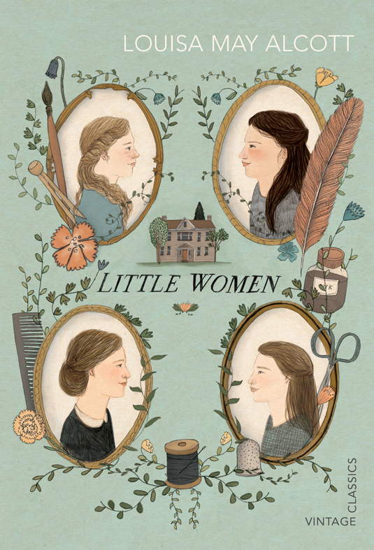
03. Little Women
- Design: Julia Connolly
- Illustration: Lizzy Stewart
Lizzy Stewart’s work has a delicate, old-world quality that is exactly what we were looking for for Little Women. The story centres around the four March sisters each with very different personalities and Lizzy has conveyed this in her illustration. Her muted colours and fine pencil-work help to evoke the New England setting.
04. The Boy In The Striped Pyjamas

- Design: Suzanne Dean
- Illustration: Mick Wiggins
A difficult one to jacket, The Boy in Striped Pyjamas has quite an iconic cover and we wanted to stay away from the film tie-in look. Set during WWII, an illustrator was needed who could evoke the period and portray a difficult subject with sensitivity. Mick Wiggins had previously worked on the Vintage Classic, Neville Shute re-issues, and he not only had the qualities we were looking for but a great sense of space and colour.
Get the Creative Bloq Newsletter
Daily design news, reviews, how-tos and more, as picked by the editors.
05. Peter Pan

- Design: Kris Potter
- Illustration: Sara Ogilvie
We wanted to give the the cover of Peter Pan a fresh look and having seen Sara Ogilvie’s own children’s books we thought her use of minimal colours and textures would give a new and exicting take on this classic story.
06. Doctor Dolittle

- Design: Matt Broughton
- Illustration: Jonathan Burton
Doctor Doolittle was an enjoyable book to commission, and Jonathan Burton the perfect illustrator for the job. He has managed to capture the eccentricity of the Doctor’s odd menagerie with subtlety and humour - and with a smart dash of Victoriana.
07. Alice In Wonderland

- Design: Matt Broughton
- Illustration: Annelie Carlström
Alice in Wonderland was a difficult cover to commission in that the characters are so familiar. Annelie Carlström was given the task of imagining the scene of Alice falling down the rabbit hole, capturing the oddness of scale and eccentrictites of Wonderland. In achieving this, she’s produced a clever new take on Alice and the white rabbit, and created a wonderfully iconic cover in the process.
08. Black Hearts In Battersea

- Design: Matt Broughton
- Illustration: Rohan Eason
Rohan Eason had already produced an excellent cover for ‘The Wolves of Willoughby Chase’, so was commissioned for Joan Aiken’s ‘Black Hearts in Battersea’. The difficulty was to render a particularly complex scene in the book and also visually link to the author’s previous work. In solving this, Rohan has managed to create a dramatic scene with particular elegance.
09. Black Beauty

- Design: James Jones
- Illustration: Chris Wormell
As soon as this brief came in, Chris Wormell sprung to mind. Black Beauty has throughout the past had many covers, but we wanted to add more colour to our Vintage Children’s Classics Version. Christopher’s wood engravings and wonderful linocut images help add that timeless sense to his work, which perfectly suits the story of Beauty.
10. Charlotte Sometimes

- Design: Stephen Parker
- Illustration: Peter Bailey
As the book is about a young girl at boarding school in the 1960s, who travels back in time to the First World War, we wanted to give the book a very retro feel. When the editor said she’d imagined something in a traditional woodcut or pen and ink style, similar to the children’s book illustrations by Peter Bailey, we thought why not ask Peter himself. He has illustrated children’s books for many years and his warm charming style is absolutely perfect for Charlotte Sometimes.
11. The Curious Incident Of The Dog In The Night-Time

- Design: Kris Potter
- Illustration: Paul Blow
For the cover of The Curious Incident of the Dog in the Night-Time we wanted to play up the title and incorporate it as part of the scene. In the book Christopher draws maps from memory and we hinted at this by giving the cover a slight aerial view, illustrating the scene where Christopher finds his neighbours murdered dog. We are big fans of Paul Blow’s work at Vintage Classics and his style and use of colour seemed to be a perfect fit for the illustration we had in mind.
12. Emil And The Detectives

- Design: Suzanne Dean
- Illustration: Salvatore Rubbino
We had been looking for a commission for Salvatore Rubbino’s work since seeing his graduation show from the RCA. His quirky characters, and quality of line remind us of the work of Miroslav Sasek and Quentin Blake. He seemed a perfect match for the 1929 Emil and the Detectives. You can tell that Salvatore draws from life, by looking at the children in the illustration.
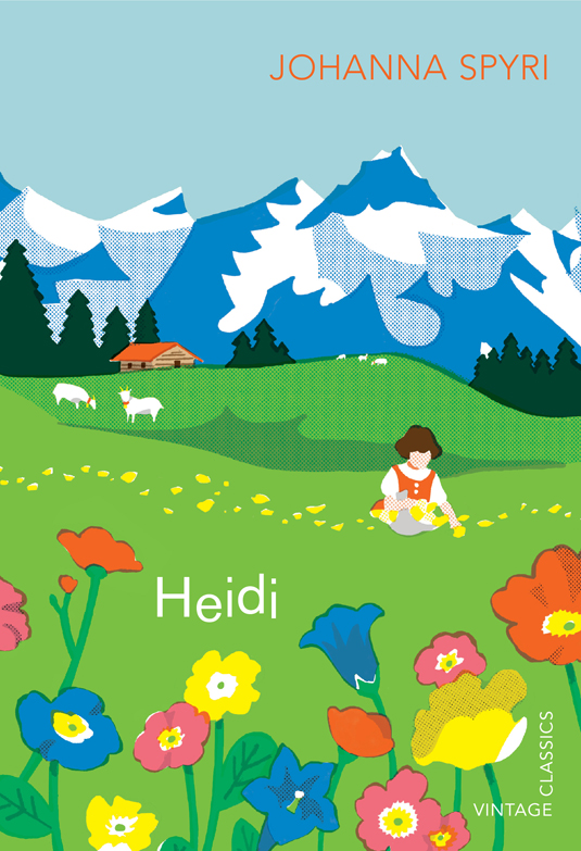
13. Heidi
- Design: Julia Connolly
- Illustration: Asako Masunouchi
For this cover we wanted to move away from the often portrayed image of Heidi with blonde hair and pigtails, in the book she actually has short dark hair and is only 5 years old. We commissioned Asako Masunouchi for her charming, nostalgic approach and graphic landscapes reminiscent of old Swiss travel posters. Her work has a naivety that seemed very fitting for this book.
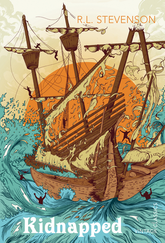
14. Kidnapped
- Design: James Jones
- Illustration: Tim McDonagh
Having already created an iconic cover for Treasure Island, Tim McDonagh continued his beautiful line work on the cover for R.L Stevenson’s Kidnapped. The cover needed that danger element, and the composition of the ships collapse amongst the stormy seas is illustrated pefectly. The challenge was to fit the scale of the ship onto the cover, which Tim managed effortlessly.
15. What Katy Did
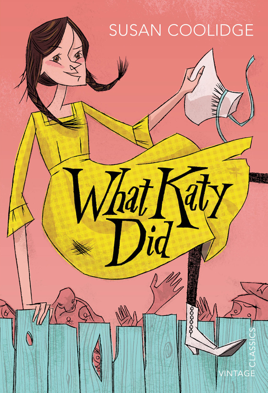
- Design: Julia Connolly
- Illustration: Anne Benjamin
Katy, the protagonist is a mischievous tomboy who is always getting herself into trouble. To convey this, we commissioned Anne Benjamin who has an ability to create playful characters. The vibrant colours and hand-lettering give a contemporary feel to this 19th-century classic.
You can keep up to date with the latest designs and releases at the Vintage Books Design blog.
Now read:
- 20 inspirational Penguin book cover designs
- 14 new cover designs for James Bond books
- 10 awesome examples of brochure design
What do you think of the new classic children's book covers? Let us know in the comments below!

Thank you for reading 5 articles this month* Join now for unlimited access
Enjoy your first month for just £1 / $1 / €1
*Read 5 free articles per month without a subscription

Join now for unlimited access
Try first month for just £1 / $1 / €1

The Creative Bloq team is made up of a group of design fans, and has changed and evolved since Creative Bloq began back in 2012. The current website team consists of eight full-time members of staff: Editor Georgia Coggan, Deputy Editor Rosie Hilder, Ecommerce Editor Beren Neale, Senior News Editor Daniel Piper, Editor, Digital Art and 3D Ian Dean, Tech Reviews Editor Erlingur Einarsson, Ecommerce Writer Beth Nicholls and Staff Writer Natalie Fear, as well as a roster of freelancers from around the world. The ImagineFX magazine team also pitch in, ensuring that content from leading digital art publication ImagineFX is represented on Creative Bloq.
