The road to responsive images
Last week's W3C editor's draft brought us one step closer to a workable specification for responsive images. Anselm Hannemann explores how the draft spec came about, the problems that remain to be solved – and why we need a specification in the first place
29 August 2012: a date that will go down in history as the one on which we finally got an official specification for responsive images. Last week, the W3C published an editor's draft for responsive images written by Mathew Marquis and Adrian Bateman.
After more than a year of discussion in the development community about the best way to handle responsive images, the W3C finally took a hand earlier this year, asking Mat Marquis from the Filament Group to write a specification. In this article, I will review the events leading up to that decision, review the aims of the specification, and examine some of the problems yet to be solved.
A bit of history
In case you've missed the debate about responsive images, here's a recap. Many people (including me) have written articles on the topic, so this is just a brief overview:
- I requested a native HTML solution for responsive images from WHATWG in July 2011.
- The topic disappeared until November 2011.
- Other people started investigating and the topic went public, without response from W3C/WHATWG.
- In February 2012, W3C formed a community group to discuss the topic further.
- In February 2012, WHATWG discussed another approach using the srcset attribute, confusing all of us because it diverged from our proposed solution. This proposal went public – prompting further debate – in May 2012
- After further discussions among both W3C and WHATWG, it finally became clear in August 2012 that the W3C wants a <picture> element including srcset.

The W3C first draft
The first draft of the specification has now been published. The good news is that W3C, WHATWG and most of the list subscribers agree with this draft in outline, so discussion has moved from the underlying approach to the details and remaining gaps in the spec.
The goal of responsive images
If you're still unclear about why we need a specification for responsive images, here's what it allows you to do (also check out the official goals):
- Respond to different screen pixel width/height in HTML.
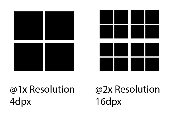
- Respond to different screen pixel densities (low-res/high-res like Apple's Retina displays).
- Respond to users zooming in on images (for example, in a lightbox).
- Provide user agents with the information they need to select the most appropriate image source in low-bandwidth situations, via media queries (not yet available).
- Preserve separation of content markup and styling.
- Provide a purely client-side solution that can include JavaScript, but doesn't require it.
- Provide different crops of an image according to the viewport or device through which it is viewed (for example, a black-and-white picture for E Ink readers).
How you will use responsive images
The current specification enables you to do one of two things:
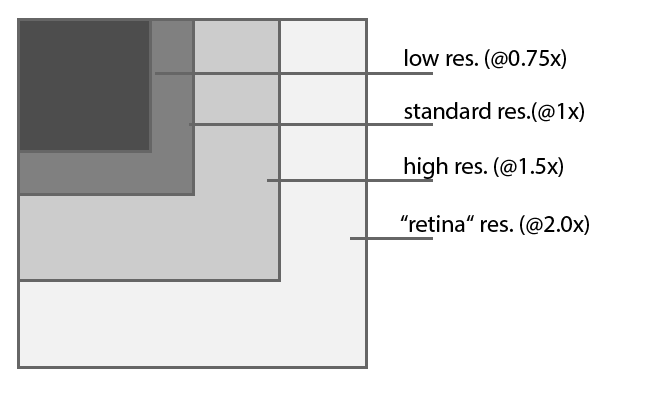
- Specify different resolutions of the same image using the srcset attribute. You don't have to care about media queries and only provide images for 1x (normal resolution), 1.5x (higher resolution), and 2x (Retina resolution). The user agent does the rest.
- Use different images for different resolutions. You specify the media queries, targeting different resolutions or different device types and serve specific images to each user. More granular, but more effort.
The <picture> element will have this syntax:
<picture> <source media="(min-width: 45em)" srcset="large-1.jpg 1x, large-2.jpg 2x"> <source media="(min-width: 18em)" srcset="med-1.jpg 1x, med-2.jpg 2x"> <source srcset="small-1.jpg 1x, small-2.jpg 2x"> <img src="small-1.jpg" alt="my alt-text" width="200" height="100"> </picture>This is a basic example of how to write responsive images. As you can see, the new element is backwards-compatible, due to the fact you can integrate the common <img> element in the <picture> element. That means you always have a fallback for older browsers not supporting the <picture> element – and therefore, that can make use of the <picture> element right now. However, I would not recommend using sytax specified in a first draft for production use.
Get the Creative Bloq Newsletter
Daily design news, reviews, how-tos and more, as picked by the editors.
You can combine srcset with media queries to target specific screen sizes and let the user agent decide if the user gets a low-res or a high-res image. This makes the syntax ultra-flexible in targeting nearly any edge case for responsive images you might ever encounter.
Browser requirements
A few things are necessary to make the <picture> element work. These are browser requirements only, so I'll only summarise the key points here:
- The user agent should fetch the appropriate asset in one single request.
- The user agent should be able to override developer values with user settings (for example, when a developer says to download the high-res image but the user has set their user agent to 'low bandwidth', indicating that they want – and will get – a low-res variant of the image).
Currently unsolved problems
Since the first draft came out a few days ago, there have been ongoing discussions on the WHATWG and W3C mailing lists. Luckily, most of the major issues seem to have been addressed. Most of the remaining unsolved problems are relatively trivial, so I won't go into detail here. However, there is one important exception:
It is still unclear how to define alternative content for a <picture> element. On the mailing lists, one suggestion is for a full rich-text fallback inside the element (as child nodes). Another is to use a simple alt-attribute on either the <picture> element or the <source> element. As this poses important accessibility issues, it may take time to get this sorted.
Feedback needed!
Browser vendors have yet to provide feedback on this proposal. It is unclear if they are interested in implementing the specifications, or see implementation problems overlooked by the W3C. Bruce Lawson of Opera has responded by requesting more feedback.
So, dear readers, we really need your feedback on this topic: please provide it – or at least help to spread the word!
Thank you!
Finally, I want to say thank you to everyone who has helped advance the debate surrounding responsive images. I'd like to mention some specific people again: Bruce Lawson, who originally proposed the <picture> element; Mathew Marquis, who heads up the W3C effort, and who co-wrote the specification; and Matthew Wilcox who invested much time in evangelising the topic, providing feedback and searching for better solutions.
Thanks also to Rodney Rehm and Marc Hinse for proof reading this article!

Thank you for reading 5 articles this month* Join now for unlimited access
Enjoy your first month for just £1 / $1 / €1
*Read 5 free articles per month without a subscription

Join now for unlimited access
Try first month for just £1 / $1 / €1

The Creative Bloq team is made up of a group of design fans, and has changed and evolved since Creative Bloq began back in 2012. The current website team consists of eight full-time members of staff: Editor Georgia Coggan, Deputy Editor Rosie Hilder, Ecommerce Editor Beren Neale, Senior News Editor Daniel Piper, Editor, Digital Art and 3D Ian Dean, Tech Reviews Editor Erlingur Einarsson, Ecommerce Writer Beth Nicholls and Staff Writer Natalie Fear, as well as a roster of freelancers from around the world. The ImagineFX magazine team also pitch in, ensuring that content from leading digital art publication ImagineFX is represented on Creative Bloq.
