The rules of responsive web typography
Responsive web typography is tough – you need to have both design chops and technical know-how. But however tricky it might be, getting it wrong isn't an option, because typography is the cornerstone of web design.
How do you get both the design and code right? How do your developers communicate with pixel-pushing designers? How can your designers make nonchalant developers care about typography? The quickest and simplest way is to get your designers and developers to speak the same language, respect each other for their craft, and seek to understand both the principles and limitations of web typography.
This article aims to provide both designers and developers with the foundation from which to begin communication on the subject of typography. We will cover necessary design principles and explore practical solutions for responsive typography.
What is good typography?
'Good' is always subjective; it isn't a fixed anchor that we can hinge communications on. For designers and developers to communicate effectively, we must begin by talking about a common denominator that both sides can understand. That denominator is the purpose of typography.
Typography is the appearance of text; we're dressing text up. The purpose of dressing is to make the wearer appealing enough to attract a conversation, but not hold so much attention that the other party becomes distracted from the conversation.
Likewise, the purpose of typography is to enable readers to focus and immerse themselves in the content of the text. Good typography, by definition, is typography that helps text fulfil its purpose of communication.
Two things must happen for readers to focus and immerse themselves in the text. First, the typography must convey appropriate (if any) emotion. Second, the text must be easy to read. This brings us to four essential properties you need to get right.
Sign up to Creative Bloq's daily newsletter, which brings you the latest news and inspiration from the worlds of art, design and technology.
- Font family
- Font size
- Line height (also called leading)
- Text width (also called text measure)
Getting the right font family helps the underlying emotions of the text shine through. Getting the other three properties right ensures your text is easy to read. For the most part, designers are excellent at finding the right font family. So, for the rest of this article we'll focus on the other three factors.
The art of readable text
The first step in any project is to set the font-size, line-height and width of your body text. This process is called typesetting. Begin by typesetting with a page that contains information a user needs. As much as possible, this page should contain multiple elements, like h1, h2, h3, body text and captions, for which you must make a conscious choice as to what works for your design. The more elements your page contains, the better your chances of setting a type scheme that works across the board.
When you select the font-size, line-height and measure for your body text, make sure you use real content. If you don't have actual content, use text from Wikipedia instead of Lorem Ipsum.
You also need to put yourself in the same situation you're typesetting for, because the distance between a reader's eyes and the screen is different for different devices. If you're typesetting for a mobile device, look at your output through a phone. If you're typesetting for a laptop, sit at your desk with your laptop, and so on.
Once you've settled yourself in the right environment, start your typesetting process by first selecting font-size, followed by measure and finally line-height. Bear in mind that there's no perfect combination – just look at other pages you feel have good typography and you'll see that none of them use the same font-size, line-height and measure. So, what you're aiming for is simply text that's easy to read.
Setting the right sizes is harder to explain in writing, so I've made some videos to help you out with font size, measure and leading.
Here are some quick guidelines to help you ensure you have a good font size, leading and measure.
Your font is too small if:
- You have to concentrate to read the text
- You have to squint your eyes
- You have the urge to zoom in
Your font is too large if:
- You begin noticing letterforms instead of reading the content
- You can only read one to three words at a time
- You have the urge to zoom out
Your text measure is too long if:
- You have to turn your head to read the text
- You lose concentration midway through
Your text measure is too short if:
- You feel irritated when the text breaks to the next line
- Your eyes get tired from bouncing to the left and right rapidly
Your leading is too narrow if:
- The text feels dense and overwhelming
- You read the wrong line of text accidentally
Your leading is too large if:
- You get distracted by the white space between rows of words
Always remember the definition of good typography: you're not after perfection, you're simply gunning for text that's easy to read. While doing so, you will want to test your typesetting choices with your audience (friends and co-workers make great testers too) to make sure you're right. Only move on to setting the sizes of other elements when you've finished typesetting the body text.
Typesetting other elements
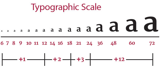
Many designers and developers chose the font-size for elements like h1 and h2 visually, and simply hope that these magic numbers work well in their design. But there's no need to just pull numbers out of thin air; typographers have used typography scales for centuries to help with this. What you do is to pick a number from the typography scale as the size of your element. Unfortunately, these scales can't be directly used for the web because they're built for print design.
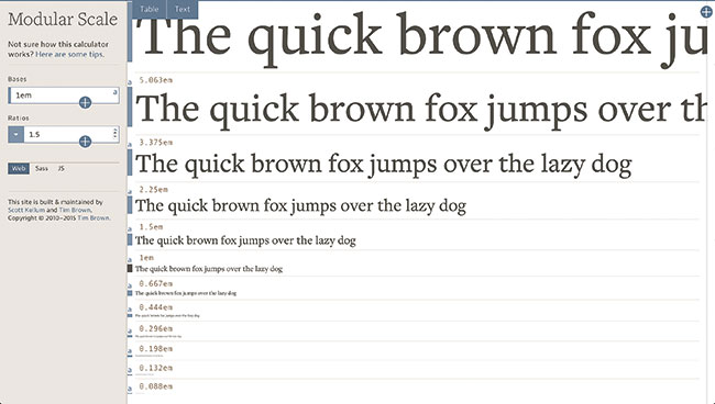
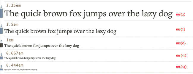
Tim Brown, an expert in the field of typography, came up with a solution called a modular scale. It functions exactly like a typography scale, except you construct the modular scale with the body text you've decided on.
To create the modular scale, you take the body text font-size (also called base font-size) and multiply it by a ratio numerous times until you get a scale. Often, the ratio you use is derived from music (since music has roots in harmony). Above is an example of a scale created with the help of a modular scale calculator.
When you're done constructing the modular scale, you can move on to typesetting the rest of your elements, picking a number from the scale as your font-size. Then set the leading and measure with the same process until you get a good balance of readable elements.
Vertical rhythm
The next step is to help gel the individual elements together using a technique called vertical rhythm. For one element to flow harmoniously into the next, we need to tweak the thing that joins them up: the white space. This white space must be large enough to differentiate one element from the next distinctly, but it must be small enough to ensure the flow isn't broken.
How much white space should you use? Many designers choose a figure like 10px that is easy for them to design around. Many developers, on the other hand, tend to whip out a random number (like 6px) either from another grid system or an article they've read online. No wonder these two can't communicate.
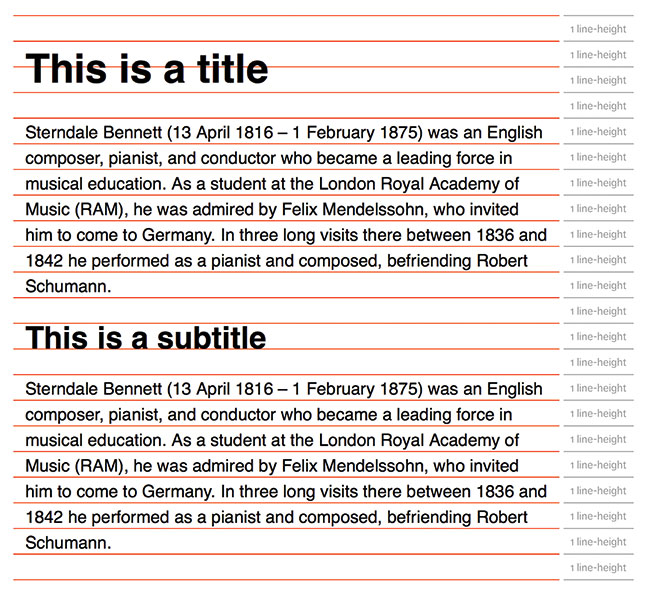
As you may imagine, there's no need to rely on a magic number for the white space; we can use a multiple of the line-height value of our body text. This is because we instinctively recognise white space patterns within text. The stronger the pattern, the safer we feel, and the easier it is to let our minds wander into the content.
To use vertical rhythm, all you do is:
- Set the white space between elements to a multiple of the base line-height
- Set the line-height of all other elements to a multiple of the base line-height
The multiple in question doesn't need to be an integer. You can use values like 0.5x and 1.25x of the base line-height to provide you with more flexibility. These values work because vertical rhythm uses the principle of repetition.
Baseline grid or no?
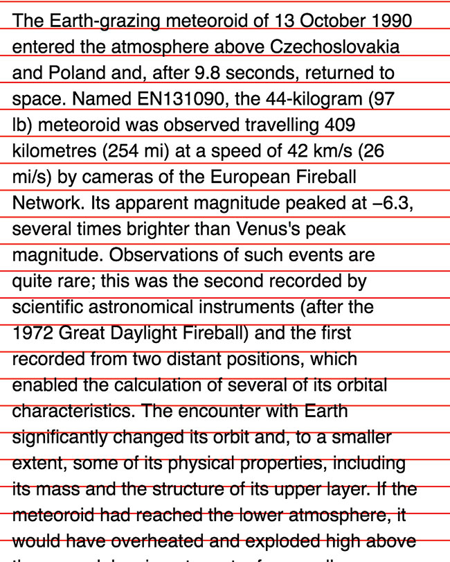
Whenever we mention vertical rhythm, the concept of a baseline grid inevitably comes into the picture. Although the baseline grid can potentially be helpful, it's mostly a train wreck because beginners focus so much energy on making text sit between (or on) baselines that they feel it's impossible to get vertical rhythm right.
Honestly, you'll never get baseline grids to work perfectly on the web because the maths in typography always contains subpixels (like 24.8px), and all browsers handle subpixels differently. For example, some browsers cause every element on the page to be off by 1px. These 1px errors accumulate and push any elements placed lower down the page even further off the grid. As a result, I recommend against using a baseline grid.
Moving on, let's step into the realm of responsive practices and designing for multiple screens.
Typography for multiple screens
Designing typography for multiple screens is no mean feat. There are three things we need to do from a design perspective.
First, the distance between a user's eyes and their screen depends on what kind of device they're using. Generally, the user will place the device further away when using a larger screen. This phenomenon means you need to increase your font sizes as the device width increases.
Second, we want to keep the proportions between the body text and other elements consistent. This means we have to increase the sizes of all elements as we increase the body text size.
Third, at specific breakpoints we want to increase the font-size of specific elements (like the h1) by picking a different number from the modular scale. Doing so allows us to control the visual hierarchy and ensures that elements garner just enough attention to pull a user to read on.
Coding for responsive typography
We know we need to increase our text sizes proportionally. The easiest way to do this is to increase the font-size within the html selector. We also want to use relative units to respect a user's font-size preference.
html {font-size: 100%;}
@media (min-width: 40em) {
 html {font-size: 112.5%;}
}
We also want to use a relative unit for other elements, so they scale according to the HTML font-size (h2 in the example below). If you need to change the font-size to a different number in the modular scale, all you do is change the font-size accordingly (h1 below).
h1 {font-size: 2.369em;}
@media (min-width: 40em) {
 html {font-size: 3.147em;}
}

h2 {font-size: 1.777em;}
Although the process looks simple, new developers might face a ton of headaches because of the maths involved, which is why I recommend using functions and mixins to help out. I often use ms() from the modular scale library. With this, you can write ms(4) instead of 3.157em and ms(3) instead of 2.369em.
An example of a function that can ease the load of calculating vertical rhythm is:
@function vr($rhythm) {@return $rhythm / 16 * 1rem;}This vr function allows you to write vr(3) for a multiple of three baselines instead of calculating it yourself. To help you (and myself) out even further, I've created a responsive typography library called Typi.
Relative units
All discussions about relative units end with a question of whether you should use rem or em units. I believe that rem and em have their unique use cases, and you should use them in different circumstances. Here are two rules that might help you choose which unit to use:
- Use em if the property needs to scale with font-size
- If not, use rem
For more information on choosing between these units, see this article.
Summing it up
In this article you've learned the essentials of responsive web typography. Of course, you'll find more details as you dive deeper, both in theory and implementation, but what you have here covers 80 per cent of what you'll need in a real project. Equipped with this knowledge, you're ready to begin conversing with both designers and developers on how to design and code good typography for the responsive web.
Responsive typography isn't incredibly difficult. It's just challenging because you need a huge amount of patience and diligence to uncover relevant principles, and apply them in a manner that suits the web.
This article originally appeared in net magazine. Subscribe here.
Related articles:

