How to design graphic figures
Turn your basic stick men into graphic figures with style and personality.

In the earlier years of my illustration career I shied away from having to illustrate figures, whether realistic or simplistic. This often held me back when it came to commissioned work. So I decided to start from scratch and train myself to illustrate figures that I could fit into the scenes and landscapes I was already illustrating.
This tutorial will take you through the same simple steps I went through to learn how to draw people, looking at body language, physical proportions and positioning different parts of the body.
If you'd like to learn more skills in Adobe Illustrator CC, don't miss our Illustrator tutorials post.
01. Start with stick figures
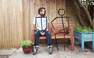
Let’s get right back to basics… stick figures! When I first started out, I found it useful to use a photo. You can try this sketching technique using a digital device, drawing directly onto a print-out or using a lightbox. Here I’m going to draw straight into Illustrator.
You want a photo that includes two seats, with a figure in one of them (see my starting photo here). Draw a stick figure over the real person, then using their proportions as a guide, draw another figure in the second seat. Drawing over a photo enables you to learn proportions, while also playing with graphic style.
02. Keep it basic
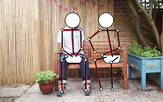
Don’t feel that you need to aim for realistic body shapes and clothing at this point. Limbs could be one or two straight lines, a head could be a perfect circle the torso needn’t be a solid shape, but could instead be just a spine. Play around with how a super-basic skeleton might fit into the scene. If your aim is to get proportions correct, use a horizontal line for the shoulders and across the hips, which the limbs then join on to.
03. Develop your figures
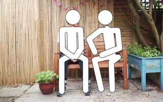
We need to start thinking about developing the stick figures into a usable graphic art style. A first simple approach you can simply thicken up the lines (consider the style of figures on street signs).
Get the Creative Bloq Newsletter
Daily design news, reviews, how-tos and more, as picked by the editors.
I would add curved caps and corners (using the functions in the Stroke Panel) to keep it nice and smooth. Consider different line thicknesses, arms and legs could be the same thickness, but any torso/spine might be thicker.
04. Experiment with geometric shapes
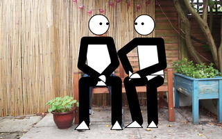
Another approach to stylising your stick figures is to build up more forms and shapes on the body. Again, don’t aim for realistic forms, but experiment with straight lines, geometric shapes and simple curves. You could start to build up the body by adding circles for knee and elbow joints, and triangles or semi-circles for feet and hands.
In order to train your brains and hand to draw graphic figure shapes naturally, I would repeat steps 01-04 a few times, developing these stick figures into simplistic but stylised figures.
05. Set the scene

Moving away from photo-study exercises to creating scenes or locations in a graphic illustration style, your scenery should work with your figure style. My graphic worlds are predominantly a combination of straight lines and geometric shapes. A great Illustrator tip for this is to hold down the Shift key while using the Pen tool; this will only allow you to draw lines at 45-degrees and 90-degrees, ensuring you don’t stray into more realistic/wonky line territory.
06. Add your people

Now it’s time to add figures to your illustrated scenes. You can either sketch them on paper before tracing in Illustrator or draw everything digitally. Remember how the proportions and body language worked on the figures you traced from photos.
If you’re working in Illustrator, you could even use the same shapes from one figure to the next, noting how the proportions of body parts shift as the body moves into different positions. You can also customise or recolour parts like heads or shoes from one figure to the next to create variety. Simplicity is key in a graphic world!
07. Think about proportions

Ensure you’re drawing a broad spectrum of figures with different ages and sizes. One key trick I work with is to use the same size circle for all heads, even children. Children’s heads may actually be smaller than adults’, but I find the proportions work well, and the figures instantly look like children if the head is a little over-sized (but obviously no bigger than an adult’s).
08. Build in detail

The final step is to add detail onto your line figures, building up the limb lines, adding a simple shape for a torso and then dressing them with clothing on top. When I was developing my style I started to add a simple curve shape to the calf muscles, or if the leg was clothed I widened the leg outline until it looked more like a trouser leg. Again, we are not aiming for realism, so it’s fine to leave out the neck, or have an impossibly thin joint at the wrist or ankle.
09. Find your style
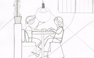
I now sketch figures within scenes in a sketchbook with a ruler and circle template to hand. This allows me to not only create observational drawings, but also means I have full concepts and scenes ready to be artworked in Illustrator.
By basing my figures on real people, studying real life clothing choices and hairstyles, as well as the body language and proportions of different figures, my scenes now have far more style and individuality.
10. Add some personality

Even a graphic figure, built from geometric shapes, can have a personality. Don’t hold back on colours, gradients or textures. Use tonal differences on skin and clothing to evoke mood lighting, and add props to tell a story and really set the scene.
Related articles:

Thank you for reading 5 articles this month* Join now for unlimited access
Enjoy your first month for just £1 / $1 / €1
*Read 5 free articles per month without a subscription

Join now for unlimited access
Try first month for just £1 / $1 / €1

