Boost D3.js charts with SVG gradients
Nadieh Bremer walks through four different ways you can use SVG gradients to brighten up your D3.js data visualisations.
Nadieh Bremer will be at Generate London in September, where she'll be demonstrating how to take SVG beyond mere shapes, using JavaScript, CSS and D3.js to make data visualisations even more fun and exciting. Book your ticket now!
D3.js has taken over the world of interactive data visualisation. An enormous number of examples can be found, each showcasing its own fun and useful twist on the library. You see, D3 is not a charting library, but something much better. It gives you only the basic tools to create data visualisations, and in doing so enables you to create practically anything you can think of. Even though some ideas might take more time than others, you'll get there eventually. And this freedom is exactly what I love about D3.
At its core, every D3 visual is built out of SVG elements. For example, for each datapoint in a scatterplot chart, to create a bar chart, as an axis, parallel coordinates or slope graph, as labels, and the extremely useful for practically everything else. Furthermore, SVGs are resolution-independent, thus look great on any display or zoom level.
Even if you're just using SVGs for their shapes, you can create wonderful visualisations. However, they can do much more – think of SVG filters for example. In this tutorial, we'll take a deep dive into one specific aspect and look at a few different ways it can be applied to brighten up a visualisation. Let me introduce you to SVG gradients!
Find all the files you need for this tutorial here.
Linear gradients
Sometimes when I create a line chart with a single line it just feels a bit too empty and can get lost on the white background. To make it stand out more, I place a light gradient below it using D3's d3.svg.area function, filled with an SVG gradient (see fig 1).
I want the gradient to run vertically from the top (where it is the same colour as the line but a lighter shade) to the bottom (where it should become white, or transparent). This is what is known as a linear gradient; something that changes colour along a straight line.
Get the Creative Bloq Newsletter
Daily design news, reviews, how-tos and more, as picked by the editors.
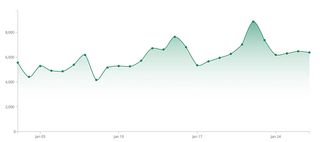
We start with an SVG. This is the canvas on which our line chart will be drawn. We then create a defs element onto which we can append a linearGradient element. It's very important to give the gradient a unique ID – we will use this later when we need to give the area below the line its fill.
var areaGradient = svg.append("defs")
.append("linearGradient")
.attr("id","areaGradient")
.attr("x1", "0%").attr("y1", "0%")
.attr("x2", "0%").attr("y2", "100%");
The last two lines of the code above define how the gradient should run. Think of it as a invisible line: x1 and y1 are the starting positions of the invisible line and the x2 and y2 indicate its end point, to give the direction of the gradient. It's often easiest to define these as percentages, although it is possible to use exact pixel locations. By default the locations refer to the bounding box of the element onto which the gradient is applied. We want the gradient to run vertically, so x1 and x2 should be the same (0% is fine), y1 has to be 0% and y2 100%.
Now we can define the colours of the gradient. At least two colours are needed for a gradient, but you can use as many as you like. For each colour in the gradient you add a stop element. Within this you specify the shade with stop-color, and the location (along the invisible line) where you want this colour to be pure (the exact colour) with offset.
Optionally, we can also set the opacity of each colour with stop-opacity. Here I'm making the shade slightly lighter at the top and completely transparent at the bottom.
areaGradient.append("stop")
.attr("offset", "0%")
.attr("stop-color", "#21825C")
.attr("stop-opacity", 0.6);
areaGradient.append("stop")
.attr("offset", "80%")
.attr("stop-color", "white")
.attr("stop-opacity", 0);
Now the linear gradient is set up, we can create an area chart and fill it with the gradient. To do this, use url(#gradient-ID) in the fill style, along with the unique ID we set earlier.
svg.append("path")
.style("fill", "url(#areaGradient)")
.attr("d", areaFunction(dataset));
Afterwards, draw the line on top of this area of the chart so the viewer can read results off your graph. In my chart, I've also placed circles to emphasise the locations of specific data points.

A smooth legend
Legends are very common in data visualisations. When you're using colours to represent a particular aspect of your data, you need to explain what each colour means. This is where a legend comes in.
In some charts, you will be using colour to discriminate between discrete cases (for example, different countries), in which case the colours are often all very different. However, you can also use colour to indicate a quantitative value.
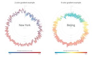
Here we're representing the temperature outside (see fig 2). The colour changes gradually to indicate the temperature going from low to high. To show this in a legend, we're going to create a long rectangle and fill it with a gradient going from left to right. We can reuse the gradient we created for our line chart, but flipped by 90 degrees (so x2 now runs to 100%, rather than y2). Although generally a rainbow palette is not recommended in data visualisation, people are used to seeing colourful temperature maps, and I've chosen nine colours to use in our example.
Instead of writing out each stop to append, we can put all of the colours in a dataset and use D3's nifty data step to make the process quicker. With D3 it is possible to access any property of the dataset in the subsequent chaining steps using an anonymous function, thereby enabling us to set the colour and offset in just two lines.
svg.append("defs")
.append("linearGradient")
.attr("id", "legendGradientMulti")
.attr("x1", "0%").attr("y1", "0%")
.attr("x2", "100%").attr("y2", "0%")
.selectAll("stop")
.data([
{offset: "0%", color: "#2c7bb6"},
{offset: "12.5%", color: "#00a6ca"},
{offset: "25%", color: "#00ccbc"},
{offset: "37.5%", color: "#90eb9d"},
{offset: "50%", color: "#ffff8c"},
{offset: "62.5%", color: "#f9d057"},
{offset: "75%", color: "#f29e2e"},
{offset: "87.5%", color: "#e76818"},
{offset: "100%", color: "#d7191c"} ])
.enter().append("stop")
.attr("offset", function(d) { return d.offset; })
.attr("stop-color", function(d) { return d.color; });
Like before, the final step is to create a rect and fill this using the unique gradient ID.
svg.append("rect")
.attr("x", 0).attr("y", 0)
.attr("width", 500).attr("height", 20)
.style("fill", "url(#legendGradientMulti)");
The charts these legends go with are recreated after the fabulous work of www.weather-radials.com showing the temperature in New York or Beijing in 2015. The average temperature each day is indicated by a coloured line, and these lines are arranged to form a circular graph. The legend below explains what each colour means. One graph uses a gradient from one colour to another, and the other progresses through all nine colours.
Data-based gradients
In a manner similar to the previous example, we can also create multiple gradients. We could make a unique gradient for each data point, based on a particular aspect of the data. I used this approach in an exoplanet visualisation, where each planet was given a gradient based on the stellar class of the star it orbits. I used a subtle sphere effect to give the impression each was lit by the star in the centre.
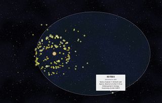
So let's go back to the 90s and turn a collection of flat circles representing the planets in our own solar system into 3D-looking spheres with radial gradients (fig 4). I've created a small dataset containing the planet's name and diameter. Each will be generalised by one colour, which we'll use to create a unique gradient for each planet.
var gradientRadial = svg.append("defs")
.selectAll("radialGradient")
.data(planets)
.enter().append("radialGradient")
.attr("id", function(d){ return "gradient-" + d.planet; })
.attr("cx", "15%")
.attr("cy", "50%")
.attr("r", "85%");
The code is slightly different here: instead of first appending a gradient element, we now immediately append the planets dataset and only after the enter do we create a gradient element (in this case radialgradient). This way, a gradient is created for each point in the dataset. Keep each point's ID unique by basing it on the data. The index i usually works, but here the planet name is safer. This ensures we can access the correct gradient later.
A radial gradient is slightly different to a linear one. We create it in a similar way to an SVG circle: supply the centre of the gradient with respect to the object bounds to which it will be applied, using cx and cy. These values default to 50%, which is the centre of the object.
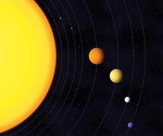
To simulate the appearance of a star shining on the planets from one side, we'll move the centre of the gradient to the left by setting cx to 15%. The radius of the gradient (where a gradient stop of 100% should end) is indicated by r. It also defaults to 50%, but due to our cx offset, this is now 85% so it fills the entire circle.
We can use the planet data to append the colour stops. To create the appearance of a sphere that is being shined upon, the colour at 0% should be lighter. By using d3.rgb().brighter(k) I don't have to specify a separate colour, as D3 will do that calculation for me. The value k defines how much lighter I want the colour to become. At around 50% I set the true colour in the dataset. At the edge I want a colour that is slightly darker, giving the appearance of shade. Logically, there is also a d3.rgb().darker(k) that we can use.
gradientRadial.append("stop")
.attr("offset", "0%")
.attr("stop-color", function(d) {
return d3.rgb(d.color).brighter(1); });
gradientRadial.append("stop")
.attr("offset", "50%")
.attr("stop-color", function(d) { return d.color; });
gradientRadial.append("stop")
.attr("offset", "100%")
.attr("stop-color", function(d) {
return d3.rgb(d.color).darker(2.5); });
If you were to inspect the HTML after running this, there would be eight different radial gradients present. Last, we need to create eight circles, give them a radius as defined by the data, and fill them with the correct gradient.
svg.selectAll(".planets")
.data(planets)
.enter().append("circle")
/* Set the class, location and radius attributes ... */
.style("fill", function(d) {
return "url(#gradient-" + d.planet + ")"; });
I've also added the Sun, which has its own radial gradient, but I've left cx, cy and r with the default setting of 50% to make it look like the Sun is glowing from the centre outward.
A disclaimer: Although the diameters of all the spheres are correct relative to each other, the distances are of course completely bogus. And I'm sorry that Saturn has no rings
Playing with the orientations
We've now explored how to set colour aspects based on data, but there are a lot more possibilities. We can set practically everything based on data – even the orientations of each gradient.
To try this out, let's make a D3 chord diagram showing the collaborations between the Avengers in the Marvel Cinematic Universe (fig 5). The chords that run between the six Avengers are sized according to the number of movies in which they both appear. We're going to fill these chords with a simple linear gradient, changing from one Avenger's colour to another's.
A chord is usually not exactly horizontal or vertical. So we'll have to set the x1, x2, y1 and y2 values based on the locations of each Avenger's outer arc. This data is not in our original dataset, but after we've supplied it to D3's d3.layout.chord function, we will get back a new dataset containing the start and end angles of each arc (as d.source.startAngle and d.target.endAngle). This is the dataset we supply while creating the gradients.
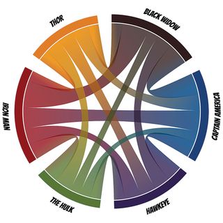
We need to know the pixel positions of the invisible line that runs from one end of a chord to the other. These are then used to give the x1,..,y2 attributes of each gradient. We can apply some trigonometry using the radius of the chord diagram and the location halfway along each Avenger's arc to get back these positions. The full trigonometric formula has been removed from the following code, but you will find it in the GitHub repo that accompanies this article.
To make a unique ID for each chord we create a string combination of the Avenger's index value at each end of a chord. D3's d3.layout.chord always sets one (of the Avengers) to source and the other to target, which makes a unique pair. Later, when drawing the chords, we can use the same technique to call the correct gradient.
var grads = svg.append("defs").selectAll("linearGradient")
.data(chord.chords())
.enter().append("linearGradient")
.attr("id", function(d) { return "gradientChord-" + d.source.
index + "-" + d.target.index; })
.attr("gradientUnits", "userSpaceOnUse")
//The pixel location of one end of a chord
.attr("x1", function(d,i) { return /* ...trigonometry based on
d.source values... */ ; })
.attr("y1", function(d,i) { return /* ... */ })
//The pixel location of the other end of a chord
.attr("x2", function(d,i) { return /* ... */ })
.attr("y2", function(d,i) { return /* ... */ });
Since each Avenger is defined by its own index number, we can make a colour function, colors, that returns each Avenger's colour per index value. This makes it easy to refer to the right colour while appending the two colour stops.
grads.append("stop")
.attr("offset", "0%")
.attr("stop-color", function(d){ return colors(d.source.index);
});
grads.append("stop")
.attr("offset", "100%")
.attr("stop-color", function(d){ return colors(d.target.index);
});
All that remains is to call the right gradient ID while setting the fill style of the chords (with the same function as we used to set the gradient ID).
Rounding up
During this tutorial, we've looked at four different ways to use SVG gradients in data visualisations, but there are always more things you can do. With gradient animations, you could simulate a flow from one part of the data visualisation to another, for example.
So next time you're designing a data visualisation, let your creativity run free. With D3.js, you don't have to be constrained by what you think are the limits of the tool. With a little out-of-the-box thinking and effort, you can make the most amazing things.
Don't miss Nadieh's session, SVG beyond mere shapes, at Generate London, 21-23 September. Book now!
This article originally appeared in net magazine issue 280; buy it here!

Thank you for reading 5 articles this month* Join now for unlimited access
Enjoy your first month for just £1 / $1 / €1
*Read 5 free articles per month without a subscription

Join now for unlimited access
Try first month for just £1 / $1 / €1
