How to create character models for games: 18 top tips
Learn how to create better, production ready games figures every time with these 18 tips for building low-poly models more efficiently.
By Antony Ward
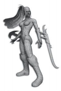
For this sequence of tips, I hope to share some of the tricks and techniques I have learned in my 17 years in the games industry, with particular reference to modelling games characters at lower resolutions.
You may think this is redundant, and are possibly saying to yourself: “Surely I just use the first division from my sculpted model?” Or perhaps you’re glancing favourably at your re-topology tools.
These are all great starting points, but can only get you so far.
Besides, what if you are working with a model that isn’t pre-sculpted, or perhaps is aimed for a mobile device?
For those times, and many more, I hope these simple rules will help you as you work.
01. Know your restrictions
One of the first things you should investigate before starting any game character is your set of working restrictions.
Get the Creative Bloq Newsletter
Daily design news, reviews, how-tos and more, as picked by the editors.
By this I don’t mean polygon and texture page limits – which are paramount to the success of your creation, of course – but rather the environment settings and how the character will be used and seen in the game.
Environment settings are variables such as working units. Are you going to work in centimetres or metres? This has to remain consistent throughout the game or you will end up with scale issues further down the line, especially when rigging and animation are involved.
Knowing how the character will be used and what they must be able to do can have a dramatic effect on the model itself.
Will it be animated, for example? If so, will individual fingers need to bend, or will the mouth need to open? If the character wears a hat, will you ever see underneath it? If not, there’s little point in building the top of its head.
02. Do your research
Approaching a project with no research material is like building something with your eyes closed. Even the most talented artists have a wealth of reference around them while they work.
Working from memory is fine, but a folder of photographs or a wall of concept sketches to work from are crucial.
I often get asked to review work. It always surprises me, especially when recreating the human form, how many artists don’t use reference photos – or have them but aren’t applying them correctly. All it takes is an hour on the web and you can have some great images to guide you.
03. Start simple
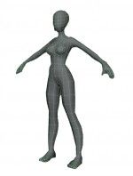
When you start working on your character, don’t rush in and try to create a fully detailed head or hand: this can come later. Block out the whole figure first using basic primitives and stitch them together. I personally like to start by using cylinders.
This will give you a broad overview of the character’s proportions, and an immediate feel for how it will look. As an added bonus, this rough shape can be passed on to be rigged, and an animator can start blocking out some early moves.
04. Try subdivision surfaces
A fantastic way to create a smoother model with an initially low polygon count is to use subdivision surfaces. This method enables you to create a higher-detail model from a low-resolution ‘cage’ mesh, meaning you don’t need to push around lots of geometry.
Once you’re happy with your creation, you can simply bake out the model and convert it to a fully polygon-based mesh, ready for further editing and optimisation.
05. Add detail only where it’s needed
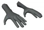
Many artists’ first impulse is to put detail into every area of their creation. It’s only natural to want to do your best, and produce an amazing character. But in the gaming world, it may just be a wasted effort if it’s never seen.
You need to know how the character will be used. If it will be seen from a distance, there’s no point adding fabric detail or the inside of its mouth. You could even use mitten-style hands if each individual finger will not be seen.
Zoom out as you work, to view the character as it would be seen.
06. Be economical
When the words Xbox 360 or PS3 are muttered, artists sometimes think, or are told, that polygon counts can go out of the window. I have worked on many projects where the artwork started out like this, only to then be greeted by a slideshow instead of a game, meaning work has to be redone.
Being economical and optimising models correctly can save you having to revisit your work later – and your lead artist will love you for it.
For me, two basic rules apply. First, remove all unseen geometry: if you can’t see it, delete it. Second, remove all unused geometry: anything which doesn’t directly benefit the shape of an object, or how it deforms.
A good example is a cube: it should only ever be made up of 12 triangles. Any added divisions are a pure waste unless they add to the shape.
07. Follow natural muscle lines

As you build, keep thinking ahead. As your character moves around in the virtual world, it will look better and deform in a more convincing way if your topology mimics the natural muscle layout of a real person.
You don’t need every muscle etching into the surface, however: the normal map, if you can use one, will add nice detail for you. Think of this more as the foundations of how the model will move.
If done correctly, when the arm raises the upper arm and shoulder, geometry will twist and crease as real muscles do.
08. Retain a seamless model
Having lots of separate elements added to a model can make it a pain to rig. As it deforms and moves around the screen, many parts will intersect with the main model, shattering the gaming experience.
This is also true of clothing. Creating the body beneath the outfit is never a good idea: always try and make the two elements part of a single model, or the skin under the clothing will inevitably pop through when the model is animated.
Physically building these into the mesh can stop this from happening, and make life easier for the animator.
09. Keep your topology clean
One phenomenon that bugs me more than any other is messy topology.
Being handed a model with random edges and vertices placed across the surface not only looks awful, but makes any future tasks more difficult, and more than often means the model has to be rebuilt or edited.
Remove anything that isn’t directly needed by the model and won’t enhance the way it looks or deforms.
Also move around the mesh and look for areas that aren’t tidy. Try to keep a clean, grid-type layout across the surface, and everyone will be happy.
10. Check deforming areas

Make sure you have enough geometry in areas that will deform. Not having the correct topology around an elbow, for example, will cause it to look jagged and harsh. It could even result in the elbow pinching as it bends.
You can get away with adding just a few extra polygons to avoid this, but keep the direction a joint will bend in mind. In the example of an elbow, add more around the outer elbow itself, as this will be the area that will stretch.
The inner elbow will also need attention, but will not require as much extra geometry. If you’re not sure, add a few joints and test it to see how it looks.
11. Image planes
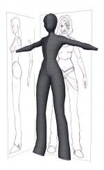
Working from reference on your desk or on a second monitor is a good way to start, but why not bring these images into the application, so you can work on top of them and be more accurate?
All 3D applications have the ability to import image files so you can view them in the scene.
12. Work smarter, not harder
As a character modeller, you will work your way through many humans and creatures in your career, so why not make things easier for yourself?
If you create a good hand model with correct topology, for example, put it to one side so you can use it again on another character.
If the character design you’re working on is symmetrical, just model half and mirror it.
13. Keep your scene clean
When you work in games, your work is never your own. Once your character is modelled,
it will go through the hands of many other people before it gets into the game – so aim to keep your scene as tidy as possible.
Correctly name each model, delete unused nodes and shaders, and bake any construction history on your models. Leave the scene as you would like to be given it.
14. Unify your normals
Most geometry in your scene is set by default to be displayed as double-sided. This can cause confusion when things start to look strange, or that hard edge just won’t go away.
Chances are the normals are flipped on part of your model, so turn it to single-sided to highlight any potential problems.
15. Let the normal map help
Normal maps are great, so take full advantage of them. They add fantastic surface detail to any model, so if you can accomplish the same effect with a normal map, remove the polygons.
This is great for objects close to the surface, like a sock, jewellery or skin detail like tendons and veins.
16. Prioritise
Think about what will be seen most in your model, and prioritise the polygon budget accordingly.
If the character has a big hat, for example, spend more polygons rounding it off so it looks smooth.
If the character’s face will feature greatly, spend time making it look great.
17. Keep regular, sequential back-ups
Like us, your software and hardware have their bad days. Some days you sail through your modelling; the next you are fighting against crash after crash, with hours of work being lost. It sounds obvious, but save regularly and use your application’s auto-save function if it has one.
You can also set many apps to save sequentially, so if you make a mistake, you can roll back to a previous version.
18. Check the silhouette

Sometimes it’s difficult to step back and see a character with fresh eyes, especially if you’ve been working on it for a week. A quick test to help weed out those jagged, polygonal areas is to disable the lights in your scene.
This will leave you with a silhouette you can move around, making more obvious any areas in need of smoothing out.

Thank you for reading 5 articles this month* Join now for unlimited access
Enjoy your first month for just £1 / $1 / €1
*Read 5 free articles per month without a subscription

Join now for unlimited access
Try first month for just £1 / $1 / €1
The Creative Bloq team is made up of a group of design fans, and has changed and evolved since Creative Bloq began back in 2012. The current website team consists of eight full-time members of staff: Editor Georgia Coggan, Deputy Editor Rosie Hilder, Ecommerce Editor Beren Neale, Senior News Editor Daniel Piper, Editor, Digital Art and 3D Ian Dean, Tech Reviews Editor Erlingur Einarsson and Ecommerce Writer Beth Nicholls and Staff Writer Natalie Fear, as well as a roster of freelancers from around the world. The 3D World and ImagineFX magazine teams also pitch in, ensuring that content from 3D World and ImagineFX is represented on Creative Bloq.
Related articles
-
-

-

-
