20 inspirational Penguin book cover designs
In the last 78 years Penguin has created some of the most iconic book covers in history. Here we present a selection of 20 design classics.
Ever since Penguin published its first paperback in 1935, its covers have had a massive influence on British culture and design. More than 75 years on, they’re as popular as ever, with some book jackets even making it onto T-shirts, deck chairs, mugs and posters.
The creators of these iconic designs have ranged from typography legend Jan Tschichold to graphic designer Romek Marber. Over the years they’ve created memorable artwork for everything from new fiction to non-fiction, classics to collections, 'Specials' to short stories.
Evocative of the era in which they were produced, and featuring great illustration, design and typography, our collection offers an inspirational glimpse into the company's archive.
Here, we pick our first batch of favourite Penguin covers...
01. The Compleat Angler

DESIGNER: Edward Young
ILLUSTRATION: Richard Jefferies
PUBLISHED: 1939
Get the Creative Bloq Newsletter
Daily design news, reviews, how-tos and more, as picked by the editors.
COLLECTION: The Horizontal Grid
When Penguin first published these infamous horizontal grid designs, the roles of designer, art director and printer were very much blurred. Edward Young devised these covers as well as the Penguin logo itself. He went on to become the publisher's first production manager. The colours were used to indicate the book's subject matter. Initially, orange was used for fiction, green for crime, dark blue for biography, cerise for adventure, red for plays and in this case, yellow for psychological novels.
02. The Rights of Man
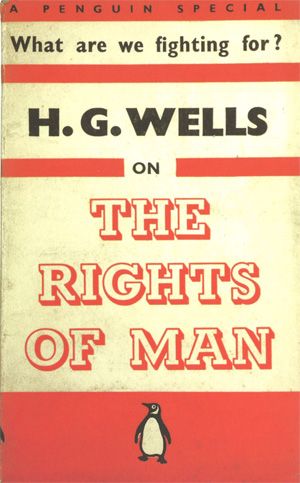
DESIGNER: Edward Young
ILLUSTRATOR: N/A
PUBLISHED: 1940
COLLECTION: A Sense of Urgency: Penguin Specials
In November 1937, Penguin released its 'Specials' collection, which published opinions and investigative journalism on current affairs. The design shifted dramatically, with some front covers even showcasing part of the book's blurb. The typography also changed, as restraints were abandoned and the bolder weights of the Gill Sans typefaces were used on many titles. The collection lasted from 1937 until 1944.
03. A Book of Toys
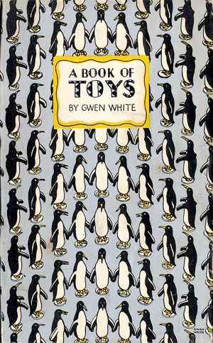
DESIGNER: Gwen White
ILLUSTRATOR: Gwen White
PUBLISHED: 1946
COLLECTION: King Penguins
This was Penguin's first venture into hardback publishing. The 'Kings' were designed as a series of collectables, and were conceived on very different principles to previous Penguin books. Despite wartime rationing, the series triumphed and continued from 1939 until 1959, with 72 books published. Most of the designs stuck to the framework of illustrations or patterned backgrounds with the title in a set bordered panel. Some, however, evolved from this template, which only added to their attractiveness and appeal.
04. The Great Escape
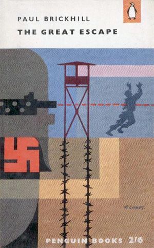
DESIGNER: Abram Games
ILLUSTRATOR: Abram Games
PUBLISHED: 1957
COLLECTION: The Abram Games Cover Experiment
Competition from other publishers was in full swing by the 1950s. The Abram Games collection series was Penguin's first dive into full-colour covers in an experiment to see how it affected sales. Designer and illustrator Games established the one-and-a-quarter inch grid for the author, title and logo to be placed above his illustrations. Nine other illustrators were commissioned during the series, but fewer than 30 covers appeared before Allen Lane decided to stop the experiment due to the increasing cost of full colour printing.
05. The Case of the Haunted Husband

DESIGNER: Abram Games
ILLUSTRATOR: David Caplan
PUBLISHED: 1957
COLLECTION: The Abram Games Cover Experiment
This cover caught our eye thanks to illustrator David Caplan's clever use of illusion (if you can’t see it yet, keep looking). Although part of the somewhat 'unsuccessful' Abram Games Cover Experiment, we think this is an absolute winner. The colour palette works especially well in contrast with the dark, shadowed faces. You might notice Caplan's signature in the bottom left-hand corner, solidifying the illustration as a piece of art.
06. Artificial Satellites

DESIGNER: John Griffiths
ILLUSTRATOR: John Griffiths
PUBLISHED: 1960
COLLECTION: John Curtis
Despite the Abram Games Collection not increasing sales as much as Penguin would have liked, its full colour covers continued to evolve. John Curtis, art director from 1957 to 1959, set out to commission talented illustrators, with highly successful results. In this picture book, Curtis used larger typography to entice younger readers.
07. Busman's Honeymoon
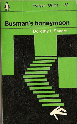
DESIGNER: Romek Marber
ILLUSTRATOR: Romek Marber
PUBLISHED: 1963
COLLECTION: The Marber Grid
In 1961, acting art director Germano Facetti commissioned three designers to create a new grid for Penguin’s crime covers. They needed to incorporate an area for illustration and graphics whilst retaining a clear typographic style. We love this design by Romek Marber; it has a sense of Saul Bass to it and that’s always a good thing! The simple colour scheme also perfectly highlights the illustration.
08. The Penguin John Lennon
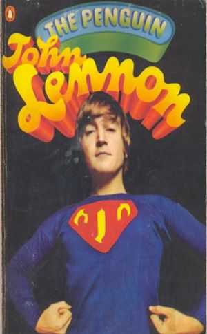
DESIGNER: Alan Aldridge
PHOTOGRAPHER: Duffy
PUBLISHED: 1966
COLLECTION: Covers as posters
With growing competition from the likes of Pan and Corgi, Penguin needed eye-catching covers more than ever. Godwin hired Alan Aldridge, who was younger and known for his sense of fun and creativity, as Penguin's fiction art director in 1965. He changed the face of the covers almost immediately, making sure their designs focused on the title in hand and not on Penguin. This was one of the first to use photography.
09. Improve Your Tennis

DESIGNER: Bruce Robertson
PHOTOGRAPHER: Keystone Press
PUBLISHED: 1966
COLLECTION: Facetti Handbooks
This series saw an update in the cover designs of the Penguin handbooks. Germano Facetti was in charge of the change and many claim that during his time at Penguin, he revolutionised book cover design. He gave this series the same sans-serif look as the other lists, with some collections within the series shaping their own style. This collection of sports handbooks is a perfect example of a sub-series within the collection. The colour scheme was chosen to increase bookshop impact.
10. Drugs
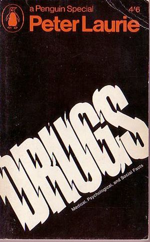
DESIGNER: Henning Boehlke
ILLUSTRATOR: N/A
PUBLISHED: 1968
COLLECTION: Specials in the Sixties
The 1960s saw a resurgence of the Penguin Specials, with titles reflecting the social and political issues that the public were steadily becoming more aware of. The series aimed to ask and answer difficult questions of its culture and of its leaders. In the first half of the decade, the colour red dominated the covers, with the latter half of the decade moving towards black. We love the focus on the typography in this design, reflecting the subject matter perfectly.
11. Kiss Kiss
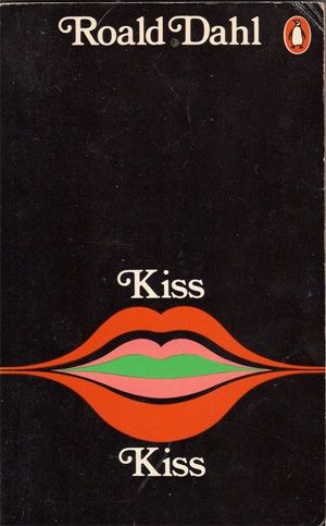
DESIGNER: Omnific
ILLUSTRATOR: Omnific
PUBLISHED: 1970
COLLECTION: Non-Grid Fiction
Art director David Pelham took over as Penguin's art director and continued to use influences from previous design choices, but enlisted a more consistent design for the books’ spine and back. Here, we see his decision to give authors their own specific design for each series they released. We love this Roald Dahl offering, with its typography combined with clever illustration to showcase the 'kiss kiss' title in a sublimely simple way. The juxtaposition of the colours with a black backdrop highlights the illustration in exactly the right way.
12. Science Fiction Omnibus
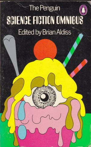
DESIGNER: David Pelham
ILLUSTRATOR: David Pelham
PUBLISHED: 1973
COLLECTION: Science Fiction
Here we see a clear homage to Pelham’s predecessor Alan Aldridge's notion of brightly coloured and strong illustration with a black background. We love the playful yet sinister nature of this drawing. The typography was specifically chosen for this series to reflect the genre of science fiction. By the 1980s, a sci-fi logo was introduced, which some argue ruined the overall design.
13. A Midsummer Night's Dream
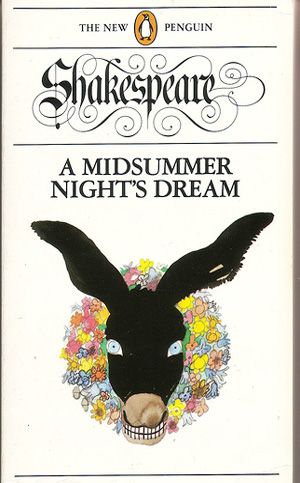
DESIGNER: David Pelham
ILLUSTRATOR: Paul Hogarth
PUBLISHED: 1980
COLLECTION: New Penguin Shakespeare
Redesigning Shakespeare classics was always going to be a difficult task. Like Facetti, David Pelham wanted to make these titles distinct from each other. So he enlisted the help of illustrator Paul Hogarth, who’d had previous success with illustrating the Graham Greene series (1968-1975). Watercolours were used to create this amazing rendition of the animal, with the typography playing homage to broken script lettering from the Elizabethan era.
14. A Clockwork Orange
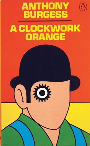
DESIGNER: David Pelham
ILLUSTRATOR: David Pelham
PUBLISHED: 1985
COLLECTION: Non-Grid Fiction
We just had to feature this cover, as it went on to become one of Penguin's most popular and famous to date. Of course, the book itself had something to do with this, but generations have fallen in love with this bright and quirky design. The 1960s influence is clear, with the sole use of primary colours ensuring that the book stands out.
15. The Slow Train to Milan

DESIGNER: Ken Carroll/Mike Dempsey
ILLUSTRATOR: John Clementson
PUBLISHED: 1985
COLLECTION: New King Penguins
The resurrection of the King Penguin series had collectors and book lovers in a flurry. This meant the design had to reflect and live up to the excitement that surrounded the new series. Commissioned illustrations played a huge role in the overall design, which featured the series title in Century Bold Condensed, placed on each cover and white spine. We love this experimental illustration by John Clementson, who now lectures illustration at the University of Wolverhampton.
16. The Fourth Mode

DESIGNER: The Senate
ILLUSTRATOR: Andrzej Klimowski
PUBLISHED: 1989
COLLECTION: Originals
Ever since illustration was allowed onto Penguin covers in the 1950s, there have been very few novels that have not used some imagery in their cover design. In this series, some of the titles didn't actually include the author's name or title of the book; with this cover, you'll notice a demise in size and focus on the author's name and title. This title was a re-working of the original design, which did not feature the Penguin logo. Illustrator Klimowski remains one of Penguin's most notable and famous artists.
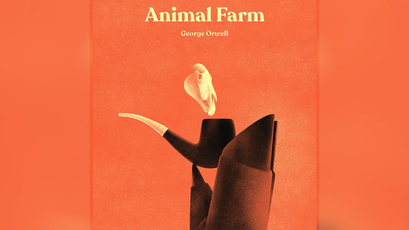
17. Animal Farm

DESIGNER: John Hamilton
ILLUSTRATOR: Peter Fowler
PUBLISHED: 1998
COLLECTION: Penguin Essentials
New art director John Hamilton's sole mission was to resurrect Penguin's fiction collection into a memorable design series. Key titles were selected as 'Essentials', with illustrators commissioned for each title. These covers don't really have any obvious unity apart from strong execution and a unique approach to design. The later novels even disregarded the orange Penguin logo, in favour of highlighting the design itself. The series, including this title, continues to sell today.
18. And The Ass Saw The Angel
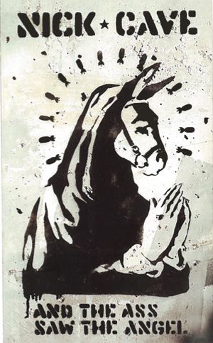
DESIGNER: Banksy
PHOTOGRAPHER: Steve Lazarides
PUBLISHED: 1998
COLLECTION: Penguin Essentials
Another example of the Penguin Essentials series, created by renowned street artist Banksy. The stencil is a perfect depiction of Nick Cave's novel, with the strange illustration and the Angel's halo made out of nuclear bombs. You'll notice the Penguin logo is nowhere to be seen. This design is extremely hard to get hold of nowadays.
Read more about Banksy in 20 inspirational examples of Street Art.
19. Brothers Grimm: Selected Titles
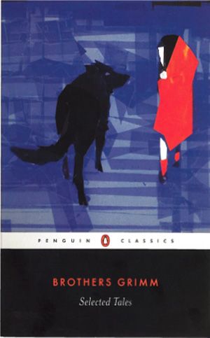
DESIGNER: Paul Buckley
ILLUSTRATOR: Chapero Rouge by Vincent Burgeon - Rue de Flandre Design, Paris
PUBLISHED: 2004
COLLECTION: Penguin Classics
This series’ designs are not unlike those of the Modern Classics series, in that they are heavily image led, with simple typography placed in a grid at the bottom of the page. Designer Paul Buckley centred the design using Futura for the author and Mrs Eaves for the title. Using contemporary art with literature covers started in 1963 by Germano Facetti and has continued to evolve. This illustration by Vincent Burgeon breathes new life into an old story, with his experimental approach and gorgeous imagery.
20. Sixty Stories

DESIGNER: Vault 49
ILLUSTRATOR: N/A
PUBLISHED: 2005
COLLECTION: Fiction today
In a highly competitive market, Penguin continues to evolve their cover designs to keep pace with other publishers. Whilst its fiction designs rarely have any unity, art director John Hamilton ensures that only the best contemporary designers create the covers. Design agency Vault 49 created this stunning cover with a clever collage effect we absolutely adore.
Like this? Read these!
- Download the best free fonts
- The ultimate logo design guide
- Illustrator tutorials: amazing ideas to try today!
Did your favourite cover make it? If not, please don't hesitate to let us know your suggestions in the comments box below!

Thank you for reading 5 articles this month* Join now for unlimited access
Enjoy your first month for just £1 / $1 / €1
*Read 5 free articles per month without a subscription

Join now for unlimited access
Try first month for just £1 / $1 / €1
The Creative Bloq team is made up of a group of design fans, and has changed and evolved since Creative Bloq began back in 2012. The current website team consists of eight full-time members of staff: Editor Georgia Coggan, Deputy Editor Rosie Hilder, Ecommerce Editor Beren Neale, Senior News Editor Daniel Piper, Editor, Digital Art and 3D Ian Dean, Tech Reviews Editor Erlingur Einarsson and Ecommerce Writer Beth Nicholls and Staff Writer Natalie Fear, as well as a roster of freelancers from around the world. The 3D World and ImagineFX magazine teams also pitch in, ensuring that content from 3D World and ImagineFX is represented on Creative Bloq.
