Pantone reveals 2016 Colour of the Year
It's twins! Two shades blended for the first time ever.
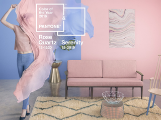
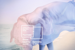
Pantone has announced its 2016 Colour of the Year – and it's a curveball. For the first time ever, the global colour authority has picked a combination of two for the year ahead: Pantone 15-3919 Serenity and Pantone 13-1520 Rose Quartz.
According to Pantone, 2016's combination is "a harmonious pairing of inviting shades that embody a mind-set of tranquillity and inner peace."
The announcement, today, is an annual event that's closely watched by pundits across the design and fashion industries. You can expect a cascade of products in these colours from designers and retailers over the following 12 months.
Pastel pairing
"As consumers seek mindfulness and well-being as an antidote to the stress of modern day lives, welcoming colours that psychologically fulfil the yearning for reassurance and security are becoming more prominent," says Pantone.
"Weightless and airy, like the expanse of the blue sky above us, Serenity comforts with a calming effect, bringing feelings of respite and relaxation even in turbulent times. Rose Quartz is a persuasive yet gentle tone that conveys compassion and a sense of composure."
Tapping into 2016's trends
We've reported on the gender blur increasingly seen across fashion, and Pantone's 2016 Colour of the Year – the combination of Serenity and Rose Quartz – only accentuates this movement.
"This more multilateral approach to colour is coinciding with societal movements toward gender equality and fluidity, the consumers' increased comfort with using colour as a form of expression which includes a generation that has less concern about being typecast or judged, and an open exchange of digital information that has opened our eyes to different approaches to colour usage," said Leatrice Eiseman, Executive Director of the Pantone Color Institute.
Get the Creative Bloq Newsletter
Daily design news, reviews, how-tos and more, as picked by the editors.
Head over to the Pantone site for more.
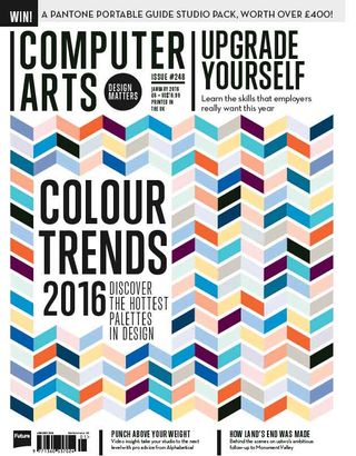
Find out which other colours are going to be big and how to harness the power of next year's top palettes in your design work with the new Computer Arts, 248 - on sale 11 December.
Liked this? Read these...
- 14 huge trends that are changing the face of design and advertising
- Download the best free fonts
- 13 secrets for creating game-changing branding

Thank you for reading 5 articles this month* Join now for unlimited access
Enjoy your first month for just £1 / $1 / €1
*Read 5 free articles per month without a subscription

Join now for unlimited access
Try first month for just £1 / $1 / €1

Julia is editor-in-chief, retail at Future Ltd, where she works in e-commerce across a number of consumer lifestyle brands. A former editor of design website Creative Bloq, she’s also worked on a variety of print titles, and was part of the team that launched consumer tech website TechRadar. She's been writing about art, design and technology for over 15 years.
