New talent: London College of Communication
With themes ranging from politics to music, this year's LCC graduates are proving unstoppable.
If you're looking for the best new graduates for your studio or agency, don't miss Computer Arts' New Talent special, issue 243, featuring the team's handpicked selection of the UK's best graduates – on sale 24 July 2015
This year's Graphic & Media Design graduate's from London College of Communication were certainly showcasing the kind of work you'd expect to see from professional designers. With political work as well as typography, motion design and packaging, each project highlighted a talent that had been refined throughout the years.
Take a look at our 10 favourite projects from the show, which include a look back at torture devices of days gone by, record label zines, typographic screen prints and woodwork.
Can't make it to the show? Be sure to check out the LCC stand at D&AD New Blood next week, and come and say hi to us on the Computer Arts stand too.
01. Sam Morley
- Course: Graphic & Media Design
- Project: The Fabulous Philae!
"The biggest challenge was the total freedom a virtual reality environment offers," begins Morley. "When anything can be coded, modelled, and presented to an audience, the challenge is the systematic elimination of possibilities. What shouldn't I do here?"
"I was very happy with the piece itself, but I always derive much more pleasure from the audience reaction. When a see members of the public slipping the headset on and cracking a big old grin, I knew I had done okay at art school."
02. Cameron Dow
- Course: Graphic & Media Design
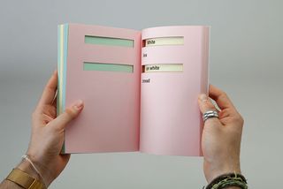
- Project: Words That Make Sentences Poems
"I feel the book demonstrates how people can interpret sentences differently; it allows the reader to form their own perceptions of what people have written. It was interesting to see that both common and unexpected themes appeared," says Dow, who produced an interactive transformation of a poem written by Natasha Kaeda.
"The biggest challenge I faced was trying to develop an engaging way people could interact with a poem to create poetry of their own. I overcame this by breaking the poem down into lines with key words missing, thus hiding the context. This gives the reader the opportunity to express their own thoughts."
03. Shreyansh Agarwal
- Course: Graphic & Media Design
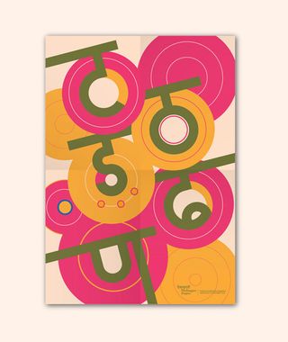
- Project: Davanagari
"Having the project in a space of typographics (type + graphics) allowed more freedom to experiment and focus on supporting graphics as well. The second, to design in a environment where nobody knew the language," says Agarwal, who created a range of geometric typefaces in the Hindi language.
"I am quite satisfied how the project shaped up and became a series publications/typographic styles. The best part was designing all the other elements that went with each booklet like the poster, the belly bound and the volume stickers."
04. Mariam Harraz
- Course: Graphic & Media Design
- Project: A Revolution's Graffiti
"For A Revolution's Graffiti I needed a medium that reflected how art found its way to the walls of Egypt through the chaos," says Harraz, who through a film, book and thread designs, showcased the political issues surrounding Egypt. Cartoons were banned from newspapers, so artists took to the streets to paint what had happened the previous day.
"What was crucial was to able to communicate the idea in a way that can illicit a reaction but also for the viewer to enjoy and easily understand the message of the piece," she continues. "I have become quite passionate about combining politics and art. Graphic design provides me with endless mediums on a platform that can engage internationally."
05. William Slocombe & Rhys Atkinson
- Course: Graphic & Media Design
- Project: Perculiar Drugs
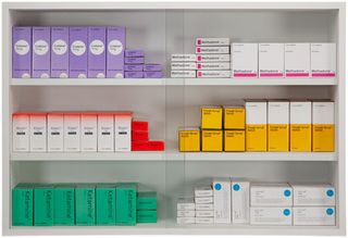
"Drugs have been abused almost since their discovery. From horse tranquillizers to plant food, we designed a range of packaging stating both their intended use and their party use, which comes alive at night under UV light," explain Slocombe and Atkinson.
"We endeavoured to achieve a professional finish, and we believe that the majority of our outcomes reflect this. We really wanted to explore the use of UV ink much more fully, working with it in a more experimental manner, however, time was tight, and we tried to ensure we devoted ourselves equally towards our various outcomes."
06. Héctor González
- Course: Graphic & Media Design
- Project: Who Am I?
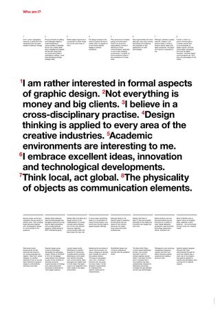
"I have a passion for typography and enjoy working on posters, so the biggest challenge for me was mainly at the stage where I was polishing the copy-text. It is a report, so all the information should be accurate and specific," says Gonzalez, who created a sort-of CV with a difference.
"The lay out development stages took quite a while too, since I often work by hand. This means I cut pieces of paper with text on it and re-arrange it several times until I find a correct composition. I'm feel happy and proud with how it turned out, though and I hope to continue with identity or editorial projects in the future."
07. Thomas Fursdon
- Course: Graphic & Media Design
- Project: Farenheit 451
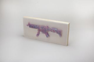
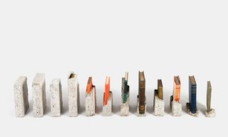
"It's a labour of love, each book is waterproofed and set in its own individual mould. Then broken out to illustrate the journey of the lead character in (the film adaptation of) Fahrenheit 451, it was great fun to make.
"On the most obvious level the concrete illustrates distopia and the books are directly indicative of the society's contraband," says Fursdon, who's graduate project taps into the fine art aspects of graphic design. "There's actually much more to it than first recognised, but I like to hear peoples interpretations of it before I tell them too much."
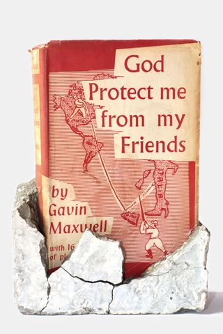
"I adore design, not the politics of it, but just seeing the communication of everything around me," he continues. "I'm actually somehow thankful I was forced away from the digital vice and pushed to play with real life. I'd never have toyed with concrete, magnets, fire, wood and fabric (all major parts of my final year) if I was hardwired to an Apple. It definitely wasn't boring to get here."
08. Alexander Gross & Ted Heffernan
- Course: Graphic & Media Design
- Project: Left Alone
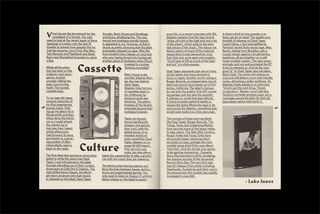
"Our Place is an independent creative design studio founded by Ted Heffernan and Alex Gross in 2013. Conceived and realised whilst studying at UAL, the studio was built on the foundations of two friends' mutual love of simple, contemporary design," explains Gross, who along with Ted Heffernan created the 'Left Alone Zine' for his final project.
Setting up their own design studio and type foundry, the pair combine their passion of music with their talents as graphic designers. "We're an innately innovative studio who believe first and foremost in craft and collaboration. Our work ranges through branding, typographic and editorial projects that always look to push the boundaries of current design."
09. Emily May Derrick
- Course: Graphic & Media Design
- Project: Serious String
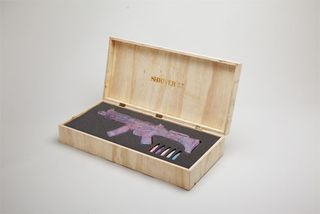
"Besides from being labelled a crazy silly string lady and inhaling one too many resin particles, I feel the biggest hiccup was to come when attempting to film part of the final piece — involving my naked friend Austin, 6 female friends, 60 cans of silly string 100 party poppers and 5,000 fun snaps," says Derrick.
"The process of transforming media from one form to another an approach one that is intrinsically endless and hugely enjoyable. My favourite aspect of the piece has been applying the strategy and logistics of graphic design to a completely new medium and the unpredictable nature of where it would end up."
10. Corin Kennington
- Course: Graphic & Media Design
- Project: Lune
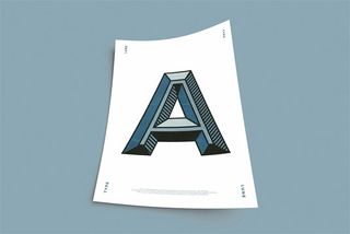
"Lune is a display typeface inspired by the aesthetics and processes found in sign painting. The development of the typeface explores the relationship between hand crafted design and digital technology," explains Kennington who's typeface is the perfect blend of the old and the new.
"The set of three A3 posters have been printed with risograph and outlined using bespoke woodblocks in letterpress." The intricate executiong in these woodblocks brilliantly show off Kennington's skills; we're confident he has a bright future in typography.
Half-price Computer Arts subs offer!
To celebrate 2015 degree show season, you can get an incredible 50 per cent off an annual subscription to Computer Arts magazine. For £39 you'll receive 12 months of industry insight, opinion and inspiration, delivered to your door.
Plus: sign up by 7 July 2015 and you'll receive Computer Arts' New Talent issue, featuring an extensive guide to 2015's most outstanding design graduates.
Like this? Read these!

Thank you for reading 5 articles this month* Join now for unlimited access
Enjoy your first month for just £1 / $1 / €1
*Read 5 free articles per month without a subscription

Join now for unlimited access
Try first month for just £1 / $1 / €1
Get the Creative Bloq Newsletter
Daily design news, reviews, how-tos and more, as picked by the editors.
Sammy Maine was a founding member of the Creative Bloq team way back in the early 2010s, working as a Commissioning Editor. Her interests cover graphic design in music and film, illustration and animation. Since departing, Sammy has written for The Guardian, VICE, The Independent & Metro, and currently co-edits the quarterly music journal Gold Flake Paint.
Related articles
-
-

-
 Tottenham Hotspur FC's nostalgic rebrand was a "labour of love"
-
