How to create mood boards that inspire: 20 pro tips
Expert advice on how to create mood boards to convey your design ideas, win pitches and get an early sign off.
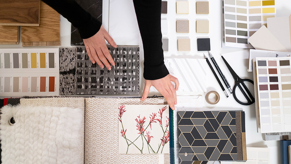
Learning how to create mood boards can transform your experience of pitching design ideas to clients. At the start of a new project, a mood board helps to communicate your vision as a designer. To impress the client, it should offer a visually stunning summary of your ideas, full of textures and images that paint a picture in ways that words alone could not achieve. In a way, it allows the client to get inside your creative mind, while also helping you to organise your own ideas.
This means it's vital to make sure that your mood board is more than a confusing collage of disparate ideas. It should be a cohesive, visually attractive expression that makes your vision clear. But how do you create a mood board that achieves this? Below, we offer a series of tips that should allow you to effectively convey your creative ideas to a client.
If you think your design portfolio also needs some work in order to accompany your next pitch, make sure you also see our tips to create a stunning portfolio website and our top portfolio examples for inspiration. Meanwhile, read on to see how to create mood boards to communicate your ideas.
How to create mood boards: 20 pro tips
01. Look beyond the digital world

When you begin working on a mood board, it's easy (and very tempting) only to use images that you find online. But even if you're working on a digital product, that doesn't mean you need to stick to digital inspiration (and chances are you may also be breaking copyright laws by using online images).
It's worth stepping away from the computer and looking at other sources of inspiration too. When it worked working on the ITV news website, digital product design company Made by Many turned to copies of the classic Picture Post magazine to explore how powerful and effective an image plus caption can be when it comes to telling a news story. Real-world inspiration like this can be a very powerful 'convincer' when putting together a board for a client.
02. Take pictures for your mood boards

Real-world inspiration is all around us, and we have the means to capture it in our pockets. Use the camera on your phone to take pictures of everything you see that inspires you, whether it's a bird in flight, great use of typography on a sign in the street, or even brickwork on a building. It might even be a little corner of your own house. You don't need to capture great photos in the traditional sense – it's more about communicating thoughts, impressions, themes and feelings.
03. Curate the content on your mood boards
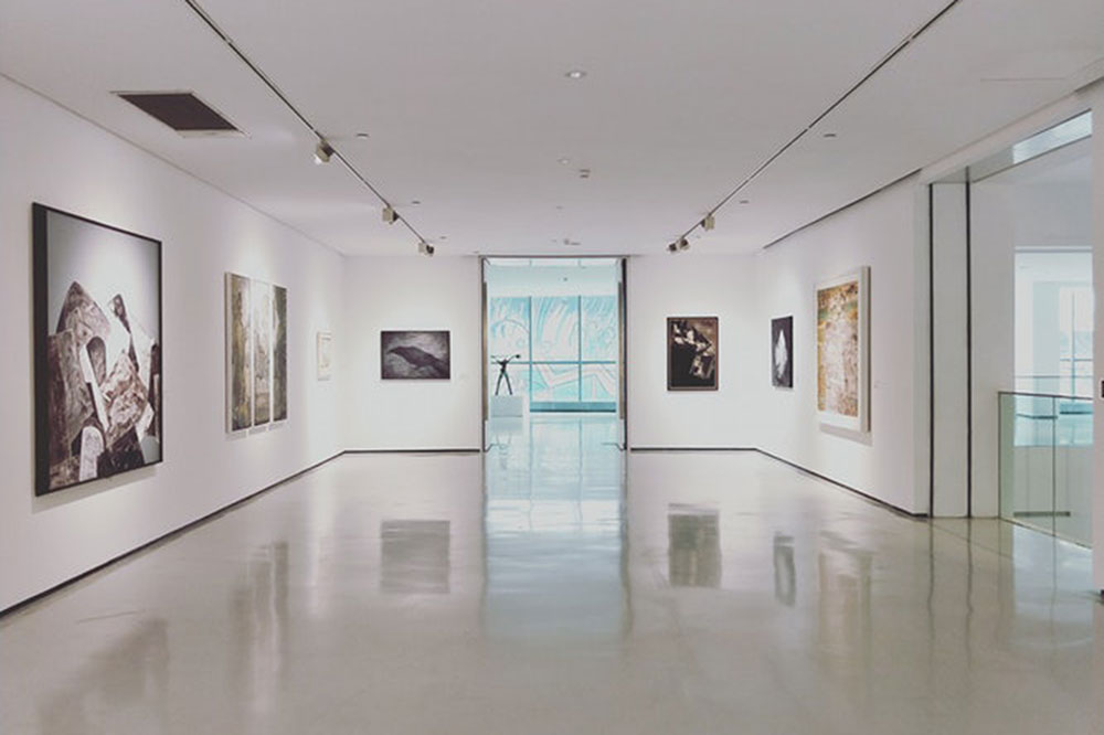
Have you ever been to a gallery exhibition and just not felt 'touched' by the exhibition or 'moved' by what was on show? It's very easy to shove a load of stuff together and call it an exhibition, but it takes real talent to curate threads and synergies between works to make an exhibition that holds together.
Mood boards work in a similar way. When putting together your mood boards, think of yourself as a curator rather than a collector, and try to introduce meaning and threads that connect the images. This can make it much easier for a client to interpret your ideas.
04. Choose the right format
Aim to establish how your mood board is going to be presented from the outset because this will determine how you go about creating it and how much or little detail to include.
An 'offline' mood board will generally be looser in style and could still be presented online, with some explanation, while a completely online mood board should be tighter and will generally need to work harder to convey a theme or style. Think about how a person viewing your mood board solely via email would view it, and make sure that they will be able to follow its flow.
05. Build things up around a large image
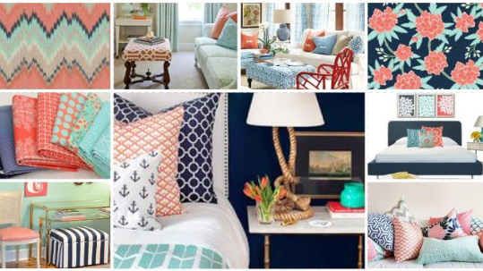
Whether your mood board is electronic or physical, the layout should give more prominence to key thematic images. You can then surround these with smaller supporting images that serve to enhance the theme.
This is something of a subliminal trick. When someone sees a large image on your board, they'll immediately have questions about it and they'll quickly scan the rest of the board to find answers to those questions. If you place smaller supporting images around the larger image, they can answer these questions by clarifying the message conveyed in the larger one.
06. Get tactile

When it comes to making a physical mood board, don't be afraid to get, well, physical. Traditionally, mood boards were made from foam board. Although cutting this stuff up with a scalpel and spray mounting cut-out images onto it can be a hassle (especially if you're not dexterous with a blade), it can also be extremely effective as a presentation tool.
It may seem like an old-fashioned thing to do, but perception-wise it's a real ace up your sleeve as a designer. The tactile nature of cut-out images glued onto boards enhances the emotiveness of what's being communicated. Just be careful with your fingers on that blade!
07. Incorporate your mood board into your pitch
Mood boards are generally considered to be separate from a pitch or presentation. They stand alone to provide guidance on mood and tone. That's the standard practice, but you can also consider making them part of your pitch or presentation.
Remember, you're trying to use subliminal visual tricks to help a client to 'get it'. Mixing mood board elements in with a presentation rather than bolting them on at the end can be an effective way of communicating concepts to the client.
08. Don't reveal everything too early

It's important to make sure that a well-meaning project manager doesn't email an offline mood board ahead of a presentation giving the client a preview of what you're going to present.
For an offline mood board, it's far better to let it all sink into the client's mind as and you showcase it rather than to let the client form an opinion before you've had a chance to explain your vision, otherwise you can expect the client to come armed with a lots of questions before you even start.
09. Present your own mood board
In a similar vein, if your mood board is being presented to the client, try to be involved in the presentation yourself. It can be counterproductive to leave something that originated in your head to be communicated by someone else, which can lead to meaning becoming muddled in a Chinese whispers-type mess.
10. Keep things loose
Locking down an idea or style in a mood board can be detrimental because the client will often feel shoehorned into going with a particular aesthetic. Keep everything a little loose so that nothing looks too final.
If you're using imagery from image libraries as previews, don't worry about the watermarking on them. It can help to emphasise a 'these are only ideas; we can still change this' feel to the board.
11. Watch the audience

When you're presenting a mood board, watch the faces of those you're showing it to. Ignore any verbal 'oohs and ahhs' and instead watch your audience's facial and emotive reactions as they look around the board. This will give you a much more honest take on whether the board is doing its job, and if they're reacting well or badly to what you're showing them.
12. Hone your mood board skills

It's good to practise your skills in creating and presenting mood boards, even if it's not for a client. Employees at branding agency Landor Associates use a form of mood board to showcase themselves to other members of the team. Individuals put together nine images in a 3 x 3 grid to give their work colleagues an insight into what they're like; their interests, passions, cares and worries.
13. Text it up
Don't ignore the power of isolated words on a mood board. A few well-chosen words can be fantastic show-stoppers that can give the viewer pause for thought because they have to mentally read what's in front of them. Big, bold words juxtaposed together work very well at creating drama, tone and meaning for any project.
14. Make the theme of your mood board clear
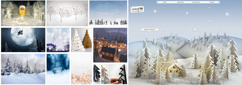
Obscure references can be fun, but try to have a number of relatable items or 'touchpoints' in your mood board to make sure that the theme is clear. You want to let others in, so being deliberately obtuse will earn you no points at all. It's easy to fill out a board with a pile of incomprehensible references; it often takes more thought to be clear and use imagery that can be easily interpreted to sell your vision.
15. Aim to spark an emotional response
Having said that, it also pays to think a little left of centre when you're presenting a mood board to a client. Ask yourself what would give them a genuine emotive response. Real-world objects are good for this. If you were inspired by the beach, bring in a shell. If your eureka moment happened on the train, bring in the ticket. This type of thing can create intrigue, which triggers that all-important emotive reaction.
16. Don't make presumptions

Expecting too much of your audience can make the difference between a successful mood board and one that's dismissed as being too cerebral – or downright confusing. There's a great danger in assuming that people will "know what you mean". The chances are they won't. Even if it takes a few more references, images or textures to really clarify what's inside your head, it's worth adding them in.
17. Test your mood board

That leads us on to our next tip for how to create mood boards. It can really help to show your mood board to someone not involved in the project to check how it goes down before you share it with the client. Remember, it's not a game of Pictionary: if your test audience has to ask too many times what an image means or why it's there, then you should probably make changes.
18. Have fun with your mood board
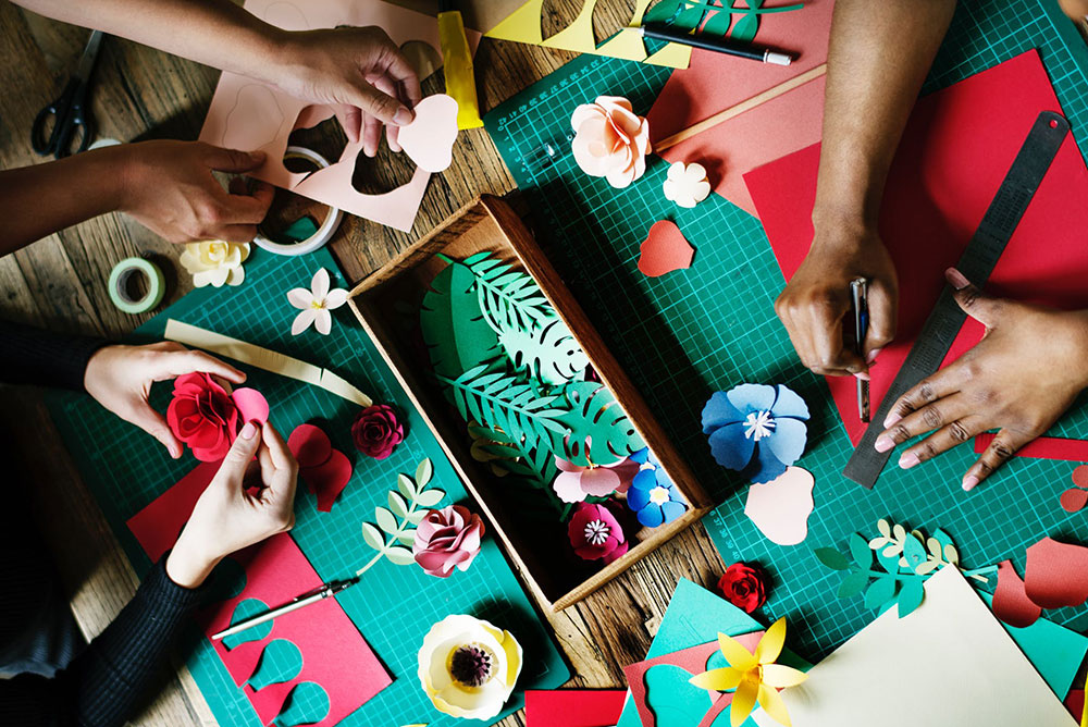
It's a lot of work, but the whole process of creating mood boards should be fun – and a refreshing break from the often tedious tasks of the jobbing designer. If you're not having fun, that's a sure sign you're going about things the wrong way.
19. Use mood boards to brief designers
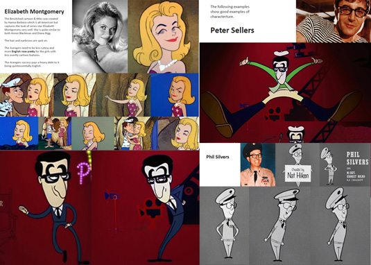
Mood boards are a good way to brief a creative. Don't be afraid to go into detail here. The mood board above was compiled for animator Tom Baker as a mood and style guide for a celebration of the Avengers TV series in 2011. Instead of relying on one example of a character, several types are shown in many different poses, which gave Baker a clear take on the style and direction of the piece.

20. Speed up client sign-off

Mood boards aren't only for pitches. Consider preparing mood boards throughout projects before creating polished visuals. 'I'll know it when I see it' is a phrase that most of us are familiar with, and hearing this feedback when finished artwork comes back from a client can be gutting, meaning it's back to the drawing board. Using mood boards at different stages of the process can help you avoid this from happening by allowing you to get feedback along the way.
Related articles:

Thank you for reading 5 articles this month* Join now for unlimited access
Enjoy your first month for just £1 / $1 / €1
*Read 5 free articles per month without a subscription

Join now for unlimited access
Try first month for just £1 / $1 / €1
Get the Creative Bloq Newsletter
Daily design news, reviews, how-tos and more, as picked by the editors.

Joe is a regular freelance journalist and editor at Creative Bloq. He writes news, features and buying guides and keeps track of the best equipment and software for creatives, from video editing programs to monitors and accessories. A veteran news writer and photographer, he now works as a project manager at the London and Buenos Aires-based design, production and branding agency Hermana Creatives. There he manages a team of designers, photographers and video editors who specialise in producing visual content and design assets for the hospitality sector. He also dances Argentine tango.
