10 bold examples of neon design
These beautiful and bold examples of neon design are as in-your-face as you possibly imagine...
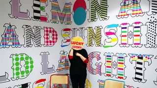
Picking the right colour palette for your design work is always a difficult decision. Whilst some favour the more understated, others opt for the bold and bright. Choosing neon will no doubt cause the likes of your illustration, branding and more to be as eye-catching as possible. Here, we've picked some of the most inspiring neon examples out there - pass the sunglasses!
01. Diwali 2013 card
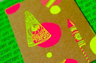
We love this Diwali card created by designer Mira Malhotra. She explains, "in the spirit of the festival of lights, this Diwali card was meant to be bright and unique, not the usual sombre affair. The aesthetic stemmed from the vibrant fliers and posters provided by low-budget printers and cheap stationery found in the Indian bazaar".
02. MTV Grouphug
This adorable spot for MTV was created by German based designer Christian Zschunke. The neon characters are super cute, and brings to life a whole new world. "The warm and cuddly theme was just about the right thing during the cold winter to make us glow," he remembers. "I spend quite some time during the initial phase, designing characters and setting the mood for the spot".
03. William Hill typography
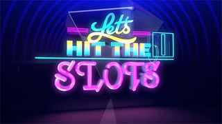
British based designer Steven Bonner is one of our favourite typographers out there. This custom typography was created for Art & Graft agency, who were producing a spot for William Hill’s Vegas online casino. "I drew a whole host of lettering designed to emulate the casino style and the guys at Art & Graft weaved their motion magic on it to make, in their words: 'a colourful, bright and fast-paced neon journey through slot machine heaven'.I couldn’t agree more," he says.
04. Morag Myerscough
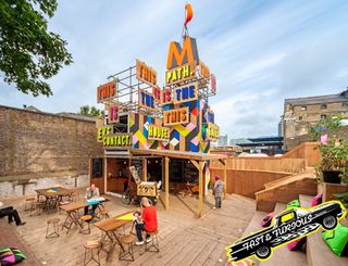
Morag Myerscough is the multi-award winning creator of Studio Myerscough. Using an array of geometric design as well as beautifully bright neon palettes in many of her designs, she's a favourite when it comes to bringing a splash of colour to a project. This neon design is placed on the the Movement Cafe in Greenwich.
05. Viction:ary's Palette book
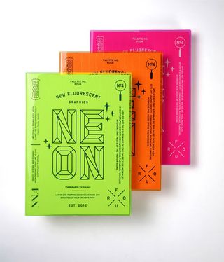
This beautiful book, the latest in viction:ary's Palette series, takes a look at what makes fluorescent a favourite for many. The 296-page book, entitled 'Palette No.4: Neon, New Fluorescent Graphics', showcases the applications of fluorescent colours in the design world, examining where they work best.
06. Baines and Fricker chair
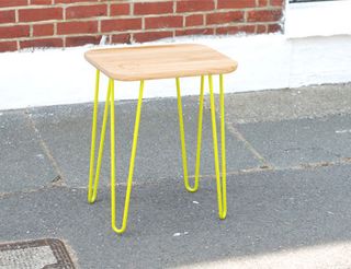
Furniture is a big deal in the design industry. A well-executed concept can result in a timeless piece of furniture that never goes out of style. This simple yet sleek design from husband and wife duo Baines and Fricker shows us that you don't have to go overboard to give your designs a splash of neon.
07. Melbourne theatre company
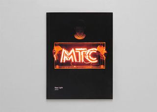
August was a glowing month for The Melbourne Theatre Company as it launched its refreshed brand identity as well as a new season of productions for 2013. Designed by former Melbourne Festival head Brett Sheehy - who also happens to be MTC’s new Artistic Director and CEO - this neon inspired branding was used across posters, brochures, flyers and programmes.
08. Habibis
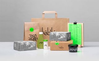
This branding adapts stylised Arabic calligraphy to a typical Mexican street setting, complete with neon colors and inexpensive materials, like craft paper bags. Deep research and careful understanding of the Arabic alphabet was needed for the design, using calligraphic pens and special brushes, the various words and signage are shown in both Arabic and Latin. We love the subtle use of neon in this one!
09. Computer Arts
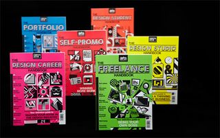
Our sister magazine Computer Arts created this gorgeous array of handbooks for their 'Presents' series. Using a neon colour scheme for each individual cover, the design was created by the magazine's then art editor Luke O'Neill. You can still purchase each handbook over on My Favourite Magazines.
10. A New Hope
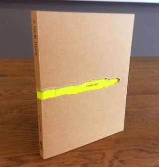
Created by Singapore based designer PY, we adore the subtle use of neon in this book cover design. "The whole project started from basic design, print, bind, mount, fold & tear! It was all done manually. The title - The New Hope was printed on the neon colour paper, with kraft paper wrapped over it and then a tear out revealing the title," he explains.
Like this? Read these!
- Illustrator tutorials: amazing ideas to try today!
- Great examples of doodle art
- Brilliant Wordpress tutorial selection
Have you used neon in your designs? Let us know in the comments box below!

Thank you for reading 5 articles this month* Join now for unlimited access
Enjoy your first month for just £1 / $1 / €1
*Read 5 free articles per month without a subscription

Join now for unlimited access
Try first month for just £1 / $1 / €1
Get the Creative Bloq Newsletter
Daily design news, reviews, how-tos and more, as picked by the editors.
The Creative Bloq team is made up of a group of design fans, and has changed and evolved since Creative Bloq began back in 2012. The current website team consists of eight full-time members of staff: Editor Georgia Coggan, Deputy Editor Rosie Hilder, Ecommerce Editor Beren Neale, Senior News Editor Daniel Piper, Editor, Digital Art and 3D Ian Dean, Tech Reviews Editor Erlingur Einarsson and Ecommerce Writer Beth Nicholls and Staff Writer Natalie Fear, as well as a roster of freelancers from around the world. The 3D World and ImagineFX magazine teams also pitch in, ensuring that content from 3D World and ImagineFX is represented on Creative Bloq.
