What is typography? Plus key type concepts you need to know
Essential type concepts, explained.
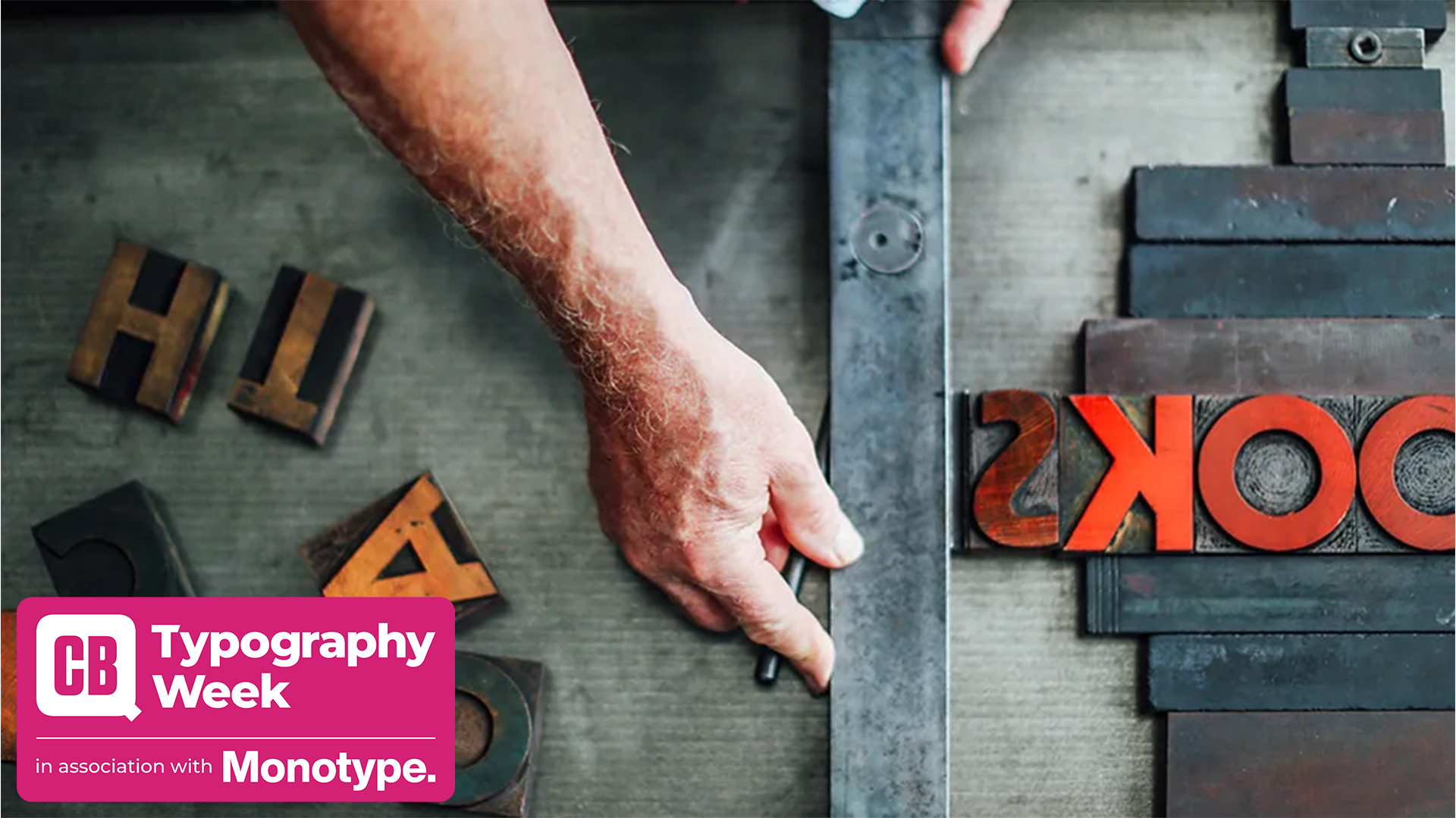
Typography is the art of arranging letters or type in a way that is legible, attractive and clear. Type is everywhere: it's on the back of cereal boxes, on billboards and on terms and conditions, it's on handwritten letters, typed out notices and on TV credits.
Typographers are people who create and manipulate type and typography design plays a key role in a designer's skill set. The typeface you choose and how it works with your layout, grid, colour scheme can make or break a design. Typography often carries the weight of a message, and getting it right contributes to the message being communicate successfully.
Legibility is part of that, but typography can also communicate a mood and personality, it can contribute the character of a brand and it can immediately shape how the audience perceives the company, organisation or individual communicating a message.
Like many areas, the field of typography design is absolutely packed with jargon. There's terminology for everything from the correct names for the different parts of letterforms to terms related to their arrangement within a design. This can sometimes make it seem rather arcane to outsiders, so below are the basics you'll need to know, both for newcomers and for more experienced designers who might want a refresher.
For more advice, see our roundup of great typography tutorials. You might also want to make sure you understand font licensing and the difference between serif vs sans-serif.

Key concepts for typography design
01. Font selection
Font design is a lengthy, detailed process. Typefaces are created by craftspeople over a long period of time, using talent honed through years of experience. The best, professionally designed fonts come with various weights and styles to form a complete family, along with carefully considered kerning pairs, multi-language support for international characters and expressive alternate glyphs to add character and variety to typesetting.
So while there's an astonishing array of free fonts to choose from online, you'll need to check the one you choose includes all the variations you need for your design. Even within paid-for fonts, the amount of choice can be overwhelming – and it can be tempting to stick to the classics.
Get the Creative Bloq Newsletter
Daily design news, reviews, how-tos and more, as picked by the editors.
02. Size
Not all typefaces are created equal. Some are fat and wide; others thin and narrow. This means that words set in different typefaces can take up a very different amount of space on the page.
The height of each character is known as its 'x-height' (quite simply because it's based on the 'x' character). When pairing different typefaces, it's usually wise to pair those that share a similar x-height. The width of each character is known as the 'set width'. This spans the body of the letter, plus the space that acts as a buffer between one letterform and the next.
The most common method used to measure type is the point system, which dates back to the 18th century. One point is 1/72 inch, and 12 points make one pica, a unit used to measure column widths. Type sizes can also be measured in inches, millimetres, or pixels.
03. Leading
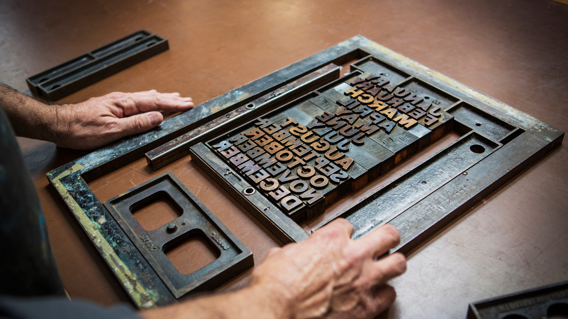
Leading describes the vertical space between each line of type. It takes its name from the practice of using strips of lead to separate lines of type in the days of metal typesetting. For body text that's legible and comfortable to read, a general rule is that your leading value should be between 1.25 and 1.5 times greater than the font size.
"Like tracking (below), if leading is set too short, the letters appear to flow into each other. If it is set too wide, unsightly gaps are created," explains Julien Fincker of Fincker Font Cuisine.

Julien Fincker is a French designer and lives near Stuttgart, Germany. After graduating as a communications and graphic designer, he worked for influential agencies and companies such as Grafisches Atelier Stankowski + Duschek. Type has always been a big part of his work – but only as a user. In 2018 he finally started to draw his first letters and released his first typeface in the beginning of 2019. With Fincker Font Cuisine he takes the focus on type in all its facets, from designing fonts to woodcutting and printing in his workshop.
04. Tracking and kerning
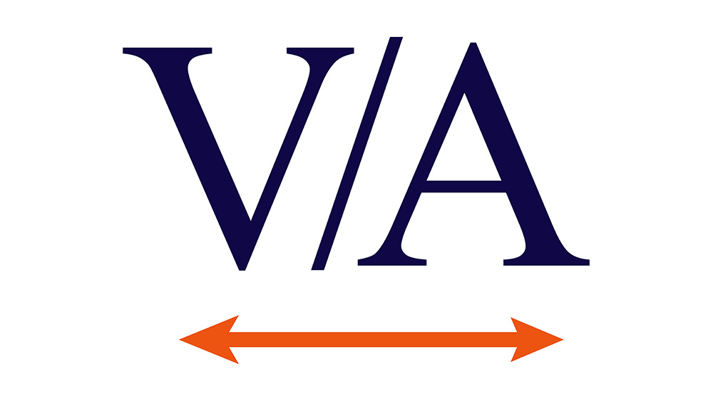
Kerning is the process of adjusting the space between characters to create a harmonious pairing. For example, where an uppercase 'A' meets an uppercase 'V', their diagonal strokes are usually kerned so that the top left of the 'V' sits above the bottom right of the 'A'.
"A font has been well kerned by the type designer if, for example, the word 'CATS' appears closed and not like 'CA TS'", explains Julien.
Kerning is similar to tracking, but they're not the same thing. "Tracking refers to the spacing of the letters over an entire word or text," says Julien. "If this is set too short, the letters appear to flow into each other. If it is set too wide, unsightly gaps are created."
05. Measure
The term 'measure' describes the width of a text block. If you're seeking to achieve the best reading experience, this is clearly an important consideration. If your lines are too long, your reader can easily get lost, while a too-short measure breaks up the reading experience unnecessarily.
There are a number of theories to help you define the ideal measure for your typography. One rule of thumb is that your lines should be 2-3 alphabets in length (so 52-78 characters, including spaces).
06. Hierarchy and scale
If all the type in a layout looks the same, it can be difficult to know which is the most important information, or what to read first. Size is one key way through which typographers create hierarchy and guide their readers. Headings are usually large, sub-headings are smaller, and body type is smaller still. But size isn't the only way to define hierarchy; it can also be achieved with colour, spacing and weight.
For more type definitions, see our detailed typography glossary. Or explore our guide to different font types.

Thank you for reading 5 articles this month* Join now for unlimited access
Enjoy your first month for just £1 / $1 / €1
*Read 5 free articles per month without a subscription

Join now for unlimited access
Try first month for just £1 / $1 / €1

Ruth spent a couple of years as Deputy Editor of Creative Bloq, and has also either worked on or written for almost all of the site's former and current design print titles, from Computer Arts to ImagineFX. She now spends her days reviewing small appliances as the Homes Editor at TechRadar, but still occasionally writes about design on a freelance basis in her spare time.
- Rosie HilderDeputy editor
