What creative pros want from the next Illustrator CC release
Top creative professionals and illustrators share 10 things they want to see in the next incarnation of Adobe Illustrator.
When we reviewed Adobe Illustrator CC 2017 recently, it was obvious that the Creative Cloud 2017 release remains a fantastic tool for all kinds of design work – from crisp vector logos, to app icons, to UI and web prototyping, to illustration to... well, pretty much anything, really.
But of course, Illustrator isn’t perfect, so we wanted to find out what creative pros really need from the app. Here's what they want Adobe to improve for the next version of Illustrator.
01. Improve Colour Picker options

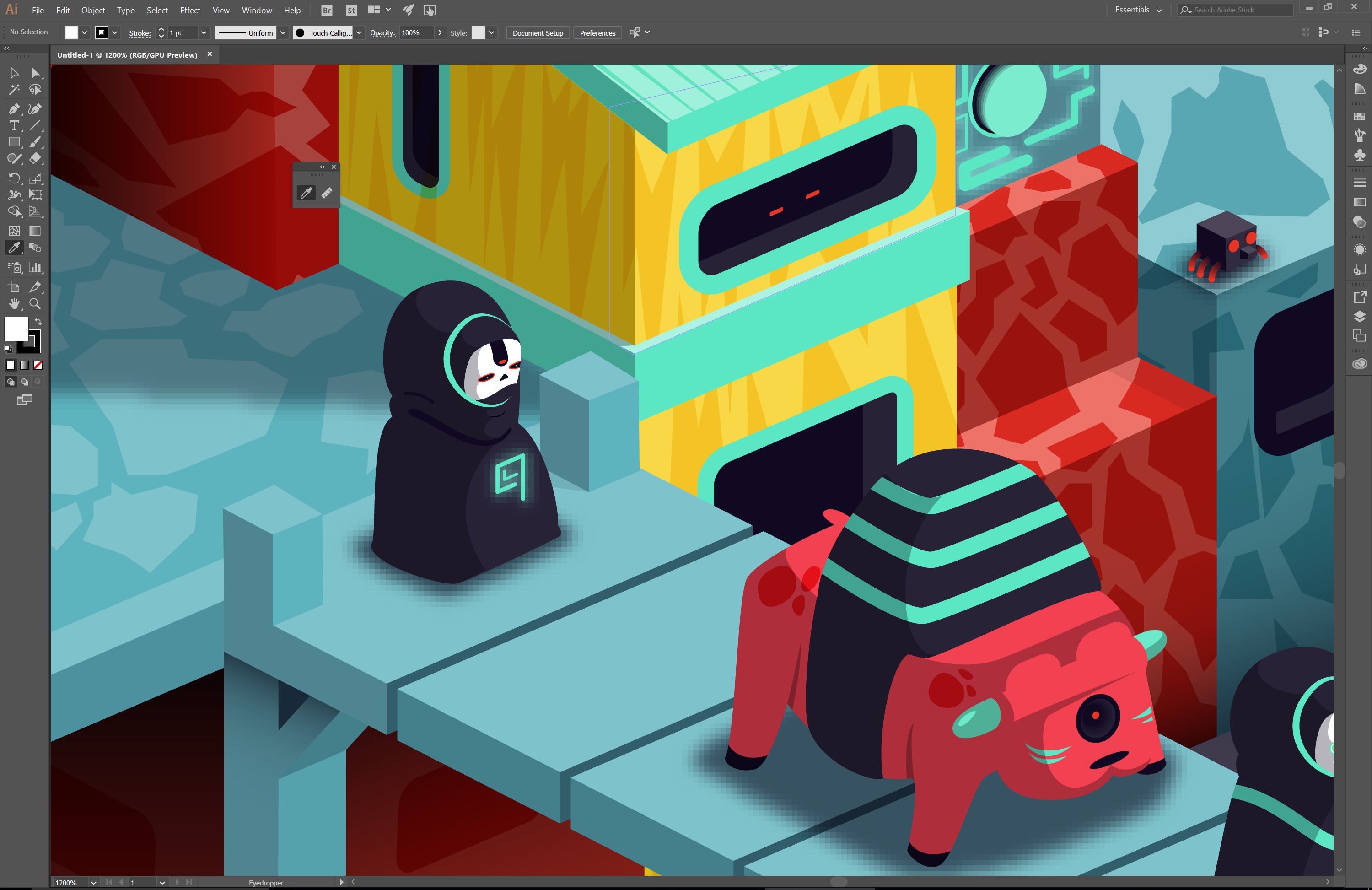
“This has bugged me for years,” says illustrator and design lead at Havas helia, Aaron Miller. “If you have the colour picker window open, you can’t simply select a background colour from anywhere on the screen or apply a swatch like you can in Photoshop. The cursor should change to the Eyedropper tool, so you’re free to select any colour.”
02. Boost bitmap rendering
“Illustrator’s vector capabilities are second to none, but its bitmap rendering for the canvas and exporting are a long way behind,” explains Marc Edwards, founder of Bjango. “In terms of antialiasing steps for shapes, there are only a few possible steps: 0%, 25%, 50%, 75% and 100% opacity.”
03. Fix the snapping bug
Illustrator Von Glitschka is very vocal about what he wants from the next version of Illustrator. “Fix the damn snapping bug that was introduced through a CC update four-plus years ago,” he says. “Snapping is a fundamental feature of vector building, and to have a so-called pro app fail at that level is absurd.” Not sure what he means by the snapping bug? Watch the video above, which he sent to Adobe’s engineers.
04. Sort out the stability
"Illustrator CC 2017 21.1.0 is the most unstable version of CC yet,” continues Glitschka. He points out that at Adobe MAX in October, Adobe announced it would be focusing on making Illustrator more stable, but he hasn't seen much evidence of this so far.
“I’ve been tracking my crashes since 1 January 2017 and so far I’ve had 41. March alone had 11. At Adobe MAX, Adobe stated that for the first time in 25 years Illustrator has a larger user base than Photoshop. Now, if that is true – and I’ll assume it is – why not make Ai rock-stable?”
Get the Creative Bloq Newsletter
Daily design news, reviews, how-tos and more, as picked by the editors.
05. Add snappy text alignment

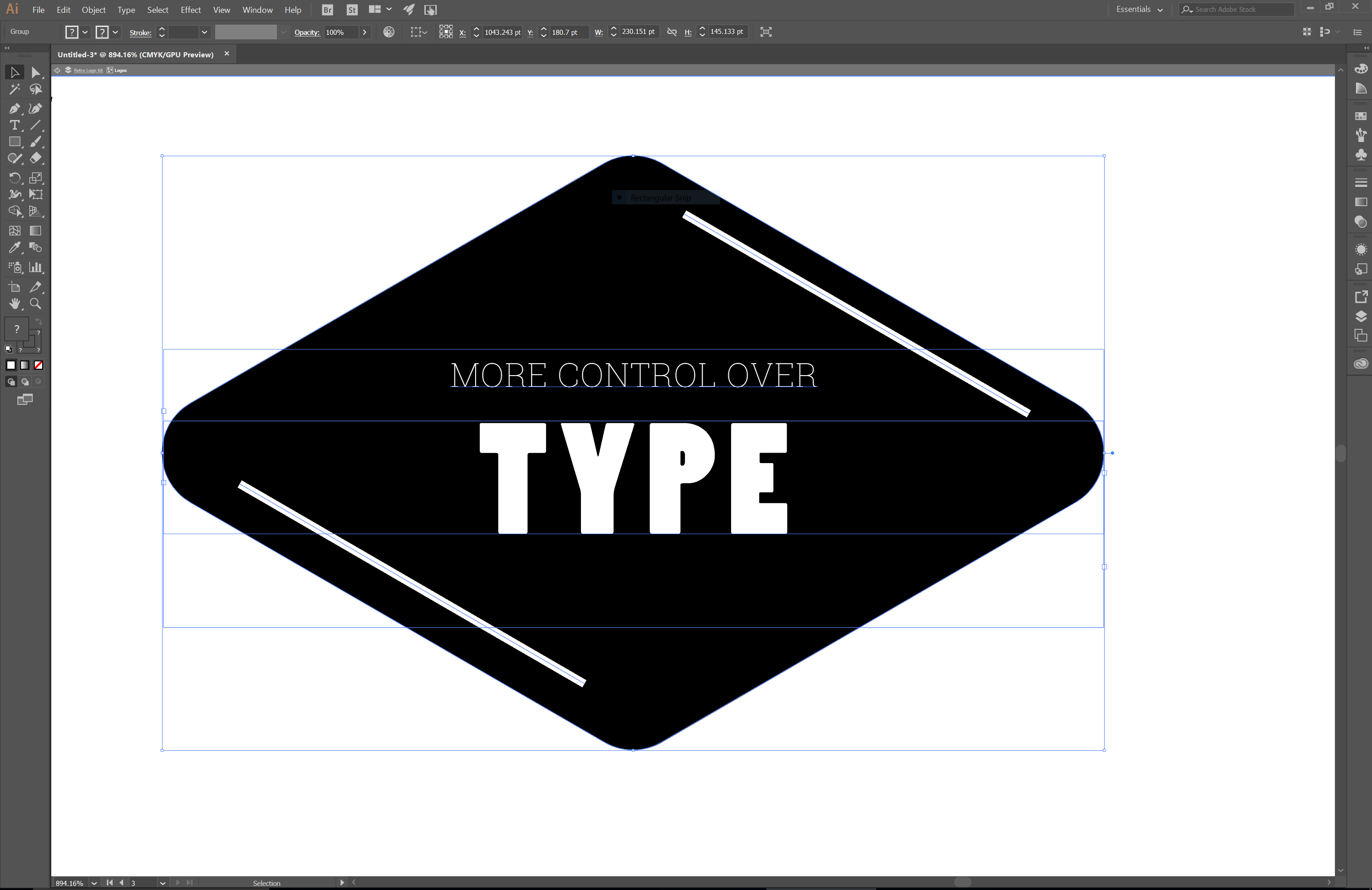
Illustrator CC 2017 brings a lot of new text enhancements, but Miller wants more. “I know many people use Illustrator for a more design-based approach and work with type,” he explains. “Something that InDesign does really well is to offer the ability to align text vertically within a text box. This combined with central alignment of the paragraph would mean text could sit ‘centrally’ within a button, for example.”
06. Enable better rendering
Edwards also wants better rendering performance. “Enabling Illustrator CC’s GPU rendering option improves performance, but reduces rendering quality even further,” he says. “Illustrator’s pixel preview also has many rendering issues, including stray pixels and other artefacts. Gradient rendering with dithering would improve the quality of canvas rendering, and also bitmap output, too.”
07. Increase artboard limits

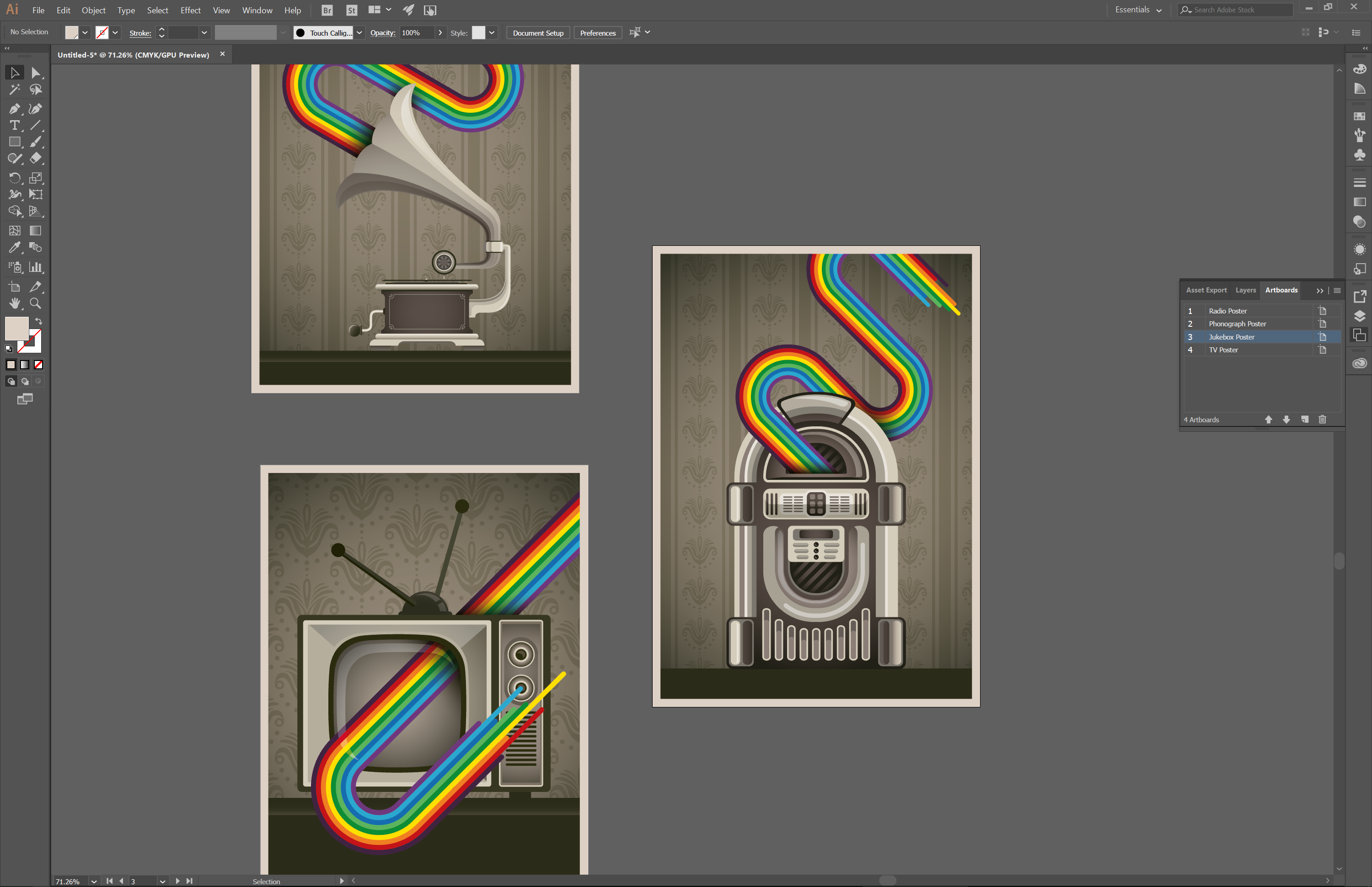
Artboards have made it possible to create multi-page documents at different page sizes, but Edwards doesn’t think the functionality is quite good enough. "I’d like the artboard limit increased from 100,” he says. “For larger projects that use artboards for exporting, 100 artboards are often not enough.”
08. Let us copy beloved effects

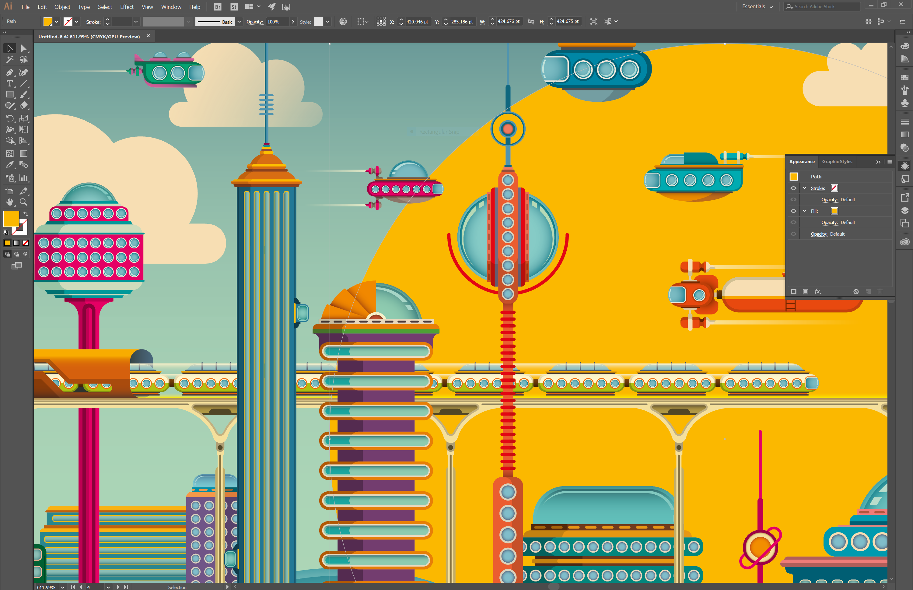
The Appearance panel is great and shows the effects and properties applied to a shape, but Miller wants more. “I do wish you could copy an effect like you can copy layer styles within Photoshop. This would make making working with effects so much easier. There are ways around this – like using graphic styles – but they feel counterproductive.”
09. Bring back default anchor points
“Two releases ago, Adobe decided on the fly to remove anchor points being shown by default on vector shapes. Who asked for that? No-one, it just did it,” muses Von Glitschka. “It got so much blowback it added a preference to return it to normal.”
10. Communicate with designers better
“The Illustrator team gets pushed so hard to develop features that will be used to push CC services,” says Von Glitschka. “They care more about that than stability. They’ll also actively remove features that don’t encourage CC use. For example, on the Adobe Draw app for iPad they removed the feature that gave users the ability to simply email your art to anyone as a PDF. They replaced it with uploading it to CC, so you can’t share it easily. It’s a convoluted hot mess.”
Related articles:

Thank you for reading 5 articles this month* Join now for unlimited access
Enjoy your first month for just £1 / $1 / €1
*Read 5 free articles per month without a subscription

Join now for unlimited access
Try first month for just £1 / $1 / €1

Rob is editorial, graphic design and publishing lead at Transport for London. He previously worked at Future Publishing over the course of several years, where he launched digital art magazine, ImagineFX; and edited graphic design magazine Computer Arts, as well as the Computer Arts Projects series, and was also editor of technology magazine, T3.
