The best horror movie logos capture some of the tension and terror the film they represent, whether that's through drips of blood, sinister symbols or scratchy, menacing fonts. Below we round up our favourite scary movie logos, including several classics from cinema history.
Some horror film logos appear in several variations since studios used to take a looser approach to branding, with multiple, sometimes wildly different logo designs popping up on different movie posters and video and DVD covers as well as in the title sequences of the films themselves... not to mention variants in different international markets.
You may have your own preferred version that you remember from the film, but this is our own pick of the horror movie logos that we have long had a fondness for. Also see our pick of the best band logos and best social media logos for more design inspiration.
The best horror movie logos from film history
01. The Exorcist logo
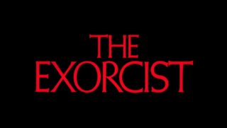
The classic 1973 film about a girl possessed by a demon was so terrifying, it reportedly provoked fainting and vomiting attacks in cinemas, and was banned by a number of local authorities in the UK. Created by Dan Perri as part of the film’s title sequence, this logo draws on the story’s religious themes in a subtly elegant manner.
In contrast with the crazed, cartoonish titles of 1950s and 1960s horror flicks, Perri’s design instead employed the kind of formal semi-serifs you might expect on a Catholic Bible, and was all the more sinister for it. You can see Perri discuss his approach to movie title design in this video.
02. The Omen logo

A 1976 horror about a child of the devil being born into the modern era, The Omen courted controversy by incorporating the Satanic number 666 into the ‘O’ of this logo, featured on its first theatrical poster by Tom Jung.
Like The Exorcist logo above, this design uses a red-on-black colour scheme and a font that’s reminiscent of medieval religious texts. But here there’s a childlike, hand-made feel to the clumsy, off-centre lettering that reflects the unhinged madness of the truly demonic.
Get the Creative Bloq Newsletter
Daily design news, reviews, how-tos and more, as picked by the editors.
03. The Shining logo
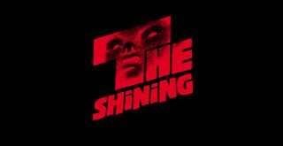
Stanley Kubrick’s 1980 adaptation of Stephen King’s novel is considered one of the greatest horror movies of all time. So it’s fitting that its logo was created by one of the film world’s greatest graphic designers, Saul Bass.
Centred around the outline of a mysterious evil presence in the opening ‘T’, the unbalanced typography (a weird mix of upper and lower case; the word ‘the’ being more prominent than ‘shining’) reflects the turmoil in the mind of Jack Nicholson’s central character beautifully.
04. Friday the 13th logo

One of the most successful franchises in history, giving birth to 12 films and counting, Friday the 13th began with a 1980 horror about a group of teenagers who get killed, one by one, at a camp. This film was intended to both scare the audience and make it laugh, and this cartoonish logo brilliantly blends the macabre and the comedic.
With lettering resembling broken pieces of wood (a broken camp sign, perhaps?), the blood-drenched ‘13’ leave little to the imagination about what’s in store (bucketloads of gore for those who appreciate a sick sense of humour).
05. A Nightmare on Elm Street logo

The story of a phantom who haunts both people’s dreams and their waking hours, Nightmare on Elm Street was the archetypal 1980s horror and became a hugely successful franchise.
There was a range of logos across different promotional materials, but our favourite has to be this design, created by Dan Perri for the film’s opening titles. This cleverly constructed lettering subtly evokes a street of burning buildings, conveying a grim atmosphere of hellfire and damnation; truly the stuff of nightmares.
06. The Scream logo

Reinventing the slasher film by subverting its cliches (the characters are all expressly aware of horror tropes, which drives the plot), 1997’s Scream brought the horror genre kicking and, er, screaming into the modern age.
This super-clean, minimalist logo from the movie’s poster added a splash of contemporary cool for the Nineties audience – and who doesn’t love the cheeky stabbing motif in the final letter?
07. The Blair Witch Project logo
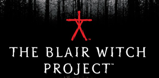
1999’s Blair Witch Project brought us a brand new movie genre: the found-footage horror. And with it came a brand new approach to movie marketing. Rather than just appear on posters, the logo was initially circulated on the internet, along with other visual elements of the film, in the guise of a true story.
One of the earliest, and most successful, cases of what’s become known as viral marketing, this creepy logo with its jagged, fractured lettering and haunting ‘stick man’ emblem, still stands up today as a design classic. The version shown above is from the DVD cover.
08. The Ring logo
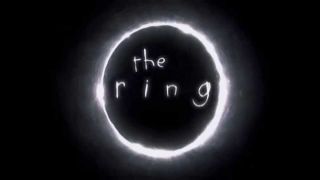
2004’s The Ring, a psychological horror about a cursed videotape, is a big-budget remake of an arguably superior Japanese film, Ringu. But when it comes to the logo, at least, the American version wins hands down.
The crazed nature of the lopsided child’s lettering and lumpily luminescent ring add up to a design that’s both truly original and disturbingly sinister. So sinister that (gasp!) no one even thought to add any red...
09. 28 Days Later logo
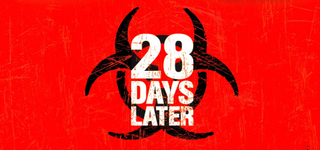
One of the first modern zombie horrors (recasting the undead as victims of a bizarre plague), 2002 Brit-flick 28 Days Later remains a stunningly original creation. And its logo is pretty darned original too.
Combining a contemporary, stencil-graffiti aesthetic with the biohazard symbol, this is both sinister and alluring... just as any good horror movie logo should be.
10. Paranormal Activity logo
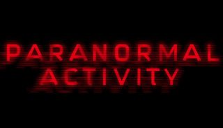
Taking the found-footage concept of Blair Witch and giving it a blockbuster budget, Paranormal Activity has become one of the biggest horror franchises of the new century.
This understated logo, based on coldly minimal, all-caps typography, evokes the digital technology behind the found footage, while the blurred lines, wide-set kerning and red-on-black colour scheme combine to convey the horror contained within it.
11. The Saw logo
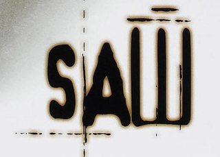
Heralding the rise of the ‘torture porn’ genre, the Saw franchise has brought a renewed sense of the nasty to horror movies. And this twisted, warped and purposefully ugly logo feels right at home with all of that.
Distorted and out of focus, with misshaped letterforms and metal scratchings that foretell all sorts of horrific happenings, this logo signals exactly what’s on offer... and it’s certainly not a date movie.

Thank you for reading 5 articles this month* Join now for unlimited access
Enjoy your first month for just £1 / $1 / €1
*Read 5 free articles per month without a subscription

Join now for unlimited access
Try first month for just £1 / $1 / €1
Tom May is an award-winning journalist and editor specialising in design, photography and technology. Author of the Amazon #1 bestseller Great TED Talks: Creativity, published by Pavilion Books, Tom was previously editor of Professional Photography magazine, associate editor at Creative Bloq, and deputy editor at net magazine. Today, he is a regular contributor to Creative Bloq and its sister sites Digital Camera World, T3.com and Tech Radar. He also writes for Creative Boom and works on content marketing projects.


