Want to engage with website visitors and persuade them to follow a particular course of action,? Then the fashion industry has much to teach you.
For years, it struggled to get consumers interested in buying clothes online. And that’s not surprising. Persuading us to buy items without being able to touch them, feel them, or try them on was always going to be a tall order.
So it’s only through constant attention to detail, and intimate understanding of the audience, that fashion retailers have managed to make online work. Here are some of lessons we can all learn from their success.
01. Homepages can be super-minimal
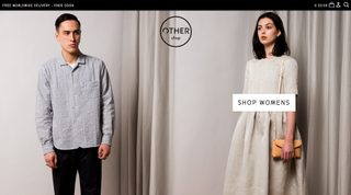
In fashion, it’s all about the look, and the industry certainly knows how to bring a product front and centre. One method is through bold use of full-screen photography on super-minimal pages.
A great example can be found at Other Shop, a retail site from the founders of London’s b store. Condensing the navigation down to a tiny number of tiny icons gives the hero image maximum exposure and shows real confidence in the product. And who doesn’t dig confidence? Similar homepages can be found courtesy of sportswear company Solasie and Italian menswear retailer Lubiam.
02. Newsletters are the new black
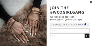
You might have thought e-newsletters died off in the '90s, but all trends come around again in the end, and right now they’re back with a vengeance.
Almost every online fashion retailer offers them, as they’re a great way to keep up with the latest news and offers in an ever-changing scene. And sites don’t hide them away, but trumpet them loudly and boldly. For instance, rather than opt for a tiny ‘Sign up for our newsletter’ box in the corner, jewellery site Wanderlust & Co booms: “JOIN THE #WCOGIRLGANG. We look good together. Enjoy 20% off your first order! CODE, ONE CLICK AWAY”.
Get the Creative Bloq Newsletter
Daily design news, reviews, how-tos and more, as picked by the editors.
Fashion websites are also leading the charge for targeted newsletters. For example, Cos Stores offers separate newsletters for men and women; alternatively, there’s a ‘pass’ option if you don’t want to reveal your gender.
03. The experience must be personalised
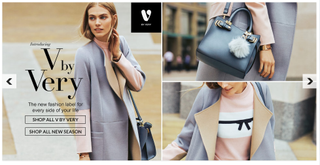
It’s not just newsletters that are being segmented and targeted at different audiences. The fashion industry is at the forefront of personalising the websites themselves.
The ‘fashion discovery engine’ Styloko, for example, only serves up the brands you’re interested in, and you can sign up for notifications of specific news, such as new stock arriving or discounts being offered on your chosen items. Atterly Road, which is focused on supporting independent retailers, lets you customise a ‘virtual high street’ by bringing together your favourite stores in the same place. And big name British retailer Very has made a big noise about launching a “fully personalised homepage”, where the brands you’re interested in appear ‘front of shop’ and even the nav is personalised.
04. 360° is so hot right now
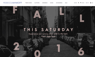
A few years back, fashion websites were among the first to make use of video, and now they’re ahead of the curve again with 360° VR photography and video. It’s a technology eminently suited to showing off products that people want to see from every angle, and fashion sites are increasingly taking advantage.
So for example, Love Hats allows you to view its chic headgear in 360° on its website; workwear brand Ellen Tracy has launched a new 360° video series that encourages women to tap into their personal passions outside of the office; and fashion designer Rebecca Minkoff has streamed a number of runway shows via 360° (she’s even released her own branded VR viewer).
05. Physical is digital’s twin
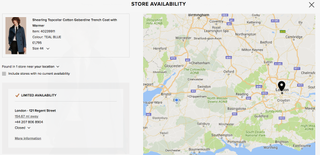
Laser-focused on making consumers’ life easier, the fashion industry is leading the way in bringing together the physical and digital worlds. Classic British men’s brand Burberry, for example, offers a beautifully seamless experience that offers the choice between free next-day delivery or ordering the item via click to collect, then picking it up from your nearest store at a time convenient to you.
Another trend is to encourage online sales when customers are out shopping, but the stock they want is not available. British retailers like All Saints, Topshop, French Connection and Warehouse are among those who’ve installed digital devices in-store to create a more joined-up experience for the customer.
06. Live chat needn’t be in your face
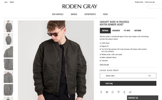
Fashion is a very personal and intimate business, so it’s not surprising that the industry is taking full advantage of new live chat technologies. But looks are everything in fashion, and nobody wants a grinning drone in headphones staring at you from the homepage. The website of Vancouver men’s clothing store Roden Gray offers a great example of how to present this feature subtly, in a sleek ‘Contact us’ tab at the bottom of its homepage.
07. Make decisions for the user
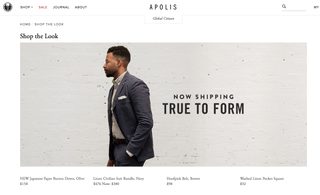
In the words of web visionary Seth Godin, “Don’t make me think”. Endless choice and constant decision making is tiring, and so many fashion websites offer to help make choices for you. A great example can be found at menswear site Apolis Global, which offers the option to shop for a whole look rather than just one item. Not everyone wants to get all their clothes from one retailer, though, so there are also a number of online personal shopping services you can try, such as Stitch Fix, Trunk Club and Tog + Porter.
08. Microcopy can move mountains
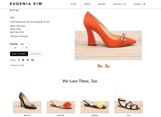
If the fashion industry knows one thing, it’s that relentless A/B testing of website elements – to find out what’s working and what needs changing – is key to improving engagement and sales. That applies as much to microcopy as anything else, and most fashion websites offer pretty great examples of raising those all-important words above the mundane.
Eugenia Kim, for example, swaps the tired phrase ‘Customers also bought…’ for ‘We love these, too’, striking a much more personal and engaging note. Fashion and beauty site ASOS pays keen attention to tiny textual details, such as using ‘Bag’ in the main menu in place of ‘Basket’ (you’re not grocery shopping, after all). And outdoor clothing store Moosejaw injects a real sense of fun to its microcopy: to persuade people to take its survey, for example, they write: ‘Think of the easiest survey ever. This is easier than that.’

Thank you for reading 5 articles this month* Join now for unlimited access
Enjoy your first month for just £1 / $1 / €1
*Read 5 free articles per month without a subscription

Join now for unlimited access
Try first month for just £1 / $1 / €1
Tom May is an award-winning journalist and editor specialising in design, photography and technology. Author of the Amazon #1 bestseller Great TED Talks: Creativity, published by Pavilion Books, Tom was previously editor of Professional Photography magazine, associate editor at Creative Bloq, and deputy editor at net magazine. Today, he is a regular contributor to Creative Bloq and its sister sites Digital Camera World, T3.com and Tech Radar. He also writes for Creative Boom and works on content marketing projects.
