20 UX tips you need to know
UX tips from an industry insider, guaranteed to up your game.

Expert UX tips can offer valuable insights for your own user experience practice. Through working on varied projects with different clients, designers often pick up a wealth of knowledge that becomes ingrained. Whether you are new to user experience and UI design or an experienced designer looking for a fresh take, insights from UX experts can always prove valuable.
In this article, Jamie Shanks, UX designer and owner of the design agency Green Tambourine, provides his 20 top UX tips gained through 20 years working with a huge range of brands across multi-discipline experiences.
for more pointers on user experience design, see our essential tips for UX design and the UX resources you should be using. And if you're designing an all-new UX, you'll want to see how it fares with the user, so make sure you see our guide to successful UX research and testing. And if you're designing a new website, you might also want to see our guide to best website builder.
01. Know your users

As a designer, it’s really important to design how your users are likely to interact with a website, product or mobile application when exploring it. to do that successfully, you can't rely entirely on analytics and stats. Dig a little bit deeper and get into the shoes of your users. After understanding users, you will be able to make informed decisions in your design.
02. Do interviews to write user profiles and stories
When creating user profiles, be sure to actually interview people. I see so much profiling that is made up and not based on any form of research. When writing user stories, having an actual person in mind will help you to funnel those users to making the decisions you want. As a designer, you should never make assumptions.
Writing user stories is good routine practice. A user story is a high-level definition of a requirement, containing just enough information so that you can implement it within your UX. This not only helps to focus the hierarchy of what you are trying to get people to do, but it also helps you to clearly create user goals. Point the user stories back to your user profiles within your interaction design. Ultimately, this will help with conversion and also create a testing hierarchy to work from.
03. Listen to your users
Listening is one of the most important ingredients of good UX design. Always take time to listen to customers, especially when collaborating with conversion rate specialists. As a UX designer, it’s your responsibility to bring together all of the requirements from a wide range of stakeholders. That's why the greatest digital projects are often those where there is a perfect equilibrium between the client's objectives and the user's needs. Sit on that fence and balance well.
Get the Creative Bloq Newsletter
Daily design news, reviews, how-tos and more, as picked by the editors.
04. Get out of the lab environment when testing mobile UX
UX testing helps to improve CRO by ascertaining how users actually interact with an experience, providing valuable feedback so that some badly performing parts of a website or app can be fixed or additional functionality added. With usability testing for a website that is conducting on PC all is already understood, but on mobile? We often see mobile UX being tested in a lab, but why would you test a user in a lab when the majority of their time using a mobile is on the move? You can gain excellent insight by changing the way you test and where you test. This can be done via so-called guerilla or portable lab testing.
05. Use effective tools for collaborative teams
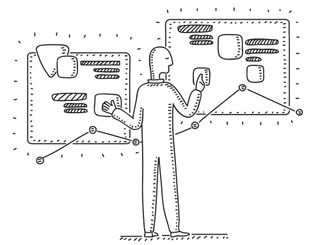
If you're an independent business you will no doubt find yourself collaborating with a number of specialist people on a project. Setting up clear communication channels is a must. I spend more time planning, collaborating and organising teams to deliver great products and design. I tend to use software such as Jira or Confluence for the more heavyweight projects and Trello or Asana for smaller projects linked with Slack (also check out the best cloud storage options). These are fantastic tools to make your life easier when delivering projects. It will also save your inbox and the off chance of losing an important email.
06. Seek UX inspiration
It’s good to seek inspiration. There are a lot of great resources online and huge communities of users that share their work, research and results, so seek these out. I like to find UX inspiration on Instagram and on sites like awwwards.com and Behance.
07. Embrace white space
I always use consistent typography and white space. Your clients will expect you to fill the space or certainly ‘make the logo bigger’ but white space is so important, especially designing for mobile. Ensure you follow some simple grid systems. I do this all the time with layouts. It not only makes the design process simpler but also consistent. Have fun with white space and don’t be afraid to play around with the size of typographic headers and also the fonts you use. Think of a website like a road trip: move users seamlessly from one section to the next by understanding the users’ personas, goals and needs. (Remember to make sure your web hosting service is tailored to your site's needs.)
08. Never put emotion before logic in UX
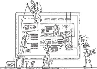
Users often perceive visually pleasing designs as being easy to use, but usability must still come before aesthetics. There is a fine line between reinforcing branding/marketing and distracting a user from their task. It's always worth remembering that users are more likely to notice items near the top of the page, in order of their importance.
09. Include animation in your UX design
Splash screens and simple loading animations can be very effective in creating brand intrigue. When onboarding a user for the first time, go the extra mile with simple animations, top tips or even introduce your app with some brand animations. Just don’t overload your animations – more than three seconds loading time results in around a 55 per cent bounce rate. Give users feedback if their waiting time is more than one second, and allow the user to skip or to choose ‘don’t show’ if they are returning.
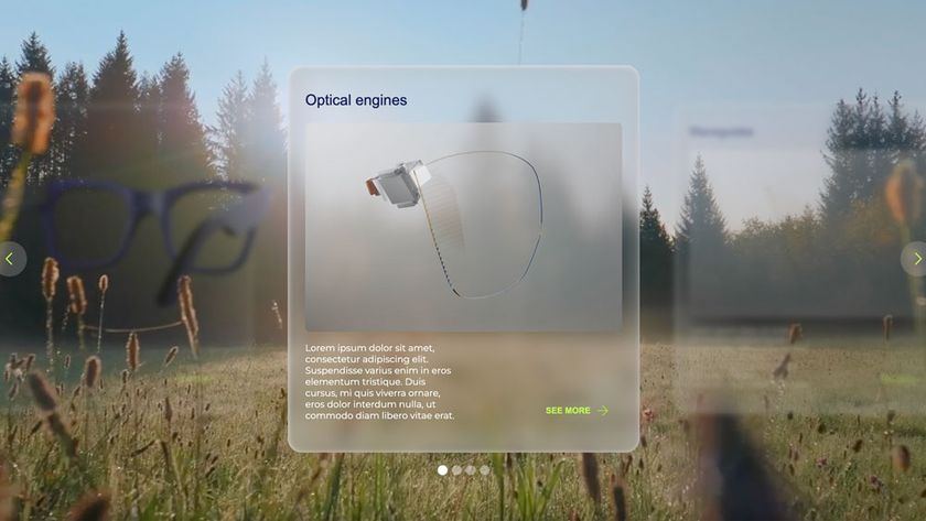
10. Cut the carousels
Okay, I’ll raise my hand and admit using a carousel myself in a recent project, but it was to explain a customer’s process and it wasn’t just the latest promo that marketing had asked me to add into a home page. Stats indicate that most users stop viewing carousel content after three or four slides. So don’t overload a carousel with more than four slides, or even better, get into the habit of not using them at all.
11. Focus on details
Wondering how to take your UX design to the next level. A good UX tip here is to think about focusing on the tiny details. When was the last time you designed an interesting 404 page, for example? (see our pick of the best 404 error pages for example. This is just one example, but these small details can make the difference hen it comes to delighting customers.
12. But make content clear
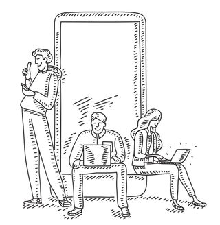
That said, copy and content rule when it comes to your interface. And how this is presented can make a difference to whether users stick around. Make good use of headings, sub-headings and copy breaks. Create smaller paragraphs to help viewers scan your web pages quickly to make your content more user-friendly. I like to make sure copy isn’t too long. Users will scroll down the web page as long as it is clear that relevant information is below the fold. However, don’t make the pages too long. It’s all in the balance. Aim to be clear and concise.
13. Design with content and not Latin text
I see this all the time when designers don’t work with the content. It does help customers ‘fill in the boxes’, but UX and UI design should never be about this. When I design, I aim to write the content or collaborate with a copywriter. It gives more context to your wireframes and early design stages. Even if it’s first draft content, it still enables you to make more informed decisions on how the content people are engaging with what will be presented.
14. Have a conversation with your site’s users
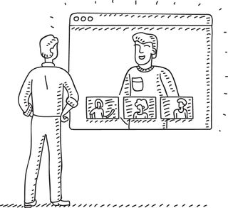
I mean this not literally but metaphorically. Make online experiences conversational. Content can be so much more appealing when your users connect. Don’t leave users in the dark; offer simple guidance (and, I don’t mean waffle!) about what they need to do. It makes it more engaging. Brands like Innocent Drinks are a great example of how to create good conversations in the brand experience.
15. Remember that in UX that less is more
A good UX tip is to remember that all great design has one thing in common and that's simplicity. Strive for simplicity and clarity in your UX design to ensure it's received by the audience in a single glance or interaction. Minimalist and simple designs are easy to understand and are more appreciated by your audience. Also remember a quote from Paul Rand, the American art director and graphic designer, who once said: “Good design doesn’t date, bad design does”. This is just as true in UX, where tend to see trends and styles that come and go. Find your own design style. Work hard at it, create rules, follow design practice but always question why.
16. Apply Hick’s law
Hick's law, also known as the Hick–Hyman law, takes its moniker from the British and American psychologists William Edmund Hick and Ray Hyman and establishes the time it takes for a person to make a decision based on the possible choices available. Hick’s law assesses the information capacity in choice reaction experiments. The amount of time it takes to process a certain amount of bits in the Hick–Hyman law is known as the rate of gain of information. In essence, we want to keep those options to a minimum.
Apply this practical UX tip to your designs and remove unessential noise so users have a clear journey of interaction. Find the balance between creating an engaging brand experience that converts users and designing something that looks like it was straight out of the 1990s. Speed things up by reducing the chance users will get distracted and leave. Research more into Hick’s law as it no doubt will help with your end product; it certainly helped me.
17. Never interrupt users without reason
Don’t get me started on chatbots or instant messages! Although there are pros and cons with chatbots per se, interrupting a user as they start their problem-solving journey is detrimental to their experience. Opening up a dialogue box without the user having done anything is a bad idea and just annoying. There are so many website sites that bombard visitors with ‘How can I help?’ or ‘I’m a chatbot… let’s get started’. My key UX tip here? A dialogue should always open as a result of an interaction, and it should never be intrusive.
18. Avoid 'Get Started' as a call to action
And related to the above, just avoid ‘Get Started’ as a call to action in general. You could consider this a pet hate of mine, but I really believe all internalised language should be avoided in call to actions; ‘Get Started’ is just the worst of several. What does it even mean? Your customer may call it one thing but your user might not understand it. Language is key, so ensure it’s simple and direct. Take care not to use ambiguous language.
19. Be proactive when it comes to responsive design

I always start by designing for mobile and then work on mobile and desktop simultaneously. There are more approaches than ‘just stacking the content’ for mobile. As a UI designer, I’ve learnt to effectively design responsive user interfaces that make use of flexible layouts, images and style sheets. Also, having a good relationship with your coder is a must if you’re not building the site or app.
20. Make your designs accessible
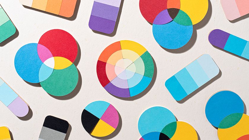
I once had an experience with a client that got extremely frustrated during the design stage. There was a huge problem getting colours signed off. What I hadn’t ascertained was that the customer was in fact slightly colour blind. Colour blindness (colour vision deficiency) affects approximately one in 12 men and one in 200 women globally. That means there are approximately 3 million colourblind people in Britain, about 4.5 per cent of the entire population.
I highly recommend getting hold of some sim specs during your testing process. It will take your user testing to a new level. Convert your designs to greyscale to ensure all users have a unified experience. Avoid the use of blue for any text on websites other than links. Be aware of the contrast on mobile websites as well. Reserve one colour for CTAs and make sure it contrasts with the rest of the page. Cold and dark colours stay in the background and warm bright colours like orange come forward. If your client’s brand has similar colours in tone, recommend a new contrast colour. You might find conversions go up. See our guide to inclusive web design for more tips in this area.
Related articles:

Want to learn more about UX and UI? Don't miss our UX design foundations course.

Thank you for reading 5 articles this month* Join now for unlimited access
Enjoy your first month for just £1 / $1 / €1
*Read 5 free articles per month without a subscription

Join now for unlimited access
Try first month for just £1 / $1 / €1
Jamie is the owner of multi-discipline independent design agency Green Tambourine, based in Bournemouth. He’s an on-demand UI/UX and brand designer with a wealth of experience and clients under his belt.


