The important thing when you’re a student is to learn and develop your skills, not to get publicity; that will more likely come later. But if a project you’ve worked on does grab people’s interest, then there’s no harm in taking advantage – it won’t exactly harm your future career prospects.
In this post, we round up five student projects that have captured the imagination of the design community so far this year.
01. Apple Music redesign: Jason Yuan
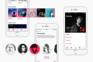
Jason Yuan is a self-taught visual designer, and currently a theatre student at Northwestern University in Illinois, USA. Earlier this year, he was rejected for a graphic design internship with Apple Music. Rather than getting depressed, he embarked on a new project – to redesign the iOS Apple Music app. And once he’d published it, it found its way onto several influential blogs, including The Next Web and Fast Co Design.
“I’d approached the project as an opportunity to teach myself skills that one might pick up in the field or at design school,” he explains. “I never expected the article to gain as much traction as it did. When the responses started flooding in, I was overwhelmed in the best way possible. Seeing seasoned professionals react positively to my work affirmed my decision to pursue design, despite my somewhat unorthodox background. I was also inspired to keep writing and publishing my thoughts.”
Yuan received a lot of constructive criticism for his work, he says. “Some comments were from a business perspective, others from a visual design perspective. They were super-helpful insights that I ended up compiling into a document for future reference. I'm really happy that my work was able to spark so many conversations and learning opportunities.”
Now determined to pursue design as a career, he’ll soon be embarking on a BFA Graphic Design course at Rhode Island School of Design. And the main lesson he’s learned? “Telling the story behind your design process is just as important as the final deliverable,” he responds. “A lot of people were drawn to how I articulated the reasons behind my design decisions instead of just showing screenshots.”
02. History posters: Kingston University students
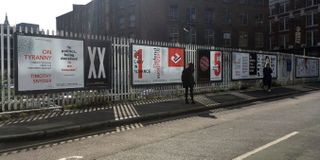
Earlier this month, Penguin Random House teamed up with graphic design students to create an unusual series of ads. The posters, which were plastered around the fashionable London area of Shoreditch, feature the entire text of historian Timothy Snyder's new book, On Tyranny.
Get the Creative Bloq Newsletter
Daily design news, reviews, how-tos and more, as picked by the editors.
To give every poster its own unique visual character, each chapter was designed by a different student. The Kingston students worked alongside Penguin Random House’s Vintage imprint, under the guidance of associate professor Rose Gridneff, and were given just one week to design and complete the posters.
The project has attracted widespread media attention in the UK, and Vintage is now looking to replicate the project in the USA.
03. A Blue, White, Green and Brown Jewel: Ben Hutchings
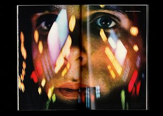
A third-year graphic design student at Central Saint Martins in London, Ben Hutchings is “interested in typography, editorial and identity design”. He's spent the last few years receiving a lot of attention for his projects, which include an identity for the New York Mozart Festival and re-design of pasta company De Cecco.
His latest project, A Blue, White, Green and Brown Jewel, is a perfect-bound, 120-page book exploring several instances where artists and designers have interacted with and reinterpreted the world of space exploration.
“I drew most of my inspiration for the design and writing of the book from counter-culture visionary Stewart Brand and his work on the Whole Earth Catalog,” he explains. “The WEC can really be attributed to popularising the DIY movement that began in the 1970s, and its reach is still remarkable today: Steve Jobs cited it as being one of the bibles of his generation at his Stanford commencement speech over 40 years later."
Hutchings wanted the design of his book to serve as an homage to the Whole Earth Catalog, but also feel more like a paperback and read like a story. “The design came together over a few weeks and many considerations, such as the typography and partial black-and-white colour scheme, were influenced by the design of the WEC,” he says. “The book was perfect bound by me and I’ve only made one copy, which will be displayed at my degree show.”
You can see more images from the book on Hutchings’ website.
04. 10 Cities Rebranded: Shillington students
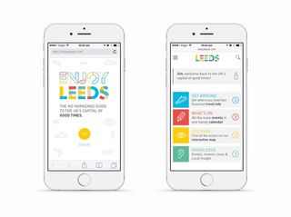
Earlier this year, Shillington – a network of design colleges across the UK, US and Australia – set it students an intriguing task: to rebrand a city. It shared the results in this blog post, which was picked up by a range of influential design blogs.
We particularly liked Jim Oliver’s tourist rebrand of the English city of Leeds, shown above. It is, in his words: “A tourism identity for Leeds, that sells the city as the capital of variety, entertainment and good times.” You can see the full project on his website.
05. Gesture: Frank Sharman
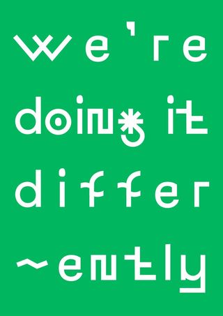
Frank Sharman is a graphic design student at Camberwell College of Arts, London who likes to experiment around image-making, typography and graphic design. His work has already featured on a range of creative and design blogs, and that’s no coincidence.
“I think it's important to promote your work, even when you’re still at college,” he says. “As well as my own website, I keep a blog showing all my projects that are in progress, which has accumulated a large following. It acts as a nice platform to test ideas and get feedback from people, which can then inform and develop my projects further.”
Sharman’s projects have recently been centred around type and language. His latest, Gesture, is a typeface created loosely on the gestural actions performed on devices. The idea, Sharman says, was initially sparked by a quote from Kenneth Goldsmith: “When I click on a link I literally press down on language. My forefinger and thumb physicalises the way I interact with visual media.”
Sharman explains: “This description of physical interaction with language acted as a trigger for the project. I felt that somewhere within our browsing, a language could be formed.” He began by mapping out observations of human actions when performing gestures. “This led to Gesture incorporating both angled lines and humanist geometric curves. This translates into multiple character variations and often awkward combinations of the two.”
“The final outcomes of this project are still in progress, and currently take the form of a series of GIFs, which fittingly documents the movement of gestural actions through animation whilst simultaneously making playful comments on our habits online. The typeface also sits within a specimen website."

Thank you for reading 5 articles this month* Join now for unlimited access
Enjoy your first month for just £1 / $1 / €1
*Read 5 free articles per month without a subscription

Join now for unlimited access
Try first month for just £1 / $1 / €1
Tom May is an award-winning journalist and editor specialising in design, photography and technology. Author of the Amazon #1 bestseller Great TED Talks: Creativity, published by Pavilion Books, Tom was previously editor of Professional Photography magazine, associate editor at Creative Bloq, and deputy editor at net magazine. Today, he is a regular contributor to Creative Bloq and its sister sites Digital Camera World, T3.com and Tech Radar. He also writes for Creative Boom and works on content marketing projects.
