7 logos by famous designers and why they work
The work of famous designers contains many lessons for creatives today.
When you're working on a new logo design and you need a little something to fire your creative processes, it’s natural to head to a modern-day gallery to grab a bit of logo design inspiration
But the principles of good design are timeless. And if you only focus on the very latest work, you’re missing out on decades-worth of beautiful, functional and brilliant logo design from the industry’s most famous graphic designers.
In this post, we look back at seven logos created by some of the 20th century’s greatest creatives, and consider what lessons they contain for designers working today.
01. Chupa Chups logo by Salvador Dalí

When you're producing a range of confectionery and you're not happy with its branding, it can be helpful to have one of the world's top artists as a friend. And while Salvador Dalí isn't largely known for his graphic design skills, he was quickly able to help Enric Bernat, the founder of Chupa Chups, with some lightning-fast work.
The story behind the Chupa Chups daisy logo is the stuff of fairy tales. Bernat and Dalí were sitting in a pavement café, and Bernat asked his friend to lend a hand with his logo design; Dalí got straight to work, scribbling on an old newspaper that was lying around the café, and came up with his design inside an hour.
The logo used today is largely the same as Dalí's design; the only change to it has been to abandon the serif lettering used for the first half of the name, and to set it in the same script style as the second half.
It's a good-looking logotype; simple, colourful and guaranteed to appeal to its target market, but the really clever bit was Dalí's insistence on how it should be displayed. Knowing that if it was displayed on the side of a lollipop, the logo would get distorted, Dalí decreed that it should instead be put on the top where it would remain intact. It was a branding masterstroke that helped elevate Chupa Chups from a small Spanish brand into a global success story.
Get the Creative Bloq Newsletter
Daily design news, reviews, how-tos and more, as picked by the editors.
Lesson learned: An understanding of how a logo is going to be used is an essential piece of information to take into your design process. Dalí's insight into the placement of the Chupa Chups logo arguably helped build the brand's prominence; modern designers need to be aware that a logo is likely to be used across any number of touchpoints and at all kinds of sizes, and design accordingly.
02. Nike logo by Carolyn Davidson
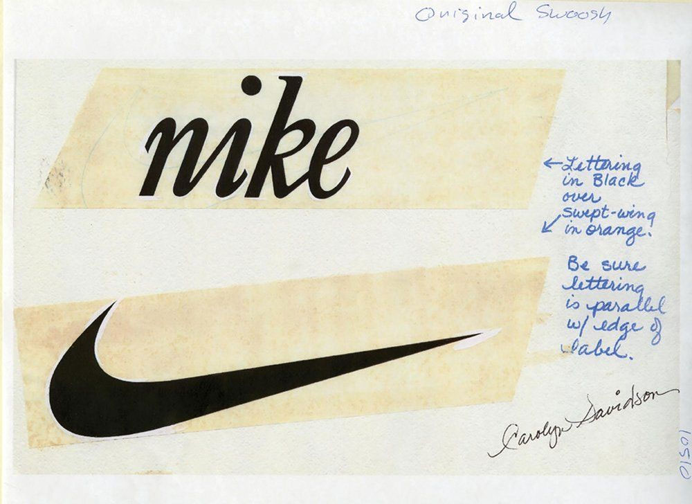
Carolyn Davidson was a graphic design student at Portland State University when Nike founder Phil Knight chanced upon her, working on a drawing assignment in a hallway. He needed some design work doing for an upcoming presentation, and offered her a couple of dollars an hour to create some charts and graphs.
Later, Knight needed a logo for his shoe boxes; again he called on Davidson, asking for a design that suggested movement. She came back with a number of designs, including the now-iconic Nike Swoosh, but Knight wasn't taken with any of them.
With a print deadline approaching his shoe boxes, Knight had a make a call, and despite not loving it he opted for the Swoosh. Davidson submitted an invoice for just $35 and continued to design for Nike until it was too big for her to handle on her own, at which point Nike appointed a full-service agency.
Davidson was later rewarded handsomely for her design, when Knight surprised her with a gold Swoosh ring with an embedded diamond, plus an envelope containing Nike shares. And while her design may not have have fired Knight's enthusiasm at first, its simplicity and energy have proved to have significant, long-lasting appeal, signifying the Nike brand in the most beautifully minimal way.
Lesson learned: It's easy to overthink things and get bogged down in indecision over a selection of potential designs. But sometimes all it takes is a deadline to focus the mind and make a choice.
03. Windows 8 logo by Paula Scher
Born in Washington DC in 1948, graphic designer Paula Scher began her career in the 1970s creating album covers for both Atlantic and CBS Records. In 1991, she became the first-ever female principal at Pentagram, and has created identities and other memorable design work for clients including Citi Bank, Coca-Cola, the Metropolitan Opera, the Museum of Modern Art and the New York Philharmonic.
In 2012, Scher was working with Microsoft to design a logo for its Windows 8 operating system. Early in the development process, she asked a simple question: “Your name is Windows. Why are you a flag?”
As you can see in the examples below, the company had been using a flag symbol for many different Windows logos over the years.
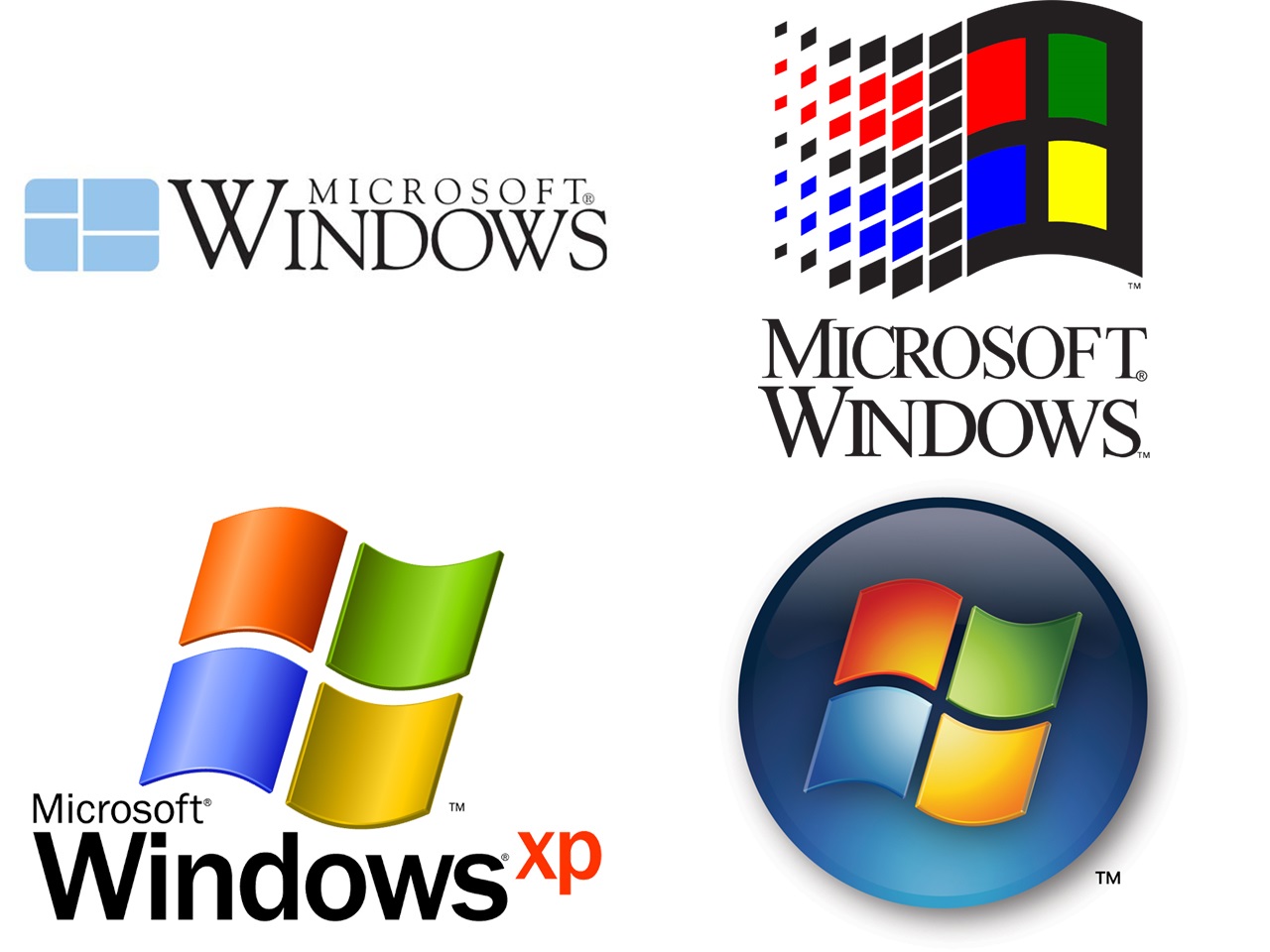
Previous logos for the operating system (including the one shown top left) had featured a window. However, over the years this had evolved into a waving flag, presumably in response to corporate requests for more 'energy' and 'dynamism'. In the process, the design had lost all connection with the original meaning behind the name ‘Windows’, which represented a metaphor for seeing into screens and systems, and a new view on technology.
Scher’s design for Windows 8, then, brought the logo back to basics, re-inventing the somewhat gaudy four-colour symbol as a sleek, modern geometric shape.
Using the classic principle of perspective (lines receding into space to suggest dimensionality), the new design offered a neutral container that still conveyed a sense of movement, while looking more modern and returning to the original concept for the brand.
Lesson learned: Dynamism and energy aren’t 'add-ons', but stem from an underlying strong and clear concept for a logo. Once you have that, everything else will follow.
04. Brooklyn Brewery logo by Milton Glaser
Born in New York in 1929, Milton Glaser is one of the world's most celebrated graphic designers. The co-founder of Push Pin Studios (1954) and New York Magazine (1968), he established his own studio, Milton Glaser, Inc. in 1974. Over the years he personally designed and illustrated more than 300 posters, including the famous 1966 poster for Bob Dylan’s Greatest Hits LP, and is probably best known as the creator of the I Love New York logo.
In 1986, Steve Hindy and Tom Potter came to him looking for an identity for their new brand, Brooklyn Eagle Beer, named in tribute to the famous newspaper once edited by Walt Whitman.
Glaser responded: “Why sell a bird when you’ve got the whole borough?”
It was a good question, and as a result of the conversation that followed, the pair settled on the simpler word ‘Brooklyn’ as the name and identity for the beer.
Brooklyn Brewery went on to be a huge success, and Glaser did pretty well out of it too. At the time, Hindy and Potter couldn’t afford to pay him, so they gave him a stake in the firm instead. It’s now worth millions.
Lesson learned: The key to successful logo design lies in truly understanding the company and brand. And in practice that means asking questions of clients, including awkward ones.
05. IBM logo by Paul Rand

Brooklyn-born graphic designer (1914-1996) Paul Rand was one of the first American commercial artists to embrace and practice the Swiss Style of graphic design. And he soon became world-famous for his corporate logos, creating designs for the likes of IBM, UPS, Enron, Morningstar, Inc., Westinghouse, ABC, and Steve Jobs’ NeXT Computers.
In today’s world, where tech companies routinely redesign their identities year on year, the fact that Rand’s 1972 logo for IBM is still in use stands testament to the brilliance of its design. Using horizontal stripes to replace the solid letters of the previous logo (to suggest "speed and dynamism"), it’s become one of the most recognised logotypes in the world, and is widely imitated by others.
But while the design may look simple, it was by no means quick to create. Having changed the font of the previous 1956 design (replacing Beton Bold with City Medium, lengthening the serifs and tweaking the shape of the ‘B’), Rand spent more than a decade experimenting with variations in the logo, before introducing the iconic stripes.
Rand also put a lot of time and effort into creating a detailed pamphlet and poster, showing the various sizes of the eight-bar logo and providing careful instructions on how to use them. That he continued to keep a close oversight of IBM’s branding for decades meant that his original designs were never abused, and have continued to be applied cleanly and consistently to this day.
Lesson learned: Good logo design doesn’t happen overnight. Patience is required to create not just a successful design, but also a robust and durable system for ensuring its careful and consistent application.
06. AT&T Bell System logo by Saul Bass

Born in The Bronx, New York, Saul Bass (1920-1996) was a graphic designer and film-maker whose influence continues to be felt in both spheres today. Best known for his credit sequences for movies such as Psycho, North by Northwest and Man with the Golden Gun, he also created iconic logos for companies such as Continental Airlines, Warner Communications and Geffen Records. An analysis of his designs in 2011 by Christian Annyas showed them to have extraordinary longevity, with an average lifespan of 34 years.
In 1969, Bass designed the logo for the AT&T Corporation, which then held a monopoly on phone service in the United States and Canada through a network of companies called the Bell System. He simplified the previous 1964 design and – at a time when most logos were intricate and detailed – created a fuss-free emblem that was instantly recognisable.

The rollout of the new logo was to be the largest corporate identity program in the history of the US, involving the redesign of 135,000 Bell System fleet vehicles, 22,000 buildings, 1,250,000 phone booths and 170,000,000 telephone directories. So the company had to be sure it was doing the right thing. To convince the firm, Bell made a half-hour film pitching the design – which you can watch in full today on YouTube.
In the film, Bass explains his vision for a broad identity that would feature on everything from letterheads and print ads to the cufflinks that executives wore. Making a logo that works at both small and large sizes is a principle often emphasised in today’s multi-device world, and it’s testament to the vision of Bass that he applied it just as vigorously in the pre-digital age.
The adaptability and scalability of his 1969 logo is one of the main reasons for its longevity, and it would probably have lasted a lot longer had Bell Systems not been broken up in 1983. Once that had happened, Bass was invited back to create the famous AT&T globe logo, which remained in place until 2005.
Lesson learned: A logo that’s simple is also scalable, so it can be adapted to a huge variety of uses, even those that haven’t even been thought of at the time of its design. And that’s going to ensure its longevity like nothing else.
07. American Airlines by Massimo Vignelli
Born in Italy, Massimo Vignelli (1931-2014) moved from Milan to New York in the 1960s and became one of the most influential designers of the 20th century. Focusing on simplicity through basic geometric forms, he designed Bloomingdale’s signature brown paper bags, the Ford Motor Company logo, the 1972 New York City subway map and branding for the likes of Xerox, IBM, Gillette and Ford.
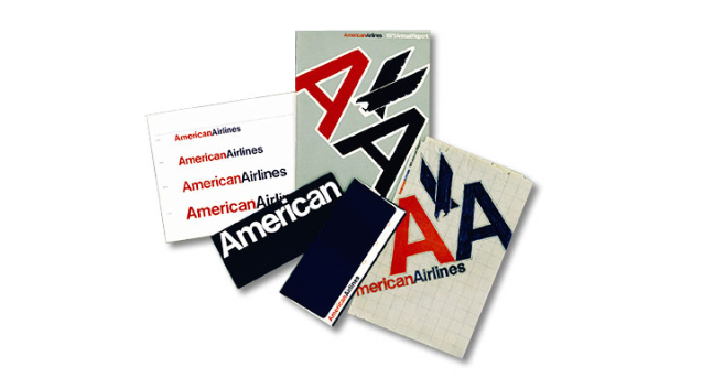
In 1967, Vignelli was introduced to American Airways by industrial designer Henry Dreyfuss, who was consulting for the then-fledgling airline. He was soon recruited to design the logo and branding for the company, and his approach was guided by two principles: legibility and nationality.
To ensure the former, he used Helvetica. For the latter, he cast the logo's two letters in red and blue. “It looked great,” he told Bloomberg in 2013. “The typeface was great. We proceeded by logic, not emotion. Not trends and fashions."
This no-nonsense, straightforward approach resulted in a true design classic, although Vignelli was keen to stress the eagle emblem was forced upon him (he refused to design it himself, so Dreyfuss’ office did the honours). Despite this, his design has become one of the most popular and by far longest-lived logos in the history of airlines.
Lessons learned: Keep it simple, stupid. Steering free of gimmicks and keeping your design as straightforward as possible are key ingredients in creating a longstanding, successful logo.
Related articles:

Thank you for reading 5 articles this month* Join now for unlimited access
Enjoy your first month for just £1 / $1 / €1
*Read 5 free articles per month without a subscription

Join now for unlimited access
Try first month for just £1 / $1 / €1

Tom May is an award-winning journalist and editor specialising in design, photography and technology. Author of the Amazon #1 bestseller Great TED Talks: Creativity, published by Pavilion Books, Tom was previously editor of Professional Photography magazine, associate editor at Creative Bloq, and deputy editor at net magazine. Today, he is a regular contributor to Creative Bloq and its sister sites Digital Camera World, T3.com and Tech Radar. He also writes for Creative Boom and works on content marketing projects.
