10 top UI trends for 2017
Discover the most important UI trends you should be implementing in 2017 – and why.
At Generate San Francisco on 9 June, Aaron Gustafson will demonstrate how interfaces can smartly morph to meet their users’ needs — slow connections, older browsers, narrow screens, and even no screens at all. Don't miss it and get your ticket today!
The world of web and UI design is a fast moving one, and it can be hard to keep up to date in the face of ever-changing trends and developments. We pick out 10 of the most important trends that we believe you should be implementing in 2017 – and why.
01. Immersive, full-screen video
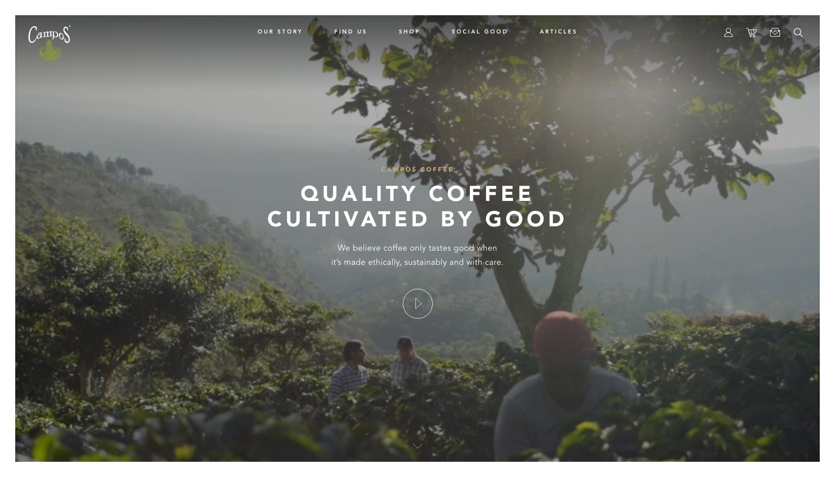
The old saying 'a picture paints a thousand words' still remains true today, and in the world of UI design is still a great way to quickly grab the user’s attention. Vision is said to be the strongest of all human senses, and a large, single image is able to summarise both message and tone of voice in an efficient, succinct way.
Imagery has long been a staple of UI and web design, and its success has slowly paved the way for its natural successor – video. We’re seeing video used more and more in digital design, and for good reason. Where traditional photography is static, video is dynamic. It’s great at catching the eye of users and as a means of visual storytelling.
Conventional imagery isn’t going to disappear any time soon, but one thing’s for sure – 2017 and beyond will be full of more rich, interactive and fullscreen video as a means of engagement and story-telling.
Why use them?
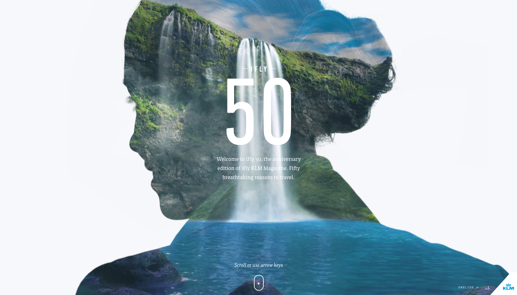
Video, (as well as big, beautiful full-screen imagery), is a powerful medium to utilize to engage users and quickly set the tone. Both mediums are highly versatile in their application, working especially well as background devices accompanied with typography.
Get the Creative Bloq Newsletter
Daily design news, reviews, how-tos and more, as picked by the editors.
02. Longform content and scrolling
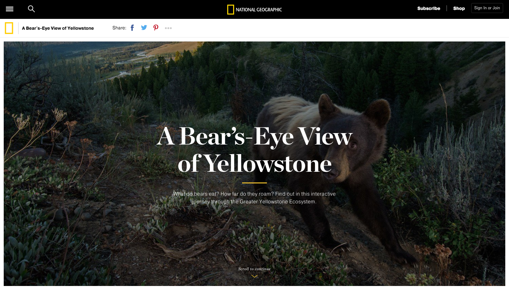
Scrolling is by no means a new mechanic, and definitely not a ‘trend’ as much as a fundamental function for browsing both the web and applications. However, what we're increasingly seeing more of is the implementation of long-scroll and longform content on desktop devices and larger-screened devices to deliver content.
As users have become more comfortable scrolling to find content on smaller-screened devices over the past few years, more designers have begun implementing longform content and scrollable interfaces on bigger screens.
This allows users to very quickly scan large volumes of content, in a single, fluid motion without being removed from the experience by navigation or interruption. It’s a versatile mechanic that works well across all devices and mediums of content, from longform journalism and news stories, to landing pages and interactive experiences.
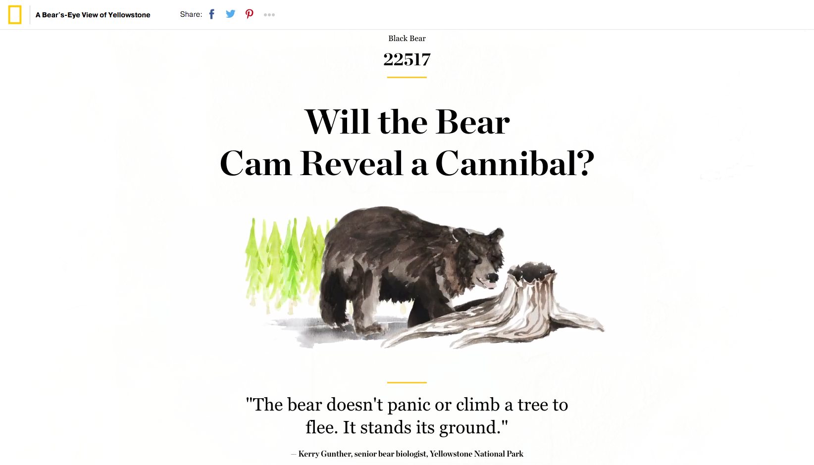
Why use them?
The long-scroll is a great mechanic to implement when seeking to tell a narrative, or structure content in a linear way to guide the user. It’s a versatile mechanic, great for creating immersive, seamless, long-form content which allows users to consume it in a fluid manner, irrespective of the device they’re using.
03. Gradients and vivid colours
2013 brought flat design, which subsequently spread like wildfire through the design community, muting colours and removing all superfluous elements in its wake. Although not without its flaws, flat design was a practical philosophy that still holds value today.
It believed in simplifying UIs to their most core, functional elements to achieve a more refined and efficient user-experienced.
Although functional and good in its intentions, flat design quickly caused the web to become a very similar landscape. Brands and designers from all over jumped on the bandwagon, following the guideline fundamentals, which for many, led to content that was all too similar and void of personality.
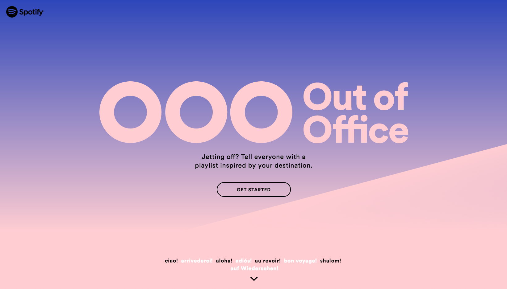
2016 saw the shackles of flat design start to loosen as more brands and designers began to once more focus on personality, experimenting with vivid colour palettes and gradients in place of the simple but dull muted tones used previously.
Gradients and vivid colours are also being implemented in much more than just traditional UI and web design, as Instagram’s controversial rebrand showed. Whether they’re to your taste or not, expect to see an increase in the use of out-there colour palettes and transitional gradient colourways as the world pushes for personality!
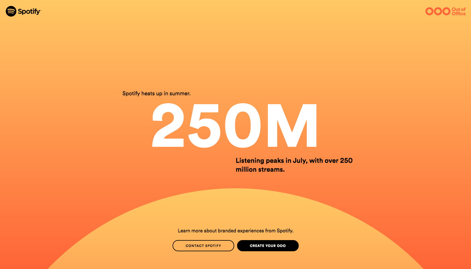
Why use them?
Vivid colours and gradients are great for injecting energy, warmth and dynamism into a project to make it stand out from the crowd. Be brave and experiment with your colour palettes, but ensure that they always work with the tone of your content and not against it. They’re also pretty strong statements, so be thoughtful in their usage to avoid an all out assault on the eyeballs!
04. Illustrations
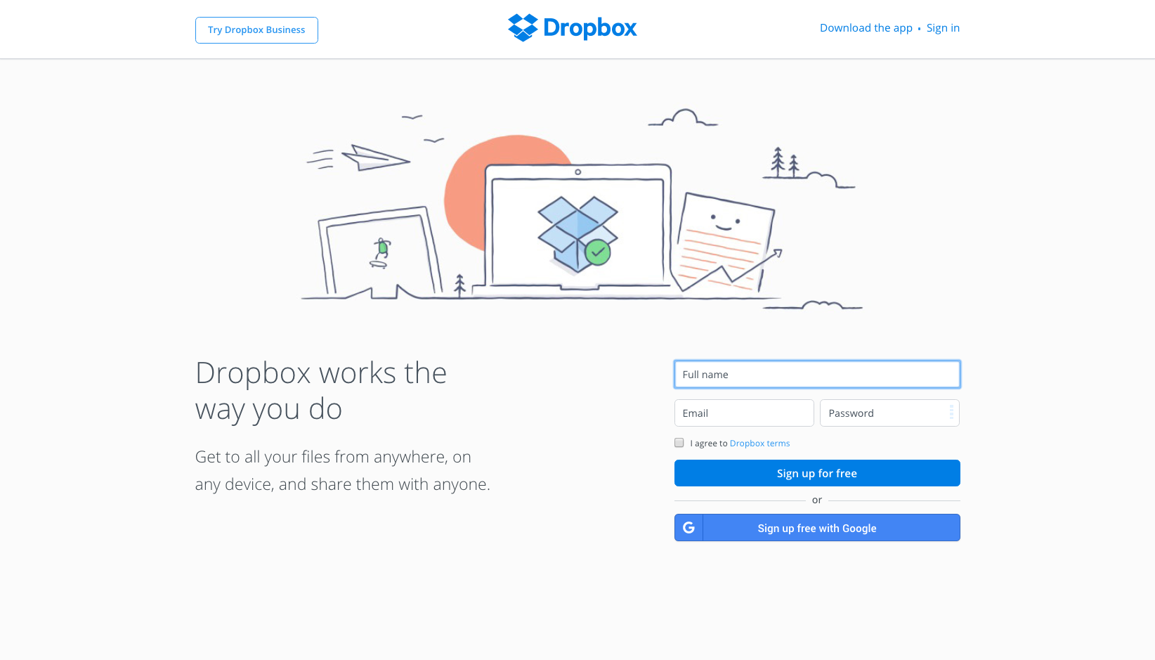
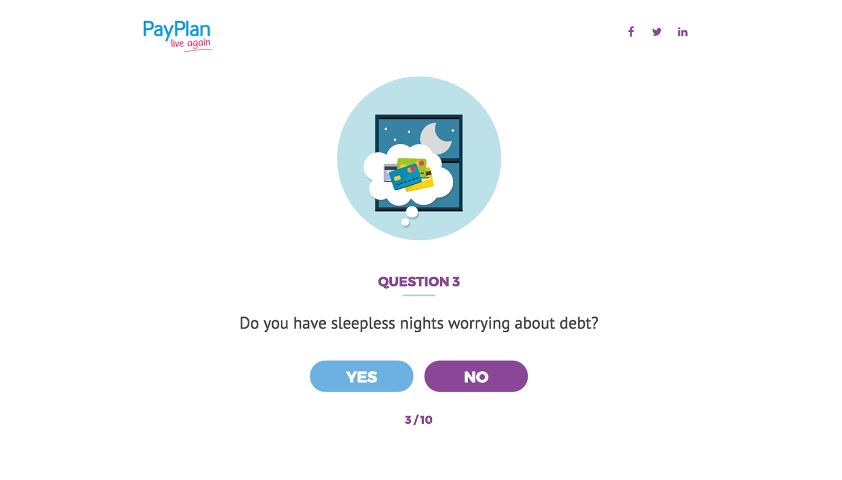
Illustrations offer a sense of personality and character that can be hard to achieve with traditional photography. Bespoke illustrations that work in line with a brand’s identity allows them to carefully create a visual language that truly captures its personality – useful for instilling a sense of authenticity and trust in users and customers.
Illustrations are a versatile medium too. Some brands may choose sleek line-based illustrations to achieve that sharp and sophisticated look, whereas others might opt for more rough-and-ready hand-rendered styles to position them as fun and playful. Illustrations open up avenues for creative direction – even more so when animated or used in conjunction with photography and typography.
Why use them?
Illustrations can be tailor-made to create personality and authenticity, two vital components that go a long way in creating a meaningful connection with users. They’re super-versatile in their application and work fantastically with many of the other UI trends discussed within this piece.
05. Breaking the grid
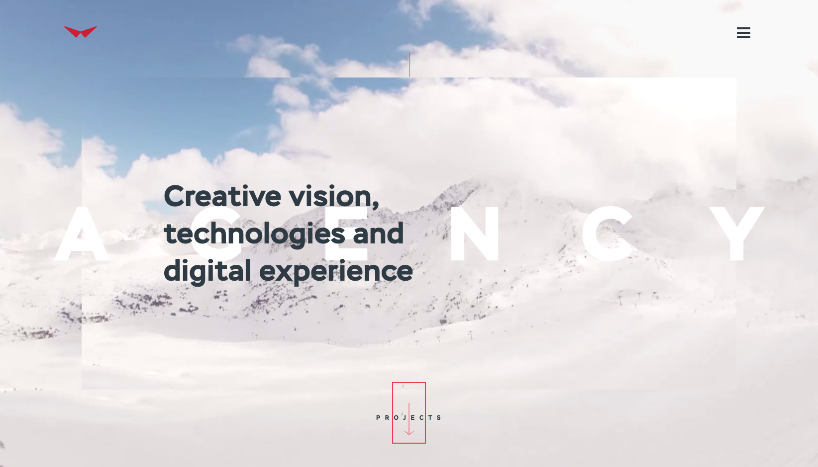
The grid has long been a holy grail of sorts for designers, providing a foundation for design that ensures consistency, balance, rhythm and order. It’s an important tool in user experience design as it provides a level of familiarity for users, allowing them to navigate through a site or app in a way which feels natural.
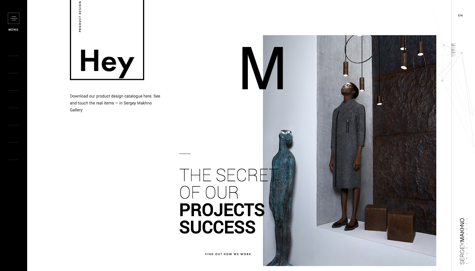
However, as important as the grid is, it can also be restrictive and rigid, limiting creative options for designers. In an attempt to create digital experiences that break from tradition, many web and UI designers are experimenting with layout by breaking the grid.
By moving away from the grid and rigid baseline structures, designers are creating sites, applications and interfaces that are altogether more intriguing and experimental. It opens up a whole new host of creative possibilities, allowing designers to create real statement pieces through the use of layering, depth, motion and obvious focal points.
Why use them?
Breaking the grid provides more creative options. Its flexibility can create a sense of fluidity and freedom otherwise unachievable. However, be very considerate in your implementation – all interfaces have to first and foremost be user-friendly, and your approach to design should always acknowledge this, otherwise you may have some very confused users! You’ll also need to consider how it works on smaller screens if you’re designing responsively.
Next page: 5 more top UI trends to explore

Thank you for reading 5 articles this month* Join now for unlimited access
Enjoy your first month for just £1 / $1 / €1
*Read 5 free articles per month without a subscription

Join now for unlimited access
Try first month for just £1 / $1 / €1
