While clients often ask you to cram in as much information into a page as possible, seasoned web designers know this can lead to a usability nightmare.
Confident and careful use of whitespace, in contrast, is all about giving content room to breathe.
The examples listed here work because everything the visitor needs is still there on the page; all that’s absent would just be clutter. In place of that clutter, whitespace helps create a balanced, easy to navigate interface where you can find what you need without being overwhelmed.
01. Made by Sofa
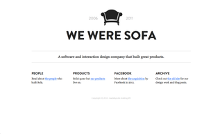
How tempting it would have been for this software and interaction design company to have used an in-your-face, colourful hero image on its homepage in an attempt to grab your attention. Ironically, by keeping things so simple, it’s fashioned a minimal design that’s actually far more eye-catching. Measured use of whitespace conveys a feeling of trustworthiness and reliability, while a subtle slice of negative space in the sofa icon adds an extra touch of class.
02. Apple
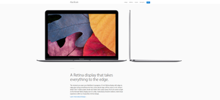
If Apple stands for anything, it’s the importance of design in tech, and its own website demonstrates that masterfully. When you have products as gorgeous-looking as this, you want to focus attention on them, and the acres of whitespace surrounding them achieve just that.
03. Built by Buffalo
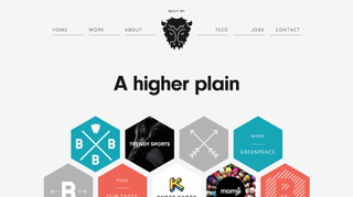
Whitespace isn’t just for ultra-minimal layouts, and here’s a great example. Brighton agency Buffalo’s homepage presents its main nav elements in colourful hexagons, clustered together in a lattice and surrounded by generous amounts of calming whitespace. It’s a strikingly original layout that both contains a kaleidoscope of colour and links while at the same time providing a laid-back, stress-free feel to the scrolling experience.
04. Dropbox

One of the tech world’s big hitters, Dropbox combines child-like illustrations with confident use of whitespace on its homepage to great effect. The overall feel is laid-back and approachable, making what could be, for the uninitiated, a scarily complex proposition seem like a fun and useful thing to try out.
Get the Creative Bloq Newsletter
Daily design news, reviews, how-tos and more, as picked by the editors.
05. Fell Swoop
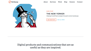
Whitespace has always been a well-used tool in magazine design, and there’s an echo of that sensibility in the website design of Seattle consultancy Fell Swoop. Slightly larger than usual fonts and restrained use of whitespace lend a slice of rare sophistication to what would otherwise be a fairly standard company site.
06. UX Myths
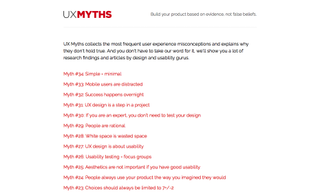
A site that teaches you about how to provide good user experiences needs to practice what it preaches. And UX Myths, a site that collects the most frequent UX misconceptions, certainly does that. Its stark, text-focused homepage at once harks back to the early days of the internet while at the same time avoiding that era’s on-screen ugliness. There’s actually a ton of information on this homepage, but clever use of whitespace means it doesn’t feel like that at all.
07. Something Splendid
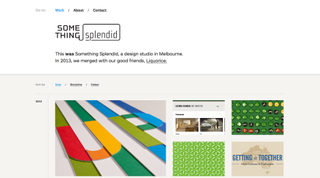
Something Splendid is an Australian design studio that no longer exists, after merging with another agency, Liquorice, in 2013. The nature of the internet, though, means that people are still going to click through old links to their previous URL. What greets them now is this adorable collection of their previous work. The header makes brilliant use of whitespace to provide a sense of distance and convey that this is a loving tribute rather than a ‘working’ site. How much nicer than a 404 page, or an unexplained transfer to the new company, would have been.
08. Chanel
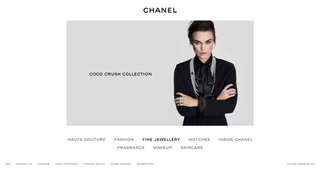
The fashion industry is all about looking good, and it fully understands the potential of whitespace to create an atmosphere of rarified sophistication. Chanel hasn’t stayed in business for 107 years and counting by accident, and its elegant website stands as an example to anyone wanting to succeed in ecommerce.
09. Lionel Durimel
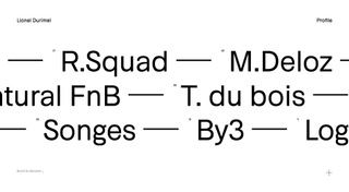
As we said earlier, it’s not just minimalist designs that employ whitespace. But if you are experimenting with ultra-minimalism, it can comes in very handy indeed. Parisian art director Lionel Durimel’s stunning portfolio site combines transparent text, scrolling effects and attention grabbing colours to really sell his services, and bold and adventurous use of whitespace helps pull it all together nicely.
10. Google
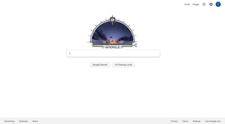
Google.com stands as the great granddaddy of whitespace on the web. Just a small square of this homepage would attract an almost unimaginable monetary value. But the search giant has stuck to its guns and its design has remained largely unchanged since the 1990s. If anyone ever criticises your use of whitespace in web design as “wasted space”, point them here and ask them whether they think the world’s most successful company knows what it’s doing...

Thank you for reading 5 articles this month* Join now for unlimited access
Enjoy your first month for just £1 / $1 / €1
*Read 5 free articles per month without a subscription

Join now for unlimited access
Try first month for just £1 / $1 / €1
Tom May is an award-winning journalist and editor specialising in design, photography and technology. Author of the Amazon #1 bestseller Great TED Talks: Creativity, published by Pavilion Books, Tom was previously editor of Professional Photography magazine, associate editor at Creative Bloq, and deputy editor at net magazine. Today, he is a regular contributor to Creative Bloq and its sister sites Digital Camera World, T3.com and Tech Radar. He also writes for Creative Boom and works on content marketing projects.
