Top tips for painting a dragon with personality
Manuel Castañón shares his process for painting an original dragon, from sketch to finished illustration.
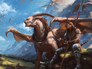
The painting above was made as an entry for the Facebook group Draw or Die's monthly Ascension contest. The idea was to paint ourselves with our own personal dragon, one that would "symbolise who you are and what you love about everything in life". It was meant to be our inner fire, as artists, something that drives us forward.
I must confess this prospect made me feel like a child. Since I learned how to draw a dragon at the age of four, my love for them has only grown stronger over the years. I wanted to show my love for fantasy and art, the joy of my inner child, what I am and what I want to be, all in one image.
Needless to say it wasn't easy. This is the fourth iteration I did for the contest over a one-month period. It was the breakthrough after a lot of failed compositions and colour choices, but once I arrived at this sketch everything went smoothly. This is the process I'm going to show you.
Never let yourself get discouraged when you’re struggling. Craig Mullins once said, "Failure is 99 per cent of the artistic process." And he's right!
01. Line work sketch
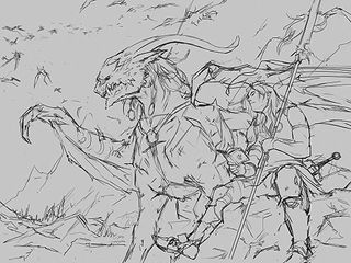
Some people work better from shapes, others work better from line work. Starting with lines feels more natural to me. I like the composition and the idea of this sketch. It looks like the character is protected under the dragon's wing.
02. Reference usage
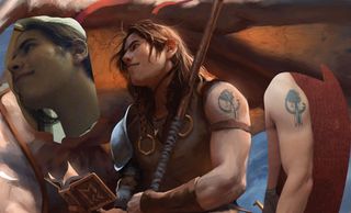
When you're just sketching stuff or practising, it's fine to do everything from imagination. However, reference becomes essential for a professional-looking illustration, especially for faces or other anatomical details. Having said this, capturing the character's look is easy because he's supposed to be me!
03. Adding 'stripes'
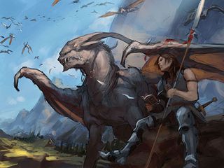
I create a new layer under the lines and start painting. I want to make this image bright and cheerful. I use the lighting to 'stripe' the image and create depth, while at the same time keeping a sense of warm light and cool shadows.
04. Storytelling elements
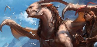
The transformations of the sheets of paper into dragons as they leave the notebook are there to bring interest and some story to the image. I spent a good amount of time messing around with them, trying to make the shapes read well without attracting too much attention.
05. Defining light sources
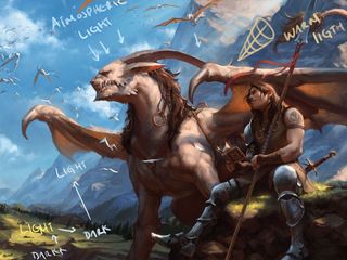
Defining your light sources is a very important step. The main light is the sun, which comes down from the right upon the scene. This enabled me to use the shadow of the mountains to create rhythm with the lights and darks in the background.
06. Refine, refine, refine!
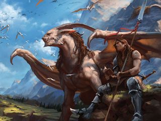
From this point the process is pretty straightforward – just paint over the lines! I use reference for the face and take inspiration from other artists for the environment – and from horses, to help depict the dragon's muscles.
07. Values test
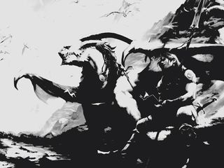
A picture must be understandable. If it doesn't work in black and white it most likely won't work in colour either. Even when the value range is drastically compressed, this image can still be understood and the most basic composition emerges.
This article originally appeared in ImagineFX magazine issue 127.
Related articles:
- How to draw manga
- Great examples of doodle art
- Illustrator tutorials: amazing ideas to try today!

Thank you for reading 5 articles this month* Join now for unlimited access
Enjoy your first month for just £1 / $1 / €1
*Read 5 free articles per month without a subscription

Join now for unlimited access
Try first month for just £1 / $1 / €1
Get the Creative Bloq Newsletter
Daily design news, reviews, how-tos and more, as picked by the editors.
Related articles
-
-
-

-
